Showcase your work and get career-advancing feedback

Showcase
Editors’ Choice
Project
Uxcel Halloween Icon Pack

🎃 Introducing the Uxcel Halloween Icon Pack! 🎃 This custom Halloween-themed icon set was created to enhance the seasonal user experience o

Project
Color System

To develop the color system for a productivity platform from start to finish, I decided to create a quick UI design for a fictional task man
Community Choice
Project
Duolingo Halloween Icon Pack

Why Duo?Who better fits the theme of halloween than the famously unhinged green owl who hops on every trend on social media. Duolingo has br
Editors’ Choice
Project
Waze: Playful Icon Transformations

Waze is a highly popular navigation app that provides real-time, user-generated updates on traffic conditions, road hazards, speed cameras,
Editors’ Choice
Project
Notion Halloween Icon Set
IntroductionI started my research by looking through products that I love to use that have incredibly built icon sets. The icons needed to b
Project
Starbucks Halloween Icon Pack

Halloween is so on! 🎃This project transforms Starbucks’ app into a Halloween haven by redesigning key icons with spooky, playful twists. In

Project
iOS A11Y Signup Form for SaaS

Alright, let’s take it easy! How about a form that’s so easy, even us couch potatoes can use it without breaking a sweat? It’ll work cross-p

Community Choice
Project
Crypto App Onboarding

Hi everyone🚀 Excited to present our latest concept onboarding for Crypto Vault Wallet 🔐—your go-to gateway for seamles

Project
FinTrust - 404 Error Page

Objective: Design a user-friendly, visually appealing, and informative 404 error page for the FinTech platform to minimize user frustration

Project
Travel Tracks: Celebrating Pride in Travel

Step 1: IntroductionOverview: Travel Tracks is a travel service focusing on destinations and custom travel experiences that are friendly to
Project
Animated icons with Rive
Hey, guys! This is my project and one of my first works dedicated only to interaction design. I created an interactive icon set by Rive and
Project
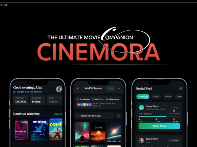
Cinemora - Ultimate Movie Companion (UIX Documentation)

Project SummaryFor this UXPilot project, I reimagined Cinemora, a movie companion app that helps users discover and organise films more inte

Project
Rummly - A zero-friction freecycle app

FAST FASHION FUELS WASTE, BUT NO EASY WAY TO REHOME ITFast fashion and low-cost shopping platforms like Shein and Temu have fueled an unprec

Project
Empty States: Course Collection

Branding, colors, visuals:I decided to design empty states for a course collection app and chose blue as the brand color in order to evoke a

Editors’ Choice
Project
HireHarbour Allies: UX/UI Case Study for Inclusive Landing Page

Note: Figma link contains multiple prototypes from research to the actual desktop view. It’s best viewed from a desktop screen. Problem: Wor

Project
UI design / protein e-commerce

Overview This project focuses on the launch of a limited edition series of protein powder and energy bars by Eiyo in celebration of Pride Mo

Editors’ Choice
Project
Unity 🌈

👋 IntroductionThis study will cover the entire design process of the Unity landing page, an inclusive platform aimed at connecting LGBTQ+ i

Project
Uxcel Pride Month Scholarship Program

Overview: To celebrate Pride Month, Uxcel is launching a special scholarship program aimed at supporting aspiring UX/UI designers. This init

Project
FoodTime

Description: FoodTime is a food delivery service that connects users with local restaurants, emphasizing support for LGBTQ+ owned and friend

Editors’ Choice
Project
Pride Month UX/UI case study

IntroductionThis project focuses on redesigning Pathfinder´s Homepage. The goal is to enhance its inclusivity and appeal towards LGBTQIA+ yo

Project
Joblet Hire - Profile Page
Joblet is a hiring web platform where companies who need to hire people and individuals looking for jobs come together like a marketplace. T

Project
Headspace sign-up page accessibility optimization

Overview: This project focused on optimizing the accessibility and user experience of the Headspace sign-up page for a free trial. The orig
Project
Airbnb: Halloween Icon + UI Takeover

What is Airbnb's mission? Airbnb is an app that bridges guests around the world to ‘Belong Anywhere,’ as guests rent out their homes an

Project
"Style me now", promo website, challenge
This challenge involved creating a landing page for a fictional company called "Style Me Now," which offers personalized fashion advice for

Project
Settings Page for Travel and Destination App

I chose to design a settings page for a travel and destinations mobile app. My primary objective was to imagine the settings pages, making t

Project
Trello Color System

In crafting the design system for Trello, I introduced a modern dark theme that foregrounds content, highlighted by a vivid yellow to draw a

Editors’ Choice
Project
UX/UI Case Study for Inclusive Landing Page for Parliament of Georgia
Due to its length, the full study cannot be displayed right now. Please read the complete study 👉 here Check the final redesign Vol 1 👉 h

Community Choice
Project
Deeply - Your Mindful Companion

This is Deeply (a real app I'm building), Deeply is your best companion when you stop your addiction (tobacco, alcohol etc...). I red one d

Project
UX Case Study: Pride in Design
IntroductionThe goal of this project was to design a captivating and inclusive landing page design experience for a non-profit organization

Project
Lazy Ant - Web3 Community Builder Mobile App - Case Study
IntroductionWelcome to the case study that delves into the development of Lazy Ant, a mobile application designed to enhance community build

Project
Reset Password - Mobile App Flow
'Continue with...' step This flow is for a user who has an existing email address, so a ‘Continue with email’ button is used to demonstrate

Community Choice
Project
Accessible Signup Form

Accessible Sign-up Form for Mobile Apps Highlights: ✔️ Clear Error Messaging ✔️ Toggle for Password Visibility ✔️ Multiple Login Option

Community Choice
Project
Siter.io Signup & Login A11Y

For the “Accessible Signup Form for SaaS Platform” brief, I analyzed Siter.io, a no-code website builder (I have a soft spot for web and mob

Project
Media portal for the bank

Project
E-Commerce Checkout Page

Design Rationale: The design approach for the checkout form aligns with a user-centric philosophy, prioritizing simplicity and clarity to e

Project
Wireframing for Video Streaming Service

Design Scenario As I’m a member of the design team at a video streaming service. My task was to brainstorm ideas and design wireframes that

Editors’ Choice
Project
Pride Month Celebration at MORHOVER

Introduction Discover how Morhover celebrates LGBTQ+ pride through a dedicated landing page, showcasing the company's commitment to diversit

Community Choice
Project
Zalando - Notifications

The primary goal of push notifications is to communicate a message clearly and consistent. Users receive multiple notifications daily so it'

Project
RetroPlum - Skeuomorphic Style Button Kit

Hello! I'm Salvatore, and I'm thrilled to introduce you to my project—the RetroPlum Button Kit, developed from scratch in response to the Ux

Project
Notion Color System Reimagined

I created a color system for Notion. The design task involved selecting colors that would not only differentiate the tool from its competito

Project
Heuristic Evaluation - Flo Mobile app


Community Choice
Project
Checkout page for Ukrainian shop
.

Project
Accessibility Sign Up form for Qonto

In this project, I designed the signup page for Qonto!, a SaaS platform that provides retirement, healthcare packages and more for you, and

Project
Scholar – Pricing Page for SaaS Education Platform

I decided to design a pricing page for a platform called Scholar for educators to interact with their students and streamline their work. I

Project
Branding : Online Gift Shop

Branding for a Online Gift Shop Mahhal sells superior quality premium niche gifts for people who want to be remembered forever. Because your

Project
Settings Page for Mobile App - Lokie App (Dark/ Light Mode)

Hey friends 👋 I am excited to share the web design I've been working on. I did it for the Settings Page for Mobile Apps: Lokie App (Dark/L

Community Choice
Project
TRADE.ly

TRADE.ly is an innovative online platform designed to provide comprehensive resources and tools for trading and forex enthusiasts. The proje

Project
NextKit Free Admin Panel

NextKit is not just another dashboard UI — it's a developer-first admin panel starter kit tailored for modern web applications. Crafted with

Project
Empathy Mapping

Financial Platform: Mobile Banking App for Millennials Device Type: Smartphone Target Audience: Millennials (ages 25-40) User Research: To u

Project
UniQ Records | Landing Page Redesign
IntroductionAt UniQ Records, music is a celebration of diversity and unity. With the celebration of Pride Month, my task as the UI/UX Design

Project
Plant Shop catalog

Project
ClickThere - PPC Agency

Designed the landing page for ClickThere, a PPC agency. The design features modern graphics with a blue and green color scheme to reflect th

Project
Voluntary Abroad - Landing Page (Non-Profit Organisation)

The design for the landing page of this voluntary abroad organization aims to strike a balance between visual appeal, user interaction, and

Project
Insurance App Empathy Map

OverviewFinancial platform: insurance app Product: Nh1816 Verzekeringen (Dutch insurance company) Device: Smartphone (iPhone 12) User resear

Project
Vietnam Bank & Mobile Wallet Logos

This is the collection of 80+ logos of banks & mobile wallets in Vietnam market. I initiated this project while realizing there's no any

Project
Ankama Games Launcher Concept - UX/UI Case Study

This presentation aims to outline the solution to the identified problem, without going into the details of the research, analysis and ideat

Editors’ Choice
Project
Widely Mobile App UX Case Study
I invite you to follow me on Behance and on my other social networks, as well as to like this project to support me. I would be very gratefu
Project
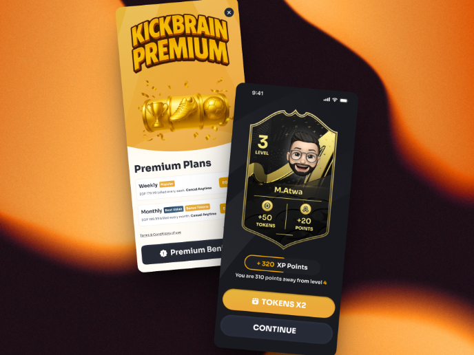
Redesigning KickBrain: Trivia Mobile Game

Overview — The Thirty Second ChallengeThe Thirty Second Challenge began as a YouTube football trivia show and quickly became a cultural hit.

Project
MobLearn - Education Web App
The empty state is the screen that users see when they first land on the app or if there is no content to display. This particular screen is

Project
PlayYourCourt - Color System
I adapted the project brief to explore reimagining the color system of the online platform and mobile app, PlayYourCourt. This product essen

Project
FMQ's Pride landing page

FMQ PRIDE FMQ (Fabamaq) is a software house within Porto’s (Portugal) technology hub that strives to develop competitive casino products for

Project
Jumana's User Persona

1. Identifying the Problem: User engagement dropped after the app launch. 2. Setting objectives: Goals: Understand why user engagement is dr

Project
Crypgo Modern Landing Page Design & Template for Crypto Platforms, Startups, SaaS, Mobile Apps

Crypgo Landing Page Template specifically designed for crypto startups, trading platforms, blockchain consultancies, and digital coin and as

Project
Footer Design for SyncR

This is a personal practice work for a gaming conference named SyncR. Please feel free to leave feedback so I can keep learning from you and
Project
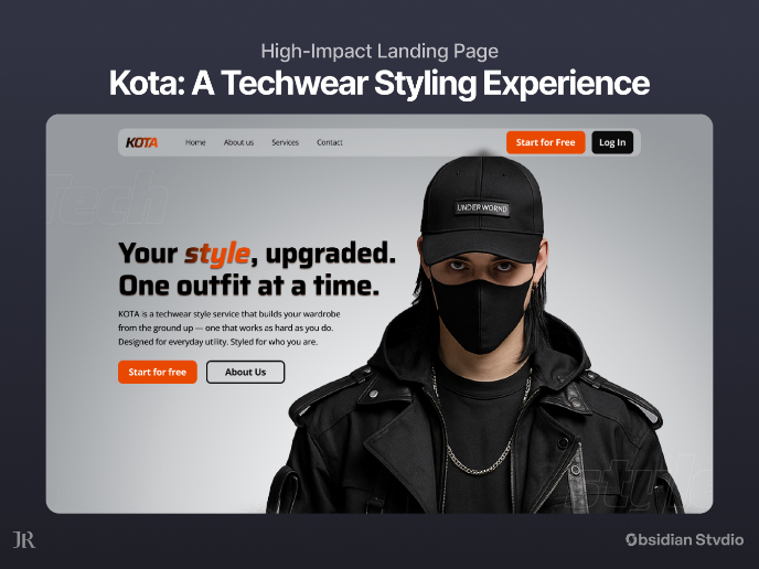
KOTA: Landing Page (A Techwear Styling Experience)

Project Overview: KOTAKOTA is a fictional but conceptually grounded techwear styling service created specifically for this project. Its core

Project
Interactive Hover

In one of my projects, I created a unique card flip interaction inspired by Apple’s WWDC 2024. This interaction features a visually engaging
Project
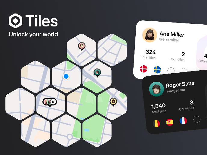
The Tiles app

OverviewTiles is a location-based exploration app that turns the world into a grid of hexagons. Each tile represents a real place that can b

Project
Ithnain Management System

Creating a Design system for a management system for a healthcare app. Starting from understanding main functions for every user type by lis
Project
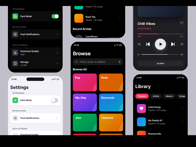
Light & Dark Mode Mobile App Exploration

Mobile Entertainment AppiOS · Adaptive Light & Dark Mode · Accessibility This project explores how a music streaming app can adapt naturally

Project
Settings page for Mobile App: Roundout
Roundout is the go-to platform for students seeking study buddies, eager to connect with peers who share their academic interests, discover

Project
Bento Grid - SaaS Website Design
The design is effective in communicating the value proposition of the product and in persuading visitors to learn more.
Community Choice
Project
Duolingo Halloween Icon Set

Duolingo is a popular language-learning app that uses fun, interactive methods to help users learn new languages. Known for its playful desi

Project
Button System Design for Project Management Tool
Choice of platform and design elements The challenge began with selecting an appropriate platform, which by its nature required a complex bu
Project
Tennis Icons
Hi Guys, Some tennis icons I did a time ago for an IOS App. I had a lot of fun playing with the geometric construction to have them with a g

Project
Placid Plastic Typography System Challange
As the UI designer in charge of designing the typography system for the Placid Plastic Duck Simulator marketing website, my process involved

Project
Travel Carousel (Prototype Included)
Hi Guys, I’ve designed an interactive Travel Carousel in Figma that lets users explore various destinations in a dynamic and engaging way.

Project
Wireframing for Video Streaming Service

Design Scenario As a member of the design team for a video streaming service, my role was to generate creative ideas and develop wireframes

Project
Speed reading app
Empty state of speed reading app screen. Contain image, text and contrast CTA button

Project
Empty State - Education App

For the empty state page, my primary focus was on selecting illustrations that visually communicate the context and message of the empty sta

Project
Grocery Shopping App Design
Designed grocery app UI that's both functional and fun! I aimed for a bright and cheerful feel to make grocery shopping less of a chore. The

Project
Empty State design for Educational App
My objective is to create engaging empty state pages that users might encounter within the English learning platform. To ensure the brand co

Project
Clean.app - Effortless Cleaning for a Faster Phone

How do you feel about apps that offer customizable interfaces? I think such apps offer several advantages: 1. Personalization: Users can tai

Project
EntertainHub App (Dark / Light Mode)


Project
Substack UX Persona Project

Platform: Substack Device: Mobile and Desktop (Web) I conducted a mixed methods survey to collect qualitative data directly from users. I ch

Project
Latios - Free Portfolio Template for UX/UI Designers

Overview I built Latios because I kept seeing the same problem: designers with solid experience getting stuck trying to launch their portfol

Project
BeReal - Social Platform

This is a user persona of the BeReal platform, targeting new users who are likely to use the app. In order to increase engagement the user p

Project
Obsidian - Form Redesign

Overview Hello! This is my attempt at re-designing the subscription form for Obsidian, which I use frequently but have never seen through t
Project
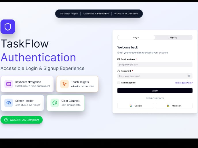
TaskFlow Accessible Login & Signup

WCAG 2.1 Level AA Compliance1.3.1 Info and Relationships (Level A): Semantic HTML5 form elements with proper label associations using htmlFo

Project
Force brand | E-commerce
ForceBrand is a young Ukrainian brand of men's and women's basic apparel. The main goal of this project is to design a user-friendly and vis

Project
Push Notification Design for E-Commerce Platform

E-commerce platformThorne is an e-commerce platform focused on personalised, scientific wellness. Their mission is to empower individu

Project
Hulu Through My Eyes - A Cinematic UI Exploration (unofficial)

This project is an unofficial, self-initiated redesign created for the Uxcel & UXPilot Challenge.

Project
Music Sidebar

Hey Guys! If you have been following a bit, you have probably noticed that Windows 11 will be released soon. This is the background for Wind

Project
Notification Design

This work involves the design of notifications microcopy for the Cosmic Beauty fashion brand. My goal was to enhance the user experience for

Project
Checkout Page for E-Commerce Platform

This design neatly splits product details and payment info across two columns, making your journey from browsing to buying smooth and straig

Project
Button System for Mobile and Web Systems

Overview: The goal for this project was to create a basic set of buttons and interactions that I can refer back to if I ever need buttons fo

Project
Reset Password Design for Mobile App: Roundout
Investigating Primary Friction PointsForgetting Username/Email: Users often forget which email or username they used for an account. Complex

Project
Parmonic - AI Video Automation Platform

I've designed a simple pricing page for a company that provides AI software to help companies trasfrorm long videos into all types of conten

Editors’ Choice
Project
New Interactive Empty State Version with Rive!
🎉 New Interaction Alert! 🎉 After receiving some great feedback and requests for a more colorful version on the previous showcase, I’m exci

Project
Figbruary 2023 Submissions (Figma Experiments)

IntroductionThis was a daily Figma UI, Prototype and Illustration challenge I took part in, February 2023. The challenge's name is Figb

Project
User Personas for Pinteres

I've decided to create 3 user personas for the social Pinterest. I've crafted the users profiles from common patterns and behaviours from pe