Light & Dark Mode Mobile App Exploration

Mobile Entertainment App
iOS · Adaptive Light & Dark Mode · Accessibility
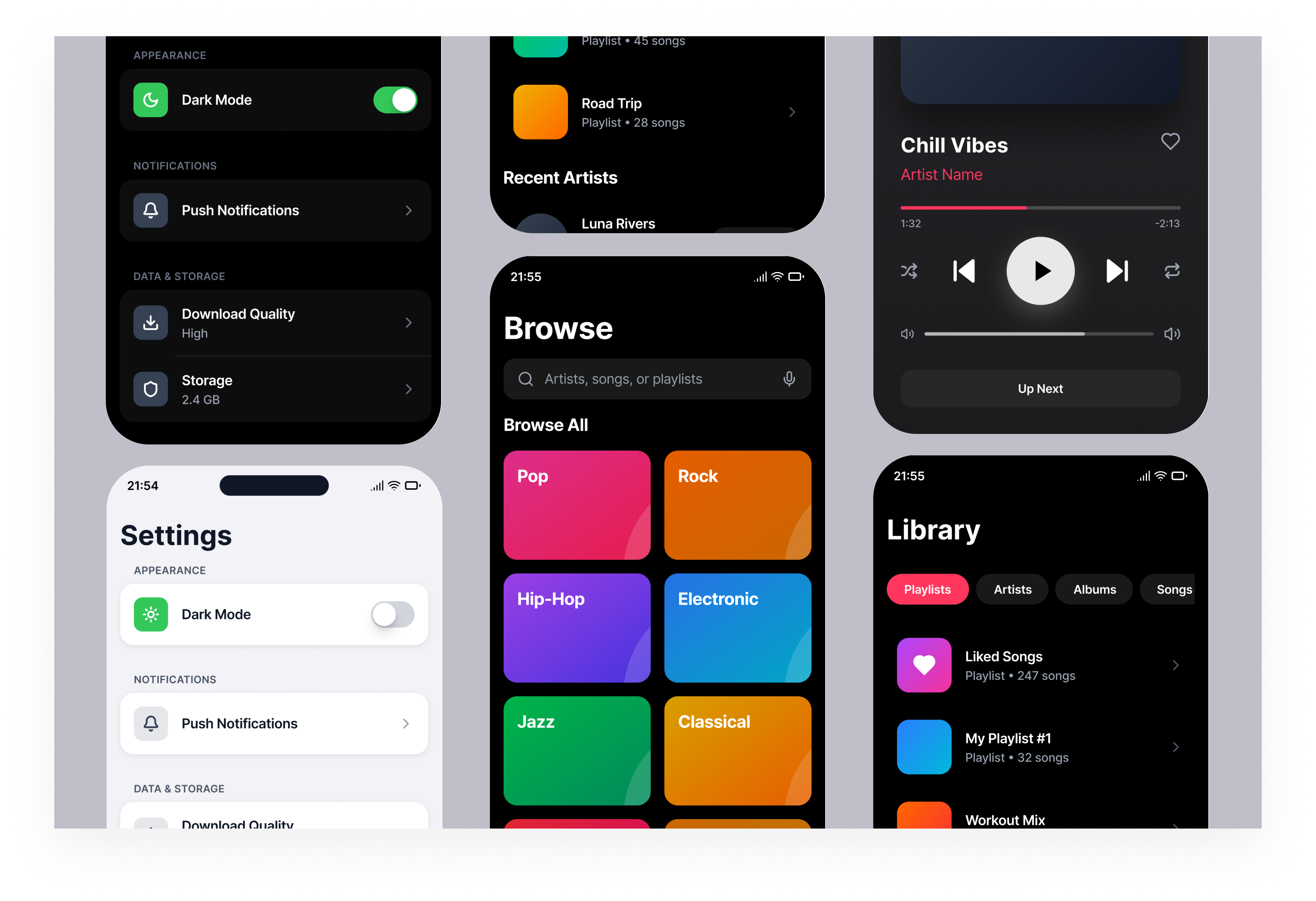
This project explores how a music streaming app can adapt naturally between light and dark mode.
The focus was on getting the basics right first. Clear navigation, hierarchy and comfortable spacing.
Using familiar iOS patterns so the interface feels predictable and easy to scan from the start.
The final concept includes four core screens, Listen Now, Search, Library, and Settings and a interactive prototyp.
Each screen is designed to follow iOS conventions for navigation, layout and interaction.
Tools used
From brief

Topics
Share
Reviews
7 reviews

I have nothing to say, you did a great job! Brava!!
Awesome work! you have taken good consideration of accessibility issues in both light and dark mode design.
To make your design stand out more exceptionally, might be good to consider lower a bit shadow ratio on the light mode of "listen now" page, especially the "recently played" cards. Too much shadow creating a "dirtish" impression.
All in all, you have created great design. Keep going.

Looking at these screens, I have to be honest, the dark mode is done correctly, but quite safely. The accent colors (pink, green, orange) work well in both modes, maintaining readability without losing vibrancy. The toggle in Settings switches cleanly, and icons adapt properly. 😊
However, the backgrounds in playlist tiles and category cards look identical in both modes. That's a missed opportunity, because in dark mode you could subtly adjust the saturation so they blend better with the dark background. Right now, those bright colors "shout" a bit against the black.
The player screen looks solid. The gradient on the album cover blends nicely. Text contrast is OK, but "Luna Rivers" in that pink color against black could be slightly brighter for better accessibility.
As for iOS conventions (navigation, spacing, and hierarchy) are all in place. Nothing deviates from standards, which in this case is an advantage.
Good work for a start. The foundation is stable, and any potential improvements are just details, not structural issues. 💪🫡
hello

A tip:
Since it's a "Mobile entertainment app," I think it's worth including images and icons to guide the user.

The color palette looks fantastic. Great job!

love the style great work
You might also like

Pulse Music App - Light/Dark Mode


Designing A Better Co-Working Experience Through CJM


Monetization Strategy


Zoom Sign in Screen


Button System for Mobile Web Platforms Brief


Mobile Onboarding

Visual Design Courses

UX Design Foundations


Introduction to Figma

Design Terminology
