Dark Mode
Dark mode is a design option that uses dark backgrounds with lighter text and elements, reducing eye strain, saving energy, and offering users more control.


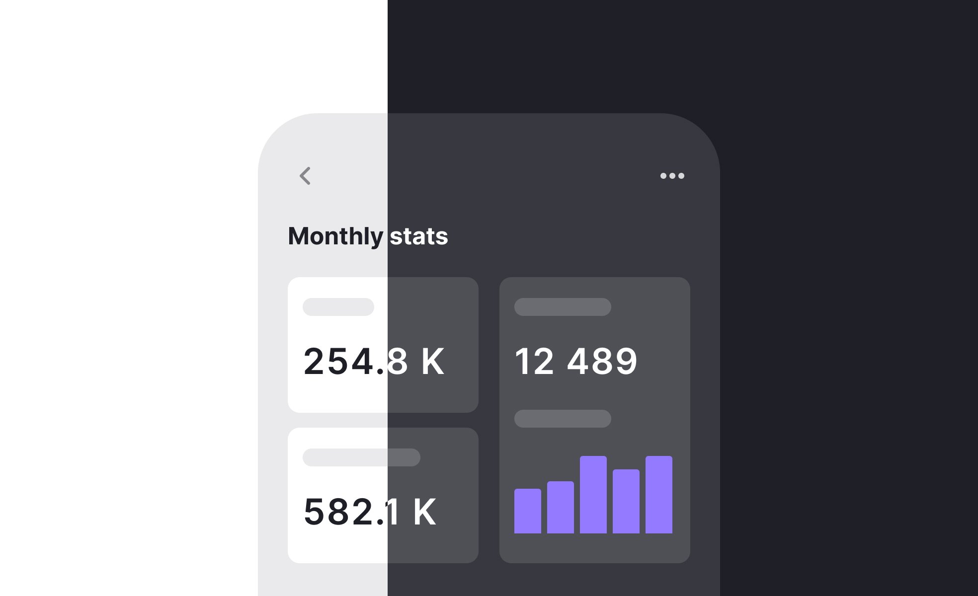
Dark mode is a user interface style that inverts the traditional design of light backgrounds with dark text. Instead, it uses darker surfaces as the base and lighter elements for content and controls. This style has grown popular across operating systems, apps, and websites because of its balance of aesthetics, practicality, and user comfort.
One of the key benefits often associated with dark mode is reduced eye strain. In low-light environments, bright screens can cause discomfort and fatigue, while darker interfaces feel gentler on the eyes. Though studies vary on its medical impact, many users report greater comfort during prolonged use, particularly in nighttime settings.
Dark mode also has an energy-saving aspect on OLED and AMOLED screens. These displays can switch off pixels to render black, meaning darker designs consume less power. For mobile users, this can translate to longer battery life, especially when apps are frequently used with high screen brightness. Designers and product managers often highlight this efficiency as a secondary benefit.
From a UX perspective, offering dark mode is about user choice. People differ in how they perceive comfort, and some find light mode more readable. By making dark mode optional and easy to toggle, products demonstrate respect for user preferences. Many apps and platforms now include system-level integration, automatically adjusting based on device settings.
Dark mode also brings design challenges. Contrast ratios must be carefully calibrated so text remains legible without appearing washed out. Accent colors that work in light mode may not translate effectively to darker backgrounds, requiring separate palettes. Designers must test both modes thoroughly to guarantee consistent usability across all contexts.
Real-world examples show its ubiquity: Apple, Google, and Microsoft all offer dark mode as default system options, and most major apps like Twitter, Slack, and YouTube follow suit. It has shifted from being a trend to a standard expectation in modern digital products.
Learn more about this in the 13 Principles of Dark Mode Design Lesson.
Key Takeaways
- Dark mode uses dark backgrounds with lighter content elements.
- Benefits include reduced eye strain and energy savings on certain screens.
- Offering dark mode demonstrates respect for user preferences.
- Design requires careful attention to contrast and color palettes.
- It has become a default expectation in modern software.
- Widely adopted across operating systems and apps.
Many users feel more comfortable using dark mode in low-light conditions, since bright screens can be jarring. While scientific evidence is mixed, subjective reports suggest that dark mode makes extended use more tolerable for some people. Others may still prefer light mode for readability, especially with long-form text.
Eye strain depends on multiple factors, including lighting conditions, screen brightness, and font design. Because of this, dark mode should be offered as an option rather than assumed as universally better.
On OLED and AMOLED displays, dark mode can significantly improve battery efficiency. These displays work by turning individual pixels on or off, so displaying black means consuming little or no energy. The result is reduced power consumption when large areas of the screen are dark.
On LCD screens, however, the effect is minimal since backlighting still powers the entire display. For this reason, the power-saving benefit depends on the type of screen technology being used.
Designers need to test readability and contrast carefully. Text that looks fine on a light background can lose legibility in dark mode if the contrast ratio is too low. Designers also often create alternative palettes, since colors behave differently on dark backgrounds.
Testing with real users helps confirm whether elements remain accessible. Proper adjustments ensure dark mode is not just stylish but also functional and inclusive across different conditions.
Recommended resources
Courses

UX Design Foundations


Core UI Components


Design Terminology

Lessons

13 Principles of Dark Mode Design

Designing for Dyslexia

Interface Materials & Layers
Exercises


Tutorials

Mastering Elevation for Dark UI: A Comprehensive Guide


12 Principles & Best Practices of Dark Mode Design

Projects

Empty States: Course Collection


Settings Page for Travel and Destination App


Scholar – Pricing Page for SaaS Education Platform