Basic Shapes
Basic shapes like circles, squares, triangles, and lines form the building blocks of design systems, supporting layout, iconography, and visual communication.


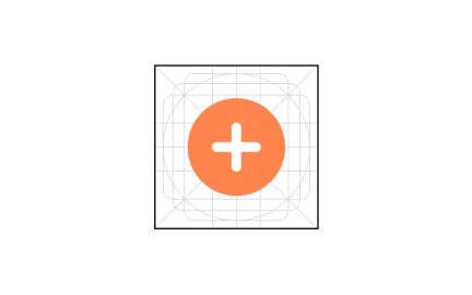
Basic shapes are the fundamental elements in design, serving as the building blocks for complex visuals, layouts, and user interfaces. Circles, squares, rectangles, triangles, and lines appear across digital products, often forming the foundation of more advanced components. By mastering how to use shapes, designers can create interfaces that are clear, balanced, and visually meaningful.
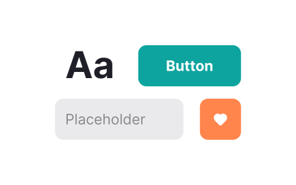
In UX/UI design, shapes communicate hierarchy and guide user attention. A circle may draw focus as a notification dot, while a rectangle becomes a button. Designers use shapes to structure information, provide emphasis, and improve navigation. For example, rounded rectangles are common for input fields and cards, offering familiarity and reducing cognitive load.
Real-world examples show how shapes influence user perception. Google’s Material Design heavily relies on geometric shapes to provide clarity and structure. Circles highlight floating action buttons, while grids of rectangles form the foundation for card layouts. This reliance on shapes makes interactions predictable and consistent across devices.
Psychology plays an important role in how users interpret shapes.
Circles often feel friendly and approachable, triangles suggest direction or movement, and squares convey stability. These associations allow designers to subtly shape user emotions and behaviors. A circle badge for a profile picture feels welcoming, while a sharp triangle warning icon signals caution.
Shapes also support accessibility when used thoughtfully. Designers can pair shape differences with color to communicate meaning, ensuring information is not lost for users with color vision deficiencies. For example, using both a triangle and red color for error icons reinforces clarity through multiple signals.
From a technical perspective, basic shapes are easy to scale and adapt across devices. Vector graphics allow shapes to remain sharp at any size, making them suitable for responsive design. This flexibility ensures consistent experiences on both large desktop screens and small mobile devices.
Learn more about this in the Basic Shapes in Figma Lesson, a part of the Introduction to Figma Course.
Key Takeaways
- Circles, squares, and triangles are core design building blocks.
- Shapes guide attention, structure layouts, and enhance usability.
- Associations with emotion and meaning influence user perception.
- Standardizing shapes supports scalable design systems.
- Accessibility improves when shapes reinforce meaning alongside color.
Basic shapes provide the foundation for interface elements such as buttons, cards, and icons. They establish consistency and clarity, helping users navigate products more easily.
By simplifying visual structures, shapes reduce cognitive effort and improve usability.
Shapes also help communicate meaning through familiarity.
Users quickly recognize rectangles as input fields or circles as notification indicators, which speeds up interaction. This shared visual language builds trust and efficiency.
Shapes carry psychological associations that affect how users feel. Circles tend to feel soft and welcoming, triangles convey movement or caution, and squares represent balance and reliability. These associations allow designers to create experiences that resonate emotionally.
For example, a round call-to-action button feels approachable, while a triangular play icon intuitively suggests action. When applied carefully, shapes not only improve clarity but also shape user perceptions of friendliness, safety, or urgency.
Yes, shapes enhance accessibility when paired with other cues. Designers can use both shape and color to represent states, ensuring users with visual impairments receive the same information. For instance, pairing a warning triangle with yellow color communicates meaning across multiple senses.
By applying accessible design principles, teams ensure that all users benefit from clear signals. Basic shapes become tools of inclusivity, supporting communication that is both effective and equitable.
Recommended resources
Courses

UX Design Foundations


UI Components I


Design Terminology

Lessons

How to Use Visual Design Elements

Intro to Design Elements

Basic Shapes in Figma
Projects

RetroPlum - Skeuomorphic Style Button Kit


Color System for Productivity Tool


Saas Platform