Design Elements
Design elements are the fundamental building blocks of visual communication, shaping how products convey meaning, usability, and brand personality to users.


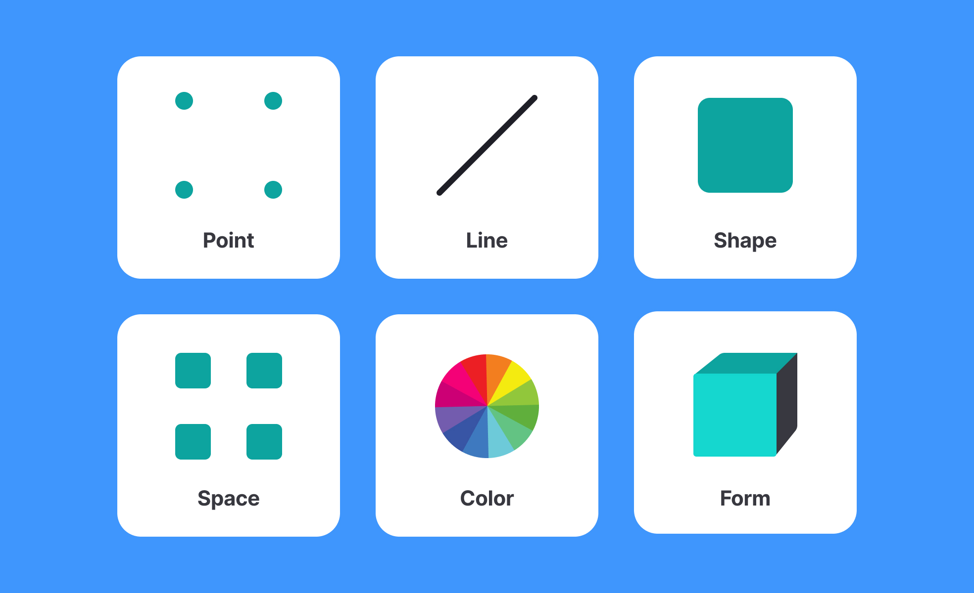
Design elements include line, shape, color, texture, space, typography, and imagery. These basic components form the foundation of visual communication in digital products. By combining them effectively, designers create interfaces that are both functional and engaging.
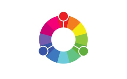
Lines guide the eye and structure layouts. Shapes define boundaries and highlight important elements. Color influences perception, mood, and accessibility, while texture creates depth. Space, or white space, balances these elements, giving designs clarity and readability. Typography and imagery provide voice and identity, helping users interpret content.
For UX/UI design, these elements go beyond aesthetics. They shape usability. For example, consistent spacing ensures readability, while color contrast improves accessibility. Misuse of elements can lead to confusion, frustration, or exclusion. A well-balanced use of design elements strengthens trust and reinforces brand identity.
In product management, understanding design elements helps in evaluating trade-offs. For example, a decision to prioritize bright, high-contrast colors might boost attention but risk overwhelming users. By recognizing these dynamics, product managers align design choices with business goals and user needs.
Real-world products illustrate this balance. Apple leverages minimalism and white space to highlight clarity and elegance. Spotify uses bold colors and dynamic imagery to convey energy and creativity. Each brand demonstrates how deliberate use of elements translates into user perception.
Ultimately, design elements are tools. Their value comes not from individual use but from how they are combined thoughtfully. When balanced, they produce harmony, usability, and a memorable experience.
Learn more about this in the Intro to Design Elements Lesson, a part of the Design Composition Course.
Key Takeaways
- Design elements are the basics of visual communication.
- Line, shape, color, texture, space, typography, imagery.
- Impact usability, accessibility, and branding.
- Misuse can lead to confusion or frustration.
- Product managers use them to guide trade-offs.
- Real-world brands show their strategic application.
Usability depends on clarity. Design elements provide structure and hierarchy, guiding the user’s eye and reducing confusion. For instance, consistent spacing ensures readability, while proper color contrast supports accessibility for visually impaired users.
These small adjustments create significant impact. When handled with care, design elements make products more intuitive, lowering cognitive effort.
Design elements reflect the voice and tone of a brand. Typography conveys personality, color builds recognition, and imagery signals values. For example, a luxury brand may favor muted tones and elegant fonts, while a social platform may use vibrant colors and playful shapes.
By aligning design elements with values, brands create stronger recognition and trust. Users not only interact but also form emotional associations with the product.
Yes. Product managers, marketers, and engineers gain context by understanding design elements. This awareness supports better collaboration with design teams, improving alignment and efficiency.
It also helps in decision-making, since non-designers can evaluate design trade-offs with a more informed perspective, balancing user needs with business goals.
Recommended resources
Courses

UX Design Foundations


Design Terminology


Introduction to Design Systems

Lessons

13 Core Visual Design Principles

Image Types and Formats

Visual Design Principles in Practice
Tutorials

How to Create Realistic Shadows in Creatie: A Step-by-Step Guide


Creating Reusable Components in Figma: A Step-by-Step Tutorial


Mastering Elevation for Dark UI: A Comprehensive Guide
Projects

RetroPlum - Skeuomorphic Style Button Kit


Crypgo Modern Landing Page Design & Template for Crypto Platforms, Startups, SaaS, Mobile Apps


404 Error Page for Fintech Platform Bankr💸
