Visual Design Principles in Practice
Understand how to practically implement guiding design principles for exceptional UX
Design principles are the very basis of creating interfaces that are both highly usable and attractive. However, the principles of design are not just about creating an appealing form.
A mindful combination of those principles helps your designs communicate a message and assists users in achieving their goals. Designs with a clear hierarchy, enough emphasis on the most important elements, and generous spacing to enhance scannability are more likely to engage users.
Unity is a
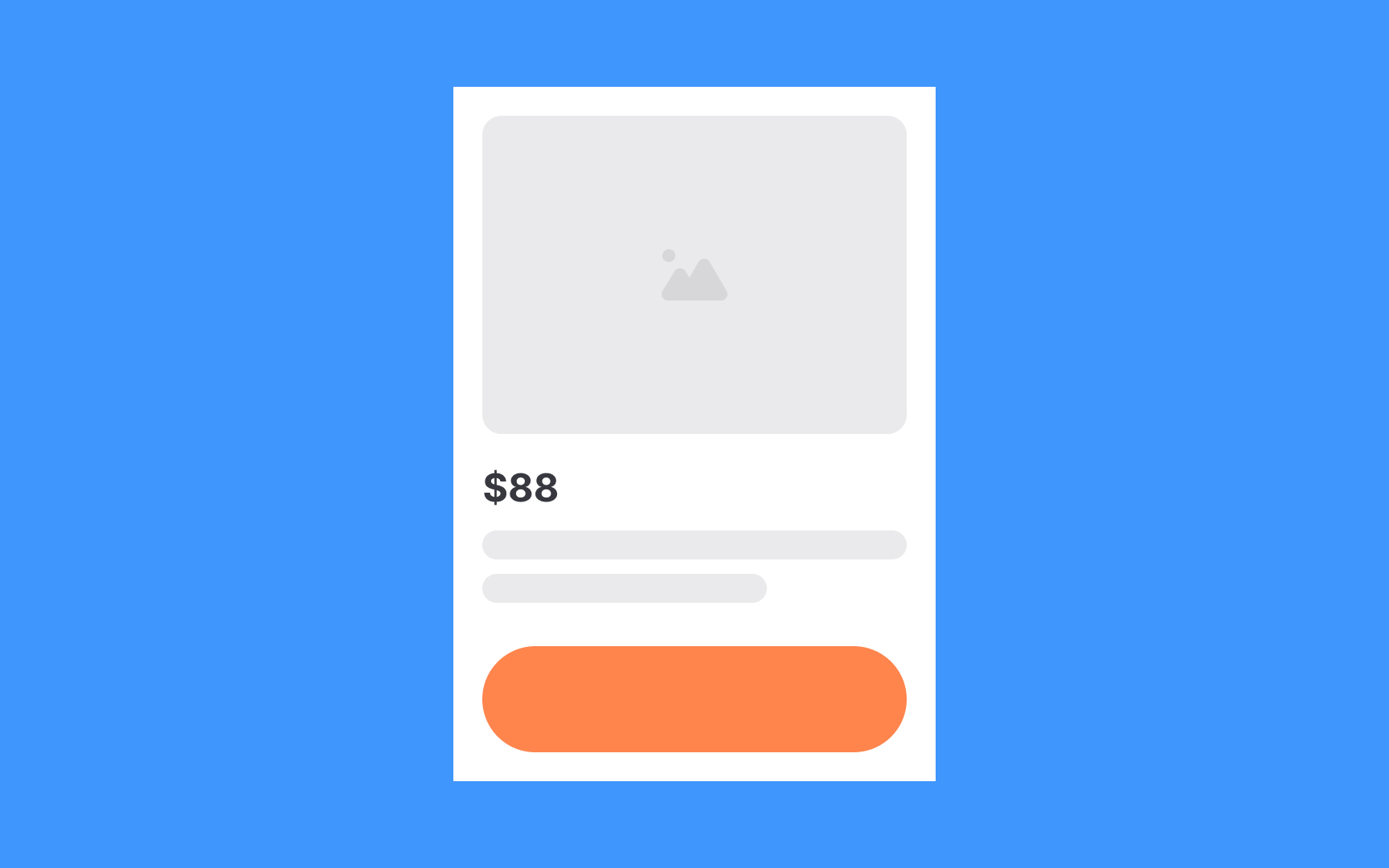
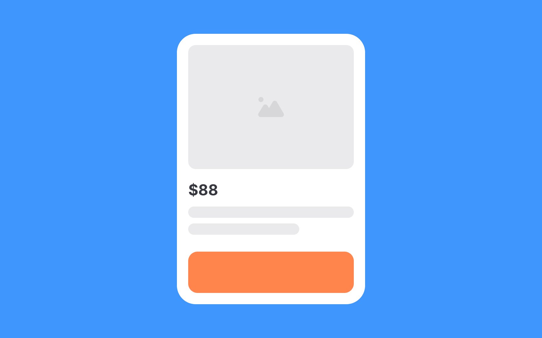
For example, product cards usually have the same priority and should demonstrate repeating styles, like colors, shapes, and sizes, to maintain visual consistency.
By unifying topic-related content and using consistent styles, you reduce cognitive overload and help users complete their tasks faster.


Proximity, which basically means "closeness," has all related and similar elements close to each other. Grouping related
This principle supports visual hierarchy and balance, and it often goes hand in hand with repetition.


According to the alignment principle, related elements should be arranged along a common axis. Applying it minimizes chaos and helps users scan
Cohesive alignment is crucial for text blocks. Left alignment is the most convenient for users' eyes as it follows a natural flow and doesn't create extra cognitive load.
In the design world, balance is achieved by combining elements, such as images, shapes, fonts, and
Asymmetric layouts are a better fit for advertising materials (banners, emails, brochures, etc.) or landing pages to bring a feeling of surprise and catch users' attention.

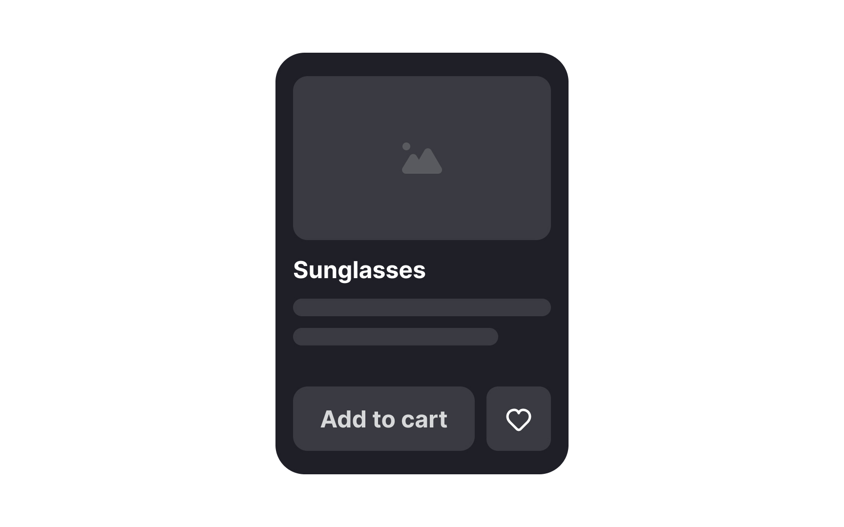
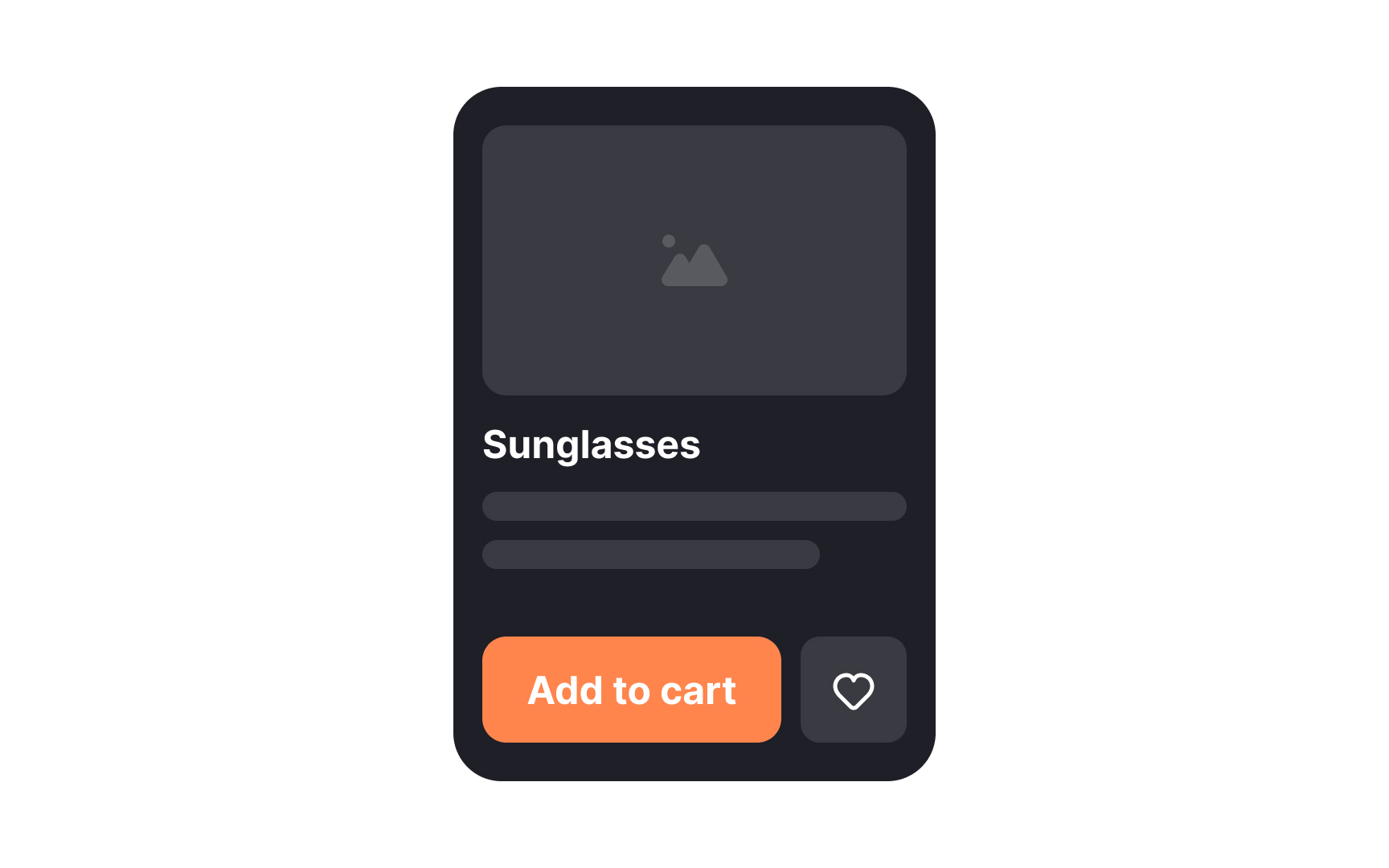
Contrast is what makes the difference between two or more elements. Designers use
One of the most effective ways to create contrast is through size. Enlarging the most important elements, like headings, containers, or critical information, immediately draws the eye and establishes a clear hierarchy. When everything is the same size, nothing stands out. When size varies intentionally, users know what to focus on.
Grouping also plays a major role in contrast. By placing related
Emphasis is used to draw users' eyes to something specific. It can be an
Surprisingly, designers can emphasize elements by breaking other
Pro Tip: The asymmetrical composition also attracts users' attention to the point of imbalance.


The principle of repetition reinforces consistency and helps organize
For instance, we apply the same styling to an


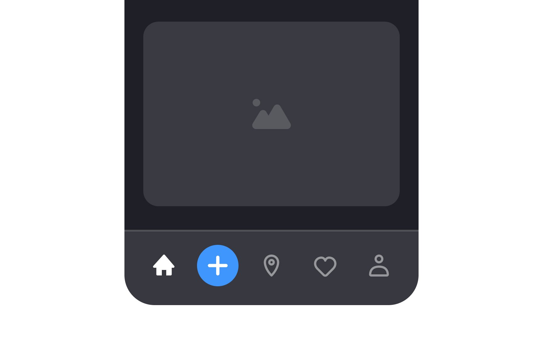
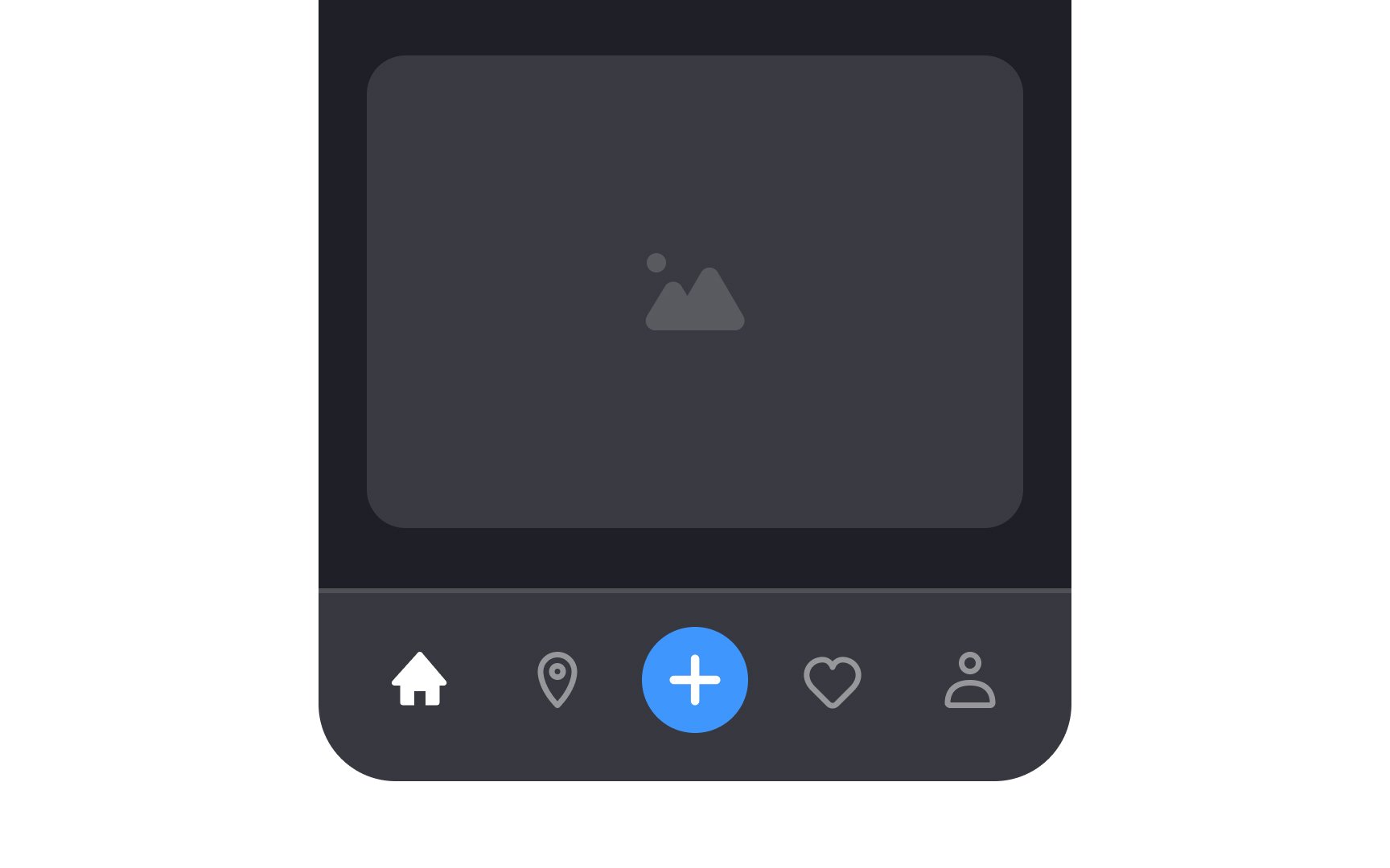
Movement describes the journey the human eye takes as it travels over a design. Visual prominence of elements allows designers to establish a hierarchy on a
Start with establishing a focal point — an element that naturally attracts the eye. It could be a prominent headline, an attractive hero image, and a large appealing CTA — elements that help users complete their goal on a page. Less important


Negative space, often referred to as
- Balance the elements: Use negative space to balance visual elements, ensuring that the
layout doesn't feel overcrowded or too sparse. - Highlight key features: Surround important elements with negative space to make them stand out and draw users' attention.
- Improve readability: Utilize space between lines, paragraphs, and other text elements to increase legibility.
- Create grouping: Use negative space to group related elements and separate them from unrelated ones, creating a logical flow.
Pro Tip: Give designs a more sophisticated feeling by adding more space between elements.

Hierarchy guides users throughout designs, leading the eye through each area in priority order. It visually ranks elements through scale,
For example, an article's headline uses a larger
Proportion indicates the relationship between various elements' sizes. The larger the element, the more important it must be. Good proportion adds harmony, symmetry, or balance to design.
Consider the following best practices for effectively applying proportion in the design of interfaces:
- Use a grid system: By using a
grid , you can ensure that your elements are proportionally spaced and aligned, which creates a more cohesivelayout . - Use a consistent scale: This means that related elements should be sized relative to each other, creating a sense of visual unity. For example, when establishing a typography hierarchy, you can make the headings 1.5 to 2 times larger than the
body text .
When the difference between elements is too large, like in the wrong example, the composition lacks harmony. In turn, when elements look almost equal, the design feels boring and monotonous.


The Gestalt principle of continuation states that our eyes naturally tend to follow elements aligned along a straight or curve line and perceive them as related. This principle becomes valuable when designers need to guide users' eyes in a certain direction.
For example, on mobile devices, the space is often limited, and designers use carousels by placing elements within one category horizontally. Continuation implies a direction to follow and helps users understand that more options are to the right.
Principles like similarity, proximity, and closure assist continuation in emphasizing that items are related and that users should expect more items if they scroll to the left.[2]


Gestalt figure-ground principle states that our brains naturally distinguish between foreground and background objects in an image. The relationship becomes ambiguous when both the foreground and background contain two distinct
UI and
References
- Proximity Principle in Visual Design | Nielsen Norman Group
Top contributors


Topics
From Course

Share


Similar lessons

Common UI Component Definitions I

Image Terminology
