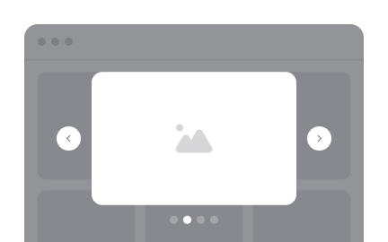
<?xml version="1.0" encoding="utf-8"?>

TL;DR

  • Overlay windows for focused interaction.
  • Used for alerts, confirmations, or forms.
  • Temporarily block background content.
  • Must balance urgency and usability.

Definition

A modal is a user interface element that appears as an overlay above existing content, requiring users to interact with it before returning to the main workflow.

Detailed Overview

Modals are among the most widely recognized patterns in interface design. They provide a way to capture attention and prompt immediate action without redirecting users to a new page. Common uses include login prompts, confirmation dialogs, forms, and critical system alerts.

A frequent question is why designers use modals instead of inline elements. Modals are powerful because they reduce distraction, creating a focused environment for tasks that require acknowledgment. For example, a confirmation modal ensures users do not accidentally delete important data without double-checking the action.

Another recurring question is about potential drawbacks. Modals interrupt workflow by design. If used excessively or triggered unnecessarily, they frustrate users and harm engagement. Poorly timed modals, such as subscription pop-ups during browsing, often create negative experiences. Effective use requires restraint and clarity.

Accessibility concerns often arise with modals. Without proper coding, screen readers may fail to detect modal content, leaving users stranded. Designers and developers must ensure keyboard navigation, focus trapping, and clear exit options are implemented. This ensures all users can interact with modals effectively.

Teams also ask about mobile considerations. On smaller screens, modals must be responsive and avoid covering too much of the interface. Alternatives such as bottom sheets or inline alerts may sometimes work better. The decision depends on context, importance of the message, and available screen space.

Finally, modals can enhance clarity when applied responsibly. They are best reserved for moments requiring explicit input or confirmation. When aligned with user expectations, modals improve accuracy, prevent errors, and support more controlled interactions.

Learn more about this in the Best Practices for Designing UI Modals Lesson, a part of the UI Components I Course.

Recommended resources

Courses

UX Design Foundations Course
Popular
Course

UX Design Foundations

Gene Kamenez
Gene Kamenez
Learn the essentials of UX design to build a strong foundation in core principles. Gain practical skills to support product development and create better user experiences.
Design Terminology Course
Course

Design Terminology

Alesya Dzenga
Alesya Dzenga
Learn UX terminology and key UX/UI terms that boost collaboration between designers, developers, and stakeholders for smoother, clearer communication.
UI Components I Course
Course

UI Components I

Colin Michael Pace
Colin Michael Pace
Learn to create user-friendly interfaces using core UI components, building a solid foundation for designing intuitive and efficient digital products.
Color Psychology Course
Course

Color Psychology

Cameron Chapman
Cameron Chapman
Learn how color influences perception, emotion, and behavior. Discover how to apply color psychology to design more impactful and engaging experiences.
Common Design Patterns Course
Course

Common Design Patterns

Gene Kamenez
Gene Kamenez
Learn design patterns most valued in product development to create intuitive, visually compelling experiences that seamlessly blend form and function.
Accessibility Foundations Course
Course

Accessibility Foundations

Ljubisa Kukulj
Ljubisa Kukulj
Learn the fundamentals of digital accessibility and how to create inclusive experiences for all users. Explore key principles, tools, and best practices.
Wireframing Course
Course

Wireframing

Colin Michael Pace
Colin Michael Pace
Learn to create effective wireframes that seamlessly integrate into your design workflows, improving communication and driving better design outcomes.
UI Components II Course
Course

UI Components II

Colin Michael Pace
Colin Michael Pace
Learn advanced techniques to design dynamic, scalable interfaces using optimized UI components and streamlined navigation for better user experiences.
UX Writing Course
Course

UX Writing

Alesya Dzenga
Alesya Dzenga
Learn to write microcopy that communicates clearly and concisely to improve user experience, build trust, and boost conversions across digital products.
Design Composition Course
Course

Design Composition

Gene Kamenez
Gene Kamenez
Learn the fundamental principles of visual layout, balance, and structure to create compelling and effective design compositions that engage and intrigue users.
Mobile Design Course
Course

Mobile Design

Denis Jeliazkov
Denis Jeliazkov
Learn mobile UI/UX patterns, workflows, and platform-specific strategies to create exceptional, user-friendly mobile experiences across different devices.
Typography Course
Course

Typography

Cameron Chapman
Cameron Chapman
Learn typography fundamentals, from typeface and font selection to layout and spatial arrangement, to create captivating designs that communicate powerfully.
UX Design Patterns with Checklist Design Course
Course

UX Design Patterns with Checklist Design

George Hatzis
George Hatzis
Learn common UX design patterns and how to apply them with practical checklists, ensuring the creation of intuitive, user-friendly, and exceptional interfaces.
HTML Foundations Course
Course

HTML Foundations

Yan Sokalau
Yan Sokalau
Learn the fundamentals of HTML, from basic formatting and structure to advanced elements and best practices, to create accessible and responsive web pages.
Enhancing UX Workflow with AI Course
Course

Enhancing UX Workflow with AI

Colin Michael Pace
Colin Michael Pace
Learn how to integrate AI into UX design to create smarter, more personalized user experiences. Explore tools, trends, and best practices in AI-driven design.
CSS Foundations Course
Course

CSS Foundations

Yan Sokalau
Yan Sokalau
Learn the basics of CSS, including the box model, element style, and content positioning, to improve communication, design handoff, and web decision-making.
Introduction to Figma Course
Course

Introduction to Figma

Gene Kamenez
Gene Kamenez
Learn essential Figma tools like layers, styling, typography, and images. Master the basics to create clean, user-friendly designs
3D Design Foundations Course
Course

3D Design Foundations

Learn essential 3D design principles, from spatial thinking and dimensional relationships to form, lighting, and texture, for a solid foundation in the field.
Information Architecture Course
Course

Information Architecture

Colin Michael Pace
Colin Michael Pace
Learn the basics of organizing, structuring, and labeling content to design clear, user-friendly information systems that enhance usability and navigation.
Apple Human Interface Guidelines Course
Course

Apple Human Interface Guidelines

Denis Jeliazkov
Denis Jeliazkov
Learn Apple’s Human Interface Guidelines to design modern, high-performing apps, focusing on UI principles and best practices for creating effective interfaces.
Introduction to Design Audits Course
Course

Introduction to Design Audits

Romina Kavcic
Romina Kavcic
Learn the art of systematic design evaluation to improve consistency, effectiveness, and create more user-centered products that meet user expectations.
Improve your UX & Product skills with interactive courses that actually work

FAQs

When should modals be used?

Modals are best used when user attention must be focused on a single task, such as confirming an irreversible action or filling out a form. They should not be used for trivial content or minor alerts.

Keeping modals limited to high-value interactions ensures they add clarity instead of friction.


Why are modals sometimes frustrating for users?

Frustration occurs when modals interrupt tasks unnecessarily or appear too often. Users may feel blocked from completing their goals, especially if the modal contains irrelevant content.

To avoid this, modals must be purposeful, well-timed, and easy to dismiss.


How do modals affect accessibility?

If coded poorly, modals can trap users or remain invisible to screen readers. Proper focus management, keyboard navigation, and clear exit controls are essential for inclusivity.

When implemented correctly, modals remain usable for all audiences, including those relying on assistive technology.


How should modals be adapted for mobile devices?

Mobile screens have limited space, so modals must scale appropriately. Full-screen modals or bottom sheets often work better than desktop-style overlays. Content must remain readable and interactive without overwhelming the interface.

Choosing the right format ensures usability in mobile contexts.


Are there alternatives to modals?

Yes. Inline alerts, banners, or side panels can sometimes replace modals, especially for less critical interactions. These patterns preserve workflow while still communicating important information.

Alternatives are often preferable when information does not require immediate interruption.