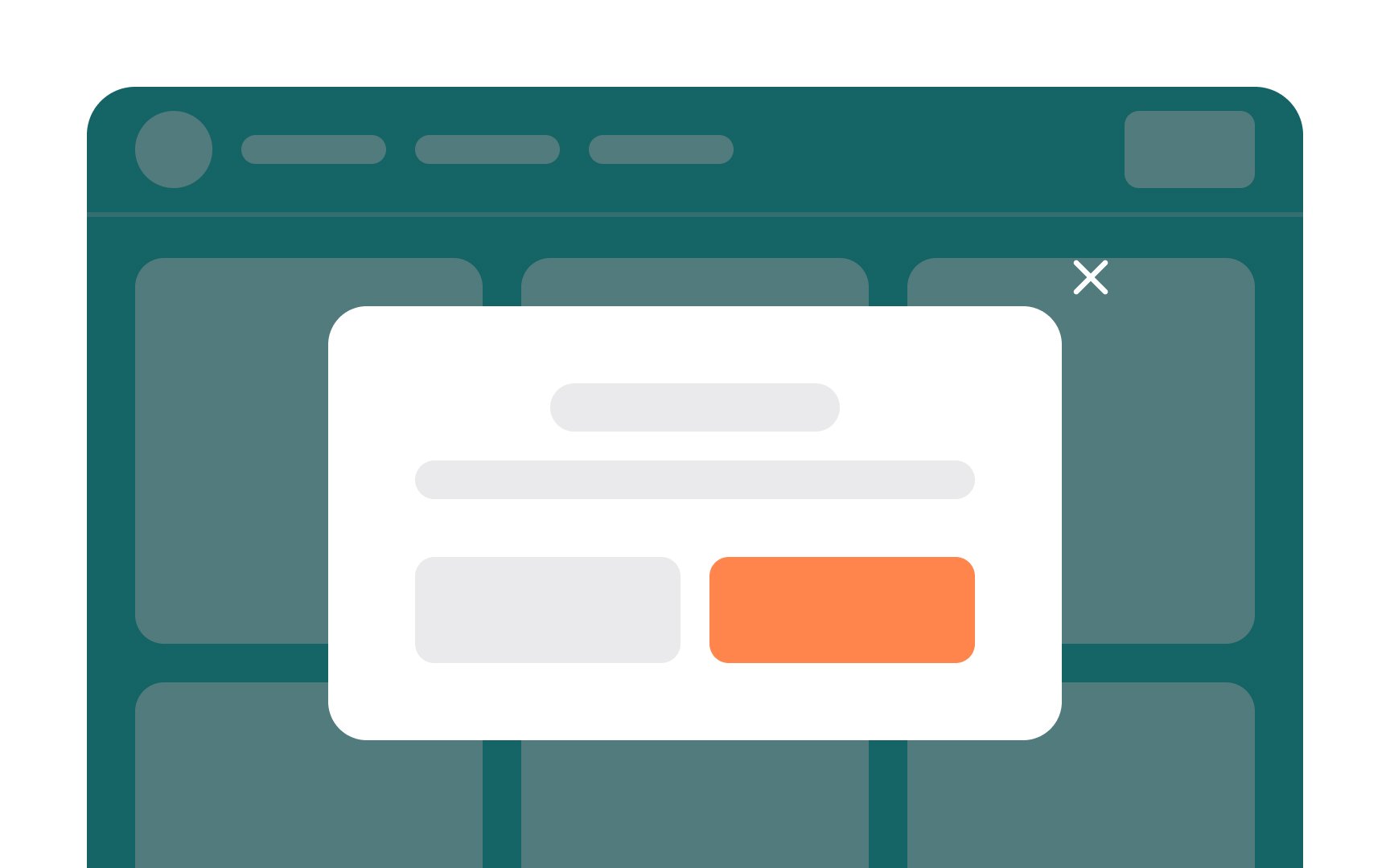
<?xml version="1.0" encoding="utf-8"?>

Regardless of how unique a website’s design is, there are certain common UI components you're likely to find on it. The most common UI components you’ll encounter include buttons, inputs, forms, cards, modals, menus, headers, and footers. When you understand how these UI components work and how to incorporate them into your designs, you’ll add to the positive experience your users have. And you can exercise your own creativity in exactly how they’re implemented and styled.

Exercise #1

Button

Button

The origins of UI buttons go back to physical pushbuttons that first appeared on electronics and other gadgets. In digital products, buttons are one of the main interactive building blocks. They allow users to perform actions with a single click or tap — for example, Submit, Start, Create New, etc.

A button's role is to encourage users to act. Button labels are as important as their design. Use action verbs on button labels (like "Buy Now" or "Add to Cart") to tell users what the button does so they can act without reading supporting text.

Exercise #2

Checkbox

Checkbox

Checkboxes allow for multiple options to be selected by users simultaneously and also let them enable or disable an option. When enabled, the boxes display a checkmark inside. When disabled, they’re empty. Checkboxes have a label beside them and can be used alone (such as a checkbox granting permission to be added to an email list) or stacked on top of each other.

They are commonly used for multi-choice questions on forms, feature preferences, or selecting items for an action. They're clear and intuitive, giving users a visual confirmation of their selections.

Exercise #3

Radio button

Radio button

While checkboxes allow multiple options to be selected, radio buttons only allow one. Radio buttons are empty when they're not selected and filled with a dot when they are. They are often initially displayed with no option selected. Once an option is selected, it cannot be returned to that state by interacting solely with the buttons (users can only switch their selection between buttons). If the deselected state is important, you'll need to give users an alternative way to return to that state.

Radio buttons are often used for questions with mutually exclusive options, like selecting a gender or a preferred payment method. They provide clear decision-making and streamline user interactions by preventing conflicting choices.

Exercise #4

Toggle switch

Toggle switch

A toggle switch grants users the ability to alternate between two options that cannot coexist, usually representing states like "on" and "off" for a specific element or function.[1]

Toggle switches commonly appear in settings screens within applications. These switches are especially effective for tasks where the response is instantaneous, such as activating dark mode or airplane mode. Their straightforward nature ensures swift decision-making and direct control over specific functionalities, enhancing user experience.

Pro Tip: Make sure the on and off states for your toggle switches are immediately apparent.

Exercise #5

Text input

Text input

Text inputs are the most common form input type. They can take many shapes and forms, depending on the situation and type of data being input. You might use text input for collecting names, email addresses, phone numbers, or longer-form text (such as comments) from users.

Make sure you create text inputs that recognize different types of data. For instance, when users input a phone number, the input field could auto-format the digits into the expected pattern and switch the mobile keyboard to a numerical layout. Similarly, for email addresses, the input could enforce the correct structure and adjust the keyboard type accordingly. This can help reduce errors and ultimately improve the user experience.[2]

Exercise #7

Form

Form

Forms are interactive UI components that are used in various contexts such as user registrations, surveys, login screens, checkout processes, and data entry. These forms consist of various components like text fields, checkboxes, radio buttons, dropdown lists, and more. Each component serves a specific purpose, like capturing names, email addresses, selections, and comments. Users engage with these elements by typing, clicking, or selecting options.

An effective form can increase conversions, while a poorly designed one can turn users away. Well-designed forms collect as little information as necessary to complete the user's action. For example, if creating a form for a newsletter signup, limiting the form fields to essentials like the email address and name (which can help with customizing messages sent to subscribers), and a permission checkbox will increase conversions.

Exercise #9

Card

Card

Cards in UI design are compact, self-contained information containers that present a snippet of content, usually accompanied by visuals, headings, and brief text. They are like digital index cards, grouping related content together in a neat and visually appealing manner. Cards are versatile and commonly used to showcase items such as articles, products, user profiles, or notifications, offering an organized way to present modular content and encourage user engagement.[3] They may also contain interactive elements to act on the card's content, such as a Learn More button.

Exercise #10

Table

Table

Tables in UI design are structured grids used to present organized and tabulated information. Just like tables you'd find in spreadsheets or printed documents, UI tables arrange data into rows and columns, making it easier for users to compare and analyze information. Each row typically represents a single entry, while columns categorize the data into different attributes or characteristics.

Tables are often used to display data like product listings, financial figures, schedules, and more. They can include text, numbers, and even icons. Headers provide labels for columns, aiding users in understanding what each column represents. UI tables enhance readability, enabling users to quickly scan and locate specific information. However, their design should prioritize simplicity and responsiveness to ensure a positive user experience.

Pro Tip: Elevate your table's usability by incorporating filters to narrow down data, sorting functionality to arrange it logically, and search functionality to quickly find specific entries.

Exercise #11

Header

Header

Headers in UI are prominent sections typically positioned at the top of a webpage or application screen. They serve as navigational landmarks and provide essential context to users.

Headers often include navigation menus that help users move around the interface, search bars for finding content, and branding elements that reinforce the identity of the product or website. They establish a consistent visual identity and hierarchy across different sections of an interface.

Pro Tip: Keep the design of your header uniform throughout your website or app.

Complete this lesson and move one step closer to your course certificate