Dialogs
Dialogs are interface elements that interrupt the main flow to present critical information, confirm actions, or request input in a focused and direct way.

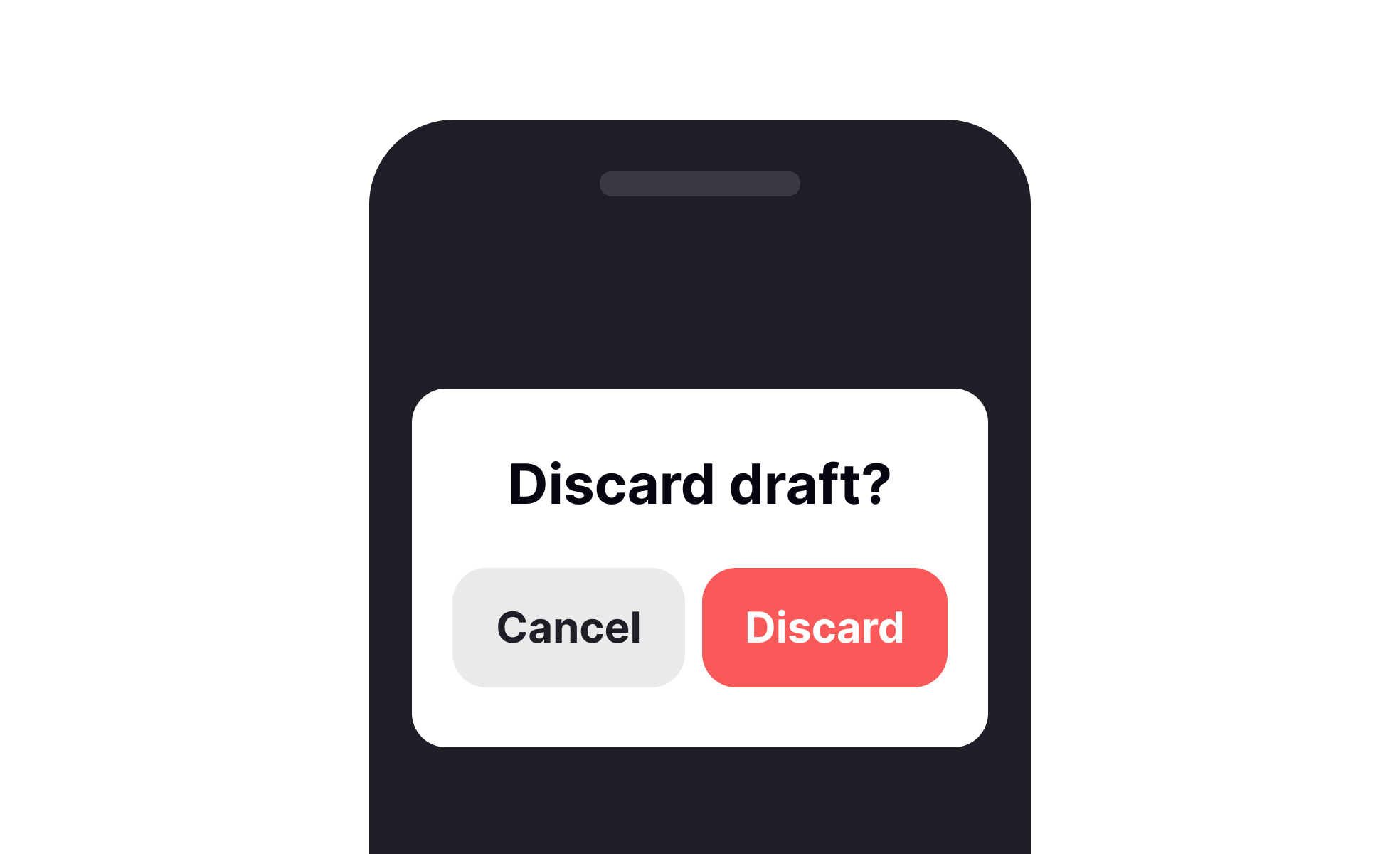
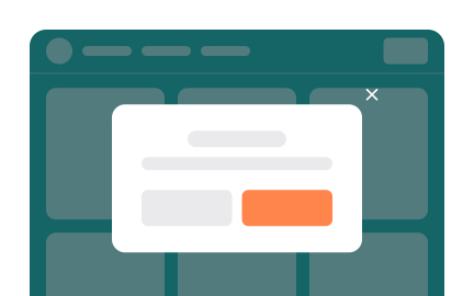
Dialogs are small interface windows that appear above the main screen to capture user attention. They may confirm an action, deliver warnings, or prompt users for specific input. Unlike passive notifications, dialogs demand immediate acknowledgment, which makes them powerful but potentially disruptive if misused.
From a UX perspective, dialogs must be designed with clarity and purpose. The message should be concise, with clear options for users to proceed. Confirmation dialogs, for instance, prevent irreversible errors, while informational dialogs highlight important updates. Their success depends on timing, relevance, and how well they integrate with user expectations.
Product managers see dialogs as tools for safeguarding user trust. Confirming destructive actions like deleting an account ensures users remain in control. At the same time, dialogs can serve as friction points that frustrate users when overused. Managing this balance is part of creating a positive overall experience while maintaining product integrity.
Designers must also consider accessibility. Dialogs should be readable, navigable via keyboard, and adaptable to screen readers. Poorly designed dialogs can trap users or block access to content, creating barriers instead of support. Following accessibility guidelines ensures inclusivity while meeting functional goals.
In real-world practice, effective dialogs are often subtle. Google’s Material Design guidelines recommend dialogs for critical actions only, ensuring that attention is drawn only when necessary. Overuse dilutes their impact, while proper restraint makes them a trusted mechanism for communication.
Ultimately, dialogs exist to reduce user error and support decision-making. When implemented thoughtfully, they strengthen the relationship between users and the product by promoting clarity, safety, and trust.
Learn more about this in the Dialogs Exercise, taken from the Mobile Information & Container Components Lesson, a part of the Mobile Design Course.
Key Takeaways
- Dialogs interrupt flow to deliver critical information.
- Common types include confirmation, warning, and input dialogs.
- Overuse can frustrate users and weaken impact.
- Accessibility is essential for inclusive dialog design.
- Designers and product managers must align on timing and purpose.
- Properly designed dialogs build trust through clarity.
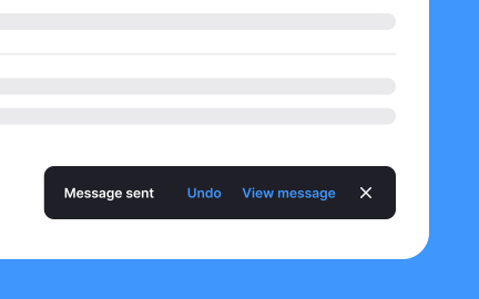
Use a dialog when the user must decide before continuing, such as confirming deletion, granting a permission, or accepting terms. Inline messages and toasts are better for status updates, soft warnings, or background events. They inform without blocking progress.
Start with the user’s goal. If the task can continue safely without a forced choice, avoid interruption. If the outcome is irreversible or sensitive, a focused dialog helps people pause, confirm details, and act with confidence.
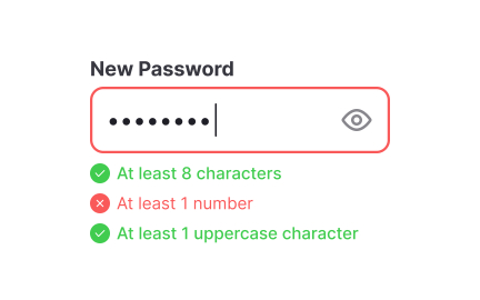
Write button labels that state outcomes, not generic verbs. “Delete project” is clearer than “OK.” Put the primary action first and give the secondary action a calm, visible place. Keep body text to a few lines, highlight key facts like names, amounts, or dates, and avoid technical jargon.
Pair clear language with predictable behavior. Pressing Escape or tapping outside should dismiss only when it is safe to do so. For risky actions, require an explicit choice. Consistency across dialogs builds trust and speeds decisions.
Manage focus on open and close, provide meaningful titles and aria labels, and keep tab order logical. Support keyboard activation for all actions and maintain strong color contrast for text and controls. These steps cover the majority of barriers.
Validate with real tools. Test with screen readers, high zoom, and device rotation. Small adjustments, like increasing line height or expanding touch targets, often lift accessibility without adding weight to the interface.
Recommended resources
Courses

UX Design Foundations


Core UI Components


Design Terminology