Mobile Information & Container Components
Learn about UI elements such as mobile information and container components that are crucial to delivering information to users
One of the main challenges of designing mobile interfaces is finding the right UI elements such as mobile information and container components to collect and deliver information without breaking the hierarchy or creating extra obstacles.
Limited screen space is one of the main challenges, but there are many other things that mobile designers should keep in mind. For example, users often interact with their mobile devices on the go, usually having only one hand free. What does this say to designers? Interfaces should be easy to scan, contain no distracting clutter, and be comfortable to interact with using a thumb.
The harsh reality is that users have no mercy when mobile applications fail to demonstrate the ability to meet their needs during the first session. If your app doesn't create the impression of a user-friendly, intuitive, functional, and delightful product, it will end up among that 25% of applications that have been used only once.[1]
Icons are metaphorical, graphic representations of ideas, objects, or actions that are pretty much a standard part of mobile app design. Users encounter them in navigation menus, forms, buttons, inputs — you name it. However, their aesthetic role is secondary.
Apart from making an interface more visually appealing, icons fulfill other roles:
- Help users identify actions and complete tasks faster
- Minimize clutter on the screen (especially relevant for mobile interfaces)
- Eliminate language barriers
- Improve brand recognizability
Many designers want to create unique sets of icons for their products. However, if people can't identify the icon's meaning at a glance, they slow down when completing their tasks and get frustrated.
Stick to generally recognized, familiar icons and avoid overdoing design. The fewer the details, the faster users recognize the symbols and move forward with their flow.
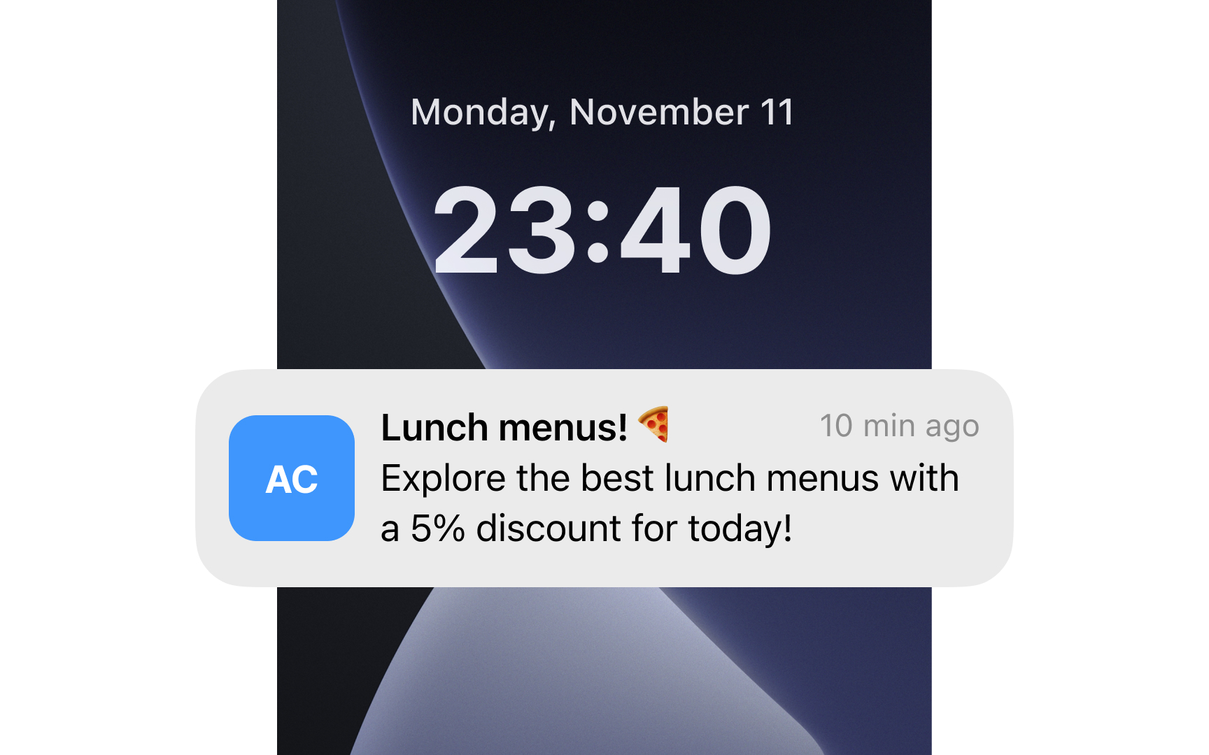

Push notifications are pop-up messages that appear on mobile screens to announce potentially relevant events.[2] They're often the first thing you see after checking your phone in the morning.
Push notifications are a key mobile feature for engaging users and increasing app opens. Their primary purpose is to capture user attention and drive app re-engagement.
Users have multiple apps sending notifications to their phones. If notifications aren't compelling, personal, and well-timed, users will ignore or disable them.
What can make push notifications meaningful?
- Promote updates, sales, and new content. Terms like "free," "new," "sale," "last chance," and "be the first" grab attention by offering clear value to users.
- Avoid marketing language. Rather than marketing speak, use conversational and witty language as if talking to a friend. Humor works when it fits your audience.
- Use location. When users permit location tracking, send relevant notifications based on their position, like alerts about nearby stores or opportunities in new places they visit.
- Don't overdo it. Excessive frequency is the top reason users block notifications. While ideal frequency varies by industry, ask users their preferences when they grant permissions.
- Timing matters. Respect users' time zones and sleep hours. Send urgent notifications only for critical updates that require immediate attention.
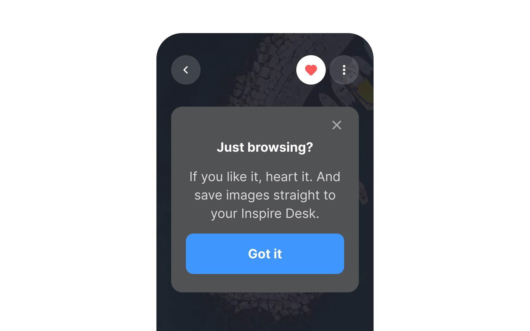
People often confuse in-app messages with
Designers have more creative freedom with in-app messages, incorporating media,
In-app messages become more relevant when targeted to specific user segments based on app activity, purchases, location, language, or cross-channel data.[3]
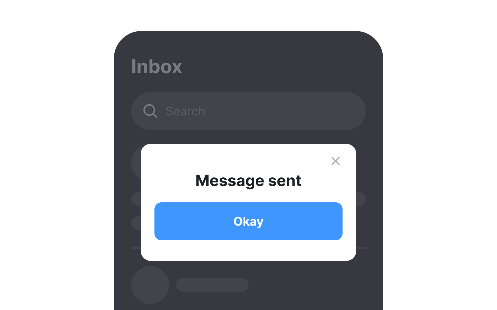
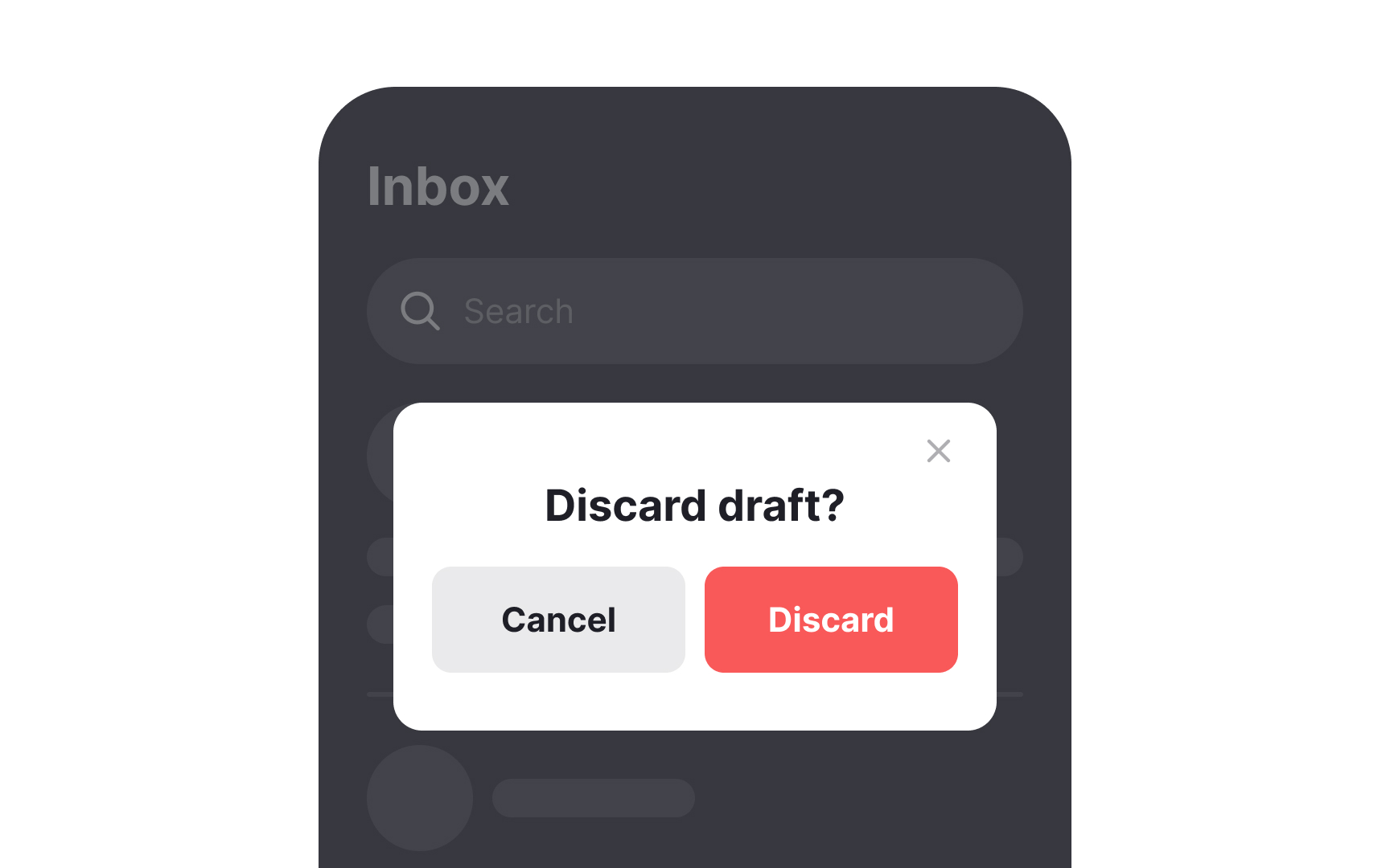
There are two types of dialogs in interfaces: non-modal and modal. Non-modal dialogs appear without disabling content, letting users continue their workflow and sometimes even move or minimize the window.
Modal dialogs, however, demand immediate attention like a traffic stop — blocking the main content until users take action. They interrupt tasks and increase cognitive load, potentially making users forget their previous context. On mobile, modals can appear as:
- Pop-ups
- Partial screen overlays
- Full-screen dialogs
Though intrusive, modals are often necessary to prevent disasters. They're particularly useful for warning users about potential data loss or irreversible actions.[4]
For less critical information, consider gentler alternatives. Snackbars automatically disappear, while banners stay visible until dismissed or until their triggering issue resolves.[5]
Pro Tip: When a modal dialog is the only solution, make sure its action buttons are within the thumb zone and are easy to reach.
Chats have several key advantages:
- Less personal than calls with lower emotional investment
- Allow users to compose and edit messages before sending, benefiting non-native speakers
- Enable multitasking while waiting for responses
- Provide time for thorough consideration of information
- Save conversation history for future reference via email
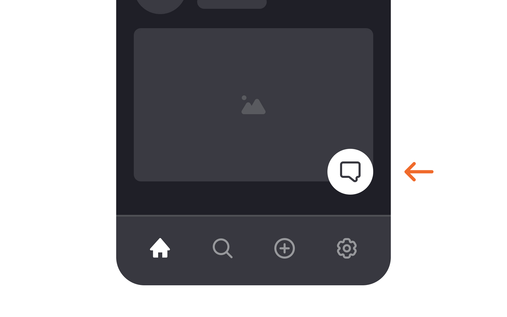
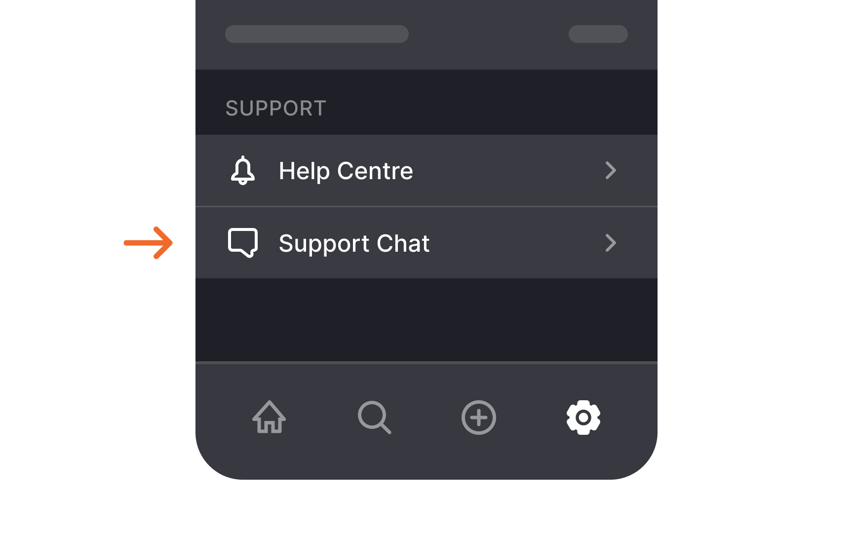
Designers often overlook chat functionality, particularly regarding mobile placement.
Chat links should be intuitive to find. While floating
Better placements include the footer, settings page bottom, contact page, or
Pro Tip: Include the message "Manager/agent is typing..." in the chat to reassure users and help them be more patient while waiting for a response.
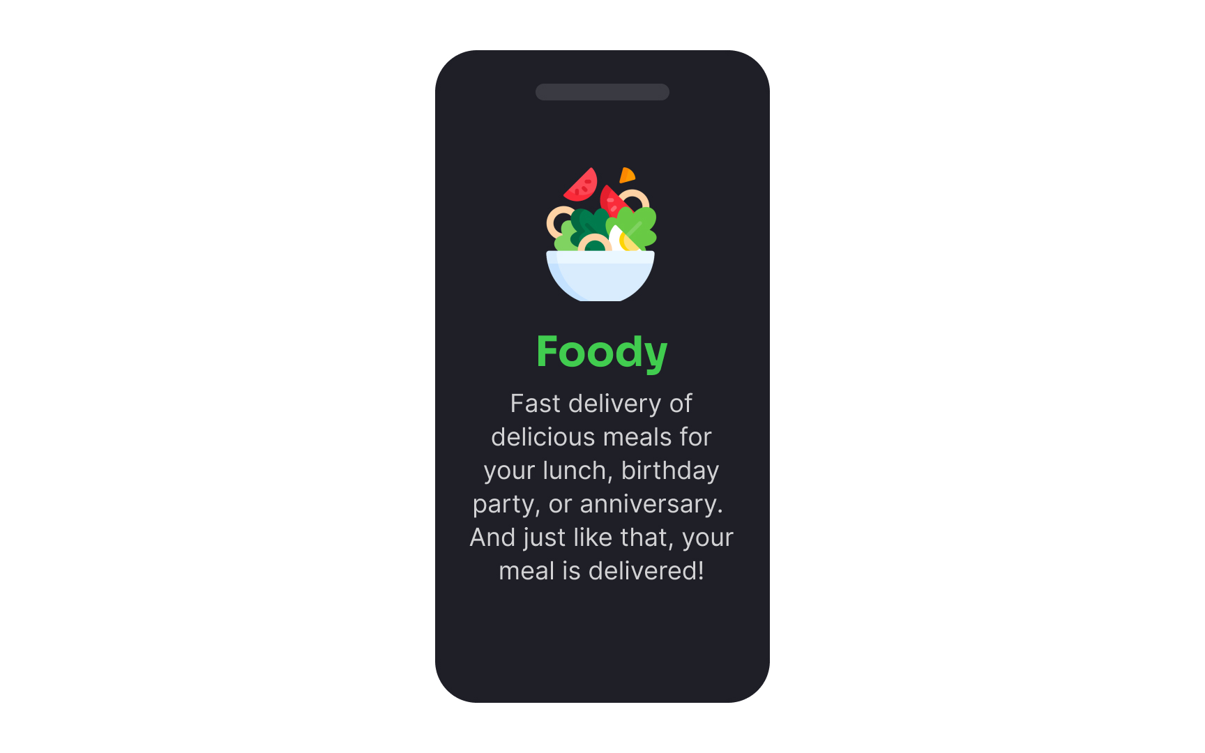
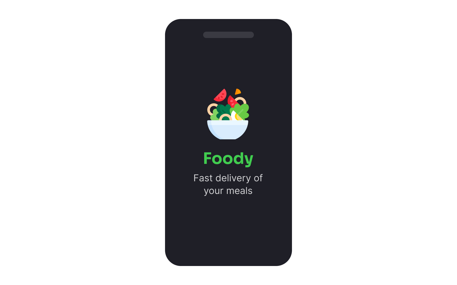
An app splash screen is an introductory screen users see while the application loads in the background. They usually contain the company logo and may be accompanied by some text or more imagery that intensifies the first impression of users.
You may wonder why applications need splash screens at all if modern mobile apps typically load fast. Here are a few reasons:
- Welcome users: Splash screens provide an opportunity for an app to say hello to its users and encourage them to explore the app.
- Create the right mood: Brand
colors , the company's logo, and the typography help create a positive first impression and set the right mood for app usage. - Introduce the brand: Splash screens are what users see first when opening an app. It's a nice chance to introduce the brand's identity by adding a short animation or snappy, witty text reinforcing the brand's value.[7]
Pro Tip: Ideally, a splash screen lasts for a couple of seconds, so avoid using too much text or detailed imagery that users won't be able to grasp quickly.
Accordions are UI components with collapsed
Help centers and FAQ
While accordions seem ideal for mobile — saving space and reducing clutter — they can disorient users and create excessive scrolling.
For mobile accordions, focus on clear
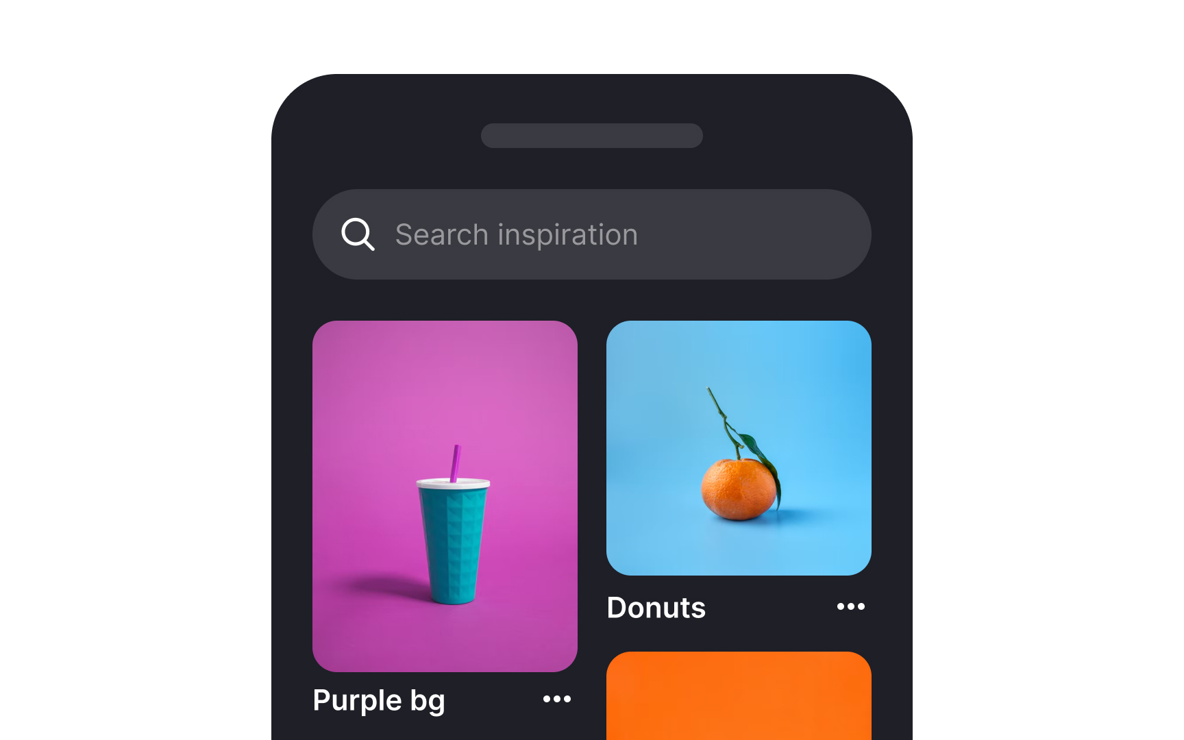
Cards are
Cards may include:
- Rich media (thumbnail
image ) - Title
- Secondary text
- Hashtags
- Call-to-action
buttons - Key information
Card layouts are non-hierarchical—all cards hold equal importance. This makes them ideal for browsing interfaces rather than
Cards require more space and scrolling than text lists. During search, this extra scrolling increases
Tumblr, Pinterest, and Instagram demonstrate effective card usage in apps designed for entertainment and continuous scrolling.
Mobile e-commerce has evolved from browsing-only to dominant sales platform, with 72% of retail e-commerce sales were coming from mobile customers in 2023.[9]
This shift demands e-commerce websites and apps provide frictionless mobile shopping experiences.
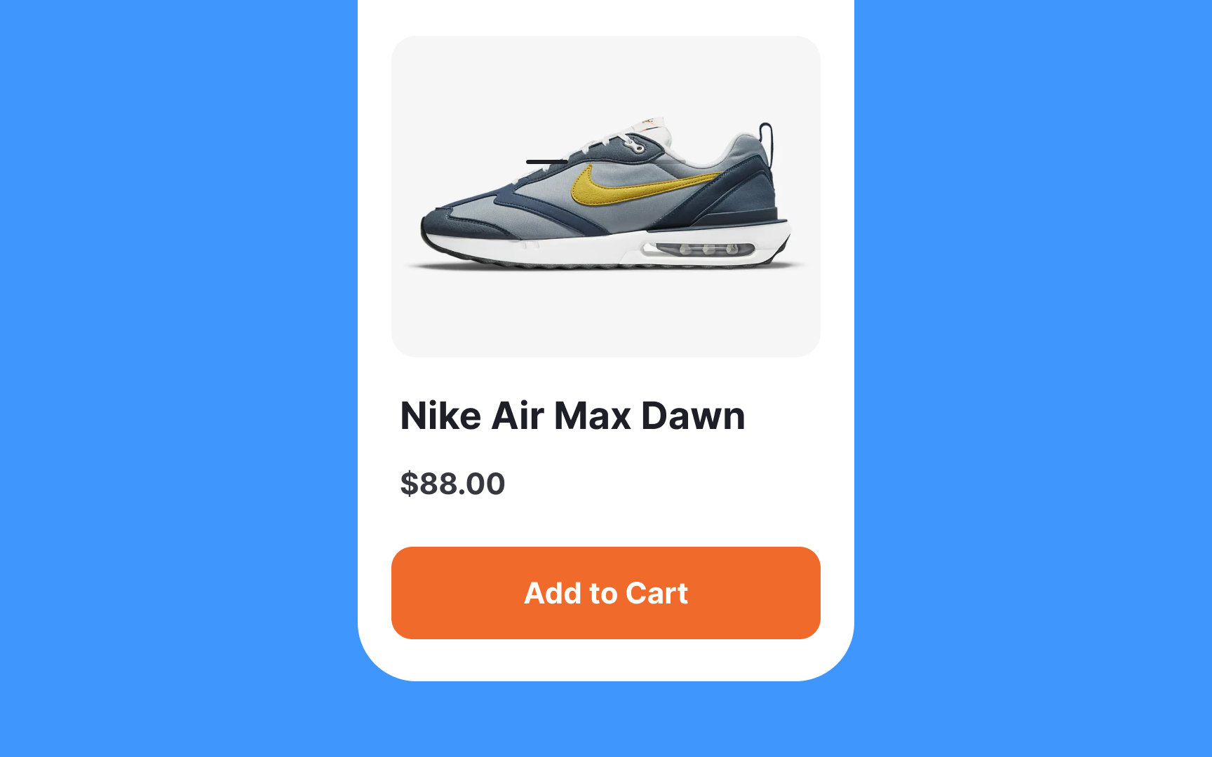
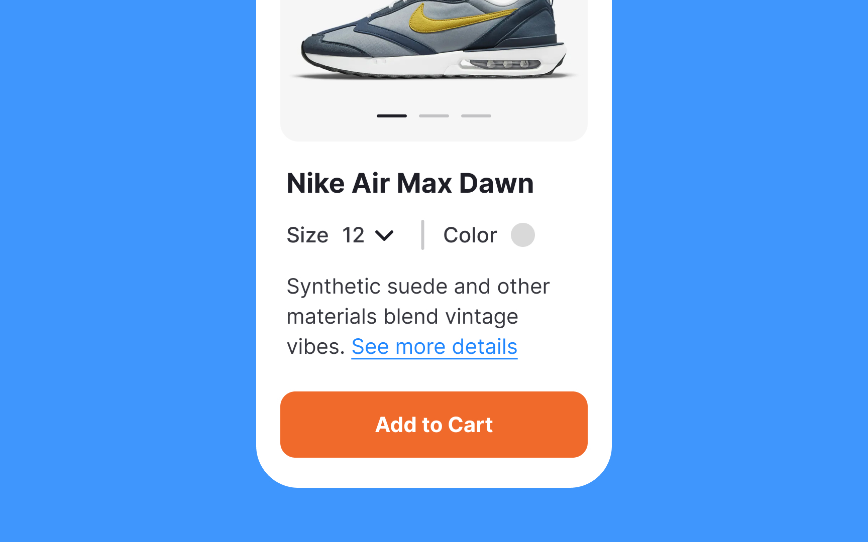
Well-designed product pages are crucial for converting browsing into purchases.
What makes a good product
- Primary product details: Key decision-making elements like name, price, size options, high-quality
images , and ratings should be visible without scrolling. - Clear images: High-quality, zoomable images are essential. Blurry or small images can deter purchases.
- Secondary product details: Include supporting information like features, benefits, and
composition to aid purchase decisions.
Pro Tip: Make sure the CTA button is clearly visible without requiring users to scroll the page or search for the Add to Cart button.
Mobile screens' limited space challenges designers to maintain hierarchy and scannability. Dividers help segregate unrelated
Traditional dividers include full-bleed or inset horizontal lines. Vertical dividers separate subcategories within groups but can create visual noise and consume space.
Alternative ways to break up content:
- White space: Creates breathing room around elements, making them stand out while improving scannability and aesthetics
- Colored backgrounds: Effectively divides content groups through contrast, ensuring text remains readable
- Shadows and elevation: Adds depth to interfaces, distinguishing elements from backgrounds and other sections
- Containers: Creates visual separation by grouping elements. Per the common region principle, elements outside
containers appear unrelated.[10]
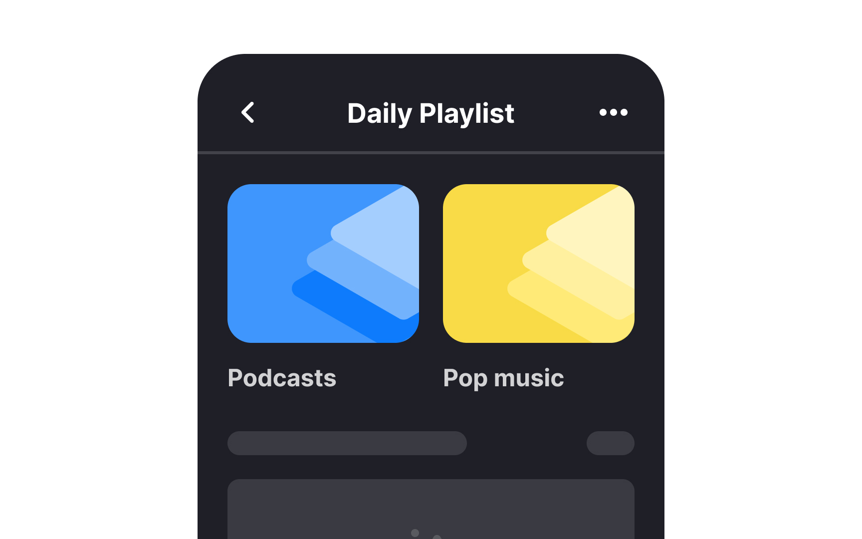
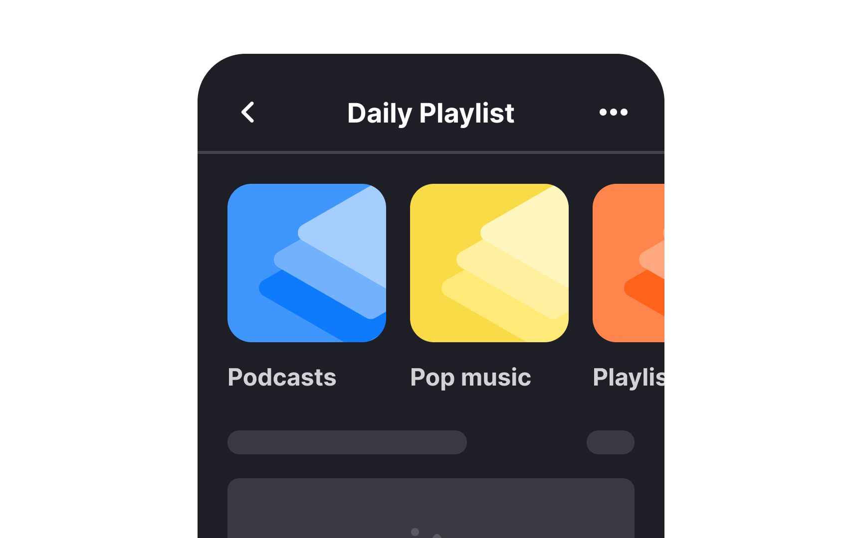
Mobile carousels, like
Many mobile carousels also lack swipe functionality, complicating user interaction. Here's how designers can address these challenges:
- Limit to 3-5 items: Fewer items increase discoverability and maintain user interest
- Prioritize items: Place the most relevant content first to capture and retain attention
- Add indicators: Use arrows and dots to signal carousel presence and aid discovery
- Show continuity: Display partial
images or text to indicate additional swipeable content - Enable swiping: Users expect this familiar gesture when multiple items exist
- Keep content related: Unrelated content increases
cognitive load and reduces predictability.[11]
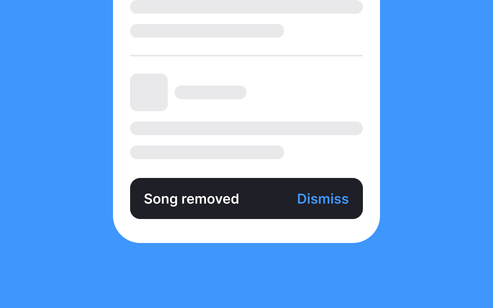
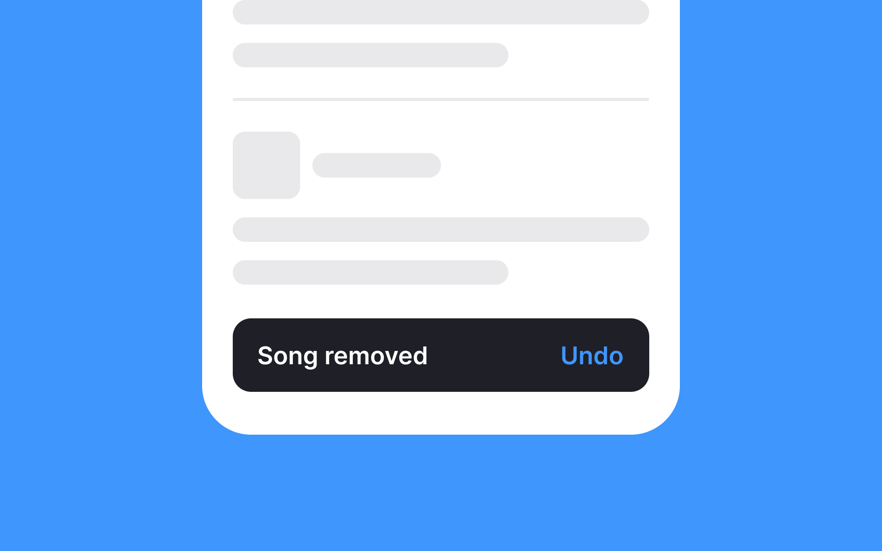
Visually, snackbars represent a rectangular
Additionally, ensure snackbars appear at the bottom of the screen and don't block any navigational components.
Pro Tip: Multiple snackbars should follow each other, instead of stacking on top of each other and cluttering the screen.[12]
References
- Five Mistakes in Designing Mobile Push Notifications | Nielsen Norman Group
- How to Personalize Your App Messaging | Customer Engagement Blog
- Modal & Nonmodal Dialogs: When (& When Not) to Use Them | Nielsen Norman Group
- Material Design | Material Design
- The User Experience of Customer-Service Chat: 20 Guidelines | Nielsen Norman Group
- Accordions on Mobile | Nielsen Norman Group
- The Principle of Common Region: Containers Create Groupings | Nielsen Norman Group
- Carousels on Mobile Devices | Nielsen Norman Group
- Material Design | Material Design
Top contributors


Topics
From Course

Share


Similar lessons

Designing for Mobile Interfaces

Responsive vs. Adaptive Design
