Menus components
Menus are interface components that organize and present options, helping users navigate systems and access commands, features, or content efficiently.


TL;DR
- Organize options into structured lists.
- Provide access to commands, settings, or navigation.
- Can be vertical, horizontal, or contextual.
- Crucial for usability and discoverability in interfaces.
What is Menu in UI design?
Menus are interface elements that display a list of options or actions for users to select, typically used for navigation, commands, or settings within digital products.
Detailed Overview
Menus are a cornerstone of user interface design, providing clear entry points to features and content. They group related commands or links into lists that reduce cognitive effort by presenting options in an organized format. Whether on websites, mobile apps, or desktop software, menus act as the gateway to functionality.
A frequent question is how menus differ across platforms. On desktop systems, menus often appear as dropdowns or toolbar structures, while on mobile they might take the form of hamburger menus, bottom navigation, or contextual overlays. The underlying principle is the same, menus consolidate and present options, but their design adapts to device constraints.
Another recurring query relates to menu discoverability. If menus are hidden behind icons or require multiple interactions to open, users may struggle to find features. Designers balance minimalism with visibility, often prioritizing the most-used options in primary menus while relegating secondary actions to contextual or overflow menus.
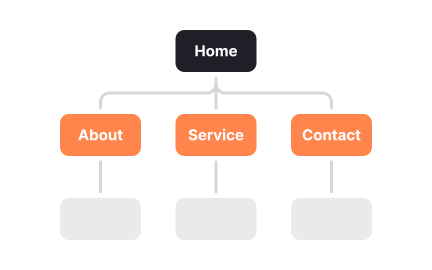
Teams also ask about hierarchy in menu design. Flat menus present all options at once, while nested menus group commands into categories. Flat structures improve speed but can overwhelm with too many choices. Nested structures reduce clutter but risk burying important features. The challenge is finding the balance that matches user needs.
Accessibility considerations frequently come up. Menus must be navigable by keyboard, screen readers, and other assistive technologies. Without proper semantic coding and clear focus management, menus become barriers rather than facilitators.
Accessible menus ensure all users can interact with content equally.
Finally, product teams often ask how menus impact engagement. Well-structured menus increase discoverability and reduce frustration, leading to higher retention. Poorly designed menus create friction and abandonment. Since menus are often the first interaction users encounter, they set the tone for the entire product experience.
Learn more about this in the Menu Exercise, taken from the Common UI Component Definitions I, a part of the UI Components I Course.
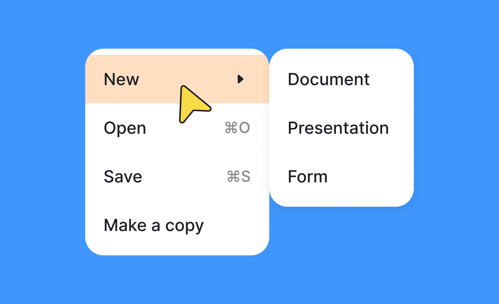
Common types include dropdown menus, hamburger menus, tab bars, and contextual menus. Dropdowns suit desktop layouts, while mobile products often rely on hamburger or bottom navigation menus.
Each type is chosen based on context, device constraints, and the number of available options.
By prioritizing frequently used options in the primary menu and placing secondary features in contextual or overflow menus. This reduces clutter while keeping critical actions easy to access.
Testing with users helps teams identify which options deserve prominence.
Hierarchy determines whether menus are flat or nested. Flat menus are faster but risk overwhelming users, while nested menus organize features but may hide them. The design depends on task frequency and complexity.
Well-structured hierarchy reduces effort and supports intuitive navigation.
Menus must support keyboard navigation, proper labeling, and screen reader compatibility. Clear focus states and ARIA roles ensure that all users, including those with assistive technologies, can interact smoothly.
Without accessibility adjustments, menus risk excluding part of the user base.
Menus shape the discoverability of features. When options are easy to find, users feel confident and stay engaged longer. Confusing or cluttered menus drive frustration and abandonment.
Because menus often frame the first impression, they are critical for overall usability.
Recommended resources
Courses

UX Design Foundations


Core UI Components


Design Terminology

Lessons

Intro to Information Architecture

Common UI Components

Common UI Components Part II
Projects

Talent searching platform profile page concept


Sidebar Menu


Music Sidebar