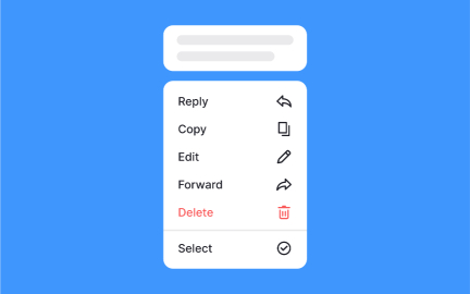
Selection Controls
Selection controls are interactive UI elements that let users choose options, toggle states, or make decisions, typically through radio buttons or switches.


TL;DR
- Interactive components for making choices.
- Include radio buttons, checkboxes, and switches.
- Ensure clarity in single vs. multiple selection.
- Core to forms, settings, and decision-making.
Definition
Selection controls are user interface components that allow users to indicate choices or set states by interacting with elements such as checkboxes, radio buttons, or toggle switches.
Detailed Overview
Selection controls are foundational in digital interfaces because they enable interaction and decision-making. They appear wherever users must choose between options, confirm preferences, or adjust settings. Their design affects usability directly, since unclear controls often lead to errors, frustration, or abandonment.
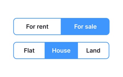
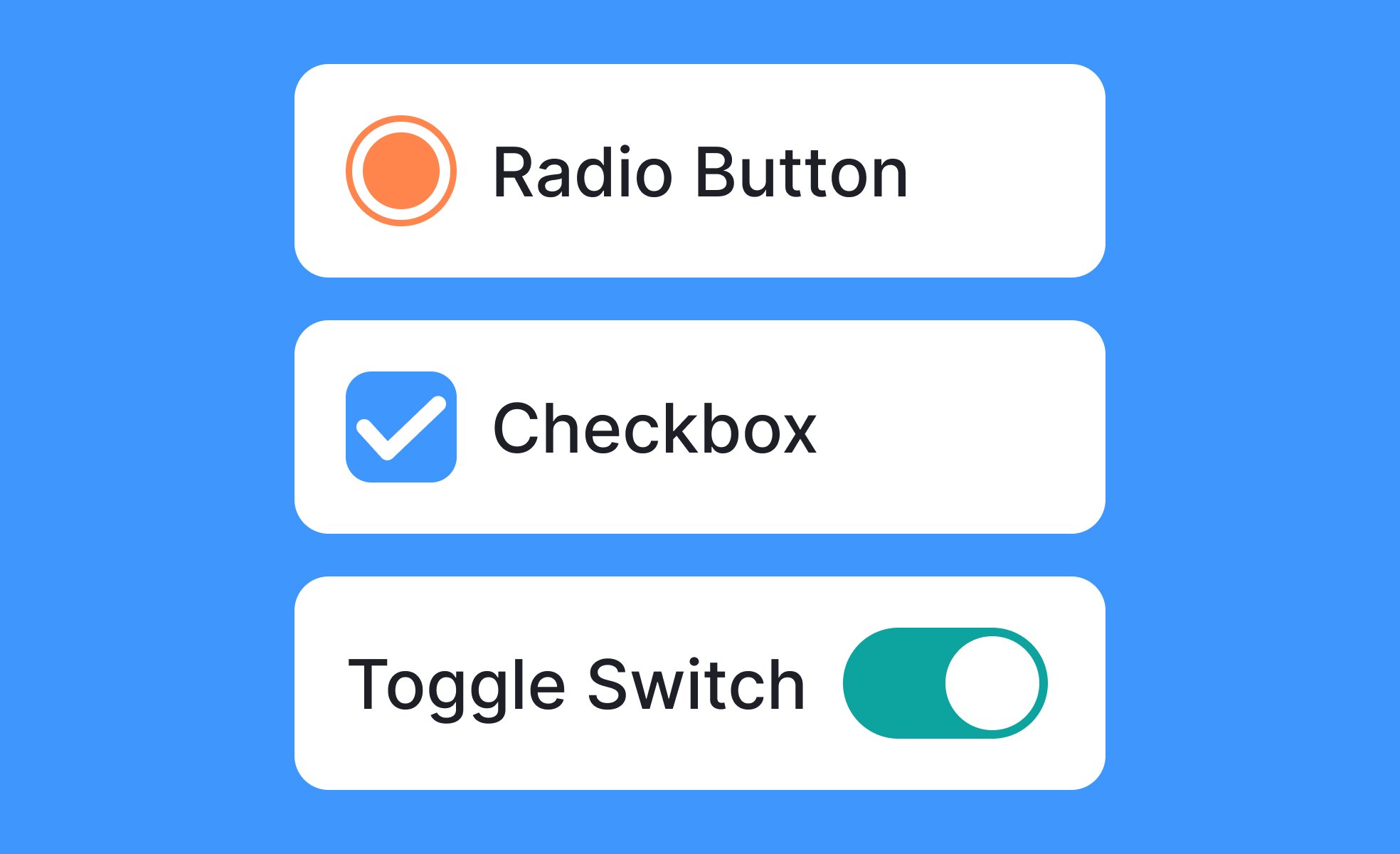
A frequent question is what types of selection controls exist. The three most common are checkboxes, radio buttons, and switches. Checkboxes allow users to select multiple options at once. Radio buttons restrict selection to a single option within a group. Switches toggle a setting between two states, such as on and off. Designers choose based on the exclusivity or flexibility of the decision being presented.
Another common query concerns when to use each type. Radio buttons are ideal for mutually exclusive choices like delivery speed, while checkboxes are best for tasks like filtering multiple product categories. Switches are most effective for binary states, such as enabling notifications. Using the wrong control confuses users and increases the chance of incorrect input.
Teams often ask about consistency. Selection controls must be predictable and behave the same across contexts. For instance, a checkbox should never be used to toggle a single binary state if switches are used elsewhere for that purpose. Design systems standardize these patterns to ensure familiarity and trust.
Accessibility is another frequent topic. Proper coding and labeling are critical so screen readers can communicate the available options. Keyboard navigation must allow users to move between controls and toggle them without difficulty. Clear labels and sufficient touch targets also ensure usability for people with motor or visual impairments.
Another important consideration is feedback. Selection controls must provide immediate, visible confirmation when a choice is made. This could be a filled checkbox, a selected radio button, or a switch sliding to a new position. Without feedback, users may doubt whether their input was recorded correctly.
Learn more about this in the Intro to UI Selection Controls Lesson, a part of the UI Components I Course.
Checkboxes allow multiple selections, radio buttons enforce a single exclusive choice, and switches toggle a binary state. Each is suited to a distinct type of decision.
Misusing them, like using a checkbox for a yes/no toggle, can confuse users and break consistency.
The decision depends on exclusivity and context. If only one option is valid, radio buttons are best. For multiple valid choices, checkboxes work well. Switches should be reserved for clear binary states.
Aligning the control with user expectations ensures clarity and reduces error rates.
Accessible controls are coded with labels, allow keyboard navigation, and are large enough to interact with comfortably. Screen readers must be able to announce both the label and the current state.
Properly implemented, selection controls provide inclusive interaction for users across abilities.
Feedback reassures users that their input has been recognized. A filled checkbox, a highlighted radio button, or a toggled switch confirms an action. Without it, users may doubt whether the system registered their choice.
Clear visual and, where appropriate, auditory feedback strengthens confidence and usability.
Design systems standardize the appearance and behavior of controls, ensuring they remain consistent across products and contexts. For example, all switches may share the same size, color, and interaction states.
This predictability builds trust and reduces learning curves for users.
Recommended resources
Courses

UI Components I


UX Design Foundations


Design Terminology

Lessons

Common UI Component Definitions I

UI Component States