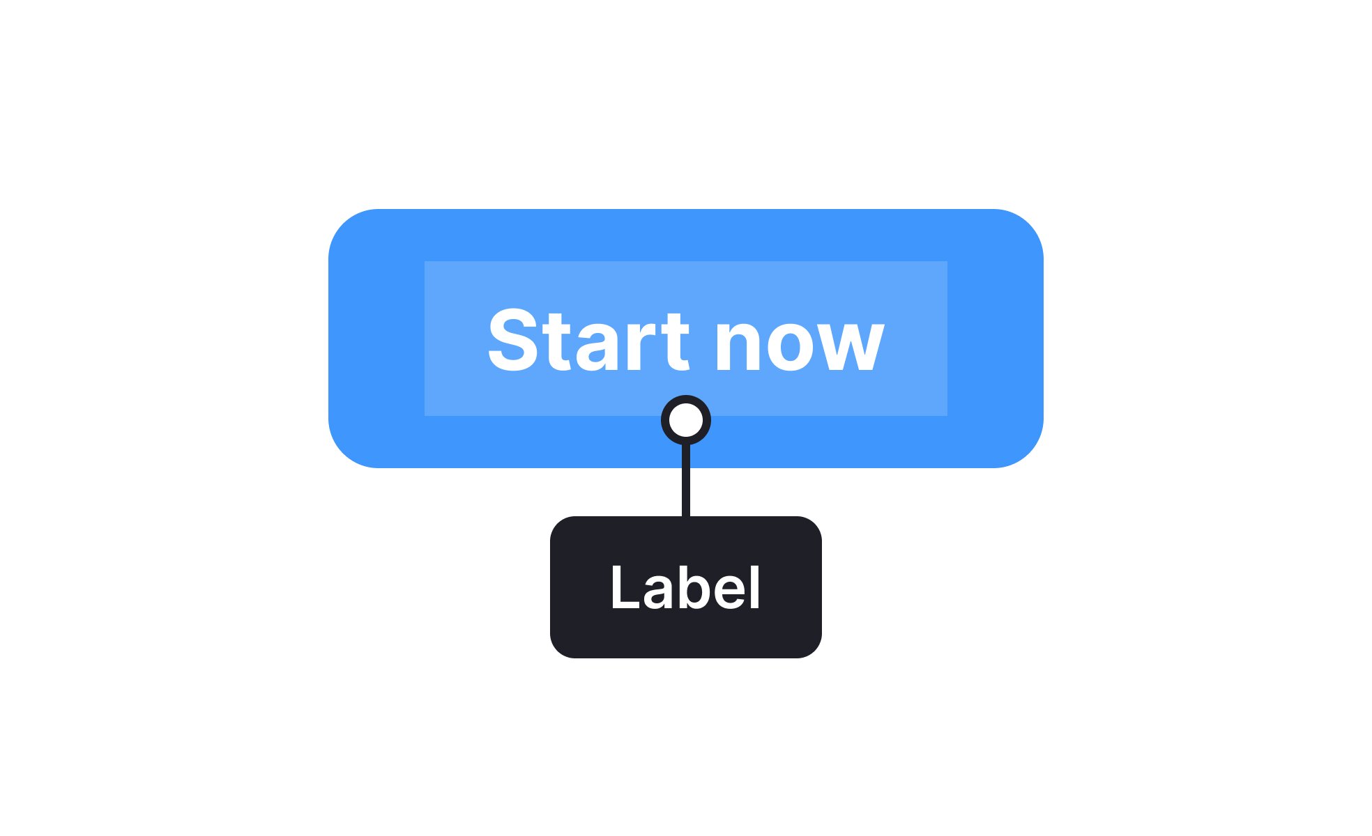
Labels
Labels in digital products are text or visual identifiers that describe elements like forms or buttons, helping users understand purpose and meaning quickly.


TL;DR
- Text or icons that identify elements in interfaces.
- Provide clarity for buttons, fields, and categories.
- Improve usability by guiding user expectations.
- Critical for accessibility and navigation.
Definition
Labels are descriptive identifiers, often in the form of text or icons, that explain the purpose of interface elements, helping users navigate and interact with digital products effectively.
Detailed Overview
Labels are essential for clarity in design. They tell users what a button does, what information belongs in a form field, or what category an item falls into. Without labels, users are left guessing, which creates confusion and errors. Well-designed labels make digital products intuitive by aligning with user expectations.
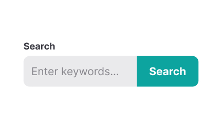
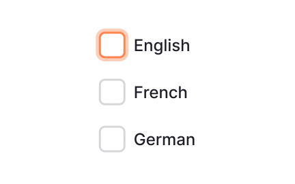
One of the most frequent questions is about labels in forms. Labels above or beside input fields guide users on what information is required. Clear labeling reduces errors and frustration, while poor labeling can lead to abandoned tasks. For accessibility, every input must have a label tied programmatically to the field so assistive technologies can interpret it correctly.
Another recurring topic is button labels. A vague label like “Submit” is less effective than a specific one like “Send Message.” Action-oriented labels increase clarity and confidence, ensuring users understand what will happen when they interact. Teams often ask how long labels should be, and the answer is concise but descriptive, short enough to scan quickly, but detailed enough to remove doubt.
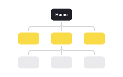
Labels are also common in categorization. For example, product labels in e-commerce help users filter items like “New Arrivals” or “On Sale.” Clear labeling improves discoverability and reduces decision-making effort. When categories are mislabeled or inconsistent, users may miss relevant options entirely.
Accessibility is always tied to labels. Screen readers depend on labels to communicate what an element does. An unlabeled button may be invisible to someone using assistive technology, making the product inaccessible. Descriptive alt text, ARIA attributes, and consistent labeling practices all contribute to inclusive design.
Learn more about this in the Labels Exercise, taken from the Anatomy of UI Components Lesson, a part of the UI Components I Course.
Labels guide users by clarifying what information belongs in each field. Without them, errors increase and completion rates drop. Proper labeling also ensures assistive technologies can read forms accurately.
Well-placed labels reduce friction, creating smoother, more inclusive user flows.
Button labels should be action-oriented and descriptive. Instead of generic terms like “Submit,” use labels like “Sign Up” or “Download Report.”
Clear labels improve confidence and reduce hesitation.
Conciseness matters, but never at the cost of clarity.
Rarely. While some icons like the trash can or magnifying glass are widely recognized, many are not universally understood. Relying on icons alone risks confusion.
Best practice is combining icons with text labels to ensure clarity across diverse audiences.
Labels are critical for screen readers and keyboard navigation. Every interactive element must have a descriptive label, whether through text or accessible attributes. Without them, the product becomes unusable for people with disabilities.
Accessible labeling practices are not optional; they are foundational to inclusive design.
A good label is clear, concise, and unambiguous. It sets accurate expectations for the user’s action or input. Consistency across the product reinforces trust and usability.
Labels that balance brevity with clarity create interfaces that feel intuitive and reliable.
Recommended resources
Courses

Information Architecture


UX Design Foundations


UI Components I
Lessons

Anatomy of UI Components

Links Accessibility