The Anatomy of UI Components
Understand how text, icons, containers, and dimensions come together to form UI components
Every UI component is made of smaller pieces working together. Text creates hierarchy and communicates meaning. Labels tell users what to do. Icons provide visual shortcuts. Containers hold everything in place and create structure. Then there are the visual properties that shape how components look and feel: dimensions define size, border radius softens edges, thumbnails offer previews, and placeholders guide input.
Understanding these building blocks changes how you approach design. Instead of treating a button or card as a single object, you start seeing the individual decisions that make it work. That awareness makes it easier to customize components, maintain consistency across an interface, and troubleshoot when something feels off. It's the difference between copying a pattern and actually understanding why it works.
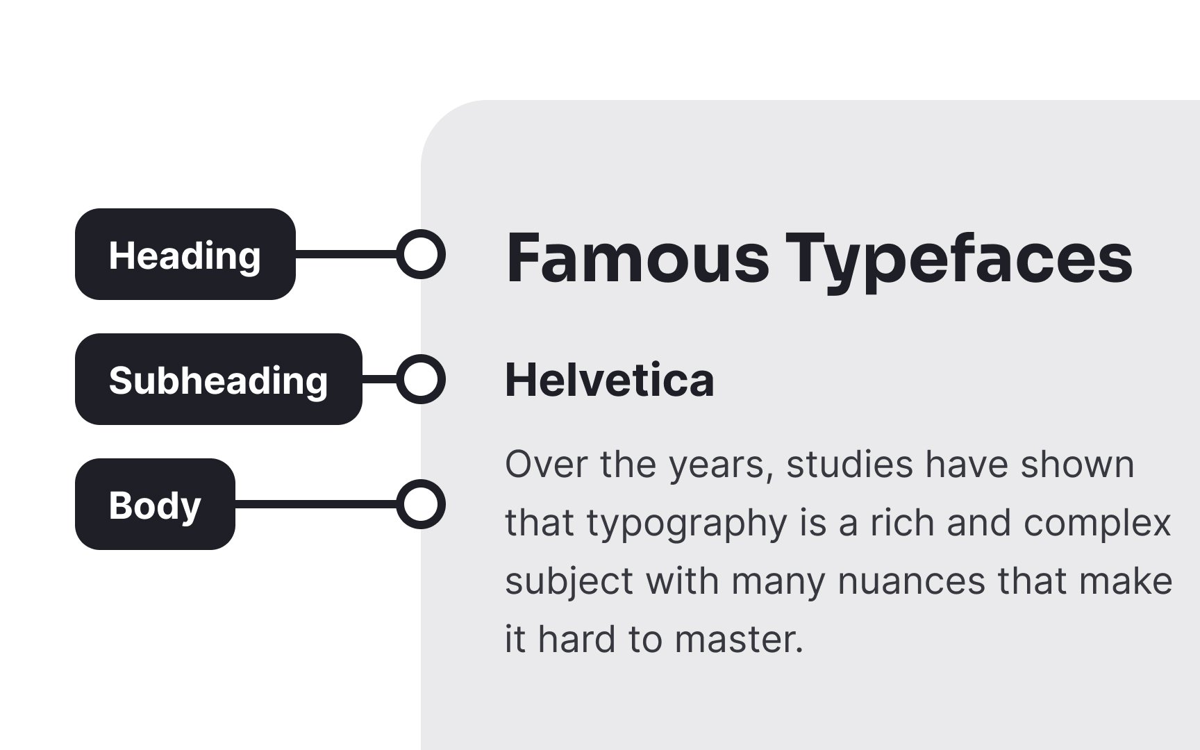
In UI design, text plays a crucial role in conveying information and guiding user interaction. It provides hierarchy, context, and clarity to content presentation. Text can generally be classified as:
- Headings: Headings establish a visual hierarchy and guide users through the structure. Clear and concise headings offer a glimpse of the content's topic and assist users in quickly identifying relevant sections.
- Subheadings: Subheadings provide further division within sections, breaking down content into digestible chunks. They emphasize specific points or topics, aiding in scanning and comprehension.
- Body text: Body text contains the main content, providing detailed information, instructions, or descriptions. It should be legible, concise, and relevant to the user's needs.
Their primary role is to enhance user comprehension, minimizing confusion, and making the interface more user-friendly. By offering clear explanations, labels guide users on how to interact with different elements effectively.
Make sure labels are readable. Stick to short phrases that can be quickly scanned and a legible font that doesn't stand out too much.
Icons can also appear independently, without a
Pro Tip: Keep icons simple and use familiar physical analogues to avoid confusion.
A
Containers can have their own styling, background, and spacing
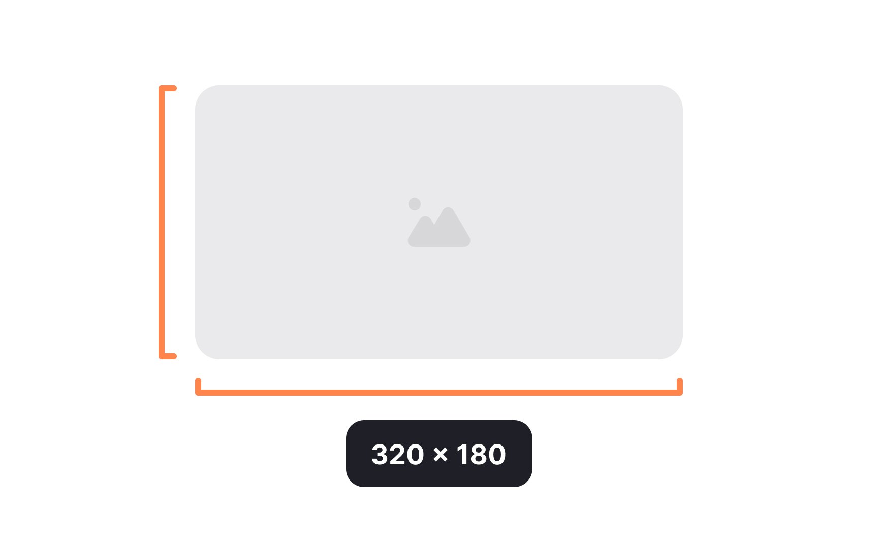
The dimensions of a component include its width and height. They should be specified whenever possible. Dimensions do not include margins around an element, but they do include any padding and borders.
Height and width can be specified with minimum and/or maximum values, allowing them to shrink or expand to fit the
Components that appear with their own background color or visible border include a border radius. Border radius defines how rounded the corners of the component should be.
Sharp edges are sometimes associated — consciously or unconsciously — with pain (think of how painful it is to bang your shin on the sharp corner of a coffee table). Rounded corners are easier on the eyes, guiding users toward the element's center.[1] Even a slightly rounded corner can avoid the painful association of sharp corners. Be careful not to overdo border radius, though, as disproportionately large radii (that's the plural of "radius") can also be unpleasant to look at.

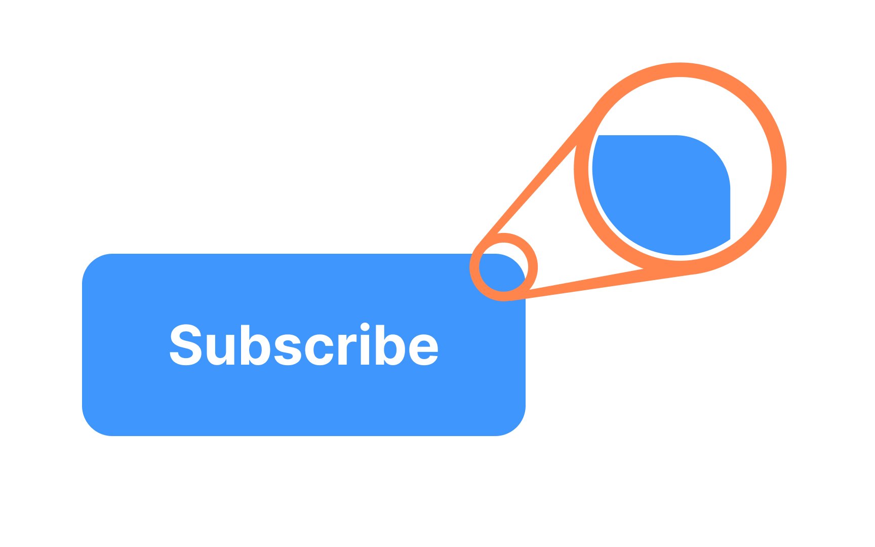
Thumbnails are small, scaled-down representations of larger
The primary purpose of thumbnails is to enable users to quickly assess the content's relevance, helping them decide whether they want to explore further. They aid in reducing cognitive load by allowing users to preview multiple items at once. Clicking on a
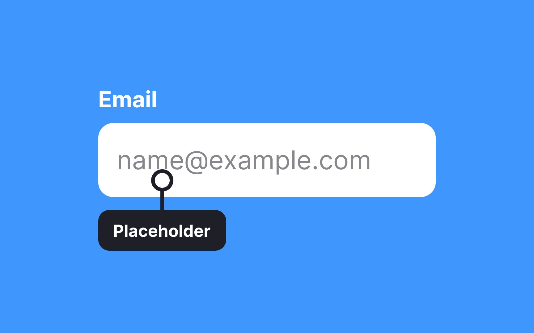
Placeholders are typically displayed in lighter or faded text within the input field, and they disappear once users start typing or interacting with the field. They're commonly used in forms for various purposes, such as indicating the required information format (like "MM/DD/YYYY" for a date field), offering examples (like "Enter your email"), or providing context (like "
References
- Rounded Corners and Why They Are Here to Stay | Designmodo
Top contributors


Topics
From Course

Share


Similar lessons

Atomic Design by Brad Frost

UI Design Deliverables
