Padding
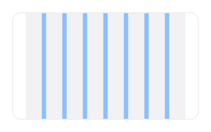
Padding is the spacing inside a design element’s boundary, creating room between its content and edges to improve readability, balance, and visual comfort.


TL;DR
- Internal spacing within an element’s boundary.
- Separates content from edges for clarity.
- Improves readability and visual balance.
- Enhances usability and layout consistency.
Definition
Padding is the space between the content of a design element and its border or edge, ensuring that text, images, and other content do not touch the edges directly, thereby improving readability and aesthetic balance.
Detailed Overview
Padding is a fundamental principle in both visual and interface design. It refers to the internal spacing applied within a container, such as a button, card, or text box. Unlike margins, which define space outside elements, padding governs the breathing room inside, directly affecting how content feels and how easy it is to process.
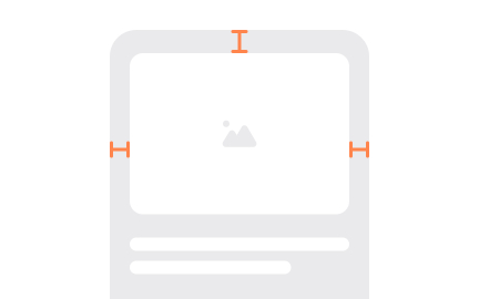
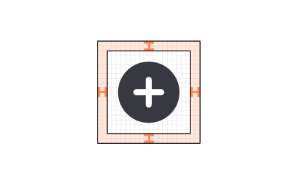
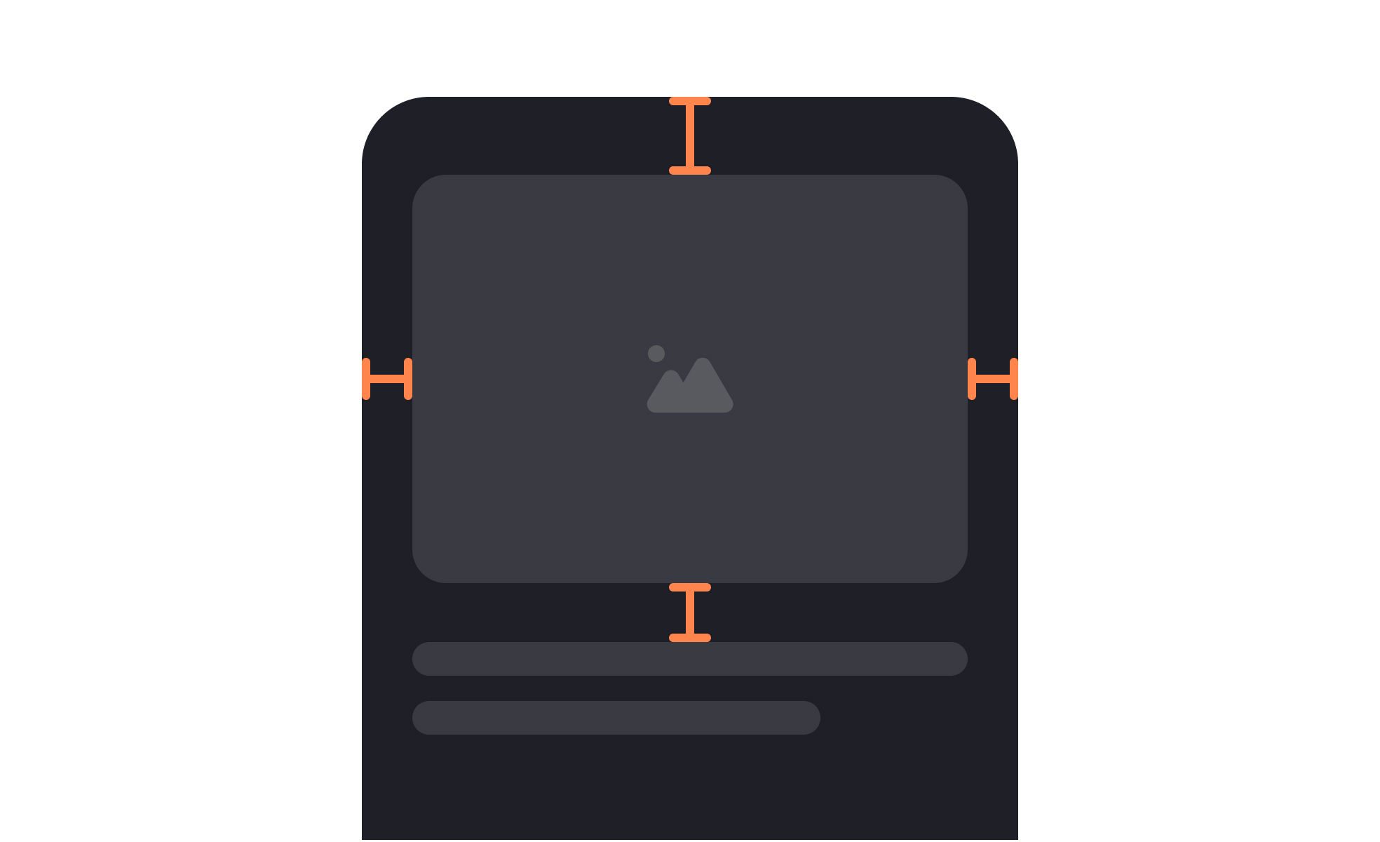
A frequent question is why padding is so critical for readability. Text that touches the edges of its container feels cramped and uninviting. By introducing internal space, designers allow the eye to scan content comfortably. For example, a paragraph in a text box with sufficient padding is easier to read than one pressed tightly against the border.
This seemingly small adjustment significantly affects user experience.
Another common query relates to hierarchy. Padding shapes the perceived importance of elements by making key actions stand out. A call-to-action button with ample padding looks prominent and inviting, while one with minimal padding may seem insignificant. This subtle adjustment of spacing communicates intent without needing extra decoration.
Teams also ask how padding differs from margins. Margins create space between elements, determining how components relate to one another on a page. Padding, on the other hand, controls the interior spacing within a single element. Together, they create balance and rhythm across layouts, but padding specifically ensures content feels properly contained.
Accessibility often comes into play when discussing padding. Insufficient spacing can reduce usability, especially for interactive components. A small tap target with little padding frustrates mobile users, while generous padding creates touch-friendly areas. Consistent padding helps ensure products remain inclusive across screen sizes and input methods.
Finally, padding contributes to overall aesthetic cohesion. A design system with standardized padding rules ensures consistency across components, improving both efficiency and brand alignment.
Learn more about this in the Padding Exercise, taken from the HTML Styles Lesson, a part of the HTML Foundations Course.
Padding is the space inside an element, while margins define space outside it. For instance, padding in a button ensures the text is not pressed against the edges, whereas margins separate the button from surrounding elements.
Both are necessary for balance, but they serve different structural purposes.
Without padding, text or images touch the boundaries of their containers, creating visual strain. Padding gives breathing room, making content easier to read and more visually inviting.
This spacing improves scanning and reduces the effort needed to interpret information.
Elements with more padding feel larger and more important. A call-to-action button with generous padding is easier to spot, while one with little padding may be overlooked.
By adjusting padding, designers emphasize priority elements without relying solely on color or typography.
Generous padding creates larger interaction zones, particularly valuable for mobile or touch users. Small, cramped tap targets increase errors and frustration. With proper padding, interfaces become more forgiving and inclusive.
Consistent padding also supports predictable layouts, which help users with cognitive challenges.
Padding is often standardized in spacing scales, ensuring consistency across components. This reduces guesswork, streamlines collaboration, and keeps designs cohesive across screens and contexts.
Well-defined padding rules align teams on best practices and reinforce brand identity through visual consistency.
Recommended resources
Courses

UX Design Foundations


UI Components I


Design Terminology

Lessons

Intro to UI Cards

CSS Margins & Paddings