UI Cards Types & When to Use Them
Learn when to use cards to group content and encourage users to explore
Cards group related content into neat, self-contained units. A title, an image, a bit of text, maybe a button. They draw from the physical world, using shadows and borders to feel like something you could pick up. That tangibility encourages interaction. Cards work especially well for browsing, where users explore without a specific target in mind. They're less effective for searching, where lists offer faster scanning and clearer hierarchy. Card styles range from elevated with shadows to flat and outlined, each carrying different visual weight and expectations for interactivity. Choosing the right style and maintaining clear hierarchy within each card determines whether users engage or scroll past.
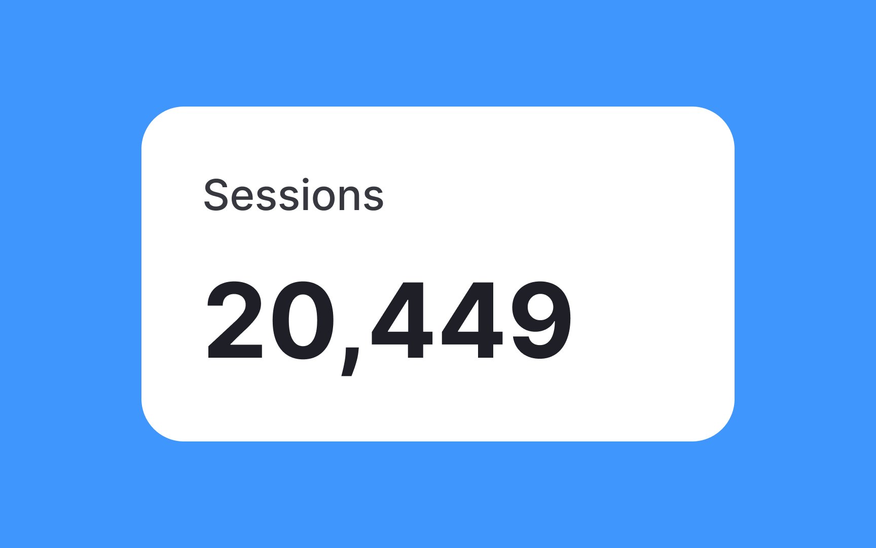
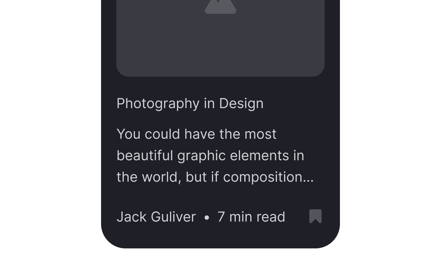
While cards come in all shapes and sizes, the most basic form is the text card. It’s commonly seen on things like dashboard applications. Text cards consist of a title and secondary text.
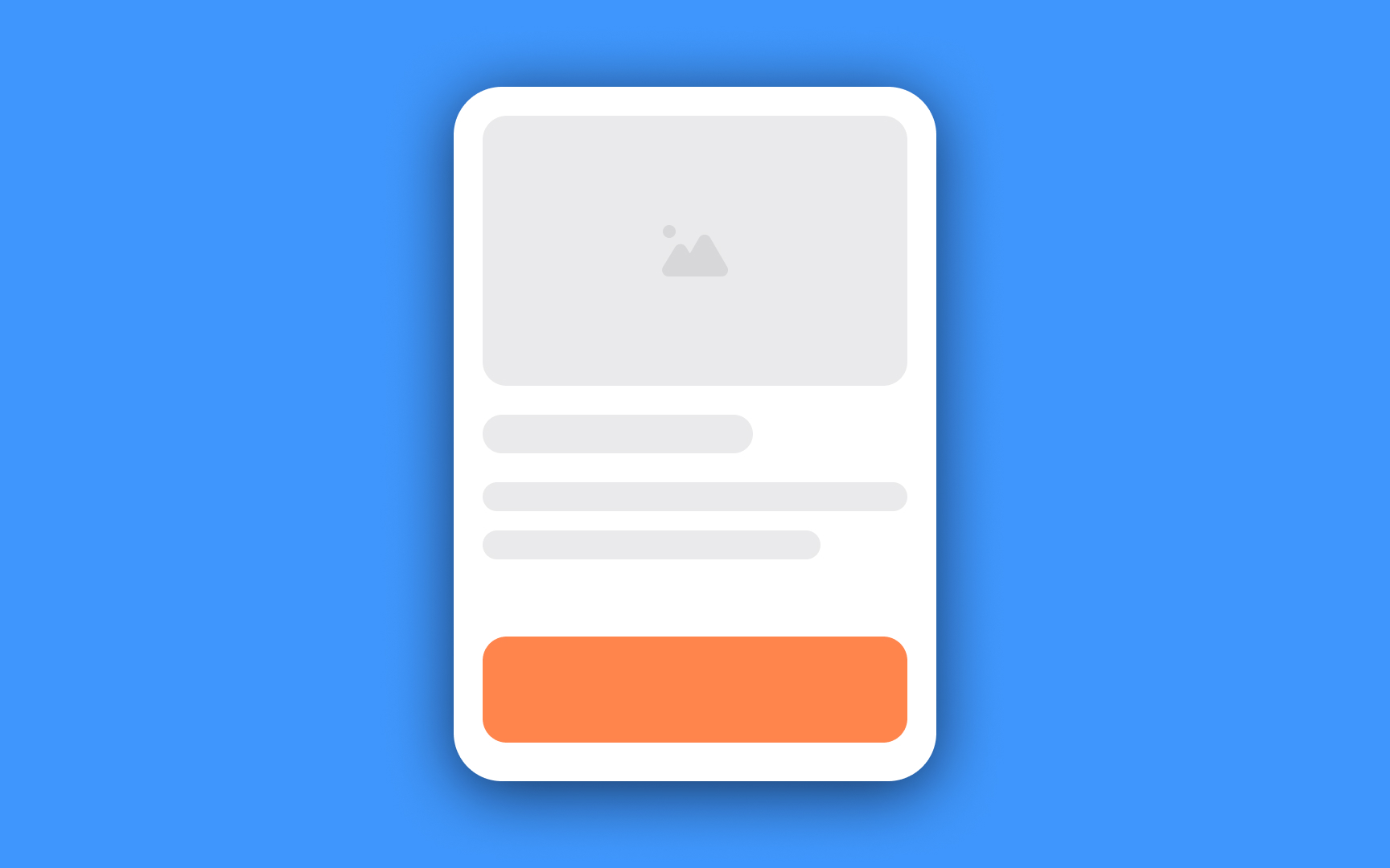
However, the only required element in a card is a container. All other elements like text, media, thumbnail, icons,
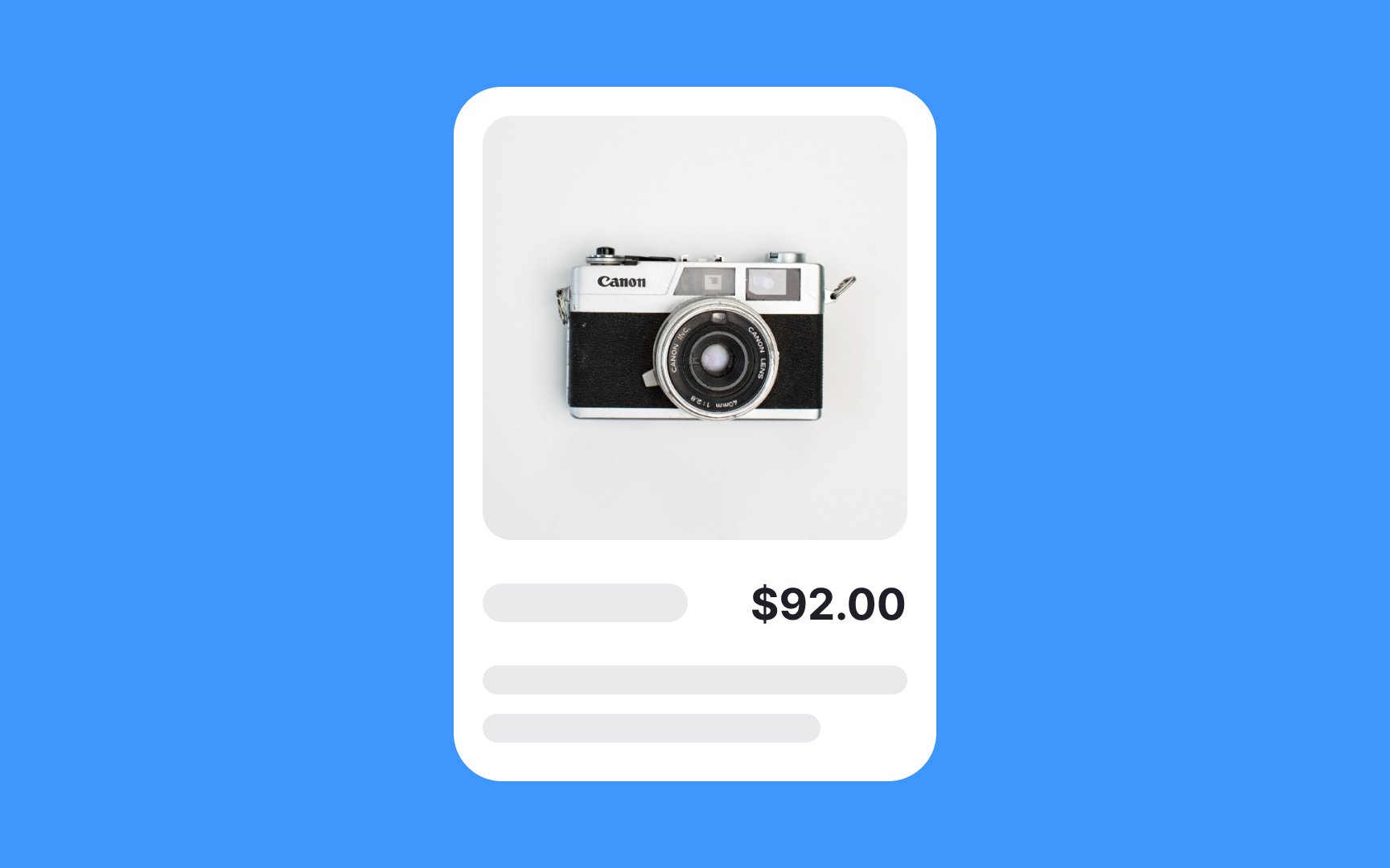
Rich cards contain a variety of complex information, including
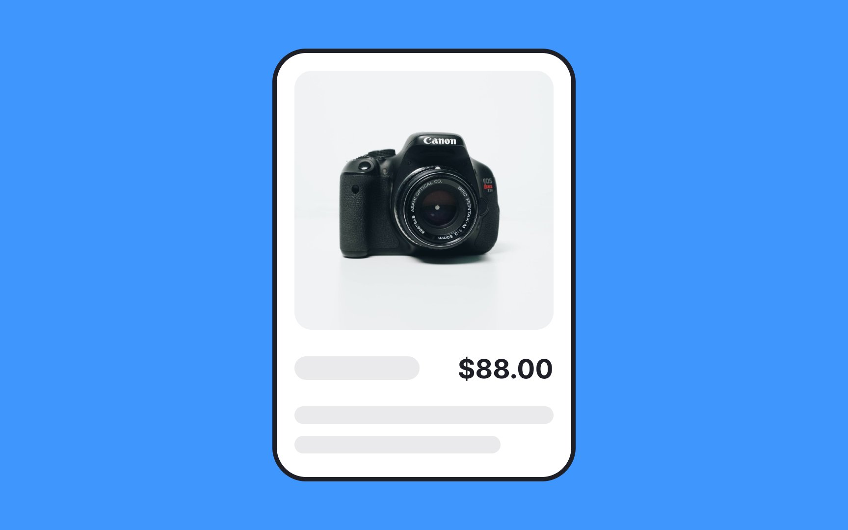
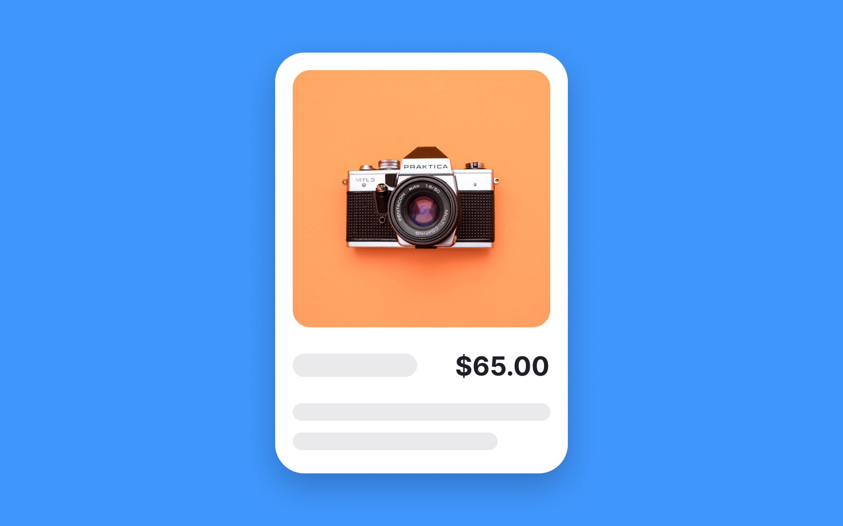
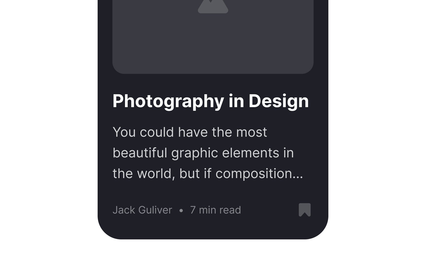
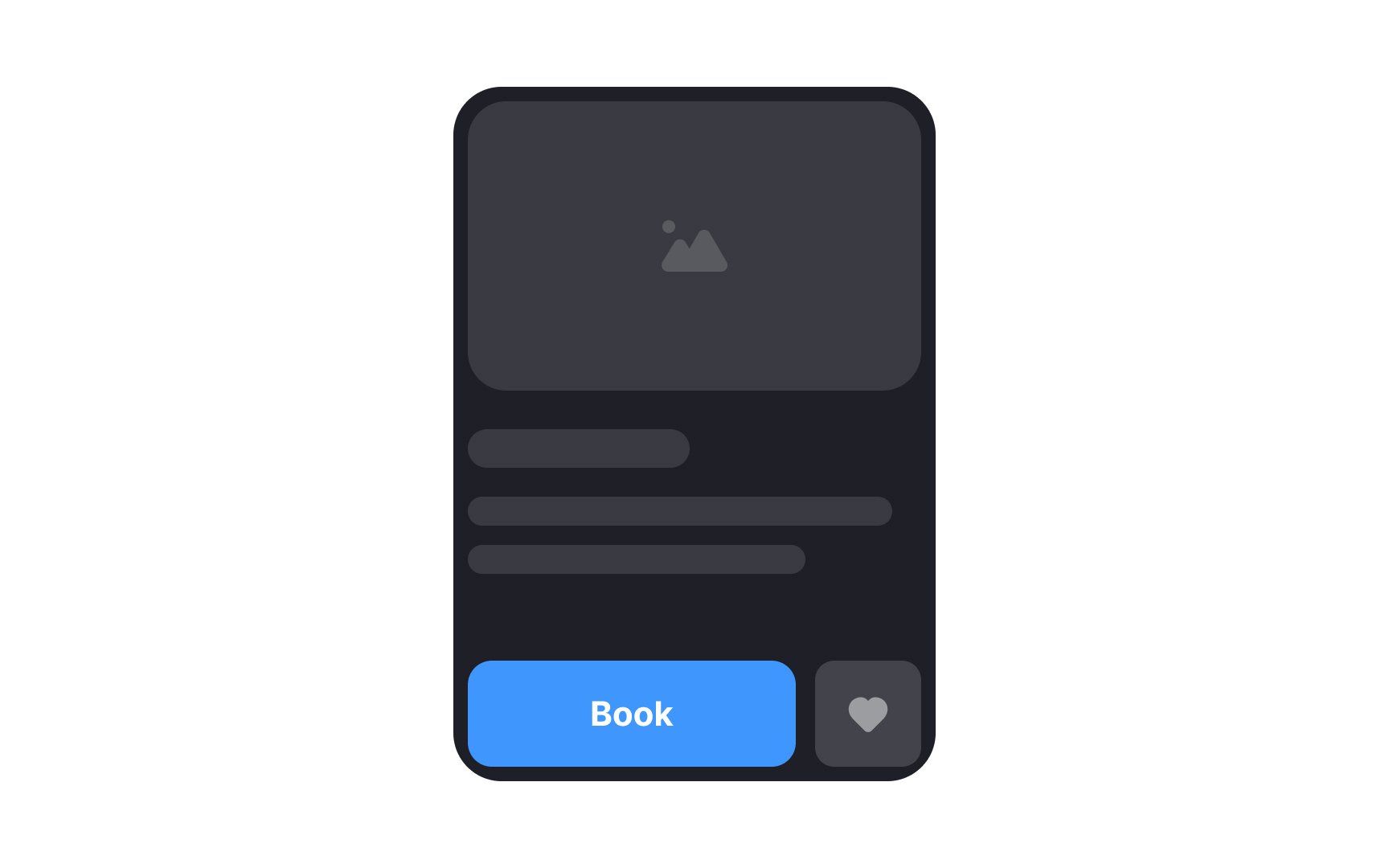
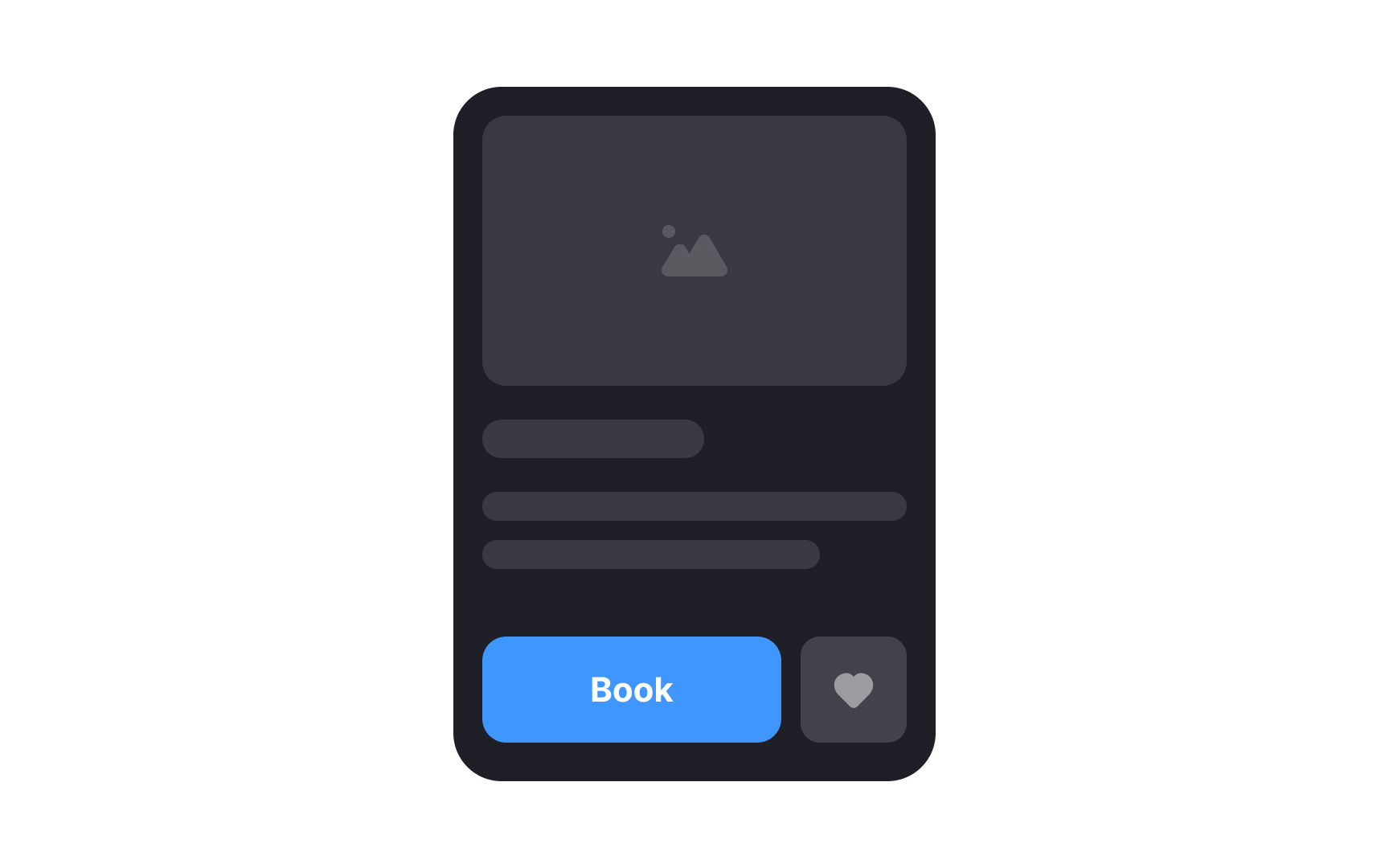
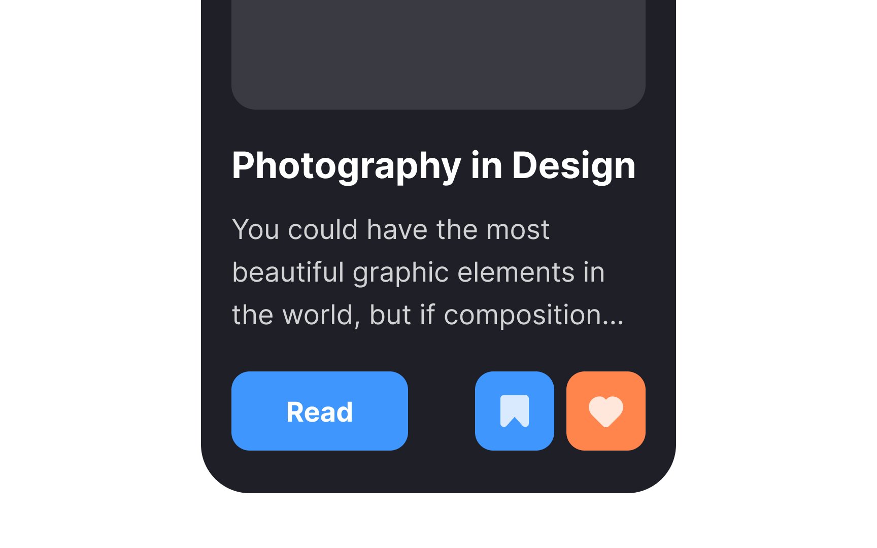
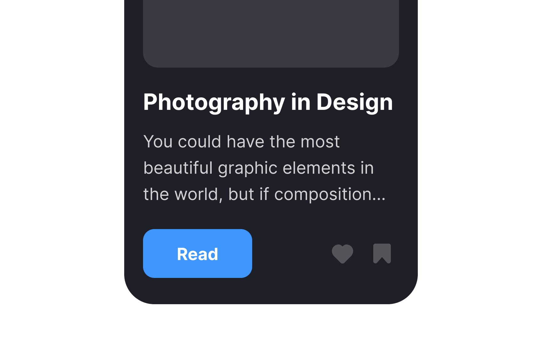
An average card may contain different types of media, like an image, a title, a summary,

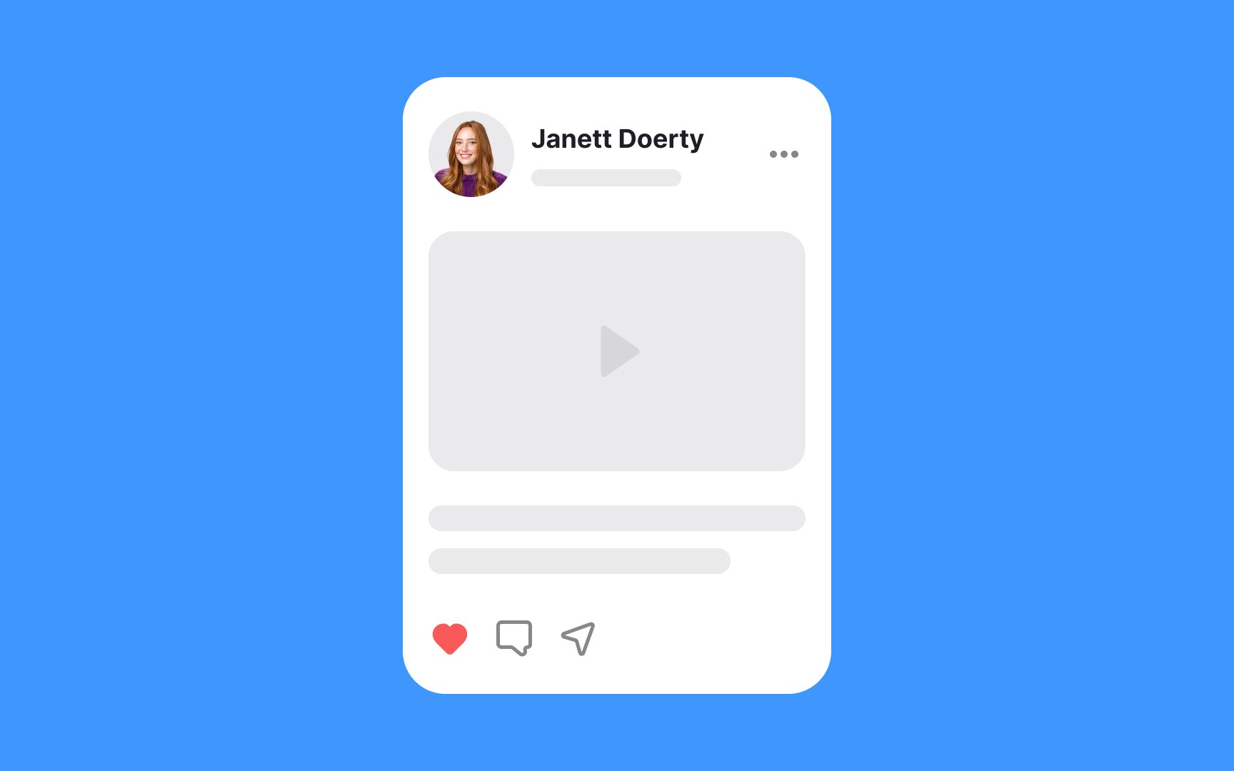
User cards are a specialized type of card that has become universal across social platforms. Their primary purpose is to provide basic user information, generally a username and avatar, but may also contain activity status, bio,
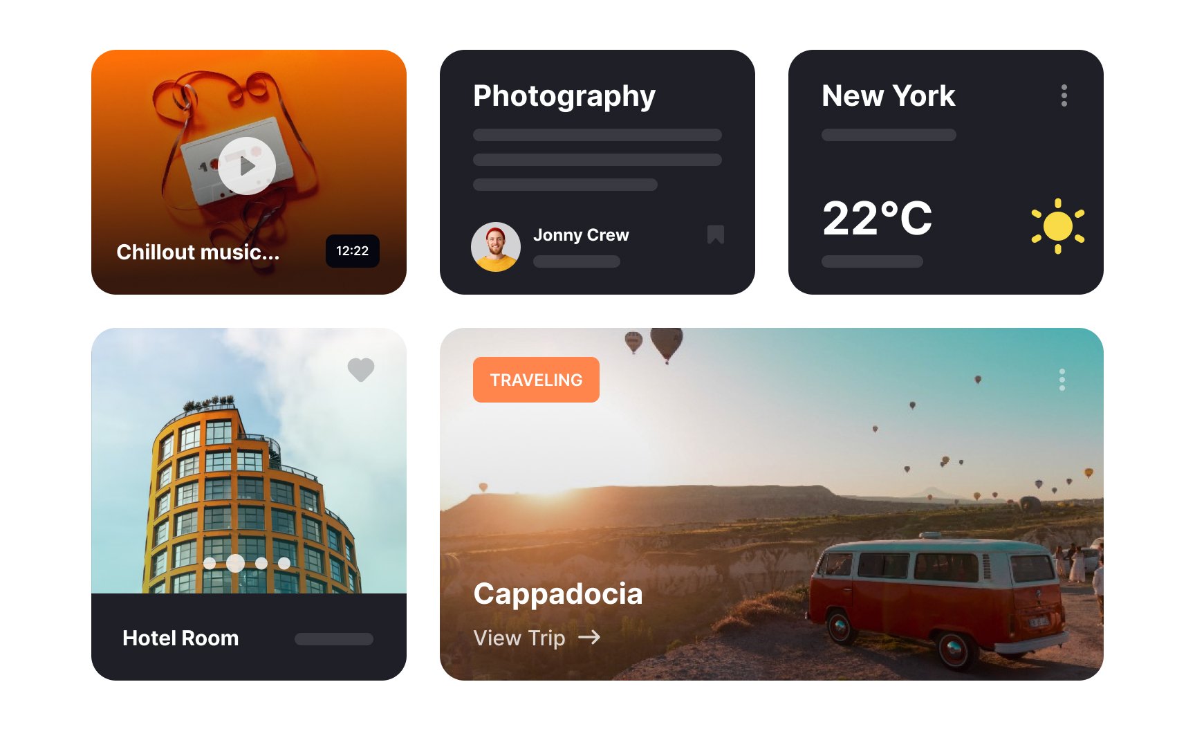
Cards are an excellent solution for grouping together heterogeneous items. Each card can contain different types and amounts of information and, thus, occupies an additional amount of vertical space. Cards may or may not include rich media (the
Card layouts are better for interfaces where users browse information instead of searching. This is because:
- Cards lack a strong hierarchy. All cards are equal and carry the same ranking. When users
search , they assume the items on the top of the list are the most relevant. - Cards are less scannable than lists. Due to their flexible height, the position of elements isn't fixed, which makes them less predictable for human eyes. When people search for a specific item, they need consistency for a more efficient and fast search.
- Cards take more space and thus, require more scrolling. When users search, frequent scrolling demands more mental effort as users need to strain their short-term memory instead of just looking at the page and seeing more items in a single view.[2]
Flat cards can be more challenging to style, as they resemble physical cards the least. They don't include
Pro Tip: Use flat cards with caution as they may appear static and don't encourage interaction the way elevated cards do.
Like elevated cards, outlined cards draw user attention and group items into a single unit. Instead of using
Elevated cards use
Elevated cards are common in design since they most readily mimic the appearance of a physical card. It's essential to intensify card shadows on hover — it communicates clickability even more and provides users' feedback on their actions.

When adding card
Pro Tip: Depending on the app style, you may apply a blur effect to increase the elevation and reduce the opacity to create a more natural look.
Regardless of style, information hierarchy within each card is vital. Good hierarchy points users toward the most relevant
Padding, which refers to the white space around the card's elements, can also contribute to visual hierarchy. Without sufficient space, cards end up looking cluttered and decrease usability. Padding makes the elements stand out (which is essential for primary
Pro Tip: Well-spaced content increases the page's comprehension and helps users focus on what's important.
Depending on the exact function and
Pro Tip: Don't neglect accessibility over visual hierarchy. Secondary buttons should be visible enough for all users.
References
- Material Design | Material Design
- Cards: UI-Component Definition | Nielsen Norman Group
Top contributors

Topics
From Course

Share


Similar lessons

Common UI Components Part I

Image Terminology
