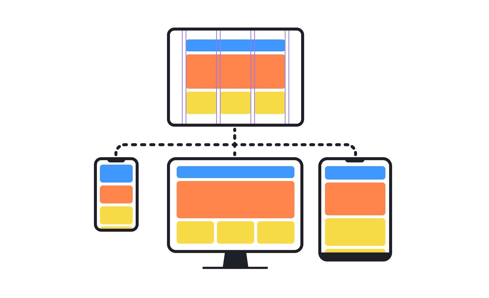
Responsive Design
Responsive design ensures websites and apps automatically adapt their layout and content to different screen sizes and device capabilities.


What is Responsive Design?
Your website or application looks great on desktop computers but becomes difficult to use on mobile devices because the interface doesn't adapt to different screen sizes and interaction patterns.
Most teams design for desktop first and treat mobile compatibility as an afterthought, missing opportunities to create seamless user experiences across all devices that users actually use to access products.
Responsive design is the systematic approach to creating interfaces that automatically adapt to different screen sizes, device capabilities, and interaction methods to provide optimal user experiences regardless of how users access your product.
Products with effective responsive design achieve 40% higher mobile user satisfaction, 25% better conversion rates across devices, and significantly reduced bounce rates because users can accomplish their goals regardless of device choice.
Think about how companies like Amazon create shopping experiences that work seamlessly whether users browse on phones during commutes or complete purchases on desktop computers at home, or how news websites adapt content layout automatically to remain readable on any screen size.
Why Responsive Design Matters for User Accessibility
Your users abandon tasks and develop negative impressions of your product because interfaces that work well on some devices become frustrating or unusable on others, limiting your audience and competitive position.
The cost of ignoring responsive design compounds as mobile usage increases. You lose potential customers who can't use your product effectively on their preferred devices, miss opportunities to engage users in different contexts, and compete at a disadvantage against products that work well everywhere.
What effective responsive design delivers:
Better user experience consistency because interfaces adapt automatically to different devices while maintaining functionality and usability that users expect regardless of how they access your product.
When design responds to device capabilities, users can focus on their goals rather than struggling with interfaces that weren't designed for their screen size or interaction method.
Higher conversion rates across devices because responsive design eliminates friction that prevents users from completing important actions on mobile devices, tablets, or other non-desktop platforms.
Improved search engine visibility as search engines favor mobile-friendly websites that provide good user experiences across different devices and screen sizes.
Reduced development and maintenance costs through single codebase approaches that work across devices rather than maintaining separate mobile and desktop versions that require duplicate development effort.
Enhanced competitive positioning because responsive design enables user engagement in mobile-first markets where competitors with poor mobile experiences lose significant market share.
Advanced Responsive Design Strategies
Once you've established basic responsive design capabilities, implement sophisticated adaptation and optimization approaches.
Progressive Enhancement and Feature Detection: Build responsive design that adapts not just to screen size but to device capabilities, network conditions, and user preferences for optimal performance.
Container Query and Component-Based Responsive Design: Use advanced responsive techniques that enable interface components to adapt to their containers rather than just global screen size changes.
Responsive Typography and Micro-Interactions: Optimize text readability and interactive elements across devices rather than just adapting layout and image sizes.
Performance-Optimized Responsive Loading: Implement sophisticated loading strategies that deliver optimal content and functionality based on device capabilities and user context.
Responsive design refers to the practice of designing and developing a website or application that automatically adjusts its layout and content to fit the screen size of the device being used to view it. This allows the site or app to be easily viewed and used on various devices, including desktops, laptops, tablets, and smartphones, without requiring the user to zoom or scroll horizontally. The goal of responsive design is to provide an optimal viewing experience for the user, regardless of the device they are using.
Responsive design should be used whenever a website or web application needs to be accessible and visually appealing on multiple devices with different screen sizes, including desktops, laptops, tablets, and smartphones. This approach ensures that the layout and content of a website dynamically adapt to the screen size and orientation of the device being used, providing a consistent and optimized user experience across all devices.
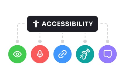
Responsive design can be accessible, but it is not automatically accessible. Accessibility involves making websites usable for people with disabilities, such as visual, auditory, motor, and cognitive impairments. To ensure that a responsive design is accessible, certain accessibility guidelines, such as those outlined by the Web Content Accessibility Guidelines (WCAG), must be followed and incorporated into the design and development process. This includes using semantic HTML, providing alternative text for images, using color contrast ratios that meet accessibility standards, and ensuring that all interactive elements, such as buttons and links, can be operated using a keyboard. By following these and other accessibility guidelines, a responsive design can be made accessible to many users, including those with disabilities.
Responsive design can impact SEO (Search Engine Optimization) positively. A responsive design ensures that a website provides the same content and URL structure to all users, regardless of the device they are using, which helps search engines understand the content and context of the website more effectively. This, in turn, can improve the website's ranking in search engine results pages (SERPs) and increase its visibility to potential users.
Additionally, a responsive design can improve the user experience, which is a ranking factor for search engines. A responsive design ensures that a website is easily usable on all devices, which can reduce bounce rates, increase dwell time, and improve overall engagement with the website, all of which are positive signals for search engines.
However, it is important to note that responsive design is just one factor that affects SEO. Other factors, such as high-quality content, user experience, and keyword optimization, are also important to consider when optimizing a website for search engines.
Recommended resources
Courses

Accessibility Foundations


CSS Foundations


Apple Human Interface Guidelines

Lessons

Designing for Mobile Interfaces

Image Properties

Intro to Design Layouts


Tutorials

Responsive Type Scales: Part 1


Understanding a Developer's Point of View

Projects

FinTrust - 404 Error Page


HireHarbour Allies: UX/UI Case Study for Inclusive Landing Page


Force brand | E-commerce