Designing for Mobile Interfaces
Learn the basics of creating user-friendly, intuitive, and functional mobile interfaces
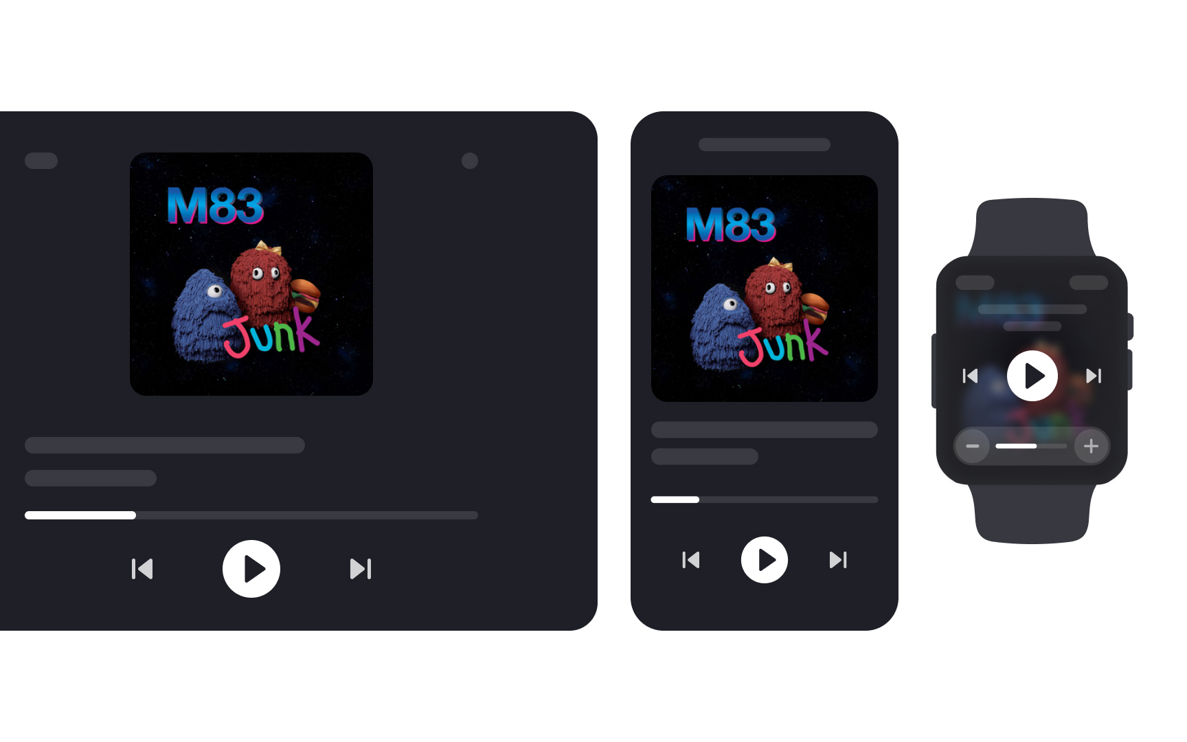
Designing mobile interfaces is different from designing for desktops. Mobile interfaces have less space, work on battery, are highly personal, support touchscreen, and usually require an Internet connection.
While designing for desktops is not obsolete, the popularity of mobile devices is snowballing. The larger amount of web traffic comes from mobile devices, as users spend more and more time surfing social networks, shopping, gaming, watching videos, and participating in work meetings from their smartphones or tablets. Thus, designers should be familiar with the context of mobile usage and technical constraints to create user-friendly, intuitive, and functional interfaces.
A mobile device is any gadget you can easily carry around and use while moving. These devices have a
Today's mobile devices do much more than make calls or send messages. They come with cameras, maps, and sensors that help you do many everyday tasks. Think of them as small computers that fit in your pocket.
Most people now browse the internet and use apps primarily on their mobile devices. This makes it essential for designers to focus on mobile-friendly designs when creating websites and apps.
In general, mobile devices are categorized as follows:
- Smartphones: They combine a mobile phone and a handheld computer into a single device you can carry in your pocket, and are generally always connected to the Internet. Some new phones can even fold open to become
tablets . - Tablets: They have all the advantages of smartphones but come in a larger form. They can be operated with your fingertips or a stylus and often recognize handwriting. Tablets are better suited for tasks requiring more battery life and larger displays, such as work presentations, gaming, and high-quality live streaming.
- Wearables (smartwatches and fitness trackers) and e-readers: These are simpler mobile devices that provide internet access and allow users to perform specific tasks.
- Other types include e-readers like Kindle made specially for reading books, and gaming devices for playing games.
Some sources define laptops as mobile devices, too. However, laptops cannot fall under this category due to their larger size, weight, and inability to be operated comfortably with one hand or on the go.
Screen sizes for mobile devices vary widely, from small
Common screen sizes follow certain patterns based on manufacturer standards and user preferences. For example, iPhones range from 4.7 inches to 6.9 inches, while Android phones offer even more variety. Tablets commonly come in 7 inch to 13 inch sizes.
Understanding these different screen sizes helps designers create flexible layouts that adapt smoothly.
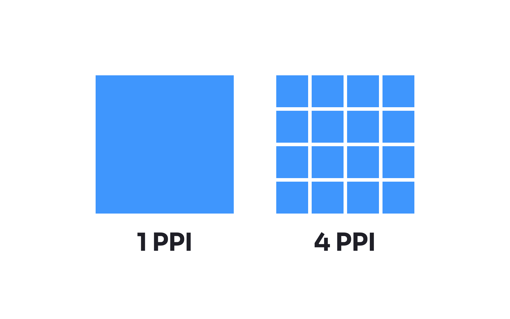
Pixel density refers to how many pixels fit into one inch of a screen, measured in PPI (pixels per inch) or DPI (dots per inch). Higher pixel density means sharper, clearer images and text. Modern smartphones typically have pixel densities ranging from 300 to 500 PPI, while
Device manufacturers often use marketing terms for their high-density displays. Apple calls their high-density screens "Retina Display," which started at 326 PPI with the iPhone 4. Other manufacturers use terms like "Super AMOLED" or "Liquid Retina," though these terms also describe other screen qualities such as color accuracy, brightness, contrast ratio, and screen technology.
Understanding pixel density helps designers create sharp graphics and readable text. For instance, text that's easily readable on a low-density display might appear tiny on a high-density screen if not properly scaled. This is why designers work with relative units rather than fixed pixel sizes.
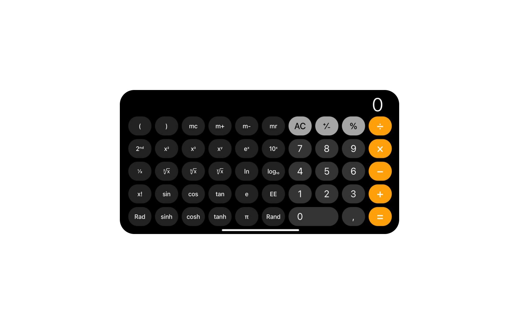
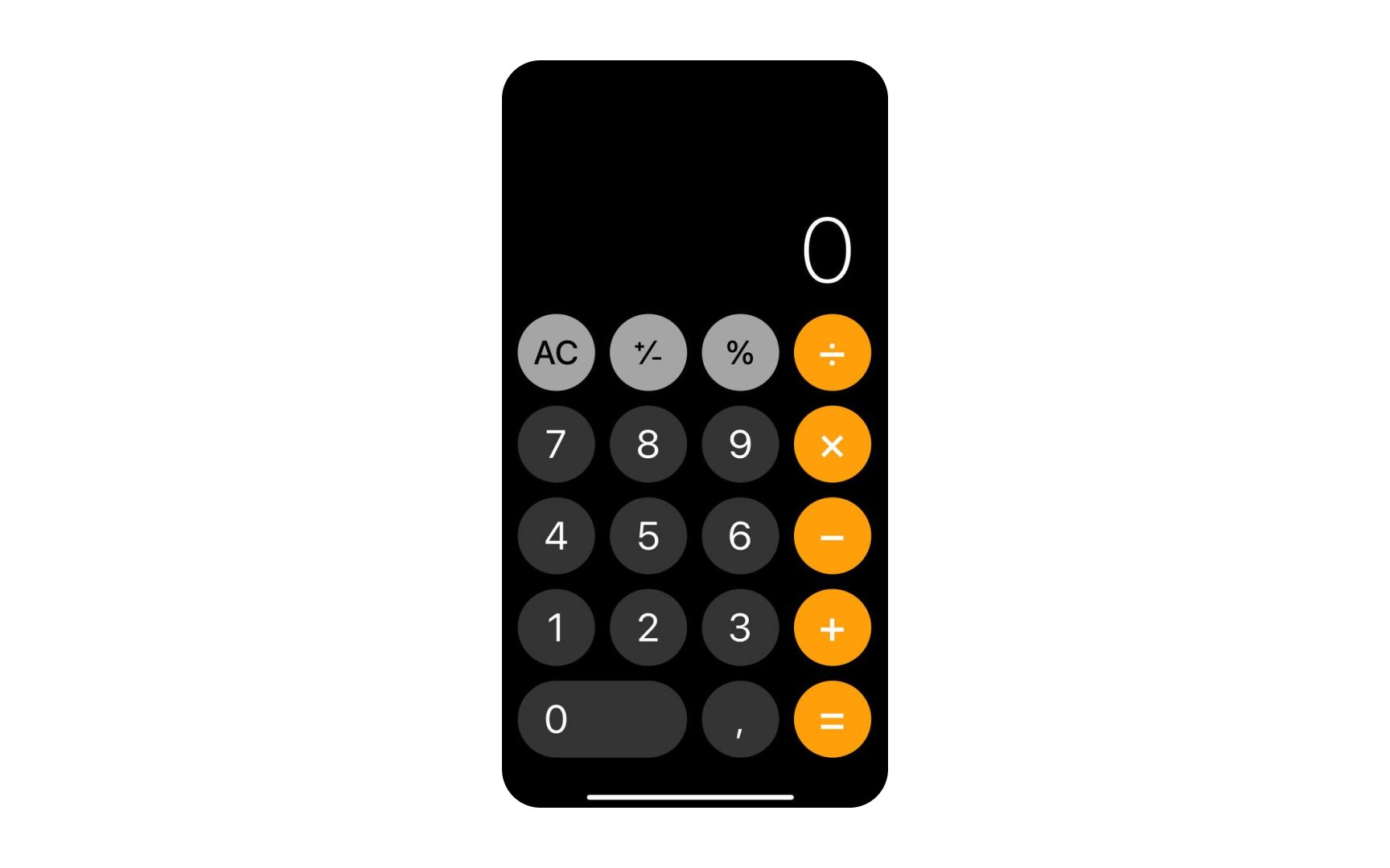
Portrait orientation is the most popular orientation for smartphones, so designers should always first design for this case. However, it's also the designer’s job to ensure designs don't break when users flip the screen to a non-primary orientation.
Having your app designed for landscape orientation is particularly important if your app expects users to type a lot, considering that the larger keyboard is more convenient. Mobile games are also commonly landscape-oriented since they require a greater amount of horizontal space for better viewing and convenience.
Users should be able to use all essential features regardless of how they hold their device. Forcing them to switch orientations to access basic functionality is a bad practice.[1]
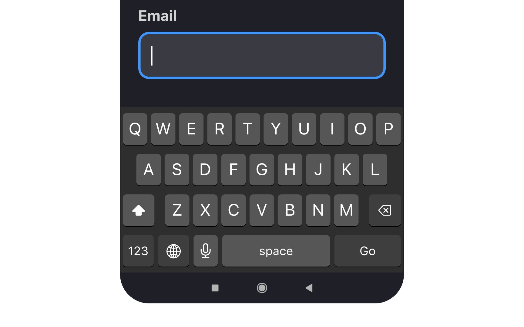
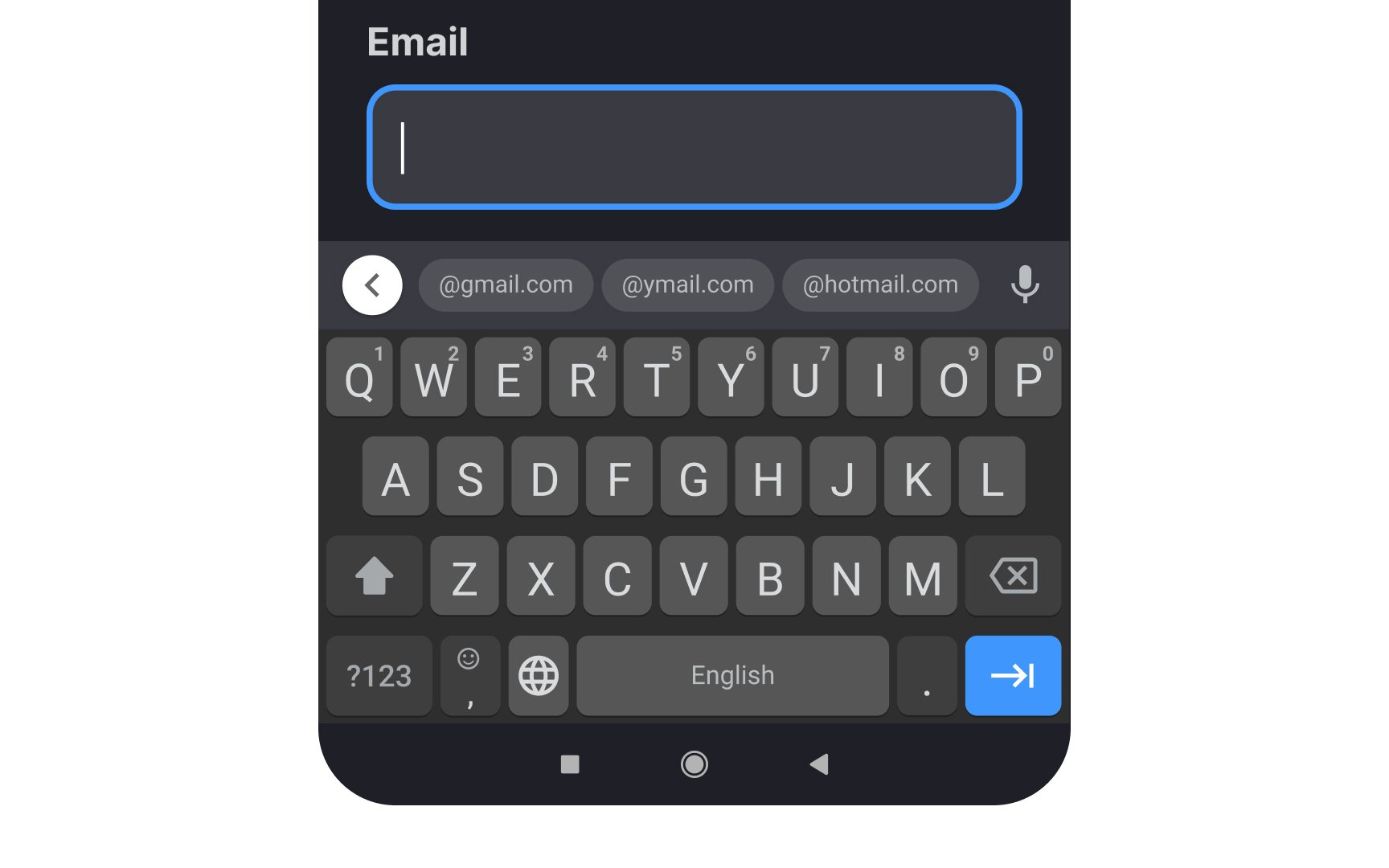
When designing mobile forms, choose appropriate keyboard types for different input fields to minimize user effort. Trigger numerical keypads for phone numbers, pin codes, and calculations. For email fields, present the email-optimized keyboard with an easily accessible (@) symbol and common domain suggestions. This significantly reduces the interaction cost, saves time, and prevents users from making accidental mistakes.[2]
Use search-optimized keyboards for search fields, showing the search icon instead of a return key. For password fields, include the password toggle to let users verify their input. URL fields should trigger keyboards with quick access to common top-level domains (.com, .org) and forward slash (/) for easier web address entry.
Also, support alternative input methods alongside traditional keyboard types. Voice input provides hands-free accessibility and is crucial for users with motor impairments. Enable swipe typing for faster text entry, where users can slide their finger across letters to form words. Include predictive text suggestions to speed up typing and reduce errors, but ensure users can easily disable these features if they prefer.
Mobile device users typically engage in shorter, more frequent sessions compared to desktop users.[3] They often interact with content while in motion, multitasking, or during brief moments like commuting. This leads to more focused, task-oriented behaviors where users want to accomplish specific goals quickly.
People prefer using mobile devices for browsing but get back to their desktops when they need to read a large amount of text carefully or make an important decision requiring confidential data. Desktop versions of a website or product make users feel safer and more comfortable.[4]
Another thing to remember is that mobile users hold their devices closer to their faces than desktop screens, but they're more likely to be distracted by their environment. And, the touch interface means interactive elements need adequate spacing to prevent accidental taps, unlike desktop designs that can pack more elements closer together for mouse-based
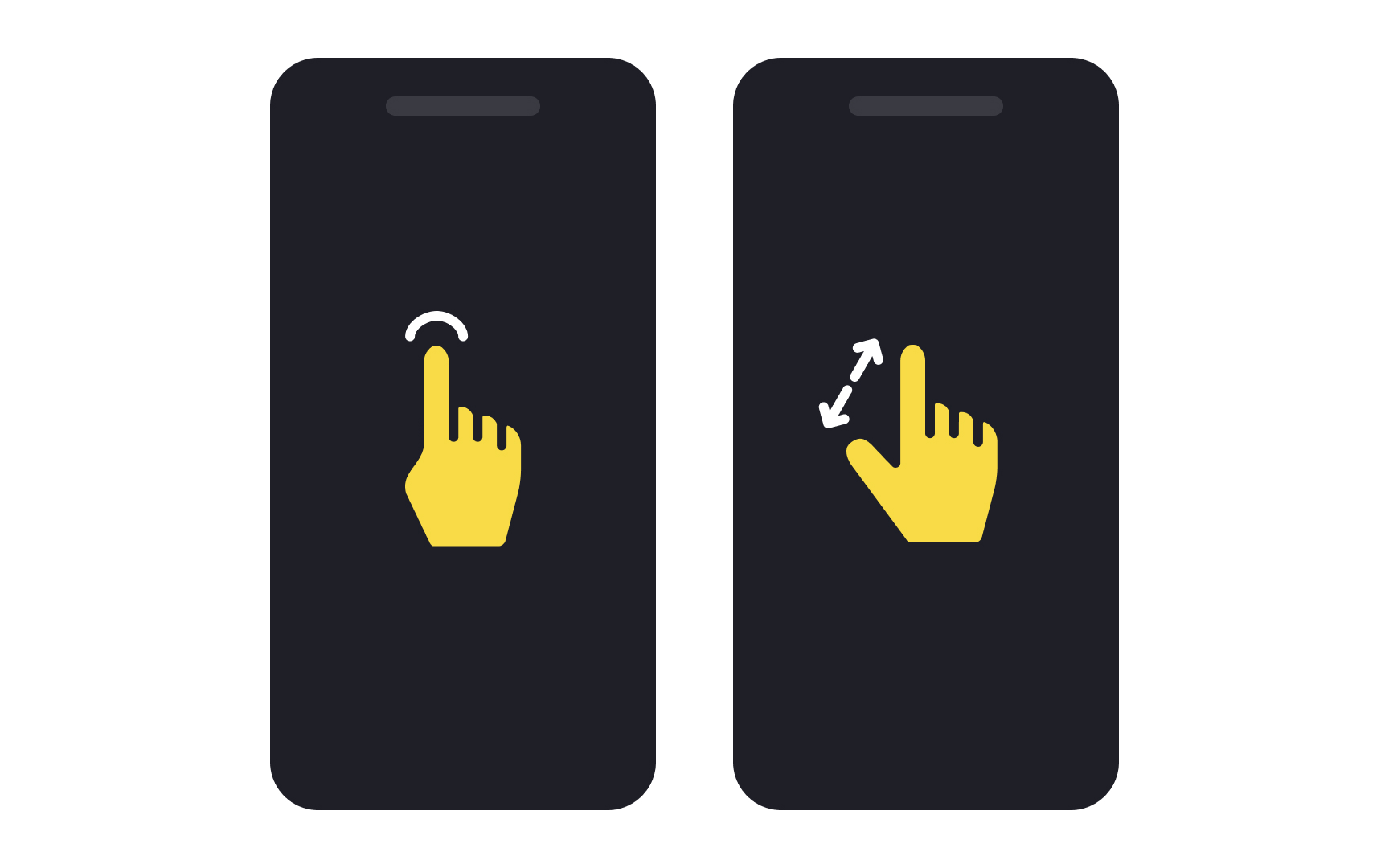
Mobile gestures are touch-based movements that control device features. These include fingertip actions (tap, swipe, drag) and whole-device movements (shake, tilt, rotate). While system gestures like pinch-to-zoom are widely understood, app-specific gestures often serve as shortcuts for advanced users.
Common fingertip gestures include tap (select), double tap (zoom), long press (options), swipe (navigate), pinch (zoom out), and spread (zoom in). Device movements include rotation for changing screen orientation, shake for undo, and tilt for gaming controls.
However, gestures come with important limitations. The main challenges of gesture controls are: discoverability (users can't see what gestures are available), consistency (gestures mean different things in different apps), and
References
- Designing For Device Orientation: From Portrait To Landscape — Smashing Magazine | Smashing Magazine
- Preventing User Errors: Avoiding Unconscious Slips | Nielsen Norman Group
- Mobile vs Desktop Usage Statistics for 2024 | Research.com | Research.com
Top contributors


Topics
From Course

Share


Similar lessons

Responsive vs. Adaptive Design

Basics of Native Mobile Design
