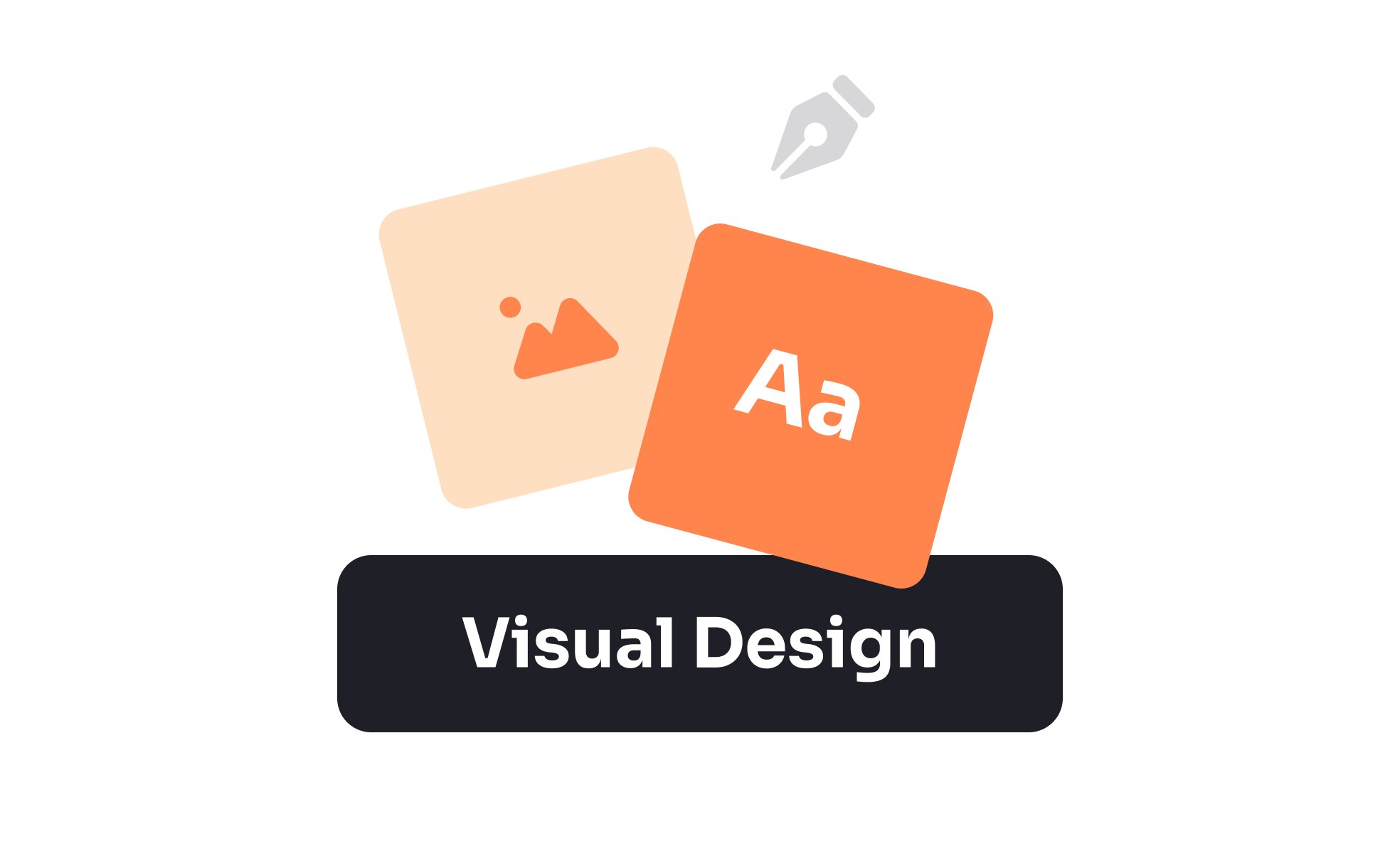
Visual Design
Visual design is the practice of shaping a product’s look and feel through layout, color, typography, and imagery, creating consistency, and emotional impact.


TL;DR
- Focuses on the visual layer of products.
- Uses layout, color, and typography to guide users.
- Balances function with aesthetics for clarity.
- Shapes brand identity and emotional response.
Definition
Visual design is the discipline of arranging visual elements, such as color, typography, imagery, and composition, to improve usability, establish hierarchy, and express brand identity in digital products.
Detailed Overview
Visual design gives products their personality and clarity. While UX ensures functionality and flow, visual design shapes how those interactions are presented. A strong design makes interfaces both usable and aesthetically pleasing. For example, consistent typography helps users scan content quickly, while carefully chosen colors guide focus and build emotional connection.
A frequent question is how visual design differs from graphic design. Graphic design often focuses on standalone visuals such as posters, ads, or branding assets, while visual design applies those principles within interactive systems. A visual designer ensures that layouts, buttons, and icons work together to guide actions, not just to look appealing.
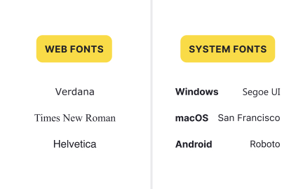
Another common query is about the principles that underpin visual design. Core principles include hierarchy, balance, contrast, alignment, proximity, and consistency. These rules help organize information and ensure clarity. For instance, larger headings naturally draw attention before smaller body text, while consistent alignment creates a sense of order across screens.
Teams often ask how visual design connects to usability. While aesthetics might seem separate from function, they directly influence task success. A cluttered interface slows users down, while clean layouts improve comprehension. Good visual design reduces cognitive load by presenting information logically and emphasizing key actions.
Accessibility is another key concern. Strong visual design accounts for contrast ratios, legible font sizes, and scalable layouts. Choosing accessible color palettes ensures that content remains readable for all users, including those with visual impairments.
Finally, visual design plays a role in branding. Elements such as color schemes, typography, and imagery convey identity and emotion. A banking app may choose muted, stable visuals to communicate trust, while a creative platform may use bold colors to inspire energy. Through these choices, visual design becomes a tool for both usability and storytelling.
Learn more about this in the Visual Design Exercise, taken from the Design Disciplines Lesson, a part of the Design Terminology Course.
UX design covers the overall experience, while visual design focuses on presentation and aesthetics. UX ensures tasks flow smoothly, while visual design ensures those flows are clear and engaging.
Together, they create cohesive, user-centered products.
Hierarchy, balance, contrast, alignment, proximity, and consistency. These principles organize information, create clarity, and reduce confusion.
Applying them consistently strengthens both usability and aesthetics.
Clear typography, logical layouts, and meaningful use of color guide attention and simplify tasks. Good visual design makes actions obvious and reduces effort.
Confusing or cluttered visuals often block task success.
Accessible visuals ensure content is usable by everyone. Contrast ratios, legible fonts, and scalable elements support users with different abilities.
Prioritizing accessibility improves inclusivity and user confidence.
Visual design reflects brand identity through color, typography, and imagery. These elements influence how users perceive a product emotionally and professionally.
Strong branding through visual design builds recognition and trust.
Recommended resources
Courses

UX Design Foundations


Design Terminology


Advanced UI Components

Lessons

13 Core Visual Design Principles

Image Types and Formats

UI Design Deliverables
Exercises
Briefs

Create a High-Impact Landing Page

Create a Typography System

Create a Color System
Assessments

Accessibility

Color

Attention to Detail

Projects

Hulu Through My Eyes - A Cinematic UI Exploration (unofficial)

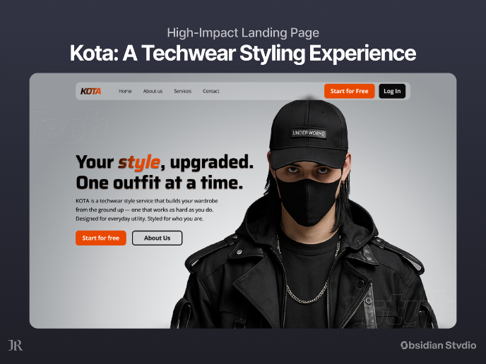
KOTA: Landing Page (A Techwear Styling Experience)

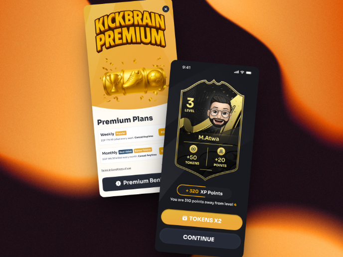
Redesigning KickBrain: Trivia Mobile Game