Iconography
Iconography involves designing and applying simple visual symbols that enhance navigation, clarify actions, and make products meaningful.


What is Iconography?
Your users can't figure out what your buttons do, even though the interface looks clean and professional. You've probably spent hours debating whether that hamburger menu makes sense, or whether users will understand that shopping cart symbol means "buy now." It's one of those silent conversion killers that teams often overlook.
Most digital products fail at iconography because teams think icons are just decoration when they're actually a complex visual language system that can make or break user experience.
Iconography is the systematic use of visual symbols and icons to communicate meaning, guide user behavior, and create intuitive interfaces across digital and physical products. Think of it as creating a visual vocabulary that users can learn once and apply everywhere in your product.
Good iconography reduces cognitive load by 40-60% and can decrease support tickets by up to 30%. Bad iconography confuses users, increases bounce rates, and forces people to hunt for features they need. It's like having road signs that nobody can read.
Consider how Apple's simple, consistent icons work globally because they follow established visual conventions. Your product icons need to follow patterns your users already understand while serving your specific business needs.
Why Iconography Matters for Product Teams
Your team launches a beautifully designed interface, but user testing reveals people can't find basic functions. They're clicking on decorative elements and missing important buttons. Your conversion rates suffer because the path to purchase isn't visually clear.
The cost of poor iconography hits immediately. Teams at companies like Dropbox found that unclear icons caused 25% more support tickets than necessary. Users get frustrated, abandon tasks, and choose competitors whose interfaces make more sense.
What effective iconography delivers:
Professional credibility through consistent visual language that builds user confidence. When your icons follow established patterns, users immediately understand your product is trustworthy and well-designed. It's that instant "this company knows what they're doing" feeling.
Faster task completion because users recognize function without reading labels. Teams report 20-35% improvement in task completion times when icons are culturally appropriate and clearly communicate purpose. Users spend time accomplishing goals instead of decoding your interface.
Global accessibility that transcends language barriers. Well-designed iconography works across cultures and languages, expanding your market reach without expensive localization. A good search icon works whether your user speaks English or Mandarin.
Stronger brand recognition through distinctive visual elements. Think Apple's minimalist approach or Google's Material Design icons. Your icon style becomes part of your brand identity that users remember and associate with quality.
Reduced development costs because consistent icon systems prevent design debt and speed up future feature development. When you have clear icon guidelines, designers and developers can work faster without constant decision-making about visual elements.
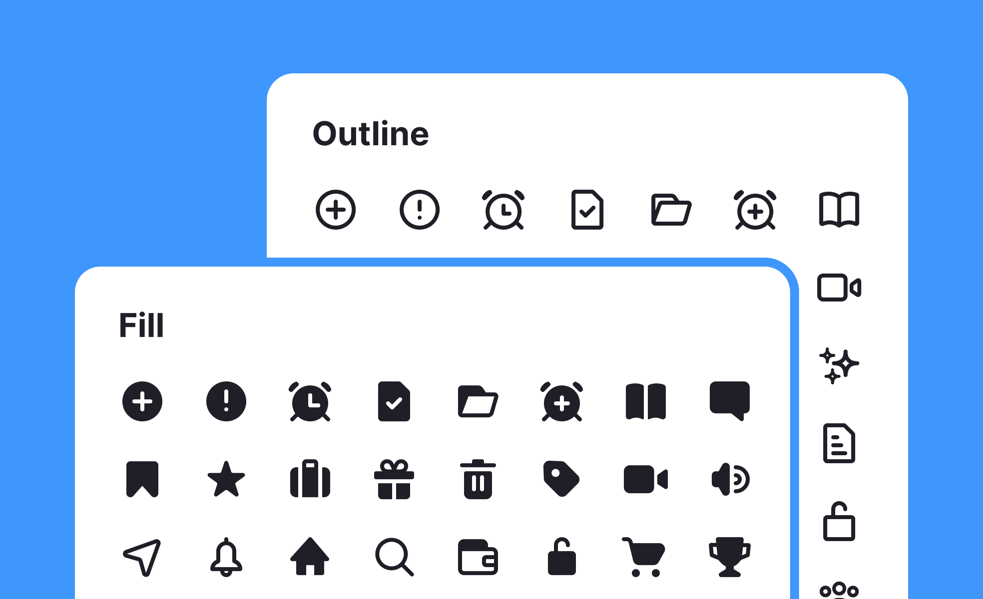
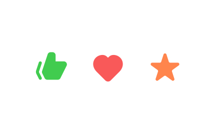
Iconography in design refers to the use of icons or visual symbols to represent concepts, actions, or objects. Icons are simplified graphic representations that convey meaning quickly and universally. Iconography is commonly used in user interfaces, signage, web design, and branding to enhance communication, improve usability, and create visually engaging experiences.
Icons provide several benefits to user interfaces:
- Visual communication: Icons effectively communicate ideas or actions in a compact and visual manner, allowing users to quickly grasp their meaning without relying solely on text.
- Simplified navigation: Icons can be used as intuitive navigation elements, representing different sections or functions within an interface. They help users identify and navigate to specific areas of an application or website.
- Space optimization: Icons save valuable screen space compared to lengthy text labels. They allow for more efficient use of interface real estate, particularly on smaller screens or mobile devices.
- Universal recognition: Well-designed icons based on widely recognized symbols or metaphors can be understood across different cultures and language barriers, making interfaces more inclusive and accessible to a global audience.
- Aesthetic appeal: Icons contribute to the visual appeal of a design, adding a sense of personality, style, and branding to an interface.
When using iconography in design, consider the following best practices:
- Clarity and simplicity: Ensure that icons are clear, easily recognizable, and represent their intended meaning unambiguously. Simplify complex concepts into minimalistic and universally understandable symbols.
- Consistency: Maintain a consistent style and visual language across icons within a design system or interface to establish coherence and improve usability.
- Context and labels: Use icons in conjunction with text labels or tooltips to provide additional context and clarify their meaning, especially for less familiar or ambiguous icons.
- Responsive design: Create icons that are scalable and adapt well to different screen sizes and resolutions. Test their legibility and usability across various devices and environments.
- Accessibility considerations: Ensure that icons are accessible to all users by providing alternative text descriptions for screen readers and considering color contrast requirements.
Recommended resources
Courses

Introduction to Figma


UX Design Foundations

UI Components I

Lessons


Projects
Uxcel Halloween Icon Pack

Waze: Playful Icon Transformations

Duolingo Halloween Icon Pack