<?xml version="1.0" encoding="utf-8"?>

Icons can enhance the usability of your interface by giving users immediate visual cues, while also enhancing the aesthetic appeal of your design. Naturally, they are vital to creating user-friendly designs.

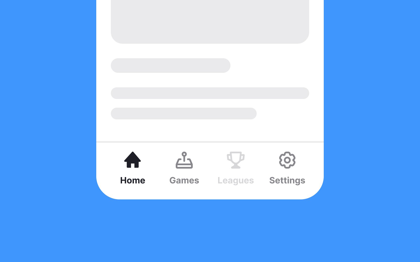
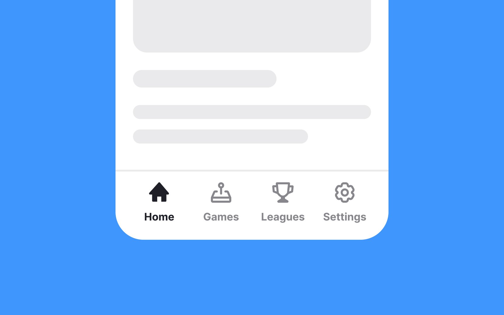
Icons are especially useful on mobile apps, where screen real estate is at a premium. But even on websites and desktop apps, icons can be more immediately recognizable to users than text-based interface elements.

Exercise #1

Use consistent icons for the same purpose

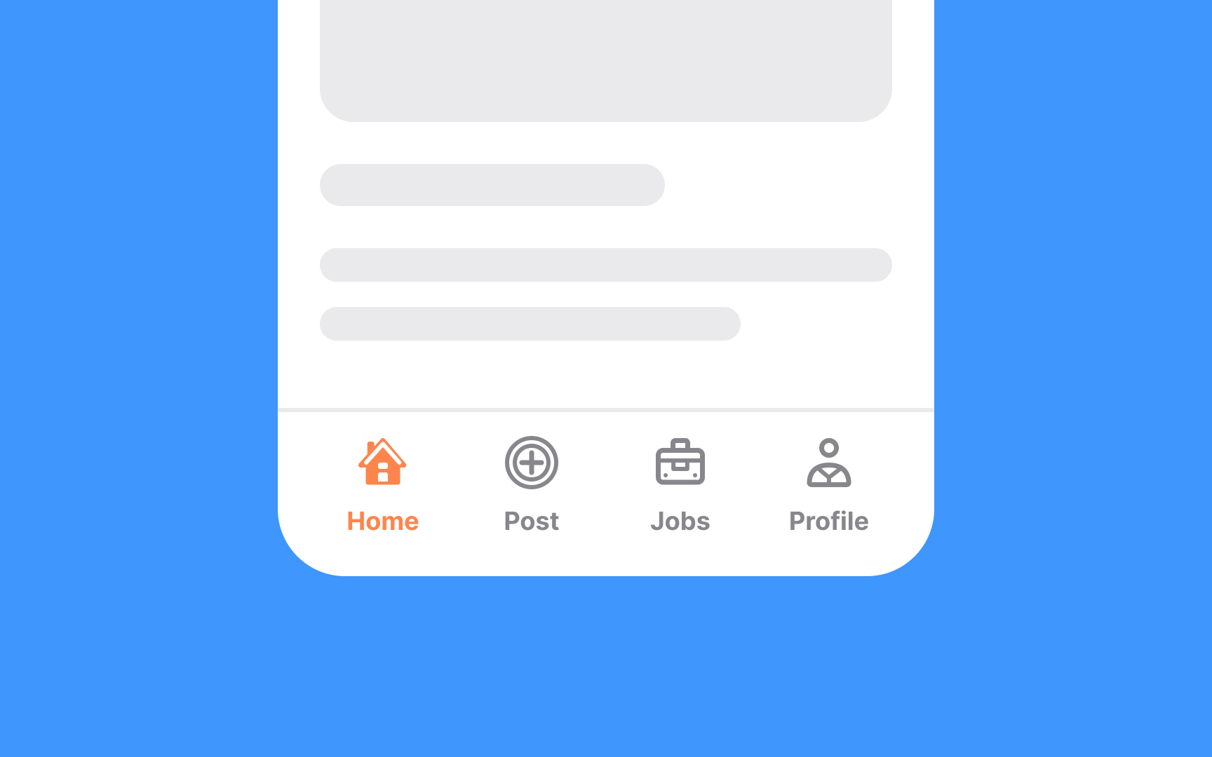
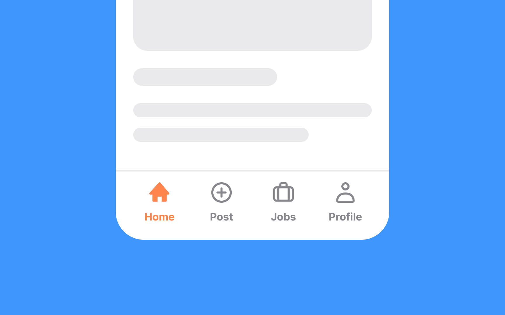
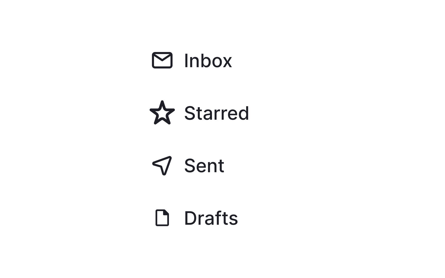
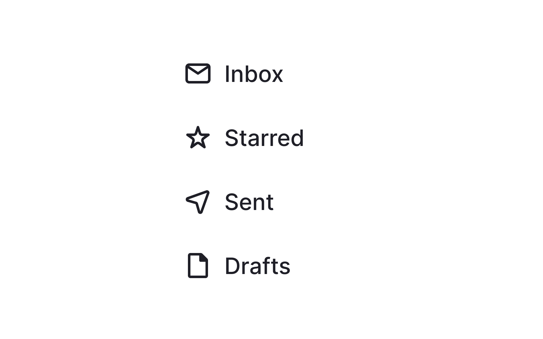
Each icon in your design should have a distinct role to ensure a smooth user experience. Keep it straightforward: one icon for one action. Mixing and matching icons for the same purpose can disorient users and muddle your interface. Let's say you've chosen a shopping cart icon to signify "add to cart" in your design. Stick with it throughout, rather than switching to a shopping bag icon elsewhere. Consistency is key in helping users intuitively navigate your design.

Exercise #2

Icons should aid in user navigation

Deciding which icons to include starts with understanding user needs and common actions in your interface. Focus on streamlining tasks that users perform frequently or actions that need to be accessed quickly. Icons like an "add to cart" or "add to favorite" usually take priority for the product page, for example.

Always ask: Does this icon simplify the user's journey? If an icon doesn't add value or makes the experience more complex, it's likely better to omit it. Also, keep an eye on clutter. Too many icons can overwhelm users and dilute the effectiveness of the truly important ones.

Remember, the goal is to make your interface quicker and more intuitive for users to navigate.
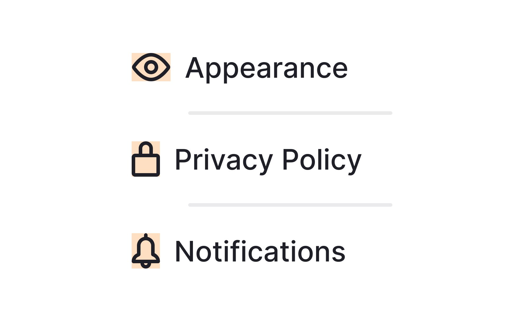
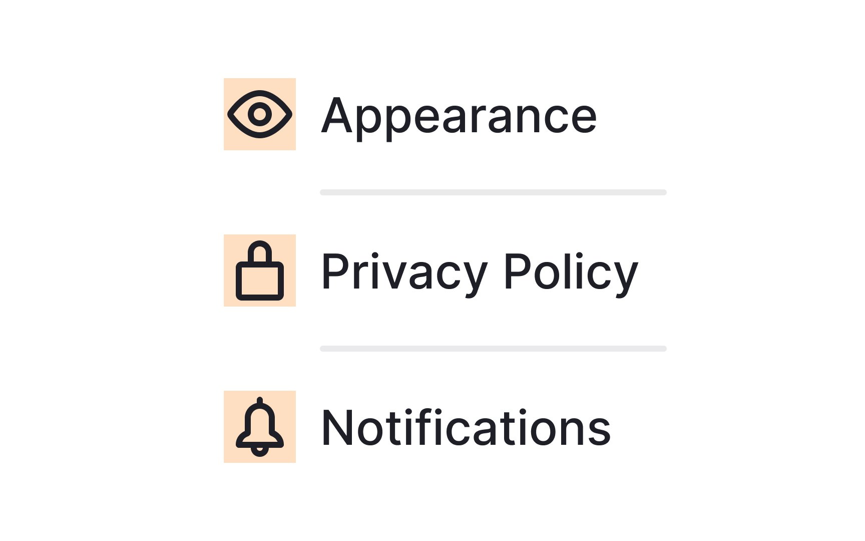
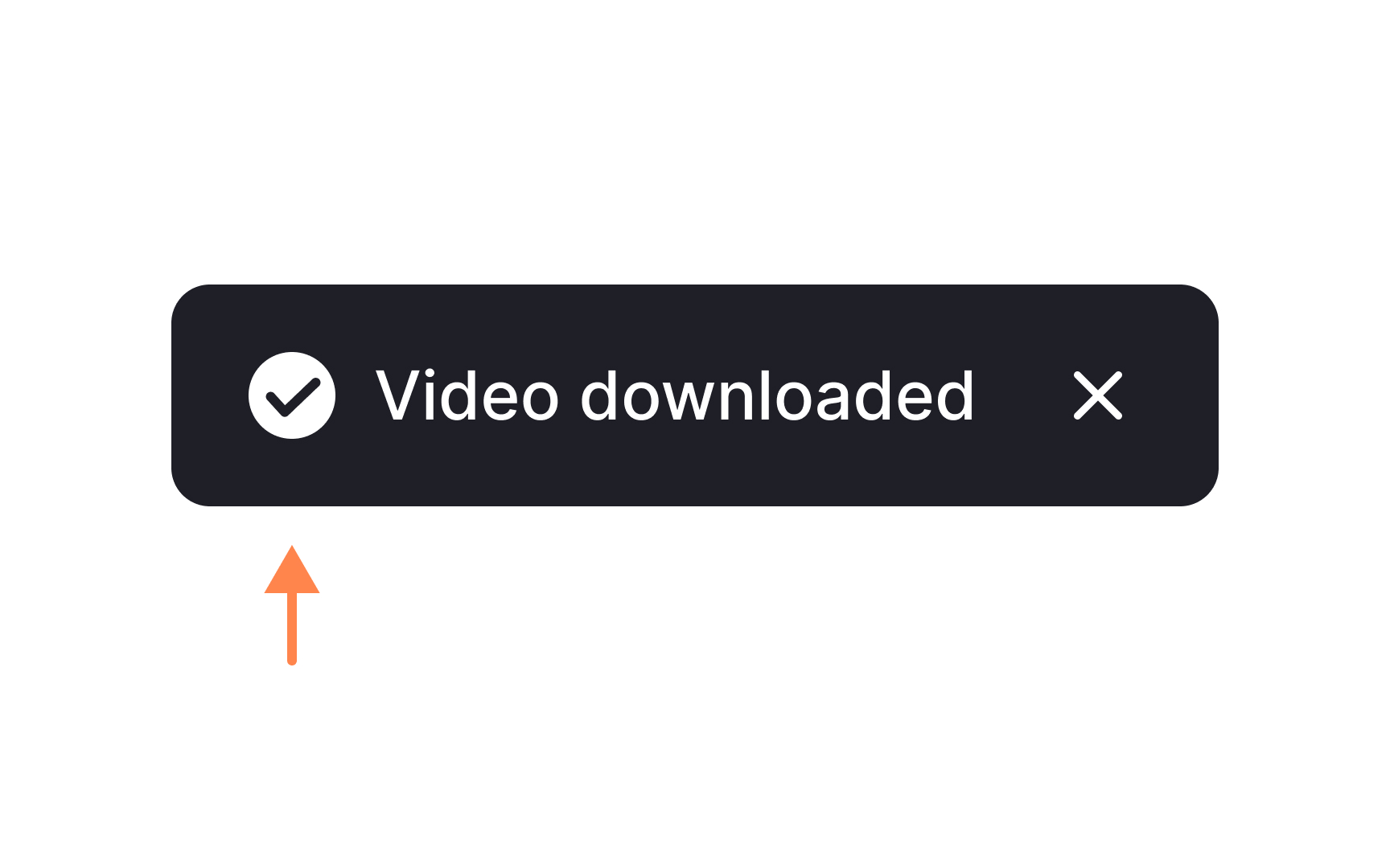
Exercise #3

Accompany icons with labels

When using icons that are not universally recognizable, icon labels minimize ambiguity. Don’t assume that all users will immediately understand the purpose of an icon. When in doubt, include a label.

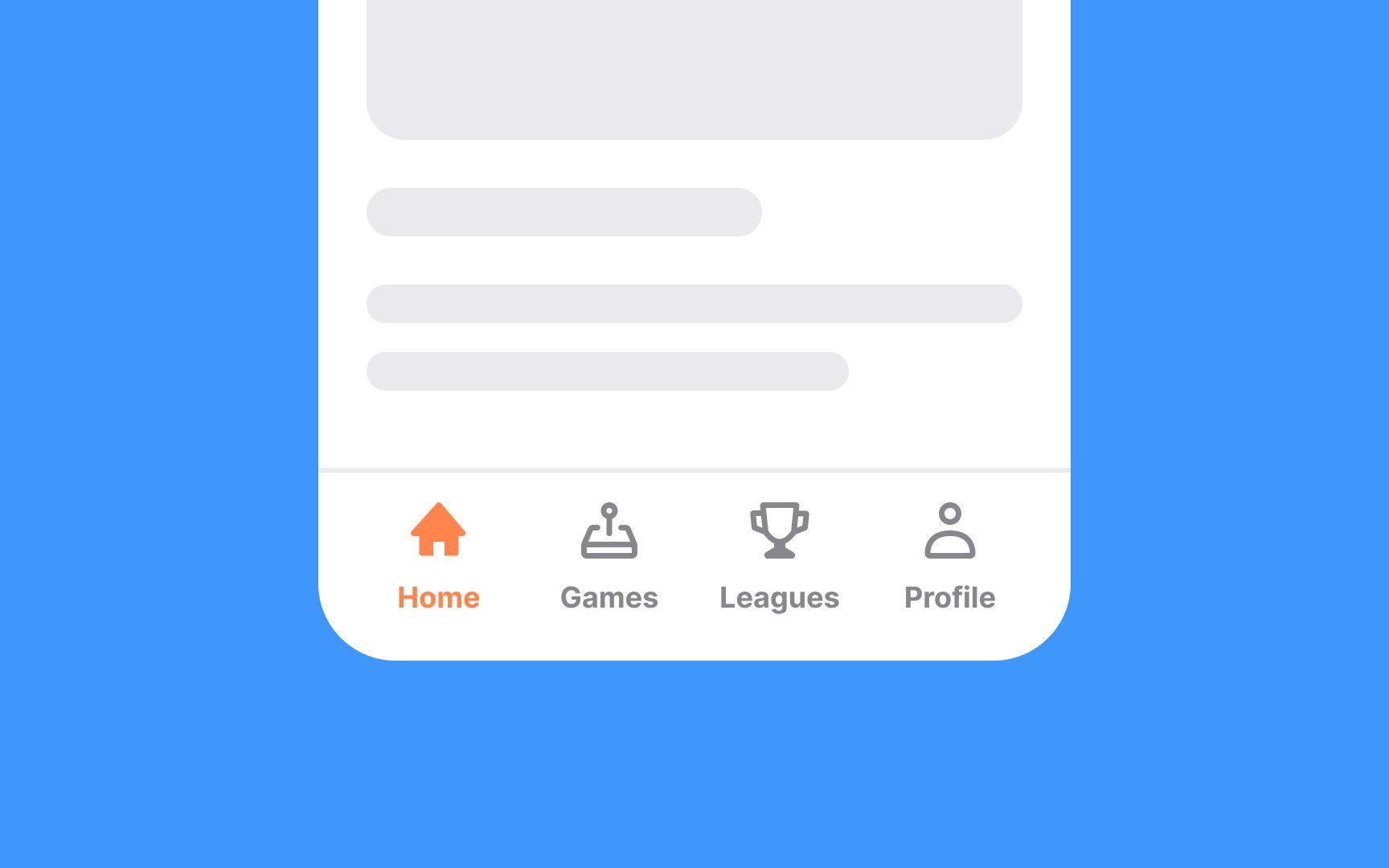
Labels should be short (1-3 words are usually best) and provide clear meaning to the icon. Action words are often best, telling users what will happen when they interact with the icon, such as "search" or "learn".

Exercise #4

Maintain icon consistency

When designing or selecting icons for a project, it's essential to keep the design elements like corner sharpness, geometry, and shapes consistent. Consistency in these aspects helps users quickly recognize and understand the icons' functions, contributing to a smoother user experience. If you opt for sharp-cornered icons, maintain that style throughout all icons in the interface. Mixing styles, like having some icons with rounded corners and others with sharp ones, can disrupt the visual flow and confuse users.

Uniform icon design not only makes the interface more intuitive but also reinforces brand identity. Users appreciate a well-curated visual language, making them more likely to engage with your interface comfortably.

Exercise #5

Stick to simple icons

Simple icons are often the most effective because they're easy to recognize and understand. When icons are small, as they often are in many interfaces, intricate details can get lost or make the icon harder to interpret. So, when in doubt, lean toward minimalism to keep the user experience fluid and intuitive.

However, there are cases where detailed icons have their place. For instance, in a large-scale display or specialized applications where the icon represents a complex action or concept, added detail can provide extra context or clarify its purpose. But even then, it's crucial to balance detail with readability.

Exercise #6

Place icons in consistent containers

Placing icons in containers offers a framework that ensures visual consistency across your design. The containers, although invisible to users, act like an invisible grid, making it easier to align icons perfectly with other interface elements. Adding a bit of padding within the container gives each icon room to "breathe," ensuring that they don't look cramped or overwhelm users.

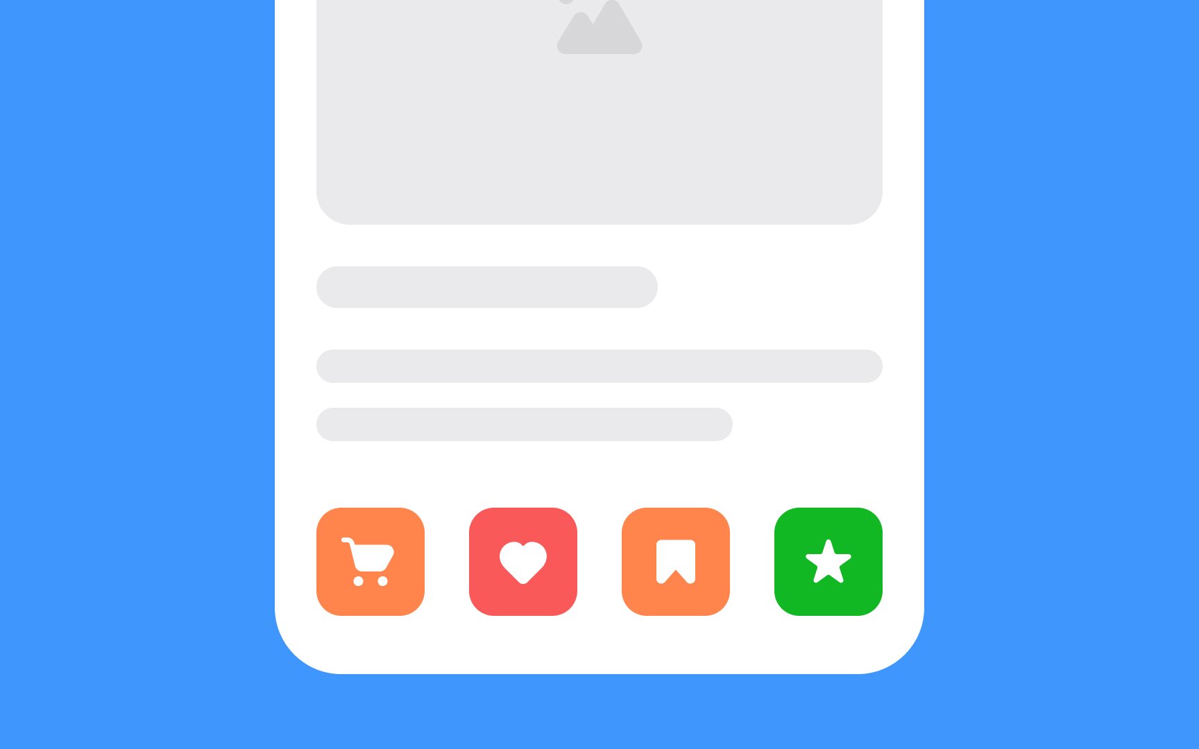
When multiple icons are placed near each other, it's crucial to use the same-sized containers for each. This standardization aids in maintaining a harmonious layout, making it easier for users to scan and understand the interface. Even if the icons themselves differ in size or complexity, uniform containers create a level of consistency that enhances usability.

Pro Tip: Use same-sized containers for alignment but adjust icon scale to balance visual weight and maintain a harmonious layout.

Exercise #7

Ensure icons are easy to tap and click

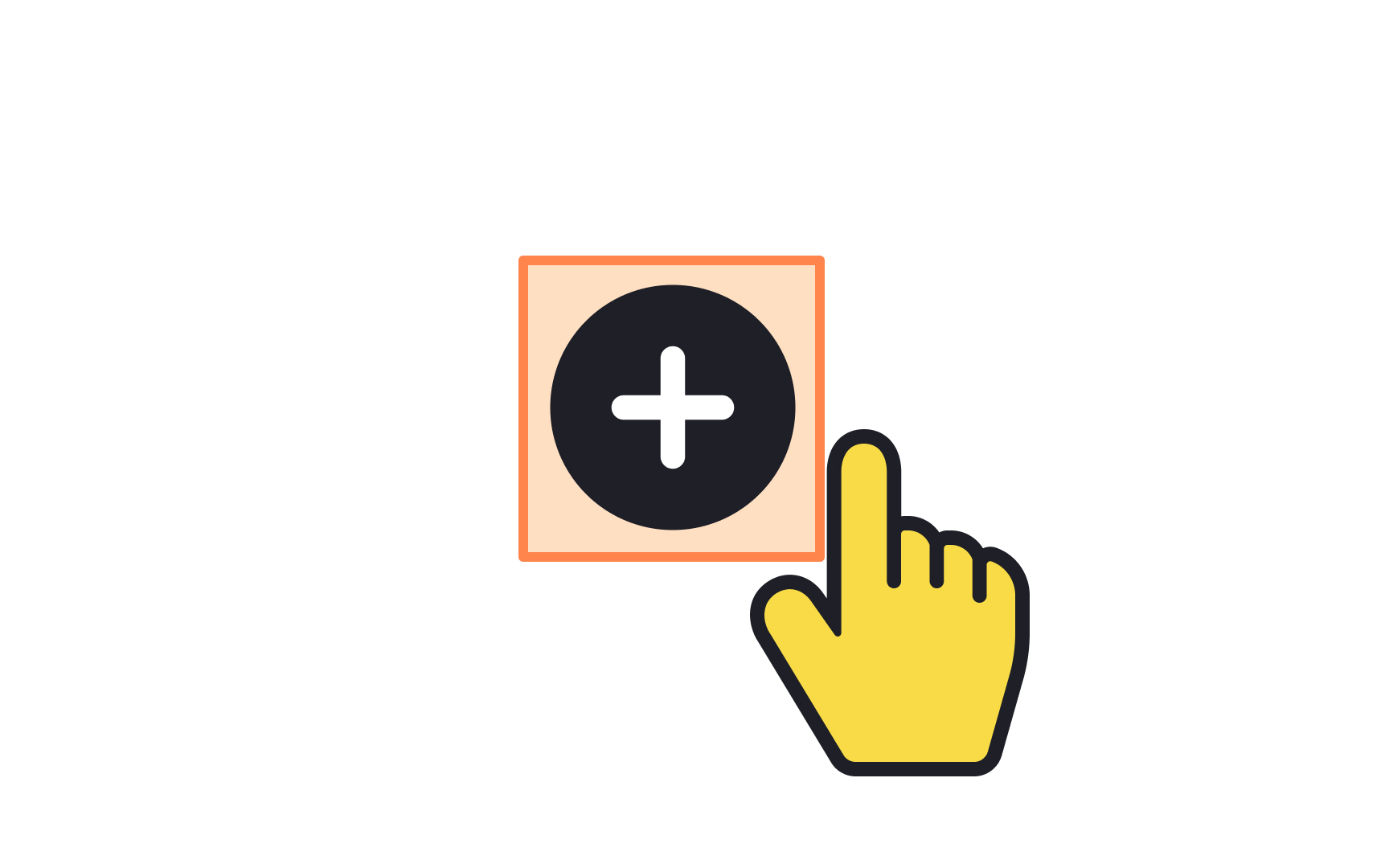
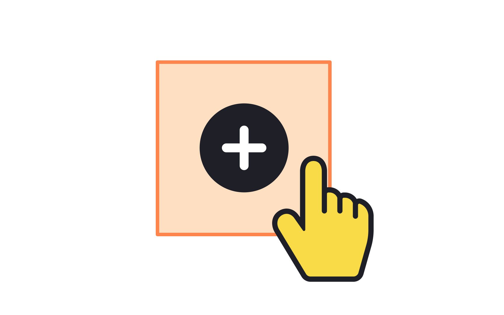
Touch targets play a pivotal role in shaping the user experience. When they're too small or crowded, users can find themselves tapping repeatedly out of frustration, and some might even conclude that the interface is faulty. A touch target is essentially the responsive area around an interactive element. To boost usability and accessibility, it's good practice to make this area larger than the visual element itself, offering a more forgiving tap zone, especially for users with motor impairments.

Material Design and iOS guidelines suggest a minimum touch target size—48x48px and 44x44px, respectively.[1] [2] These standards are a useful starting point to ensure that your interface is user-friendly and accessible to as many people as possible.

Exercise #8

Ensure your icons scale correctly

Not all icons are the same size. That’s why it’s important to keep icon scaling in mind when designing your icon set. Smaller size icons fit fewer details while larger icons can include more detail.[3]

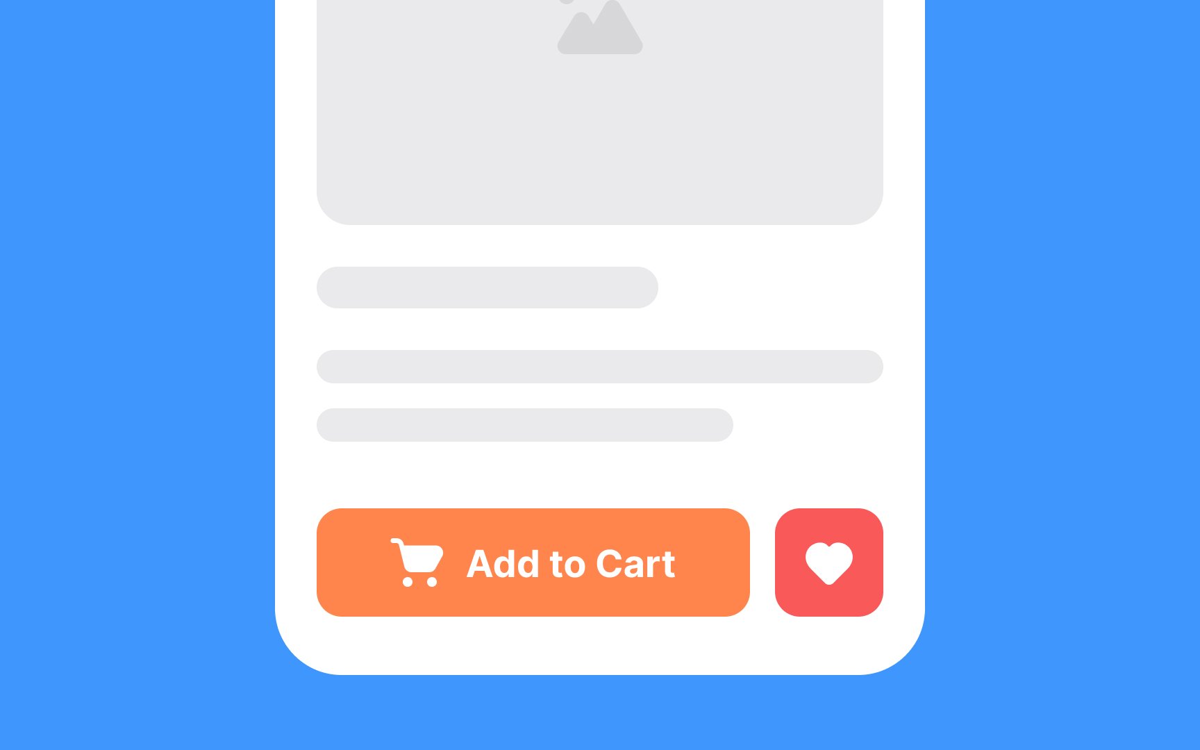
Design your icons in multiple sizes whenever possible, with each slightly more detailed than the previous one. Smaller icons can also be wrapped in larger containers to give them more visual weight without increasing their size.

Exercise #9

Balance out icons visually

When designing a set of icons, it's crucial to consider not just their actual dimensions but also their visual weight. Some icons, like a YouTube logo, may have complex designs or bold colors that make them appear more prominent, even when they occupy the same-sized container as simpler icons.

To create a balanced, user-friendly interface, you may need to adjust the scale of such icons within their containers. The goal is not strict dimensional consistency, but rather a harmonious visual rhythm that enhances usability. It's all about making the icons feel visually "equal" to users, even if they technically aren't.[4]

Exercise #10

Use consistent colors for your icons

Maintaining color consistency in your icons is vital for a harmonious user experience. Typically, a single, standout color for important or active icons works well, alongside a different uniform color for the rest. This makes it easier for users to spot key functionalities without feeling overwhelmed. For example, an active icon in the bottom navigation bar might be in your brand's main color, while inactive icons could be a muted version of that same color or a neutral shade like dark gray.

The key is to choose colors that not only are consistent but also fit seamlessly within your interface's broader design palette. Inconsistencies in color can lead to user confusion, so once you've picked your palette, stick with it to ensure a cohesive and user-friendly experience.

Exercise #11

Leading icon

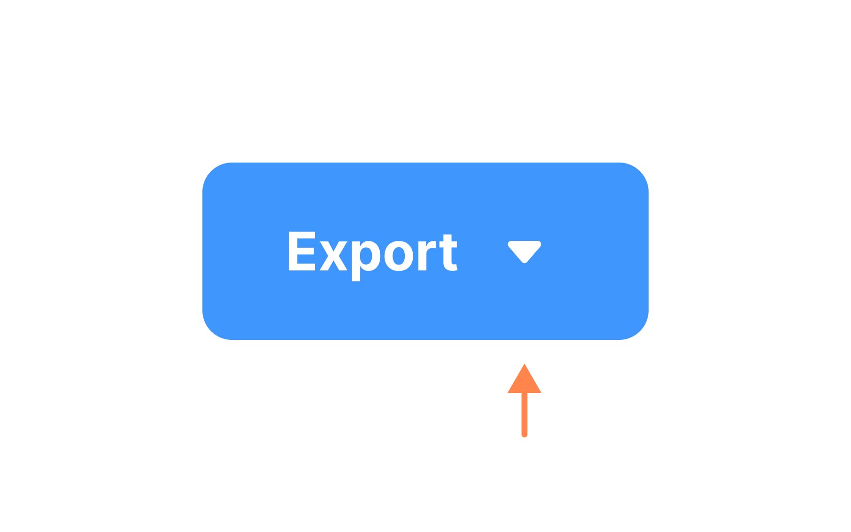
Within an interface, icons are often accompanied by labels or other text content. Icons that appear before the content are called leading icons. They add context to the element they’re contained within, such as clarifying the action of a button or the message contained in a notification.

Exercise #12

Trailing icon

Trailing icons are found after an element’s content. They’re generally interactive, triggering an action on nearby elements, such as showing or hiding a password or opening a dropdown menu. Be sure to use icons that are easily recognizable to help users figure out what the trailing icon's purpose is.

Complete this lesson and move one step closer to your course certificate