Trailing Icon
A trailing icon is a small graphic placed at the end of a UI element, such as a button or list item, to provide context, indicate actions, or reinforce meaning.


TL;DR
- An icon placed at the end of a UI element.
- Adds clarity, context, or secondary actions.
- Common in menus, lists, and buttons.
- Supports quick recognition and usability.
Definition
A trailing icon is a UI component positioned at the end of an element, often a button, list item, or text field, to signify additional context, an action, or a state.
Detailed Overview
Trailing icons are subtle yet powerful tools for improving clarity in digital interfaces. By placing an icon at the end of a UI component, designers reinforce meaning or indicate that additional functionality is available. For instance, a list item with a trailing arrow communicates that it can be expanded or navigated to another screen.
A common question is how trailing icons differ from leading icons. Leading icons appear at the beginning of an element and are often used for primary identification, like a folder icon at the start of a file name. Trailing icons, on the other hand, suggest supplementary information or actions. They do not define the element itself but extend its meaning or indicate next steps.
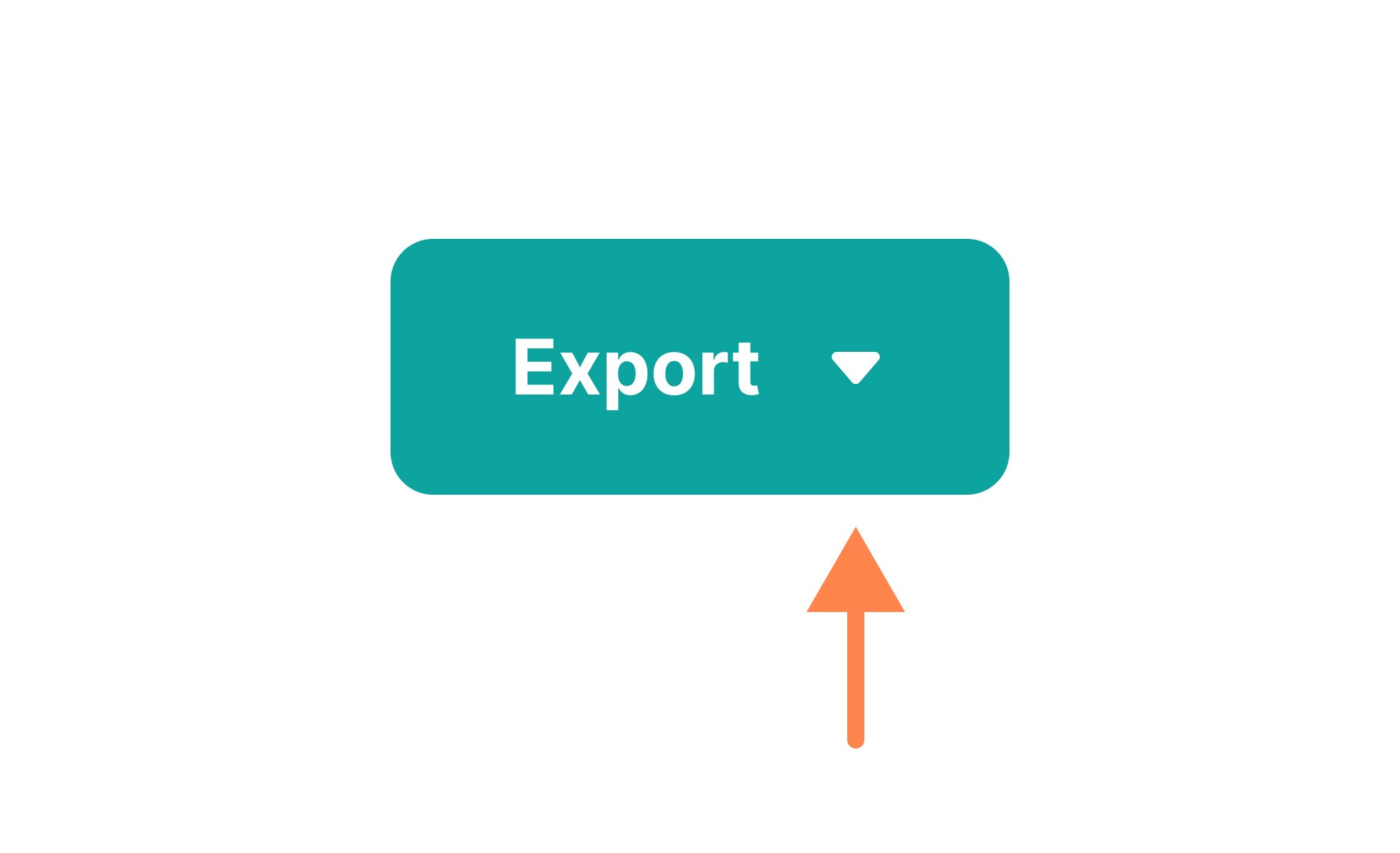
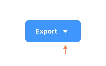
Another frequent query relates to use cases. Trailing icons are widely used in navigation menus, buttons, and lists. For example, a “Download” button may feature a trailing arrow pointing downward, reinforcing the action. In text fields, trailing icons often provide utilities like a clear button (X) or a password visibility toggle (eye icon). These help users perform secondary actions without cluttering the interface.
Designers must be careful with clarity. Trailing icons should be universally recognizable or supported by tooltips to avoid confusion. Overuse or vague symbols can overwhelm users or create uncertainty. For example, using an arrow icon inconsistently, sometimes for navigation, sometimes for dropdowns
Accessibility is also a key concern. Trailing icons should include descriptive labels for screen readers and maintain sufficient size and contrast for visibility. Icons that act as buttons must be keyboard-accessible. Without these considerations, trailing icons risk excluding users from important actions.
Finally, trailing icons support efficiency. By signaling functionality directly within an element, they save users from hunting for secondary actions elsewhere. This improves speed, reinforces patterns, and enhances the overall user experience.
Learn more about this in the Trailing Icon Exercise, taken from the Intro to Icons in IU Lesson, a part of the Intro to Icons in UI Course.
Leading icons appear at the start of an element and help identify it, like a document icon before a file name. Trailing icons appear at the end, adding context or secondary functionality.
Together, they balance recognition and usability within components.
They often indicate navigation (arrows), secondary actions (clear buttons), or states (visibility toggles). They are common in menus, lists, buttons, and input fields.
This helps users understand at a glance what actions are possible.
In some cases, yes, if the icon is universally recognized, like an arrow or a close symbol. But in many contexts, pairing them with labels or tooltips improves clarity.
Text support prevents ambiguity, especially for less common symbols.
They must include descriptive labels for screen readers, be keyboard-navigable, and maintain sufficient size and contrast. Without accessibility support, they may exclude some users.
Inclusive design ensures icons communicate meaning to all audiences.
Yes, they improve usability by signaling secondary actions directly within components. Instead of searching menus or guessing, users instantly understand available actions.
This reduces friction, speeds up interaction, and builds confidence in the interface.
Recommended resources
Courses

UX Design Foundations


UI Components I


Design Terminology

Lessons
Intro to Icons in UI
Icon Terminology
