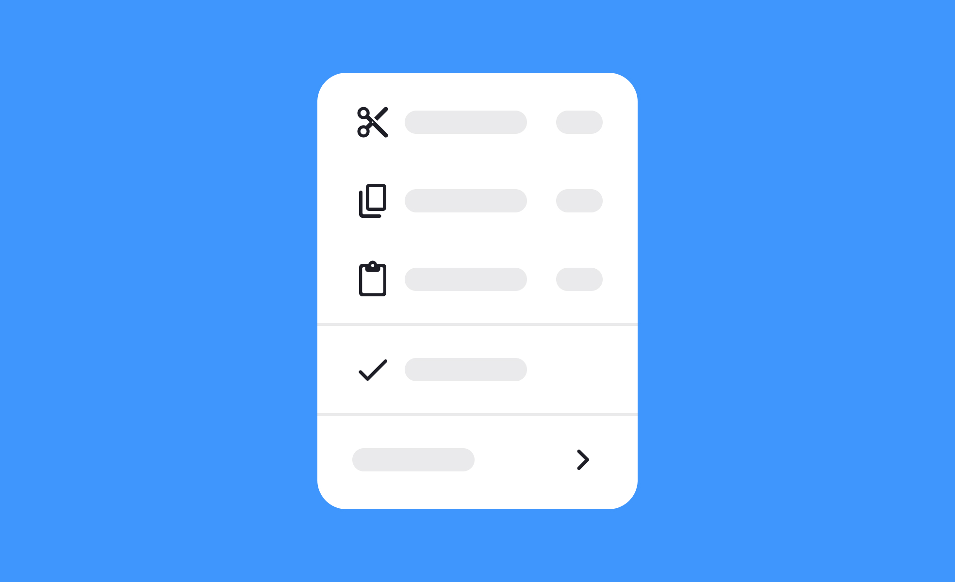
Icons
Icons are simplified visual symbols used in digital interfaces to represent actions, objects, or ideas, helping users navigate quickly and understand functions.


TL;DR
- Small graphical symbols that convey meaning instantly.
- Used for navigation, actions, and reinforcing hierarchy.
- Reduce text reliance and speed up user interactions.
- Require consistency and testing for clarity.
Definition
Icons are small, symbolic graphics used in digital interfaces to represent functions, objects, or concepts, providing quick recognition and reducing the need for lengthy text.
Detailed Overview
Icons are one of the most familiar building blocks in digital design. They provide compact visual cues that help users complete tasks without reading long instructions. For example, the gear icon is almost universally understood as a settings menu, while a magnifying glass suggests search. These symbols save space and improve scannability, especially in mobile and compact layouts.
A common question is how icons differ from broader iconography. Iconography refers to the entire system of icons, including style rules and libraries, while icons are the individual assets themselves. A shopping cart symbol on an e-commerce site is an icon, while the full set of shopping, account, and navigation symbols forms part of the product’s iconography. This distinction matters when building design systems, as consistency across icons is as important as the clarity of each symbol.
Designers and teams often ask whether icons should replace text. While icons speed up recognition, they can also be ambiguous when used alone. An arrow could mean “forward,” “back,” or “download” depending on context. That is why most usability experts recommend pairing critical icons with short text labels, particularly for new or global users. Over time, users may learn icons well enough to rely on the symbols, but text support ensures clarity from the start.
Another frequent question concerns scalability. Icons must be legible at multiple sizes, from small buttons on a mobile app to larger placements on desktop dashboards. Vector formats like SVG are preferred because they scale without losing quality. Consistency in line weight, padding, and grid alignment ensures that icons look balanced across the interface, regardless of size.
Icons also raise questions about testing and validation. Even widely recognized icons can be misinterpreted in certain contexts. For example, a star might signal “favorites” in one product but “ratings” in another. Quick usability tests, where participants explain what they think an icon means, reveal whether the design communicates effectively.
Learn more about this in the Intro to Icons in UI Lesson, a part of the UI Components I Course.
Icons are minimalistic, functional graphics designed to convey meaning quickly. They strip details down to their simplest form so they can be recognized instantly, even at small sizes. Illustrations, on the other hand, are more detailed and decorative, used to support storytelling or branding.
This distinction is important for usability. Icons guide actions, while illustrations enhance atmosphere or tone. Mixing the two without clear roles can confuse users about what is clickable versus decorative.
An effective icon is simple, consistent, and contextually clear. It should work at small sizes, remain legible in different environments, and feel aligned with the overall product style. Overly detailed or abstract icons often fail these tests, leaving users unsure of their purpose.
Design systems solve this by defining clear standards for icons, including stroke weight, padding, and alignment. Teams that follow these rules produce icons that feel professional and trustworthy.
The most direct method is usability testing. Showing users an icon and asking what they think it means provides immediate feedback. If interpretations vary too widely, the icon may need to be redesigned or paired with text.
Post-launch analytics also help validate effectiveness. If an icon is rarely used despite being prominent, it may not be communicating its purpose clearly. Continuous testing ensures that icons remain both intuitive and functional.
Recommended resources
Courses

Common Design Patterns


UX Design Foundations

UI Components I

Lessons


Projects
Uxcel Halloween Icon Pack

Waze: Playful Icon Transformations

Duolingo Halloween Icon Pack