Dropdowns
Dropdowns are interface components that reveal hidden options when activated, helping users navigate, filter, or select choices in compact digital spaces.


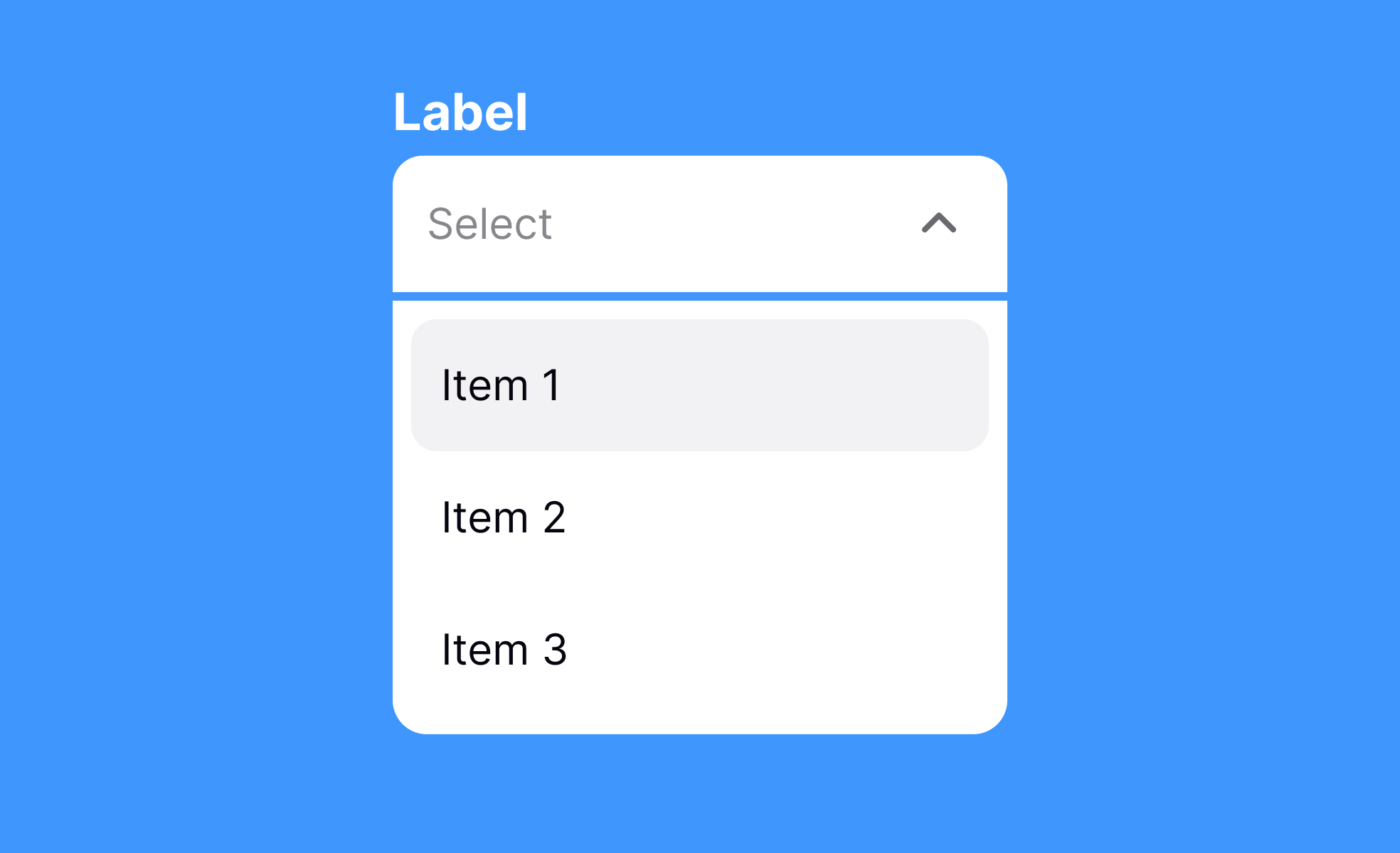
Dropdowns are one of the most common UI elements, used to present multiple choices without overwhelming screen real estate. They hide content until triggered, making interfaces cleaner and more efficient. From selecting a country in a form to filtering products in an e-commerce store, dropdowns balance functionality with space-saving design.
In UX, dropdowns reduce clutter but must be used carefully. Long lists can frustrate users, especially on mobile devices where scrolling through dozens of options is tedious. Designers often use autocomplete within dropdowns to improve usability. This hybrid approach, seen in Google’s search suggestions, makes selection faster and reduces errors.
From a product management perspective, dropdowns affect workflows and user experience metrics. Poorly designed dropdowns can lead to drop-offs in conversion funnels, while optimized versions can streamline task completion. A well-known example is Facebook’s privacy settings, where dropdowns were simplified after user feedback revealed that hidden complexity discouraged engagement.
Dropdowns also support contextual filtering. In dashboards, dropdowns help switch between time frames or data sets without cluttering the interface with multiple visible options. This keeps the design lightweight while giving users control.
However, dropdowns come with accessibility challenges. For screen reader users, improperly coded dropdowns can be confusing or even inaccessible. Adopting ARIA attributes and ensuring proper keyboard navigation helps mitigate these risks. Teams that prioritize accessibility often redesign dropdowns to behave more like native controls across devices.
Real-world design showcases how dropdowns can improve engagement. In booking systems, for example, carefully structured dropdowns let users select dates, times, or ticket types quickly. When tested against radio buttons, dropdowns often perform better in terms of space efficiency, but only when the options are limited and clearly defined.
Learn more about this in the Dropdowns Exercise, taken from the Designing Mobile Selection Controls Lesson, a part of the Mobile Design Course.
Key Takeaways
- Dropdowns save space by hiding multiple options.
- Useful for filtering, selection, and navigation tasks.
- Long lists require autocomplete to improve usability.
- Poor design can hurt conversions and task success.
- Accessibility requires semantic markup and ARIA attributes.
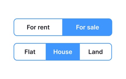
Dropdowns are inefficient when the number of options is small. For example, presenting only two or three choices is better done with radio buttons or toggle switches. Dropdowns add unnecessary clicks and obscure visibility of available options, reducing efficiency.
Usability studies confirm that clarity often trumps compactness. If options need to be visible at a glance, dropdowns may hinder rather than help.
Dropdowns can pose problems for users who rely on screen readers or keyboard navigation. If not implemented correctly, they may not announce available options or fail to respond to tab navigation. This creates barriers for visually impaired users.
Teams mitigate this by adopting semantic HTML and ARIA roles. Properly coded dropdowns announce options clearly and allow smooth navigation, ensuring inclusivity.
Not always. For large data sets, a dropdown alone becomes unwieldy, forcing users to scroll through long lists. In such cases, a combination of dropdowns and search inputs provides the best of both worlds.
Autocomplete dropdowns, where users type and receive filtered options, often outperform plain dropdowns in terms of speed and satisfaction. This hybrid design is now common across modern applications.
Recommended resources
Courses

UX Design Foundations


Core UI Components


Design Terminology

Lessons

Common UI Components Part II

Types of UI Inputs & When to Use Them

Designing for Autism Spectrum Disorder

Projects

Skiyii Website Design Exploration


Dropdown UI - Light & Dark Mode


DailyUI #27 | Dropdown "Real Madrid"