UI Pickers & When to Use Them
Choose the right picker type for dates, times, and ranges based on how users will interact
Pickers handle one of the trickiest input types: dates and times. Users might need today's date, a birthday from decades ago, or a range spanning multiple months. No single picker design works for all of these. Modal calendars suit near-future selections. Input fields work better for distant dates. Scrolling pickers feel natural on touch devices. The wrong choice creates friction, whether that's endless scrolling through years or confusion about date formats.
Good picker design also prevents errors before they happen, disabling invalid options and showing clear feedback when a selection is made. Matching the picker to the use case makes the difference between a smooth interaction and a frustrating one.
According to Material Design guidelines,
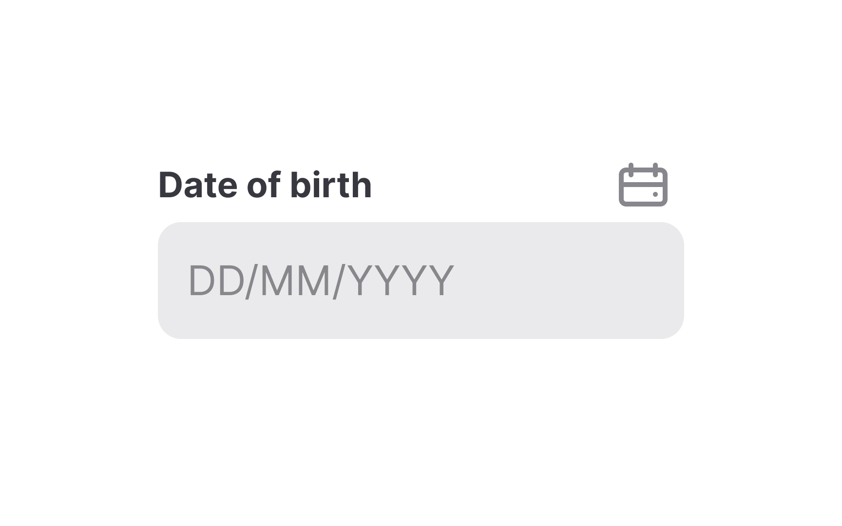
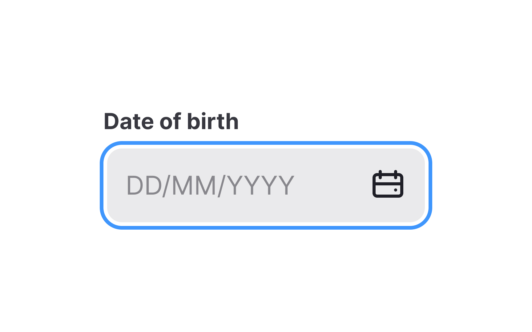
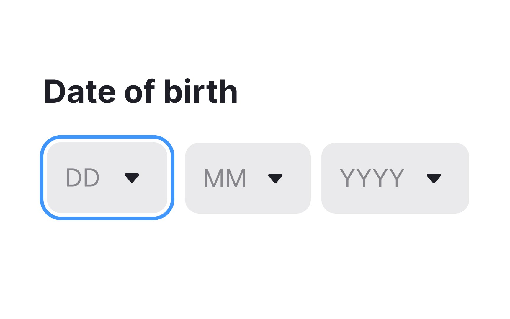
If your product caters to users internationally, make sure the date format is clear and understandable. Provide clear labels or placeholders that don't disappear once users activate the field.
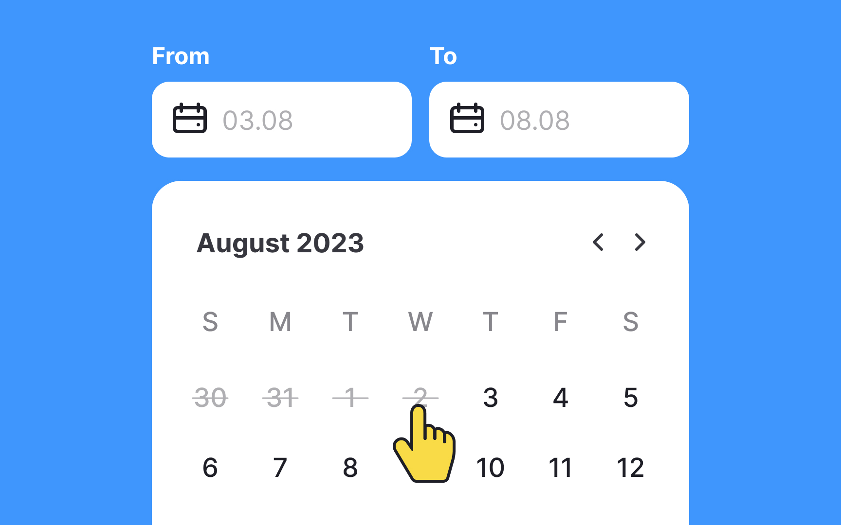
Modal date inputs provide the best solution for selecting a date that is well in the past (e.g., birthdate or passport expiration date) or the future. Users should also be able to pick a date from the calendar icon, but the primary
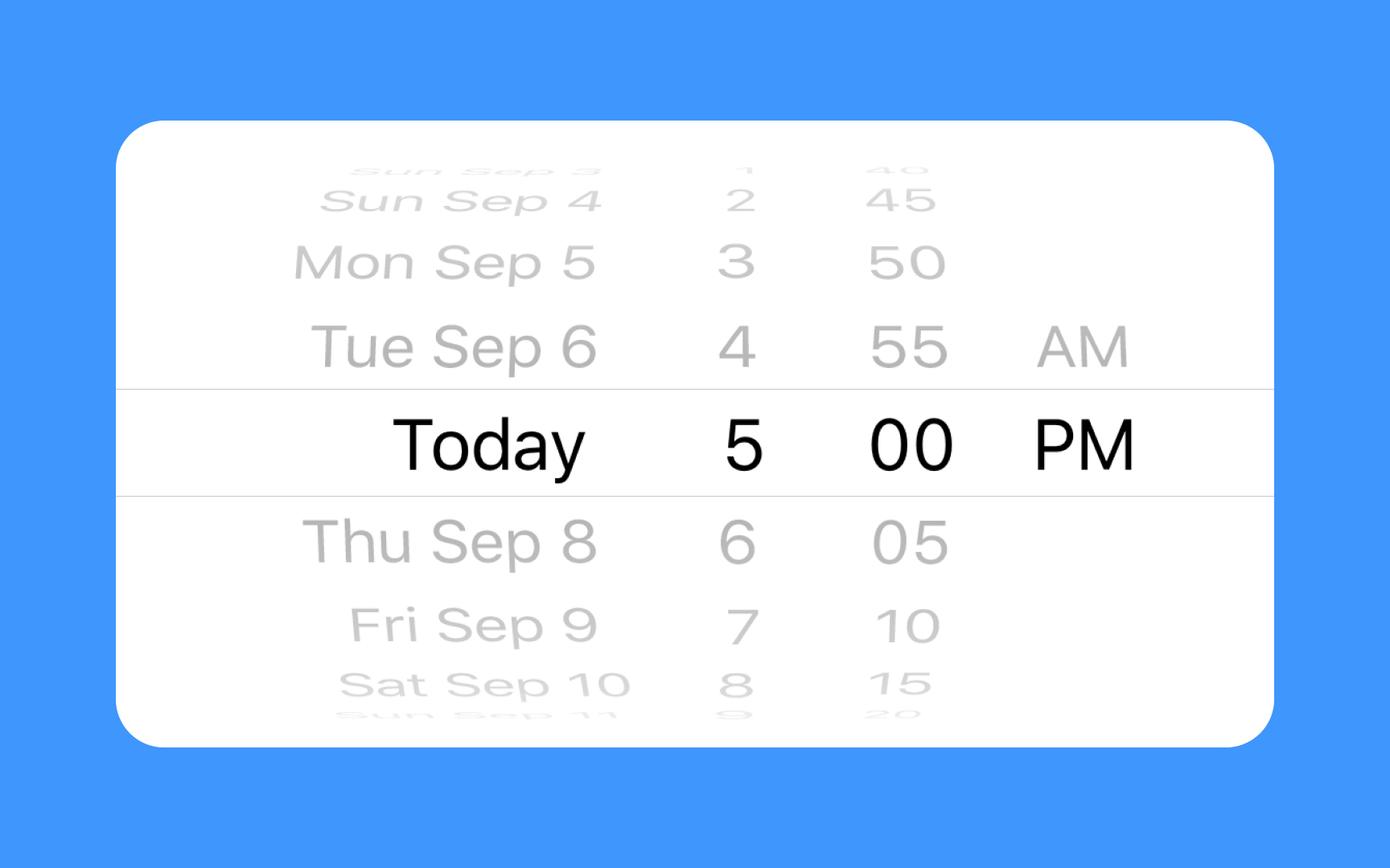
Scrolling date
Pro Tip: Make sure users don't have to scroll too far into the past or future to select their input date and/or time.
A
When users need to choose a date that is well in the past or future, this control can require too much effort. In such cases,
Pro Tip: When designing for booking, disable non-selectable date options.
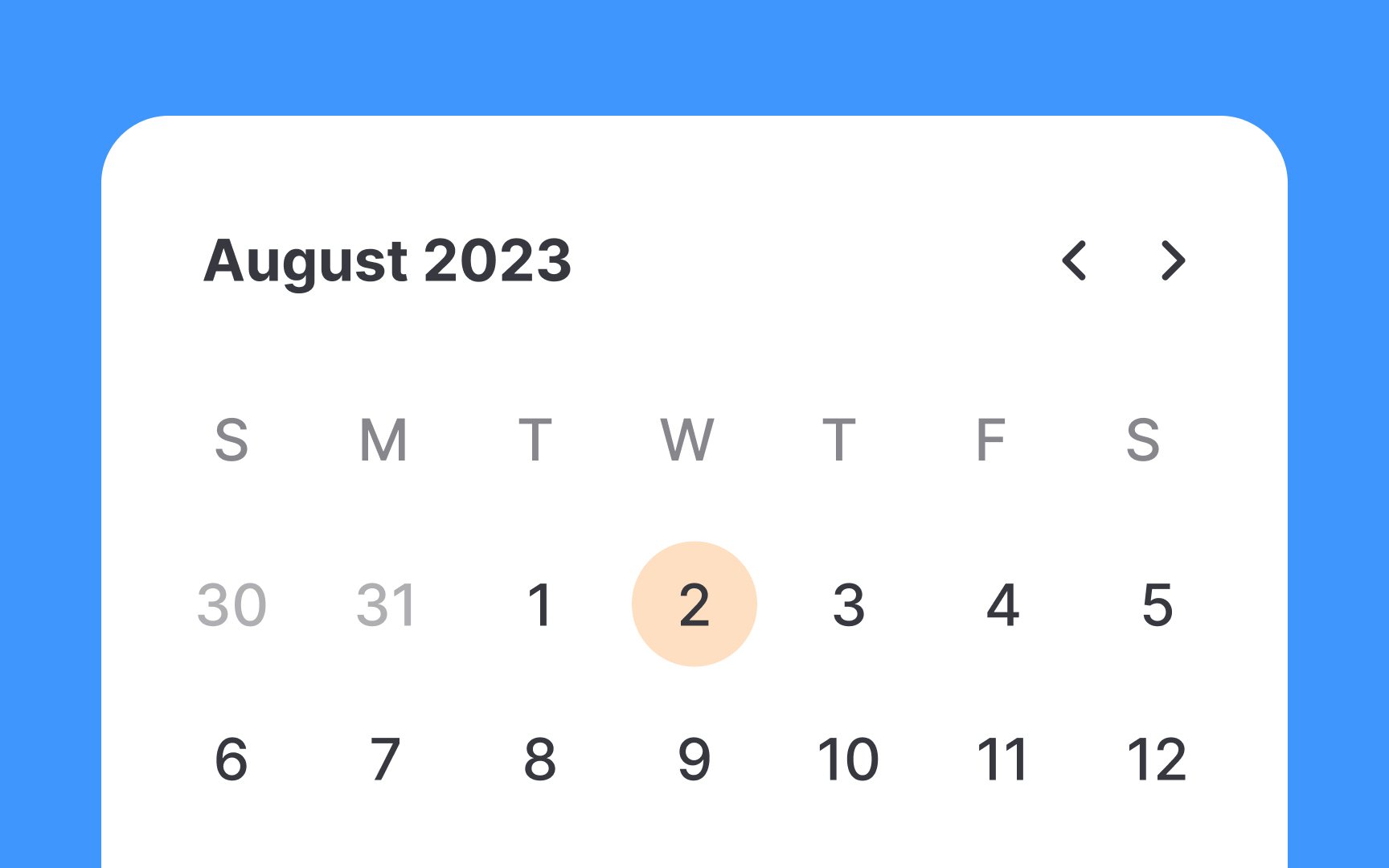
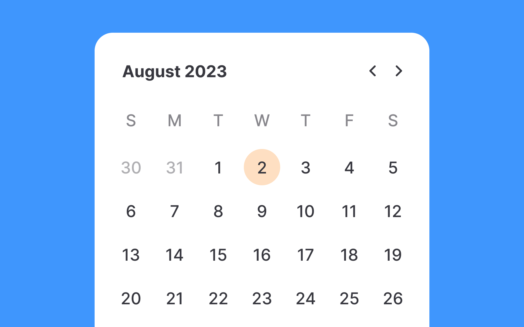
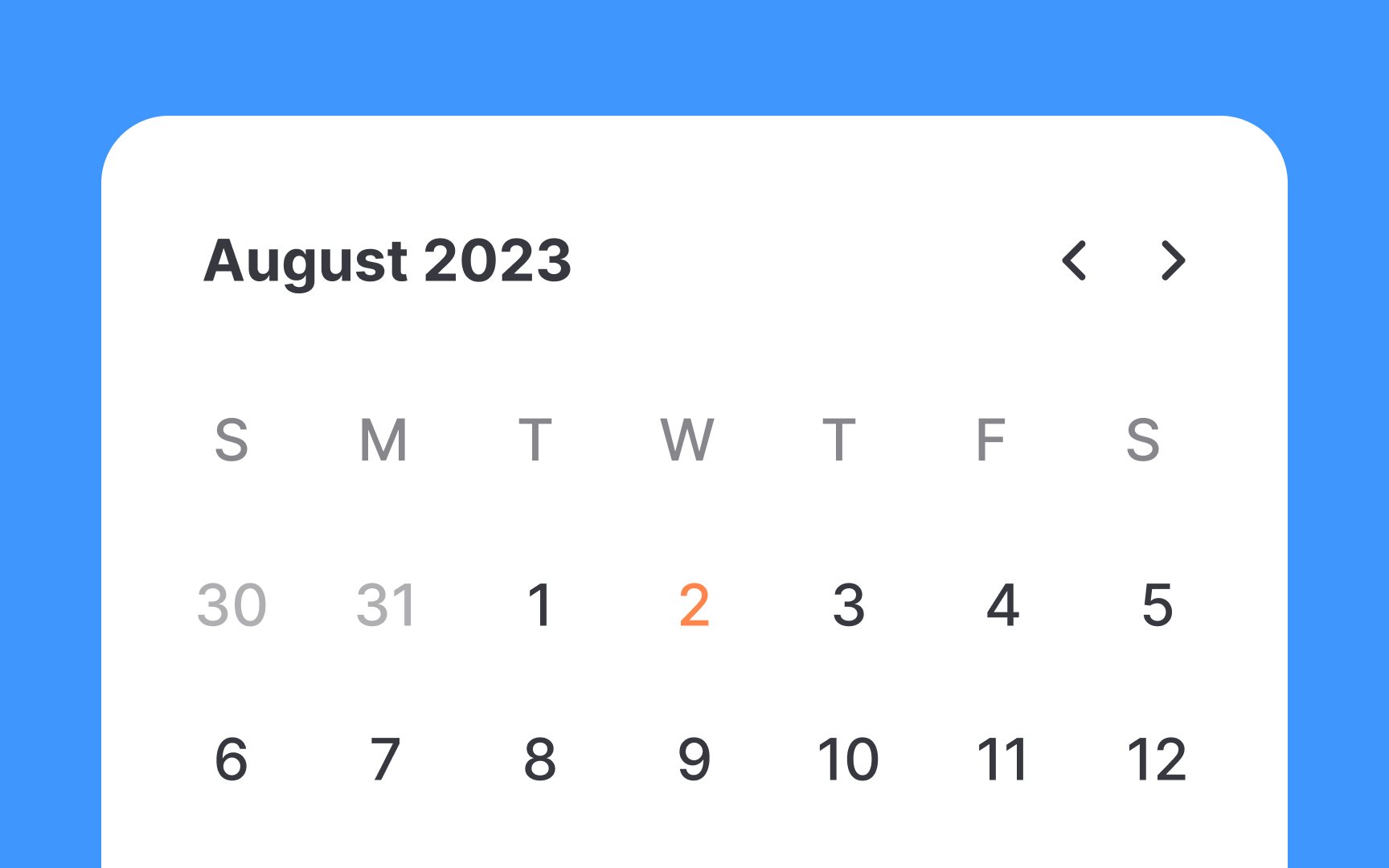
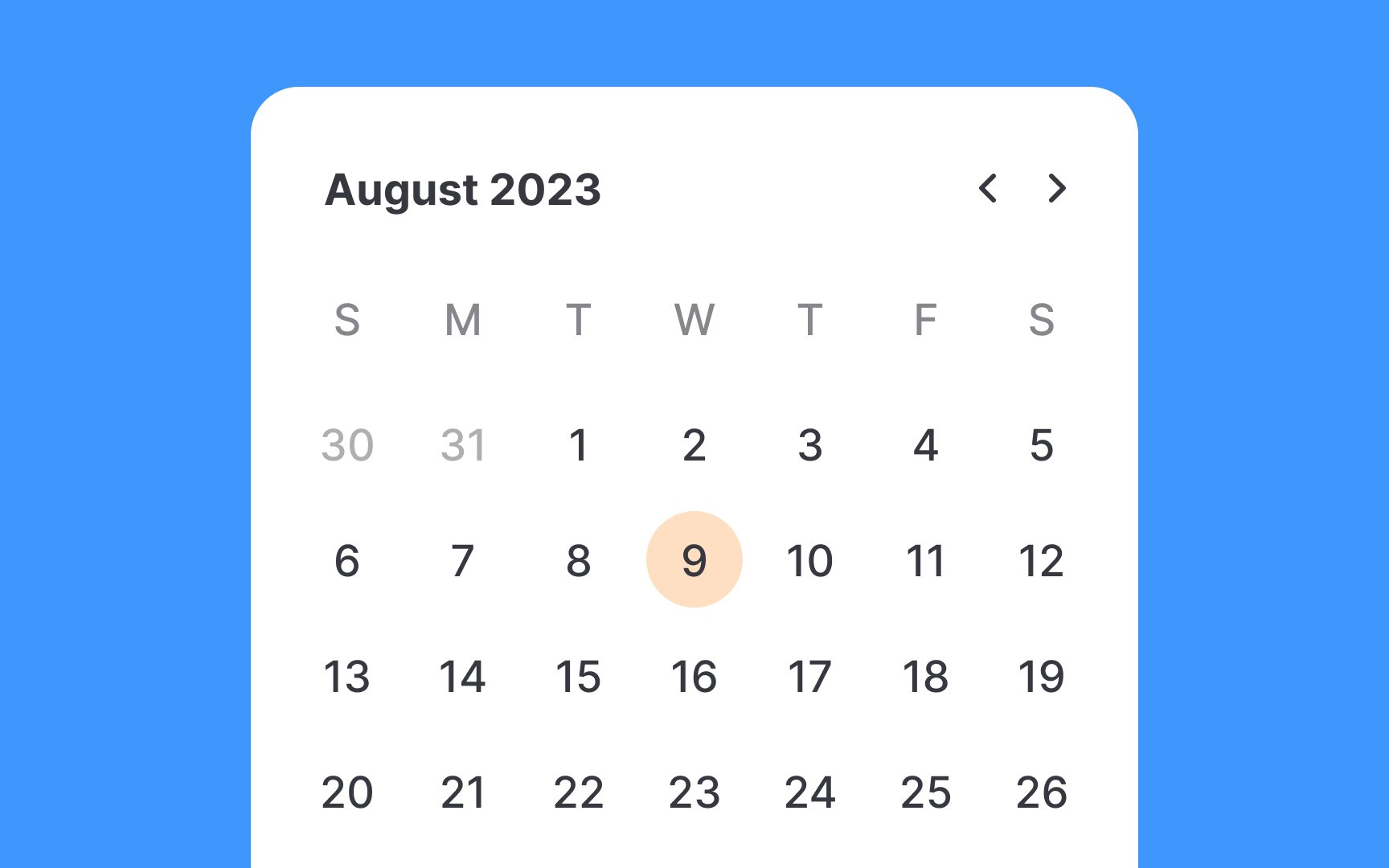
Indicating the current date in date
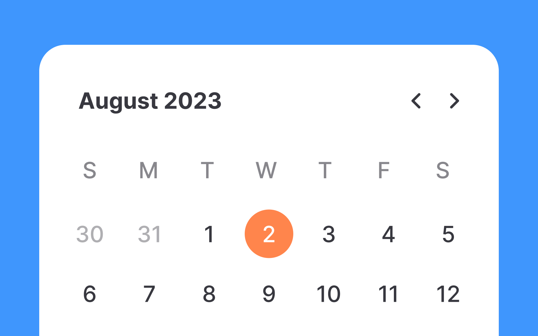
Highlighting a selected date in date
- Focus on user action: The selected date is the user's active choice and the interaction's focal point. It should stand out to confirm successful
input . - Avoid confusion: Over-emphasizing today's date can confuse users, making them think it's the selected date, especially during quick
navigation .
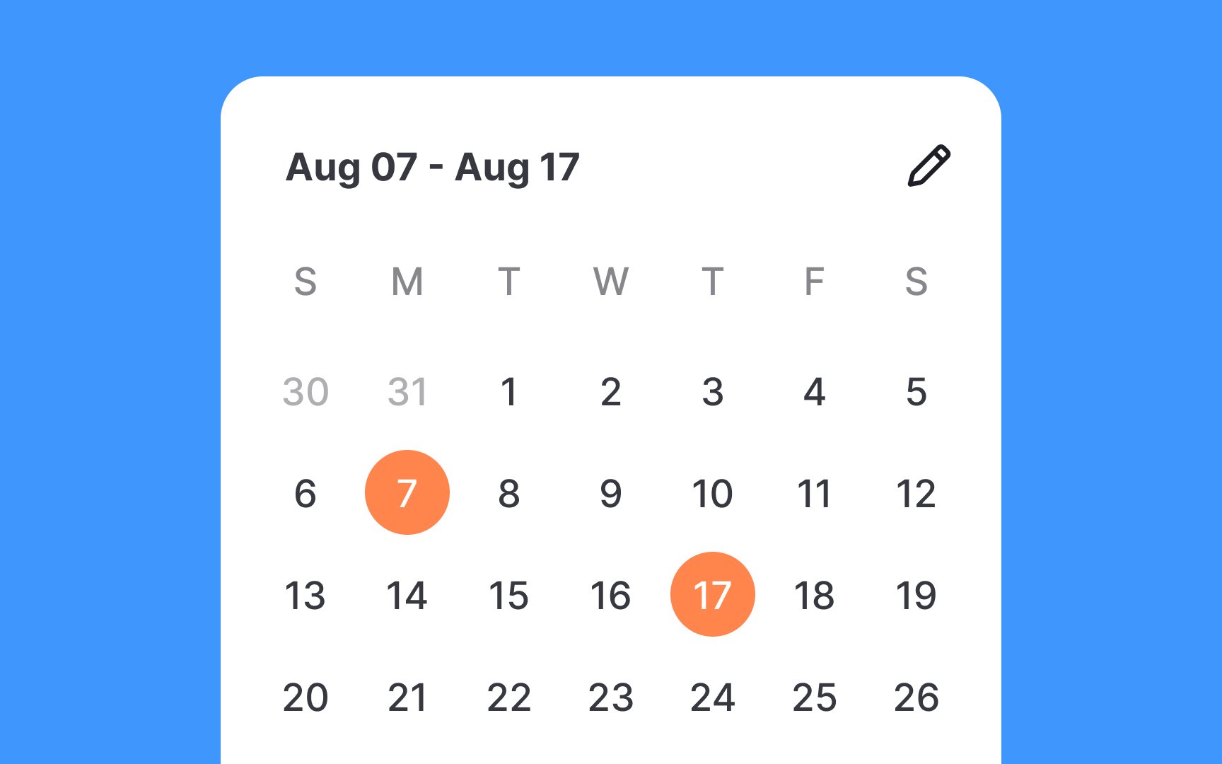
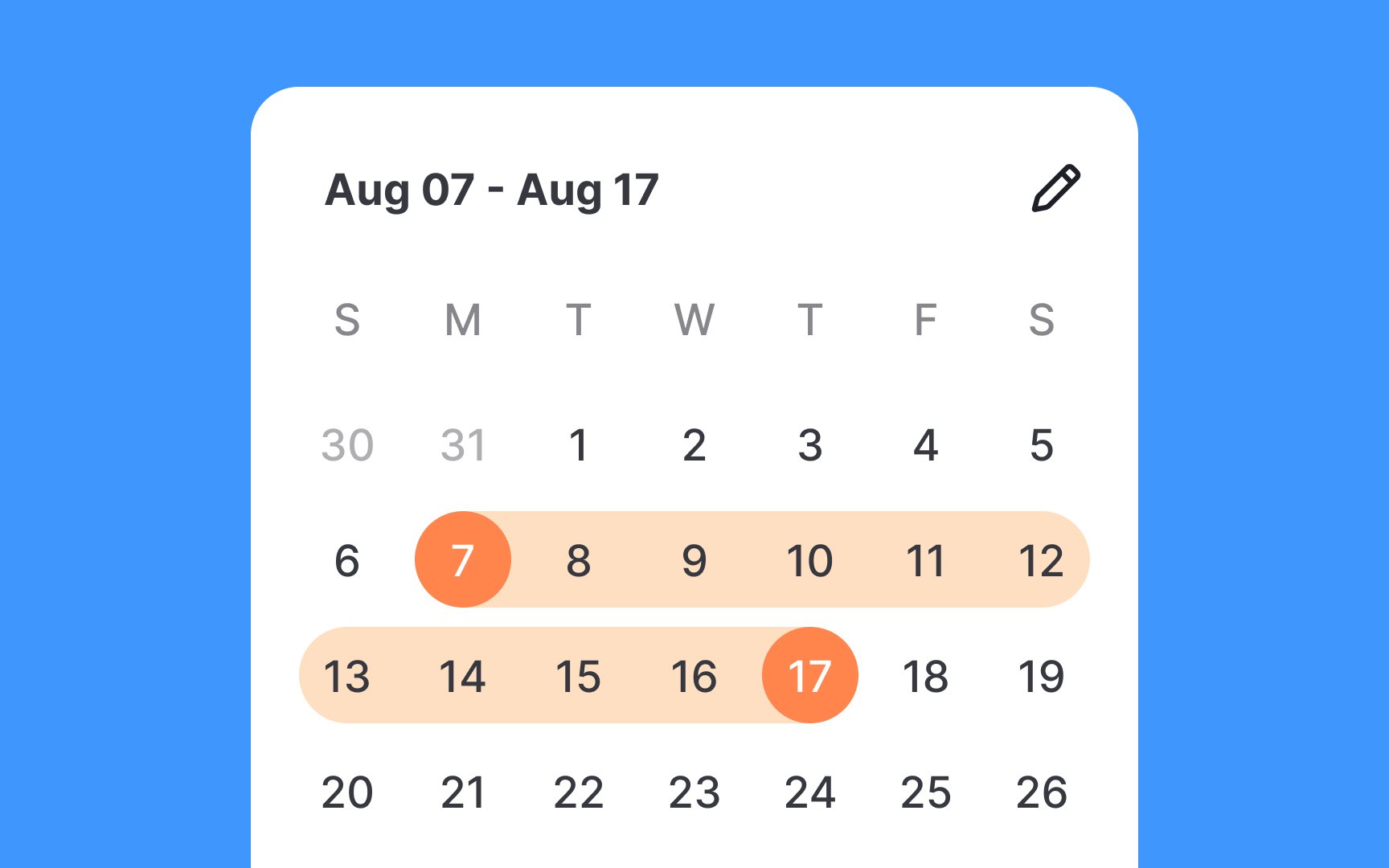
Use bright color overlays to distinctly highlight the first and last dates in the selected range. Additionally, employ a softer fill color between these dates to indicate inclusion in the range. This visual guidance is especially important for common
If the range spans multiple months, maintain visual continuity by extending the fill color across month boundaries. This ensures users can easily follow their selected range, even when flipping through different months, thereby reducing potential for
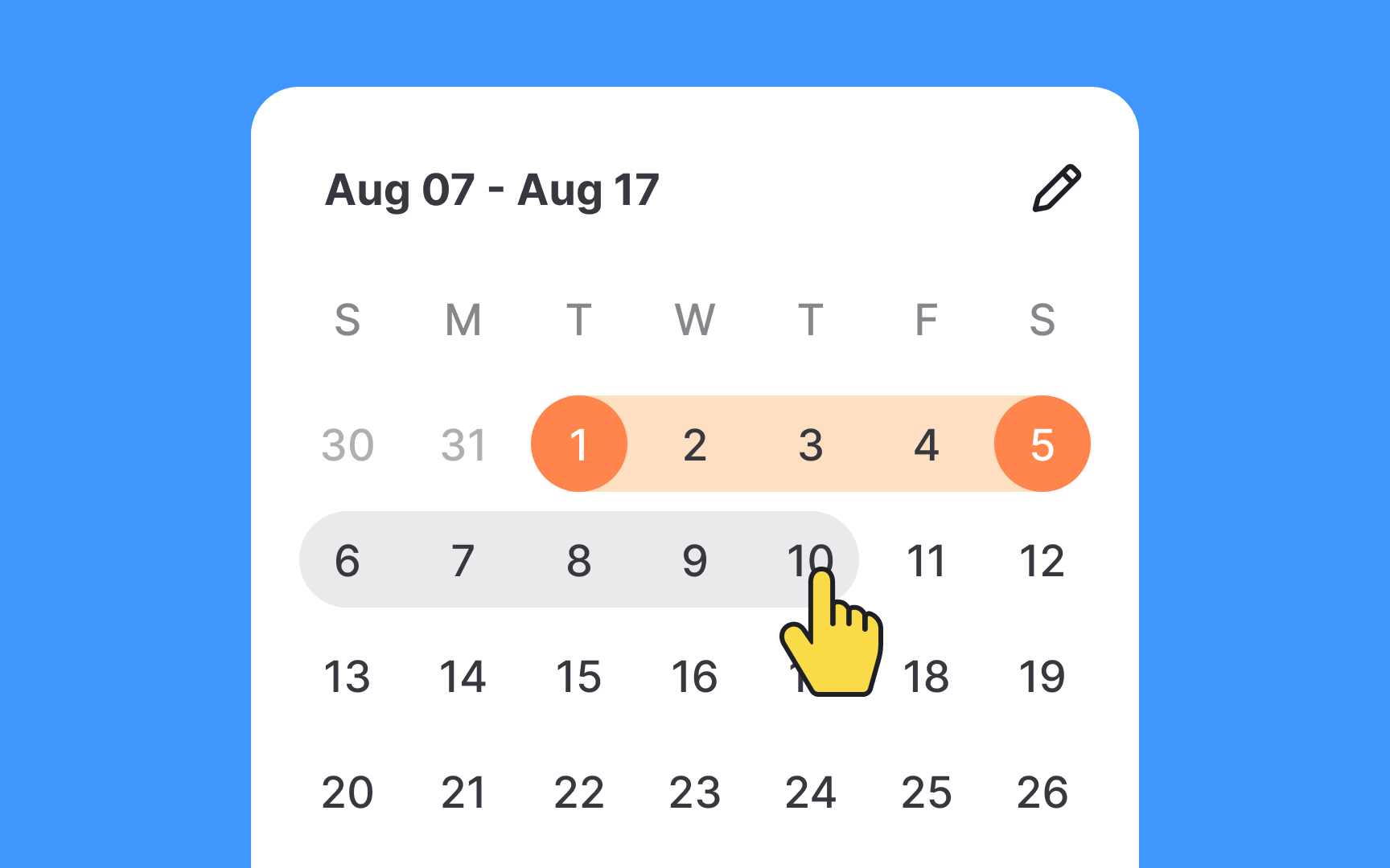
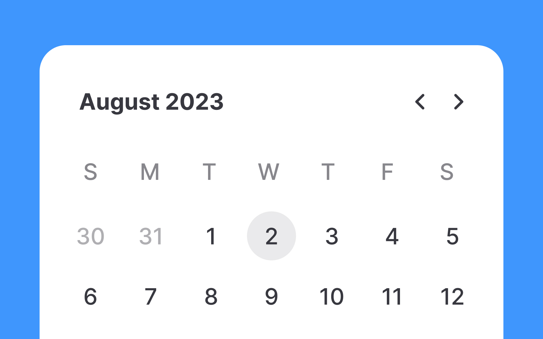
Utilizing a hover state in a calendar
Pro Tip: The hover state should differ from the selected state.
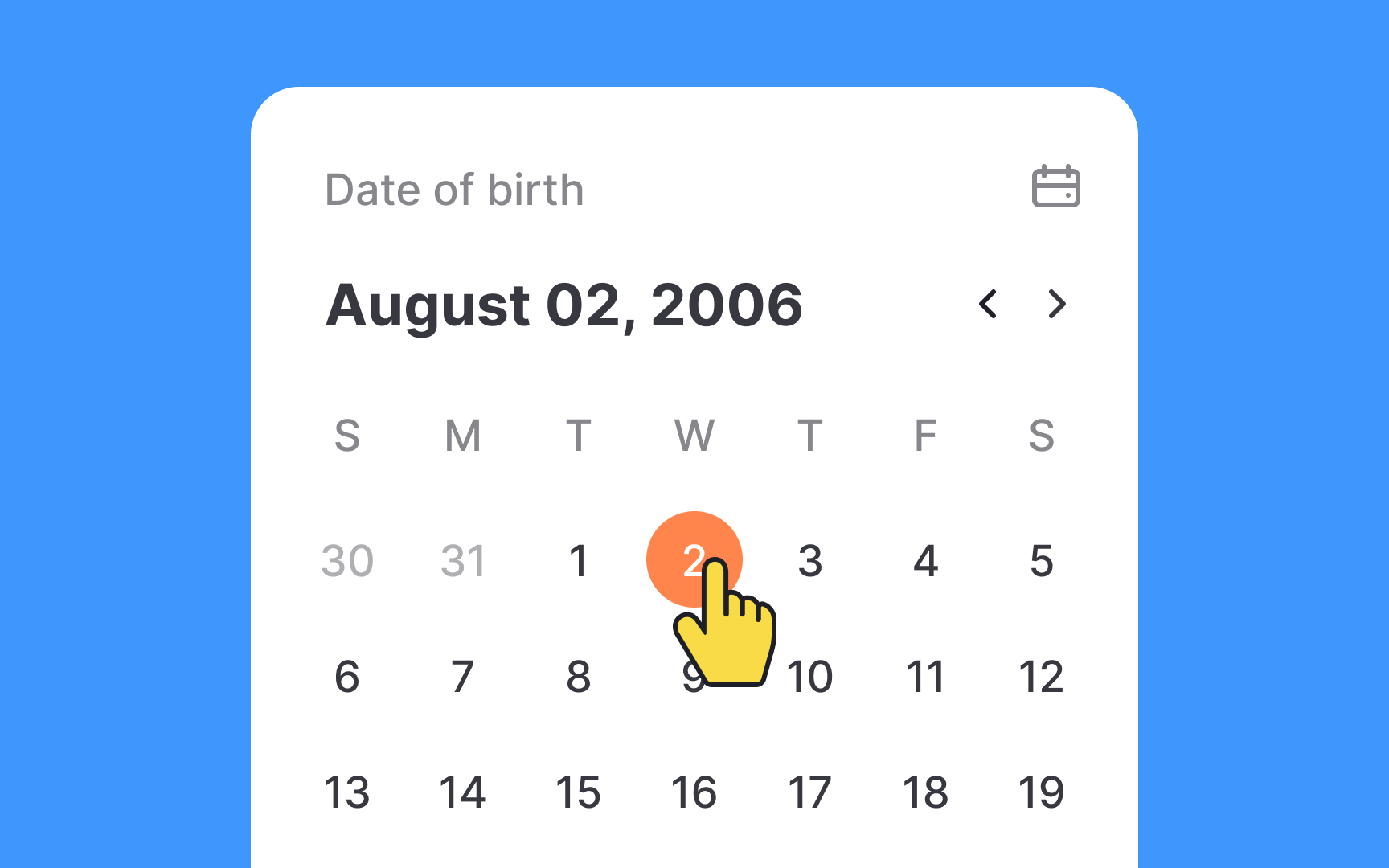

For selecting distant dates like birthdates, it's wise to use the traditional
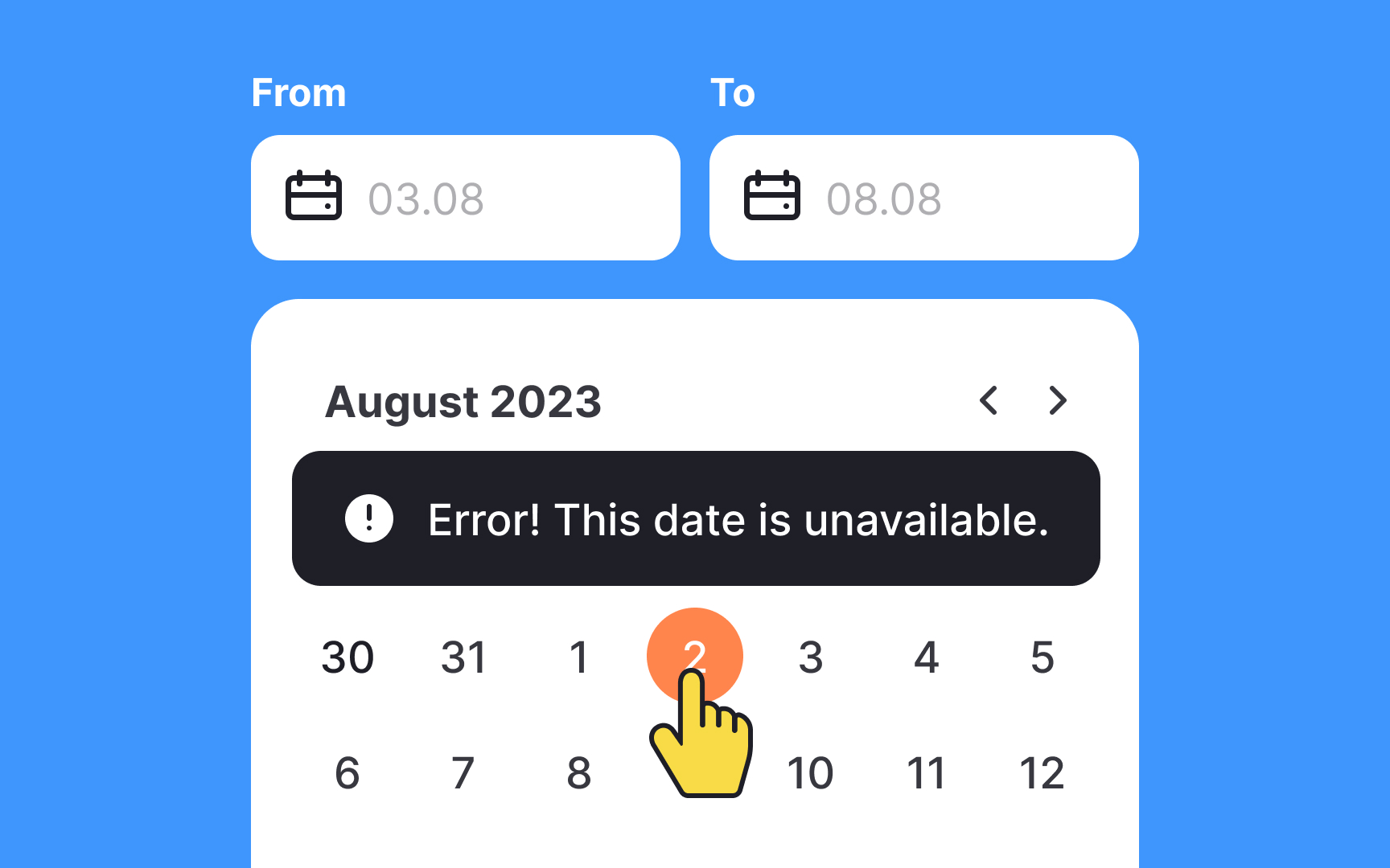
Users are never 100% focused on a task. So it's your responsibility to prevent them from accidental
One option to handle this situation is to provide a meaningful validation message indicating an error. A more effective method is to disable invalid and illogical options. It should be visually apparent that specific dates are unavailable. The most popular technique is using subtle grey or making dates inactive when users try to click or tap them.
Offering multiple methods for date selection enhances
However, designers should be cautious of potential
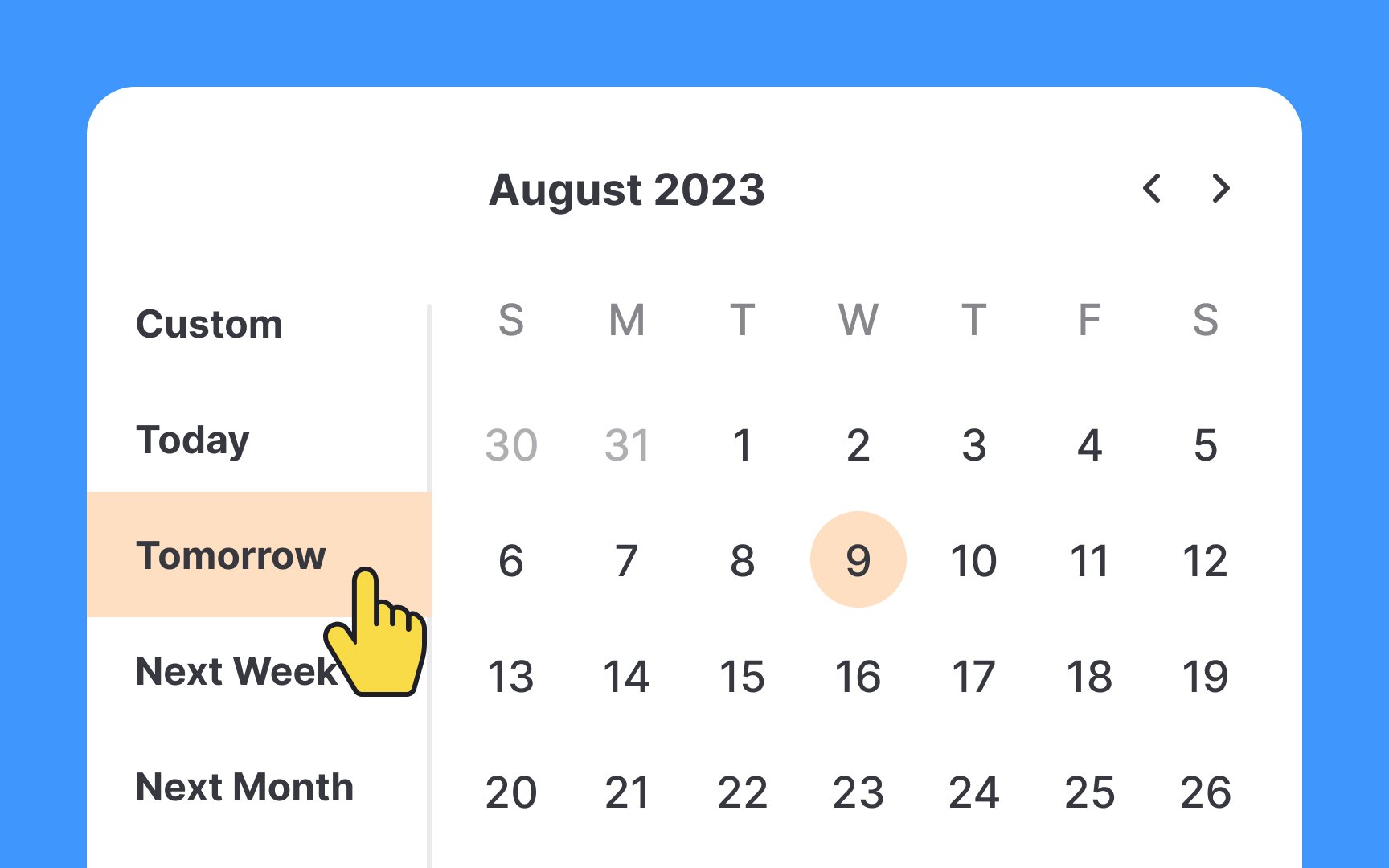
Sometimes, offering built-in date options like 'Today,' 'Tomorrow,' or '2 Weeks Ago' is more efficient than asking users to navigate a calendar. These quick options streamline the process and enhance
However, it's crucial to keep the list focused. Including only the most commonly used dates avoids overwhelming users with too many choices, making the experience more user-friendly and efficient.
References
- Date pickers – Material Design 3 | Material Design
- Date-Input Form Fields: UX Design Guidelines | Nielsen Norman Group
- Date pickers – Material Design 3 | Material Design
Top contributors


Topics
From Course

Share


Similar lessons

Common UI Components Part I

Image Terminology
