Pickers
Pickers are interface components that let users select values from a predefined range or list, commonly used for dates, colors, and other structured choices.


TL;DR
- UI components for selecting values.
- Used for structured inputs like dates or times.
- Improve accuracy by restricting options.
- Must balance flexibility with ease of use.
Definition
A picker is a user interface element that allows users to select a value from a set of predefined options, streamlining input and reducing errors in structured tasks.
Detailed Overview
Pickers are a core part of user interface design, providing a simple and structured way for users to make choices. Instead of requiring manual input, pickers constrain options to a fixed set, ensuring consistency, accuracy, and efficiency. Examples include date pickers in forms, time pickers for scheduling, and color pickers in design tools.
A frequent question is why pickers are so valuable. The main benefit lies in preventing errors. Freeform input often leads to inconsistencies, such as users typing dates in different formats. A date picker enforces a standard format and validates input automatically. This reduces friction for both users and systems, ensuring data is reliable and predictable.
Another query often raised is about picker usability. A well-designed picker should balance efficiency with clarity. For instance, scrolling wheels on mobile devices allow for quick adjustments, while dropdown-style pickers on desktop provide clarity for long lists. Poorly implemented pickers, however, can frustrate users, especially when the interaction requires too many steps or when lists are unnecessarily long.
Designers also ask about accessibility in pickers. Accessible pickers provide keyboard support, screen reader compatibility, and logical focus states. A time picker, for example, should allow users to type a value as well as select it visually. This flexibility ensures inclusivity for users with different abilities and preferences.
Pickers also play a role in personalization and efficiency. By tailoring default values to user context, designers reduce the number of steps required to complete a task. For instance, a travel booking site might preselect today’s date in a date picker, saving effort and speeding up interaction. Context-sensitive defaults make pickers more user-friendly without limiting choice.
Finally, product teams often wonder about the balance between pickers and freeform inputs. While pickers are great for structured data, they can feel restrictive for open-ended tasks.
Learn more about this in the Pickers Exercise, taken from the Designing Mobile Selection Controls Lesson, a part of the Mobile Design Course.
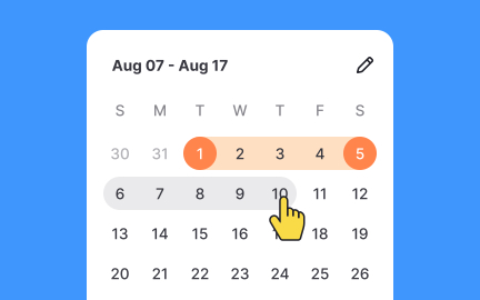
Pickers reduce errors by limiting user choices to predefined formats. For example, date pickers enforce consistency, avoiding confusion caused by multiple formats like MM/DD/YYYY versus DD/MM/YYYY.
This consistency benefits both users, who feel more confident, and systems, which can process data more reliably.
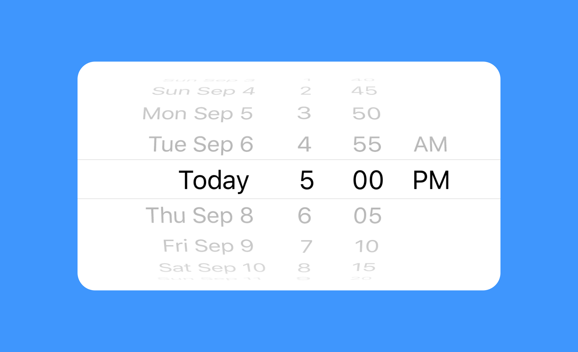
A good picker is intuitive, efficient, and tailored to the platform. On mobile, scrolling wheels are quick and touch-friendly, while dropdowns or calendars work well on larger screens.
Poor design choices, such as overly long lists, slow users down and reduce satisfaction.
Accessible pickers provide alternatives to visual selection, such as keyboard input or screen reader compatibility. They also maintain clear focus states and offer text-based input for flexibility.
This ensures that people with visual, motor, or cognitive impairments can still complete tasks effectively.
Default values reduce effort by anticipating user needs. For example, a meeting scheduler may default to the current date and nearest half-hour. While users can adjust, starting with a logical default speeds up interaction.
Thoughtful defaults minimize friction while maintaining choice.
Pickers are best for structured data, but they can feel limiting for open-ended tasks. For example, forcing a picker for text entry can frustrate users. In these cases, freeform input is more appropriate.
Balancing control with flexibility ensures users feel supported rather than constrained.
Recommended resources
Courses

UX Design Foundations


UI Components I


Design Terminology