Show a preview of the selected date range
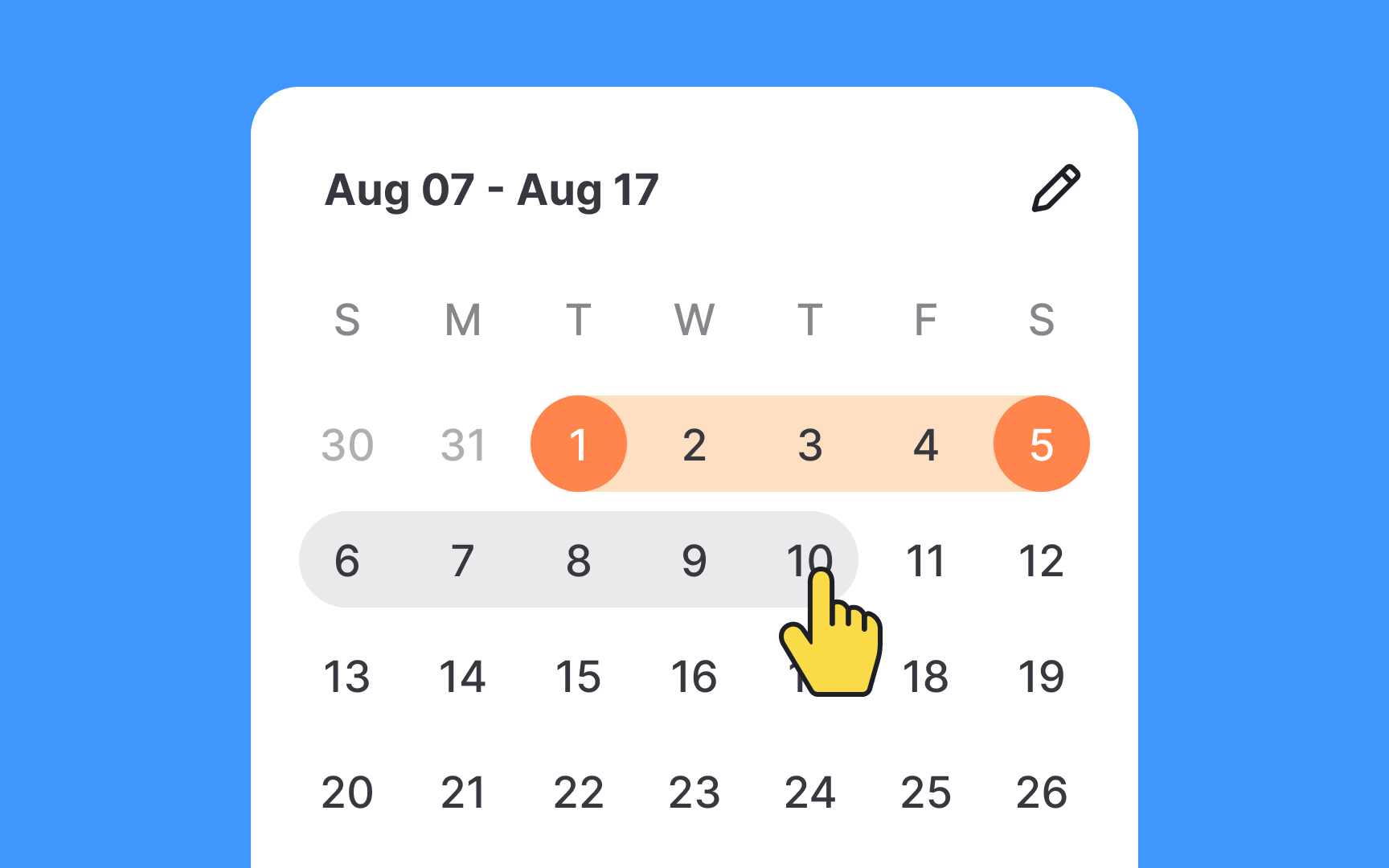
Utilizing a hover state in a calendar picker is beneficial for a seamless user experience. As users navigate through dates, the hover state shows a preview of how the selection range will change, offering valuable real-time feedback. This feature not only serves as a location guide but also enriches the interaction, making it more engaging. By visually communicating what will happen before users make a selection, you increase their confidence in the interface, ultimately enhancing overall satisfaction.
Pro Tip: The hover state should differ from the selected state.
