<?xml version="1.0" encoding="utf-8"?>

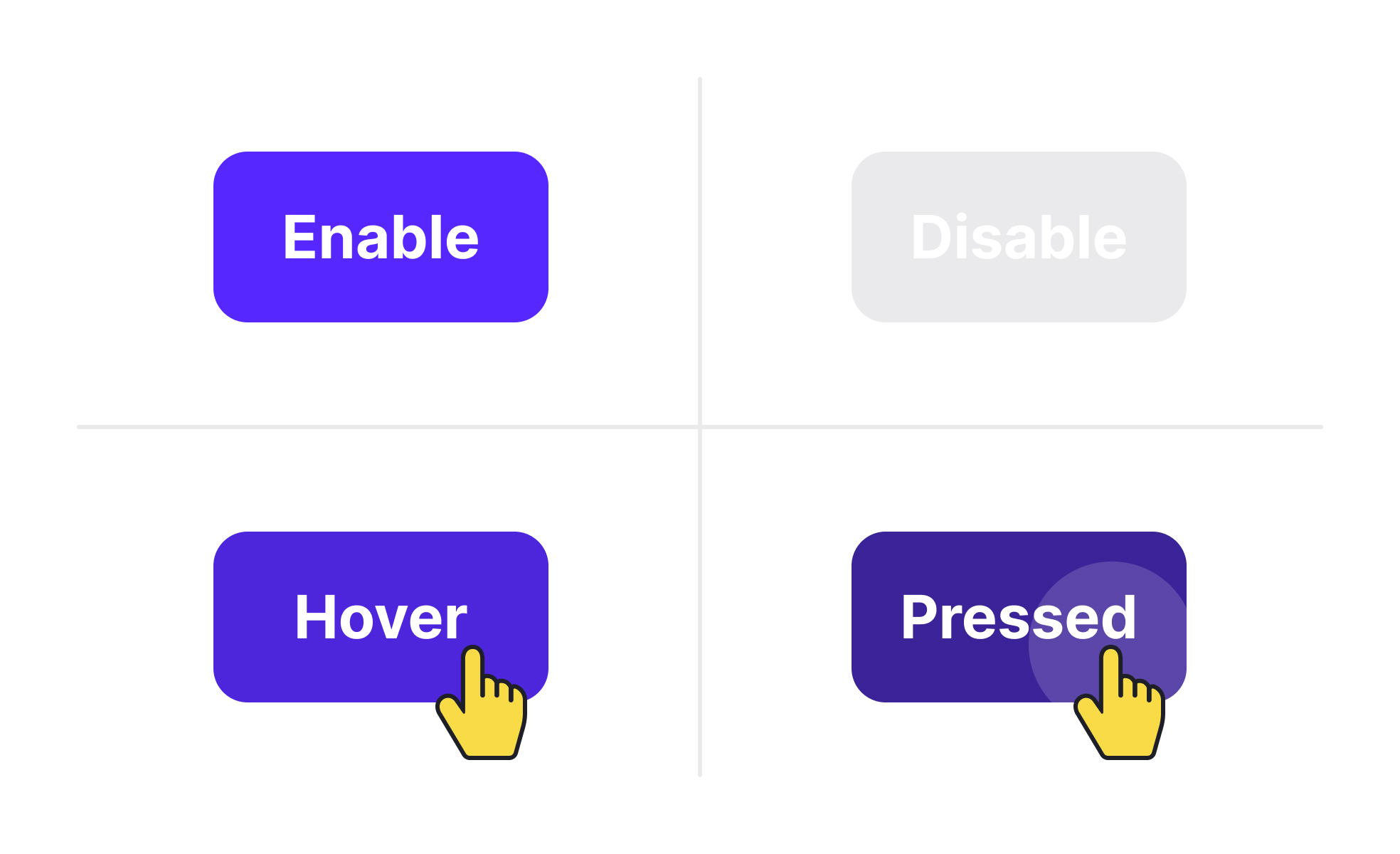
Element states represent the different appearances and behaviors of user interface components depending on user interaction or system status. Common states include default, hover, active, disabled, and error. Designing these states thoughtfully provides users with feedback that reinforces control and clarity within a product.

For UX and UI designers, element states act as signposts guiding user actions. A button that changes color when hovered or clicked reassures users that their input is registered. Without such feedback, users may repeat actions, leading to errors or frustration.

In product management, element states play a role in defining functional requirements and consistency across a platform. Product managers ensure that design teams and developers align on state definitions so that every button, form field, or navigation item responds predictably. This consistency reduces user confusion and simplifies development.

Accessibility also intersects with element states. Disabled elements must be visually distinct but not so faint that they exclude users with vision impairments. Error states should use clear, descriptive messages alongside visual indicators. Following accessibility standards ensures that all states are perceivable and usable.

Real-world examples emphasize their value. Google’s Material Design library includes extensive guidelines for element states, ensuring that buttons, toggles, and forms communicate effectively across devices. E-commerce websites like Shopify use clear states for checkout buttons, reducing errors in critical flows and improving conversion rates.

When teams fail to design clear states, products suffer from usability issues. Users may abandon tasks if they cannot tell whether an action succeeded or why a field failed validation. Well-defined states improve trust and flow within digital experiences.

Learn more about this in the UI Component States Lesson, a part of the UI Components I Course.

Key Takeaways

  • Element states represent component behavior across interactions.
  • Clear states provide feedback and improve user confidence.
  • Product managers ensure consistency across platforms and teams.
  • Accessibility requires thoughtful contrast and messaging in states.
  • Real-world platforms rely on states to improve conversions.

Recommended resources

Courses

UX Design Foundations Course
Popular
Course

UX Design Foundations

Gene Kamenez
Gene Kamenez
Learn the essentials of UX design to build a strong foundation in core principles. Gain practical skills to support product development and create better user experiences.
Design Terminology Course
Course

Design Terminology

Alesya Dzenga
Alesya Dzenga
Learn UX terminology and key UX/UI terms that boost collaboration between designers, developers, and stakeholders for smoother, clearer communication.
UI Components I Course
Course

UI Components I

Colin Michael Pace
Colin Michael Pace
Learn to create user-friendly interfaces using core UI components, building a solid foundation for designing intuitive and efficient digital products.
Color Psychology Course
Course

Color Psychology

Cameron Chapman
Cameron Chapman
Learn how color influences perception, emotion, and behavior. Discover how to apply color psychology to design more impactful and engaging experiences.
Common Design Patterns Course
Course

Common Design Patterns

Gene Kamenez
Gene Kamenez
Learn design patterns most valued in product development to create intuitive, visually compelling experiences that seamlessly blend form and function.
Accessibility Foundations Course
Course

Accessibility Foundations

Ljubisa Kukulj
Ljubisa Kukulj
Learn the fundamentals of digital accessibility and how to create inclusive experiences for all users. Explore key principles, tools, and best practices.
Wireframing Course
Course

Wireframing

Colin Michael Pace
Colin Michael Pace
Learn to create effective wireframes that seamlessly integrate into your design workflows, improving communication and driving better design outcomes.
UI Components II Course
Course

UI Components II

Colin Michael Pace
Colin Michael Pace
Learn advanced techniques to design dynamic, scalable interfaces using optimized UI components and streamlined navigation for better user experiences.
UX Writing Course
Course

UX Writing

Alesya Dzenga
Alesya Dzenga
Learn to write microcopy that communicates clearly and concisely to improve user experience, build trust, and boost conversions across digital products.
Design Composition Course
Course

Design Composition

Gene Kamenez
Gene Kamenez
Learn the fundamental principles of visual layout, balance, and structure to create compelling and effective design compositions that engage and intrigue users.
Mobile Design Course
Course

Mobile Design

Denis Jeliazkov
Denis Jeliazkov
Learn mobile UI/UX patterns, workflows, and platform-specific strategies to create exceptional, user-friendly mobile experiences across different devices.
Typography Course
Course

Typography

Cameron Chapman
Cameron Chapman
Learn typography fundamentals, from typeface and font selection to layout and spatial arrangement, to create captivating designs that communicate powerfully.
UX Design Patterns with Checklist Design Course
Course

UX Design Patterns with Checklist Design

George Hatzis
George Hatzis
Learn common UX design patterns and how to apply them with practical checklists, ensuring the creation of intuitive, user-friendly, and exceptional interfaces.
HTML Foundations Course
Course

HTML Foundations

Yan Sokalau
Yan Sokalau
Learn the fundamentals of HTML, from basic formatting and structure to advanced elements and best practices, to create accessible and responsive web pages.
Enhancing UX Workflow with AI Course
Course

Enhancing UX Workflow with AI

Colin Michael Pace
Colin Michael Pace
Learn how to integrate AI into UX design to create smarter, more personalized user experiences. Explore tools, trends, and best practices in AI-driven design.
CSS Foundations Course
Course

CSS Foundations

Yan Sokalau
Yan Sokalau
Learn the basics of CSS, including the box model, element style, and content positioning, to improve communication, design handoff, and web decision-making.
Introduction to Figma Course
Course

Introduction to Figma

Gene Kamenez
Gene Kamenez
Learn essential Figma tools like layers, styling, typography, and images. Master the basics to create clean, user-friendly designs
3D Design Foundations Course
Course

3D Design Foundations

Learn essential 3D design principles, from spatial thinking and dimensional relationships to form, lighting, and texture, for a solid foundation in the field.
Information Architecture Course
Course

Information Architecture

Colin Michael Pace
Colin Michael Pace
Learn the basics of organizing, structuring, and labeling content to design clear, user-friendly information systems that enhance usability and navigation.
Apple Human Interface Guidelines Course
Course

Apple Human Interface Guidelines

Denis Jeliazkov
Denis Jeliazkov
Learn Apple’s Human Interface Guidelines to design modern, high-performing apps, focusing on UI principles and best practices for creating effective interfaces.
Introduction to Design Audits Course
Course

Introduction to Design Audits

Romina Kavcic
Romina Kavcic
Learn the art of systematic design evaluation to improve consistency, effectiveness, and create more user-centered products that meet user expectations.
Improve your UX & Product skills with interactive courses that actually work

FAQs

Why are element states essential for usability?

Element states provide users with immediate feedback, confirming whether actions are registered or restricted. Without them, interactions feel unresponsive, creating uncertainty. Feedback through states builds trust and smooth user flow.

Teams often test states during usability studies to confirm clarity. Effective states reduce repetitive actions and prevent frustration, directly improving satisfaction.


How do states support accessibility?

States such as error or disabled need to combine visual and textual cues. A red border around a text field may signal an error, but without accompanying text, it excludes color-blind users. Clear, multi-sensory feedback ensures inclusivity.

Accessible states improve compliance with WCAG standards, ensuring products work for all users. These considerations are essential for enterprise or government products, where accessibility compliance is non-negotiable.


What tools help designers create element states?

Design tools like Figma and Adobe XD allow teams to build interactive prototypes with multiple states. These tools help designers simulate hover, active, and error conditions before development.

Prototyping with states helps align design, product, and engineering teams early, reducing costly changes later in the workflow. Interactive previews also improve stakeholder buy-in by showing how states enhance the user journey.