Button Design System
Button Priorities and Types
- Primary Button: Highest priority actions like "Save", "Submit", "Confirm". Used to guide users towards the main action on a page.
- Secondary Button: Less critical actions such as "Cancel", "Edit", "View More". Supports the primary actions but is not the main focus.
- Success Button: Indicates successful actions such as "Success", "Done", "Completed". Used to convey positive outcomes.
- Danger Button: Indicates actions that might have serious consequences such as "Delete", "Remove", "Warning". Used to alert users to potential risks.
- Icon Button: Actions that can be represented by an icon only, such as "Delete", "Add", "Settings". Used when space is limited or for repetitive actions.
Button States
- Default: Regular state when the button is ready for interaction.
- Hover: State when the user hovers over the button with a cursor.
- Active: State when the button is being clicked or activated.
- Disabled: State when the button is not available for interaction.
Accessibility
- All buttons meet the WCAG's color contrast requirements (at least 4.5:1 for normal text and 3:1 for large text).
Design Justification
Visual Design: The button system is designed with a consistent visual style that aligns with modern design principles. The use of bold colors for primary actions ensures that the most important buttons stand out.
Accessibility: The color choices and contrasts meet WCAG standards.
Usability: Each button type is designed with clear differentiation in terms of priority and state, making it intuitive for users to understand and interact with the buttons.
Responsiveness: The buttons are designed to be responsive, with appropriate padding and sizing for both desktop and mobile devices, ensuring a seamless experience across different screen sizes.
Reviews
4 reviews
Kudos to you for crafting an exceptional Button component set that seamlessly integrates accessibility and contrast ratios! Your attention to detail in incorporating success and danger state buttons showcases a holistic approach, indeed.
As I delve into your design, one suggestion I’d like to propose is the inclusion of a Link component. Building upon your already impressive work with icon button variants, offering both icon and non-icon options for the Link component would further strengthen your Design System’s comprehensive nature.
With this addition, users will appreciate the consistency and flexibility in navigating through the interface. The versatility of having both visual and non-visual link options will cater to various design scenarios, making it an excellent opportunity to elevate the overall user experience.
I’m excited to see how you’ll incorporate this suggestion into your Design System, further solidifying its value as a go-to resource for crafting exceptional digital experiences!
Hi Nebile,
You have done an outstanding job creating a Button component set for the Design System. It's great to see that you've prioritized accessibility and contrast ratios in your designs, which are crucial aspects. Additionally, incorporating success and danger state buttons demonstrates a comprehensive approach.
One suggestion I have is to include a Link component. Since you have already included icon button variants, it would be beneficial to have the Link component available with both icon and non-icon options.
Overall, excellent work!
Outstanding work on the visuals of this button system! I appreciate how daunting it must have been. Great job!
You did a good job with button design system, however the accessibility for disabled buttons can be improved.
Besides the great work of the button design system I also appreciate the presentation. Its something I dont have patience for and youve done it extremely well!
You might also like
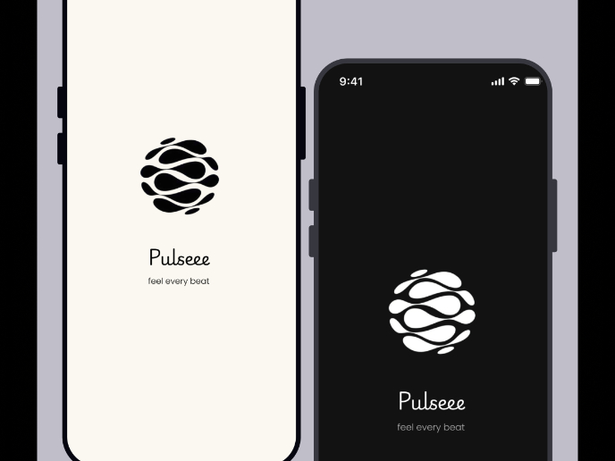
Pulse — Music Streaming App with Accessible Light & Dark Mode
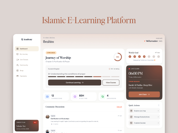
Islamic E-Learning Platfrom Dashboard
SiteScope - Progress Tracking App

FlexPay

Mobile Button System
CJM for Co-Working Space - WeWork
Visual Design Courses

UX Design Foundations

Introduction to Figma


