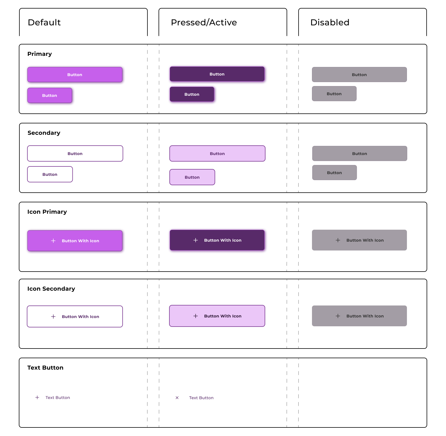
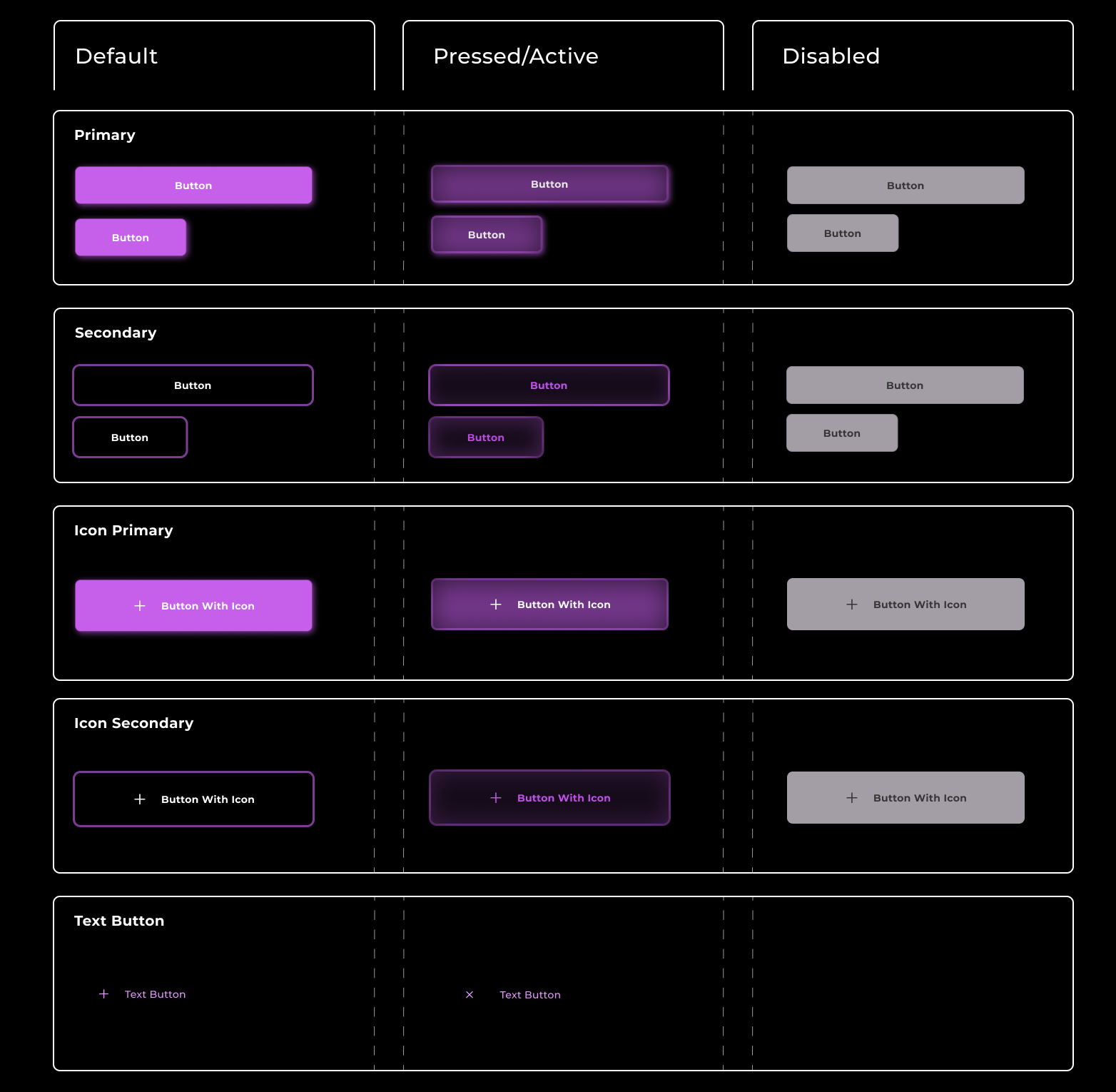
Mobile Button System

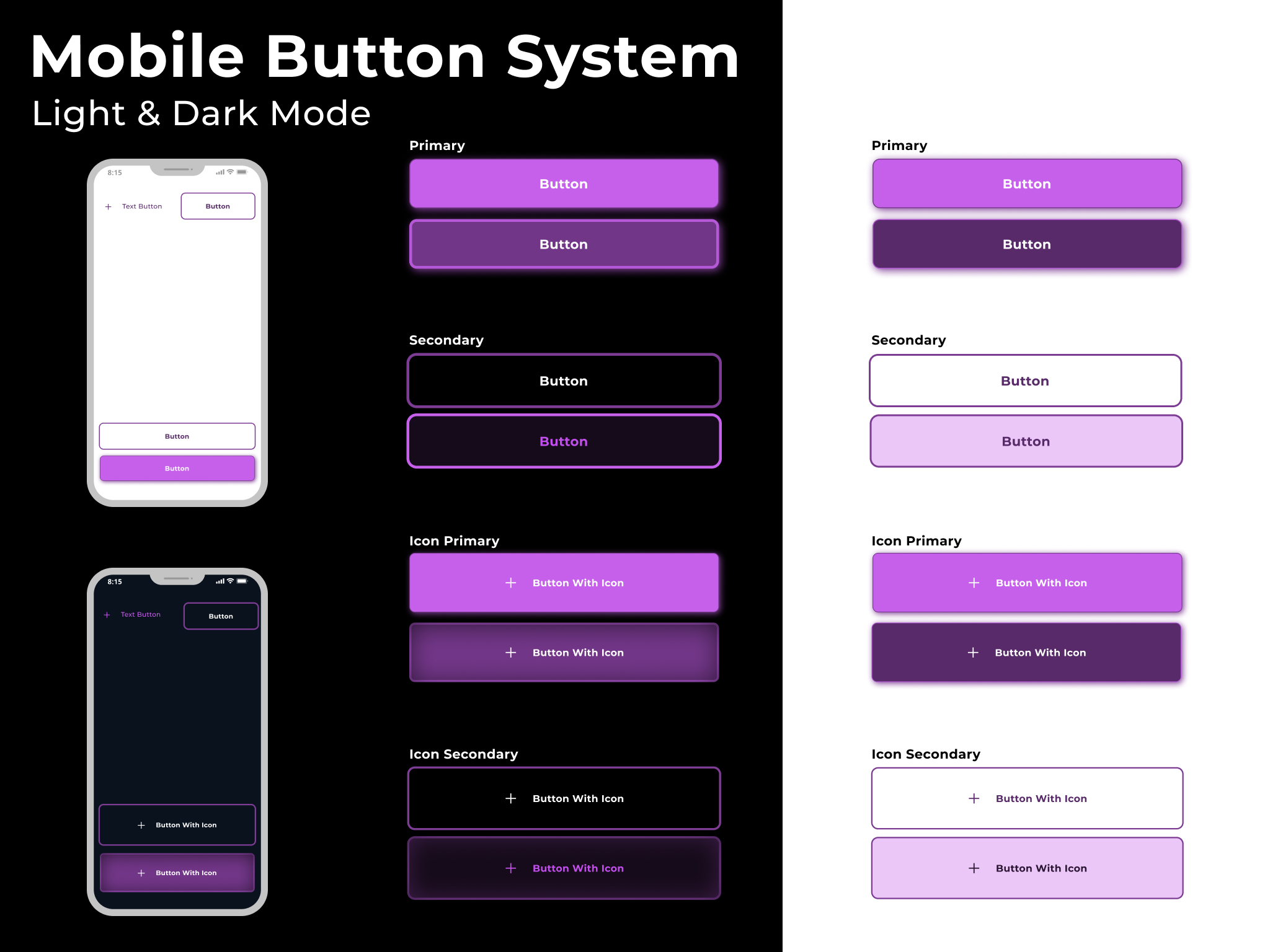
As my first ever ux design attempt, I tried to go with a simplified approach with only a few button types and states. I kept the color pallet monochrome and tried to focus on shadows and making clear distinctions between states. I also tried to maintain consistency within hierarchy, but this is what I struggled with most and would appreciate some feedback on where I can improve.
Button Types:
- Primary
- Secondary
- Icon primary
- Icon secondary
- Text Button
States:
- Default
- Pressed/Active
- Disabled
Mobile Button System Light Mode:
Mobile Button System Dark Mode:
Defining Button Sizes:
I designed the buttons to take up the entirety of the phone screen, with about 30px of margin on the horizontal sides. This is for buttons that go at the bottom of the screen after the user has gone through the material of the page.
I also designed a version of the primary and secondary buttons that is approx. half the size, accounting for gutter so the smaller buttons could be placed next to each other and still stack neatly aligned above or below any of the longer buttons.
For the icon versions, I lowered the vertical padding from 16 to 10 to keep the button from looking to large in height. (the other button's ratios are 32:16)
Designing Different States (where I struggled most):
I ran into some difficulty with the pressed/active states (which I believe can be the same in mobile design, since there's no hover?). Specifically with dark mode, I found that pressed/active state for primary and secondary look quite similar. I found it a bit difficult to make the transition from default to pressed for the secondary/outlined buttons in general. In order to make the transition more obvious, I added a change in text color. However, i'm not sure if this is too inconsistent with the primary buttons (I didn't feel that colored text on a colored background made sense for the primaries).
Lastly, for the default states, I originally had different versions for each button type, but after reading some other breifs, I saw advice to make the default type consistent for all button types so as to stay consistent.

Reviews
2 reviews

Great job, Yasmin! You've created a very complete button system.
A tweak that I'd suggest is regarding the disabled button. I'd recommend using a lighter gray for light mode and a darker for dark mode, even if it results in poor contrast.
As you can see here: https://www.w3.org/TR/WCAG22/#contrast-minimum:~:text=least%203%3A1%3B-,Incidental,-Text%20or%20images disabled buttons don't need to meet the same contrast requirements for accessibility compliance
I suggested this because many apps have gray, clickable buttons, and users often identify buttons with good contrast as clickable.

I like how clean these buttons look! You’ve done a great job establishing a clear visual difference between the light and dark modes.
Why this is productively important: Having a defined system for both themes ensures that the product is scalable and consistent, no matter what setting the user prefers. It makes the app feel professional and polished, which builds immediate trust with the user.
Here are a few things to improve:
- Try to use Auto Layout to ensure spacing remains perfect as text changes. Also, I recommend not distinguishing between buttons with icons and without; the internal padding and height should be identical, so there is no difference for users.
- I noticed you used a secondary button style at the top of the mobile screen. It’s quite rare to place a secondary action there, and the sizing feels a bit off. I’d recommend adjusting the size to fit the navigation context or sticking to a standard icon-based action for the top bar.
- Try to create more variants for different situations, think about different sizes (small, medium, large), and especially states (hover, pressed, and disabled). Keeping these consistent across the whole system will make the developer's life much easier.
You might also like

Smartwatch Design for Messenger App


Bridge: UI/UX Rebrand of a Blockchain SCM Product


Pulse Music App - Light/Dark Mode

Uxcel Halloween Icon Pack


Monetization Strategy


Designing A Better Co-Working Experience Through CJM

Visual Design Courses

UX Design Foundations


Introduction to Figma

Design Terminology
