Buttons
Buttons are interactive design elements that trigger actions, guiding users through interfaces and supporting both usability and product goals across platforms.


Buttons are one of the most fundamental components in user interface design. They act as gateways to actions, whether that is submitting a form, navigating to another page, or confirming a purchase. Despite their simplicity, buttons carry immense importance because they directly influence user behavior and determine how effectively someone interacts with a product.
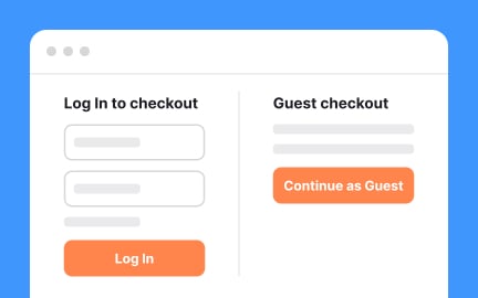
In UX/UI design, the placement, style, and labeling of buttons affect usability and overall satisfaction. A poorly designed button can confuse users or lead to errors, while a well-placed button with clear text can guide people seamlessly through a process. For example, call-to-action buttons on e-commerce sites often determine whether a user completes a checkout or abandons their cart. Small adjustments in color, size, or wording can significantly impact conversion rates.
Real-world examples illustrate the impact of button design. Companies like Amazon continuously test button text and positioning to optimize purchasing flows. These examples highlight the power of small design decisions on business performance.
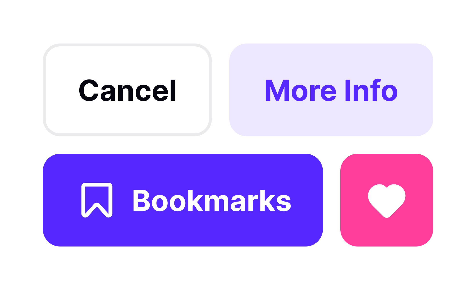
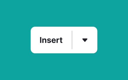
Buttons also come in various types, each serving different roles. Primary buttons highlight the most important action on a screen, while secondary buttons offer supporting options. Tertiary buttons or text links provide less critical actions. Designers often use visual hierarchy, through color, contrast, and size, to distinguish between these roles. Misusing this hierarchy can overwhelm users or cause them to overlook key actions.
Accessibility is another crucial factor in button design. Buttons must be large enough to tap on touchscreens, clearly labeled for screen readers, and visually distinct from non-interactive elements. Inclusive button design ensures that products are usable for all users, regardless of device or ability. Neglecting accessibility can exclude users and even create legal risks in some markets.
Beyond functionality, buttons also carry emotional weight. A “Buy Now” button might evoke urgency, while a “Learn More” button signals exploration. Misleading or vague buttons erode trust and harm long-term relationships with users.
Learn more about this in the UI Buttons Lesson, a part of the UI Components I Course.
Key Takeaways
- Buttons are interactive elements that trigger actions in digital products.
- Placement, style, and wording directly affect usability and outcomes.
- Product managers analyze button engagement to refine strategies.
- Types of buttons (primary, secondary, tertiary) serve different roles.
- Accessibility in button design ensures inclusivity and legal compliance.
Buttons are essential because they represent the primary way users interact with digital products. Every button click is a decision point, whether that means completing a transaction, submitting data, or navigating to a new section. Without clear and effective buttons, users may feel lost or frustrated, leading to abandoned tasks and lower satisfaction.
For designers, buttons offer an opportunity to simplify experiences. By crafting visually distinct and well-labeled buttons, they can guide users through flows with minimal confusion, ensuring that interfaces remain intuitive and efficient.
Product managers track button interactions to understand user behavior and measure funnel effectiveness. A high click-through rate on a button like “Start Free Trial” may indicate strong interest, while a low rate suggests friction in the messaging or placement. These insights help managers identify which features resonate with users and where improvements are needed.
This data-driven approach allows teams to experiment, optimize, and allocate resources more effectively. Instead of guessing what works, managers rely on actual interaction data to guide decisions that improve product performance.
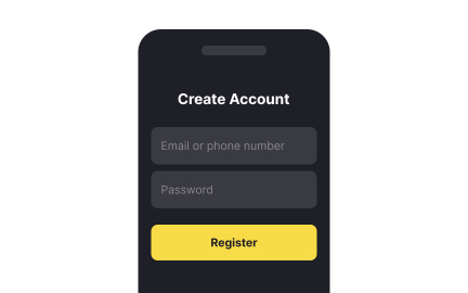
Common mistakes include using vague labels like “Click Here,” making buttons too small for mobile interaction, or failing to differentiate primary actions from secondary ones. These issues can confuse users, reduce engagement, and even lead to costly errors such as unintended purchases.
Another frequent issue is neglecting accessibility. Without proper contrast, size, or labeling, buttons may be unusable for people with disabilities. Addressing these challenges ensures that buttons not only function well but also support inclusive, user-centered design.
Recommended resources
Courses

Core UI Components


UX Design Foundations


Design Terminology

Lessons

Common UI Components Part I

Animation Theory & Motion

The Anatomy of UI Components
Exercises

Projects

HireHarbour Allies: UX/UI Case Study for Inclusive Landing Page


RetroPlum - Skeuomorphic Style Button Kit


Scholar – Pricing Page for SaaS Education Platform