UI lists
UI lists are structured collections of items, such as text, icons, or images, displayed to organize content and aid navigation in digital products.


TL;DR
- Organizes items in structured layouts.
- Can be vertical or horizontal.
- Used for navigation, data display, and grouping.
- Supports scanning and efficient interaction.
Definition
A UI list is a design pattern that displays related items in a structured order, often with accompanying icons, images, or actions, to improve clarity and navigation.
Detailed Overview
UI lists are one of the most common ways to present content in digital products. They group related items into structured layouts, helping users scan and interact efficiently. Lists appear in navigation menus, contact directories, product catalogs, task managers, and countless other interfaces. Their versatility makes them essential in both mobile and desktop design.
A frequent question is why lists are so widely used. Human perception is well-suited to scanning linear structures. Lists reduce cognitive effort by presenting information in a predictable format, letting users quickly find what they need. For example, email apps use lists to display messages with sender, subject, and time metadata for easy scanning.
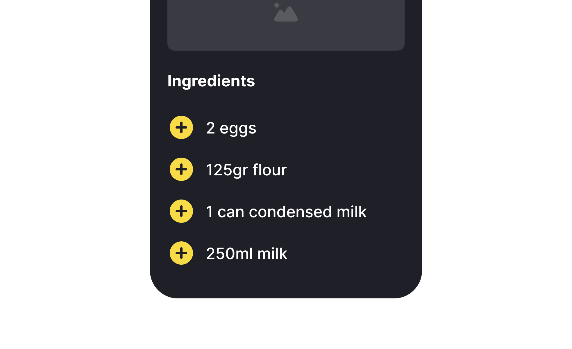
Another common query involves the difference between simple lists and more complex list components. A simple text-based list may be enough for short menus, but data-heavy contexts often include supporting visuals, actions, and metadata. A music streaming app, for example, lists songs with album art, play buttons, and duration to enrich user understanding and interaction.
Designers also ask about visual hierarchy in lists. Consistency in spacing, alignment, and typography helps users distinguish primary from secondary information. For instance, bold text might highlight item titles, while lighter text provides secondary details. Without a clear hierarchy, lists become cluttered and harder to parse.
Accessibility is a key consideration. Lists must maintain legible text sizes, adequate spacing for touch interactions, and semantic HTML markup for screen readers. Inconsistent or inaccessible list structures make navigation difficult, particularly for users relying on assistive technologies.
Finally, lists support interactivity and engagement. Interactive lists allow sorting, filtering, or reordering, giving users control over how they view and organize content. This adaptability makes lists a powerful tool for both simple navigation and complex data presentation.
Learn more about this in the Intro to UI Lists Lesson, a part of the UI Components II Course.
Lists are simple, predictable structures that match how users naturally scan information. They reduce effort and make navigation faster.
This efficiency explains their use in apps, websites, and system interfaces.
Lists often include icons, images, or actions alongside text. This adds context and makes interactions easier.
For example, contact lists may display avatars, while task lists include checkboxes.
Hierarchy helps users process information. Titles, metadata, and supporting visuals must be arranged logically to guide the eye.
Without hierarchy, lists risk becoming visually noisy and harder to use.
Accessible lists use adequate spacing, semantic markup, and support for keyboard and screen reader navigation.
This ensures lists are usable for audiences with diverse needs.
Interactive lists allow users to filter, sort, or reorder items. This flexibility supports personalization and makes handling large sets of data more manageable.
It increases efficiency and engagement within digital products.
Recommended resources
Courses

UX Design Foundations


Core UI Components


Design Terminology

Lessons

Tables & Lists Accessibility

UI Lists & When to Use Them

Best Practices for Designing Lists
Exercises


Projects

Bento Grid - SaaS Website Design


Settings Page for Mobile App - Lokie App (Dark/ Light Mode)

Music Sidebar