Tables & Lists Accessibility
Discover how to effectively organize information in tables and lists without causing overwhelm
Tables serve as powerful tools for displaying complex data relationships but present significant barriers when inaccessible. Proper table structure requires clear headers, appropriate markup, and logical organization to ensure all users can navigate and comprehend tabular information. Screen readers rely on correctly implemented HTML semantics to announce relationships between data cells and their corresponding headers.
Beyond basic markup, accessible tables benefit from features like captions, summaries, and proper scope attributes that provide crucial context. Well-designed tables maintain simplicity through strategic column management, responsive layouts, and appropriate visual styling that enhances rather than hinders comprehension. These practices don't merely accommodate users with disabilities; they improve usability for everyone navigating complex information structures across diverse devices and contexts.
Assistive technologies interact differently with each table type, making proper implementation essential. For layouts, CSS is now the recommended approach since screen readers process content in the order it appears in the code. For data tables, the <table> element is required.
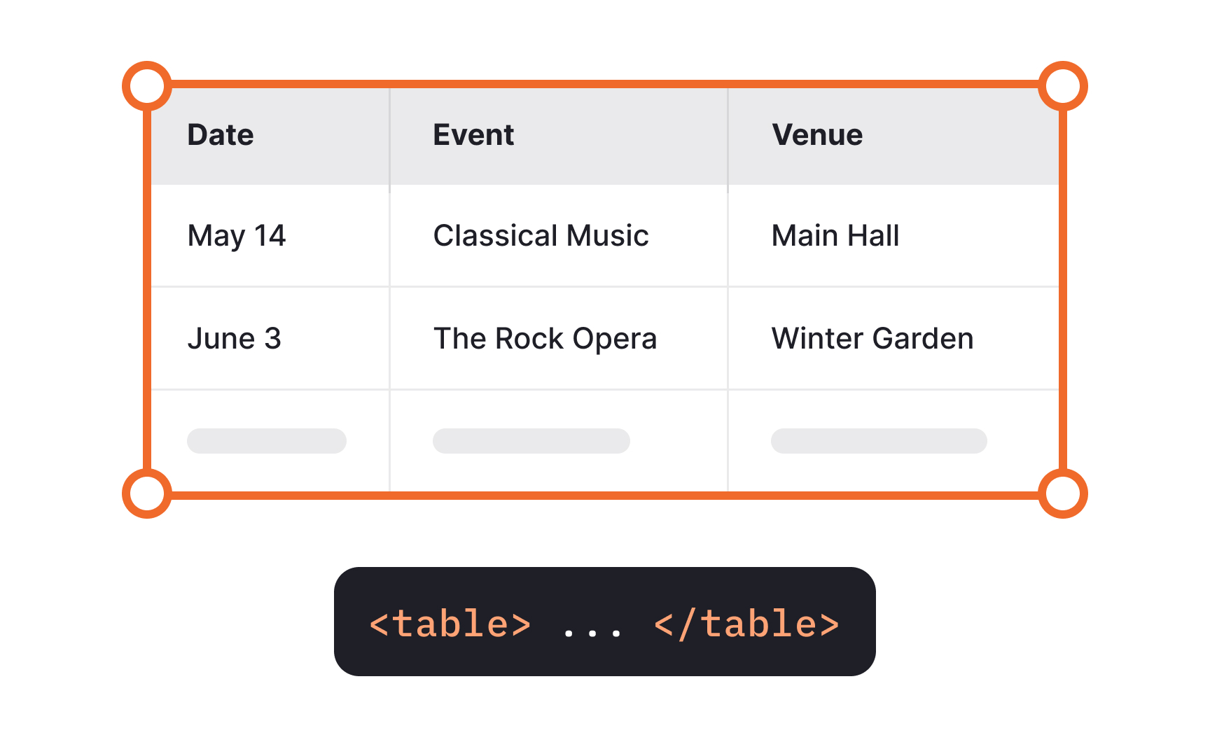
The <table> element enables screen readers to announce crucial information like the table's dimensions, provide specialized navigation controls, and correctly associate data cells with their headers. This structured markup creates a meaningful experience for users relying on assistive technology.
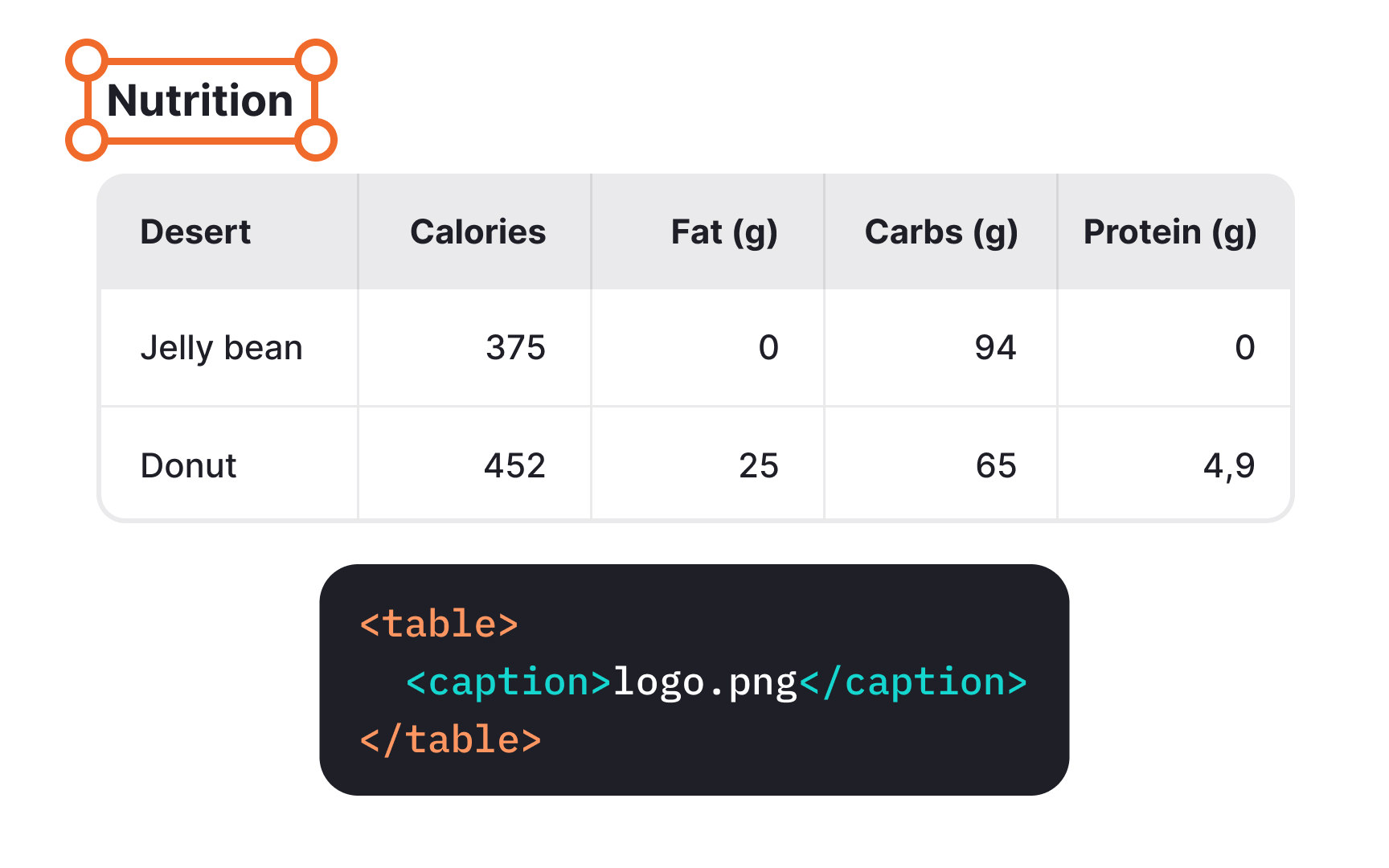
A caption is similar to a heading for a table that screen readers read out. It helps users identify a table, understand what it's about and decide if they want to read it. While every table may not need a caption, they are generally beneficial. Use the <caption> element right after the opening <table> tag to associate the caption with the respective table.
For more complex

Data
To ensure accessibility, always include text in every table header cell. This includes the often-overlooked top-left cell that may appear unnecessary in visual
Headers establish relationships between data cells and create a framework that helps users understand how information connects. Without proper headers, assistive technology users cannot determine what values relate to which categories, making the data effectively unusable.
Pro Tip: If your table has cells without data, mark them with 0, NA, or "blank" instead of leaving them empty.
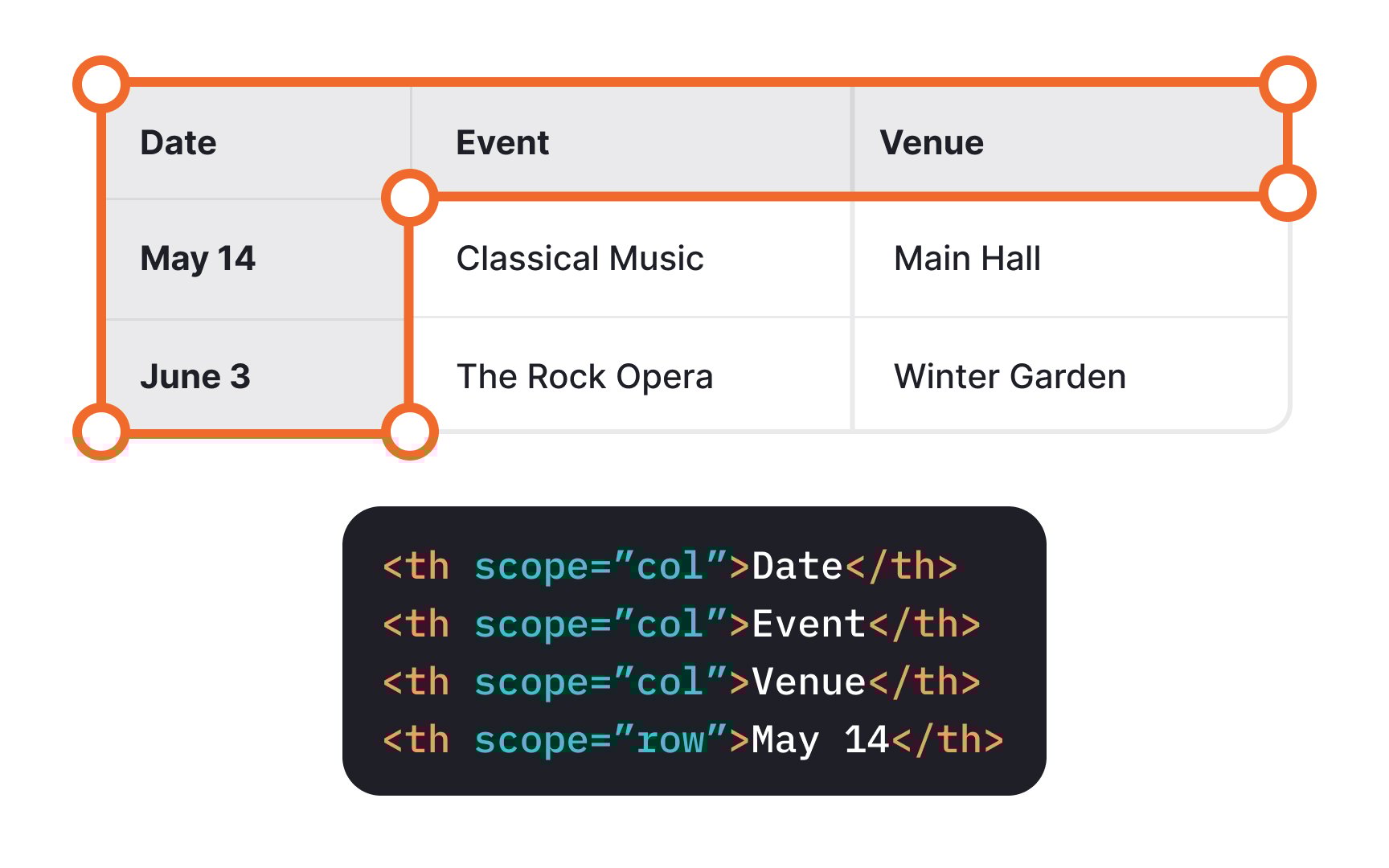
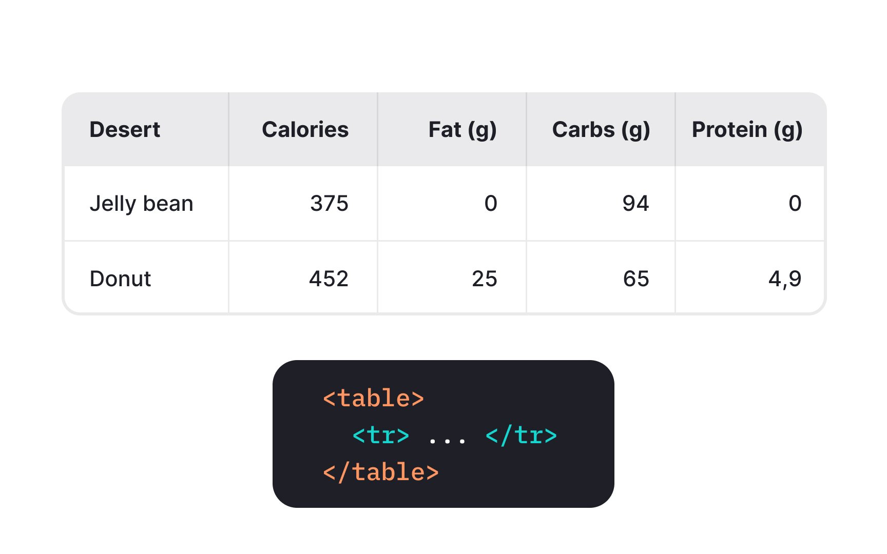
Correct markup is key to making your <th> and data cells with <td> col or row for columns and
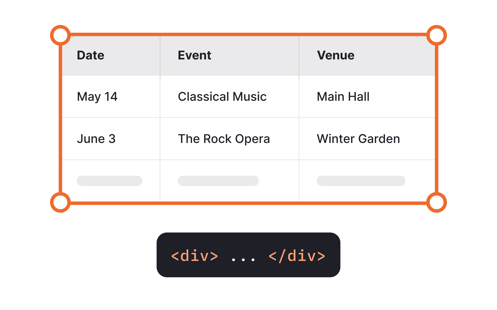
Correct markup adds context for every data cell, giving assistive technology users the same obvious information for visual users. As they move through the table, the screen reader announces column headings when moving left and right and rows headings when moving up and down. For example, when a user in the "Event" column moves one cell down, they'll hear "May 14, Classical Music," learning that on May 14, there will be a classical music concert.
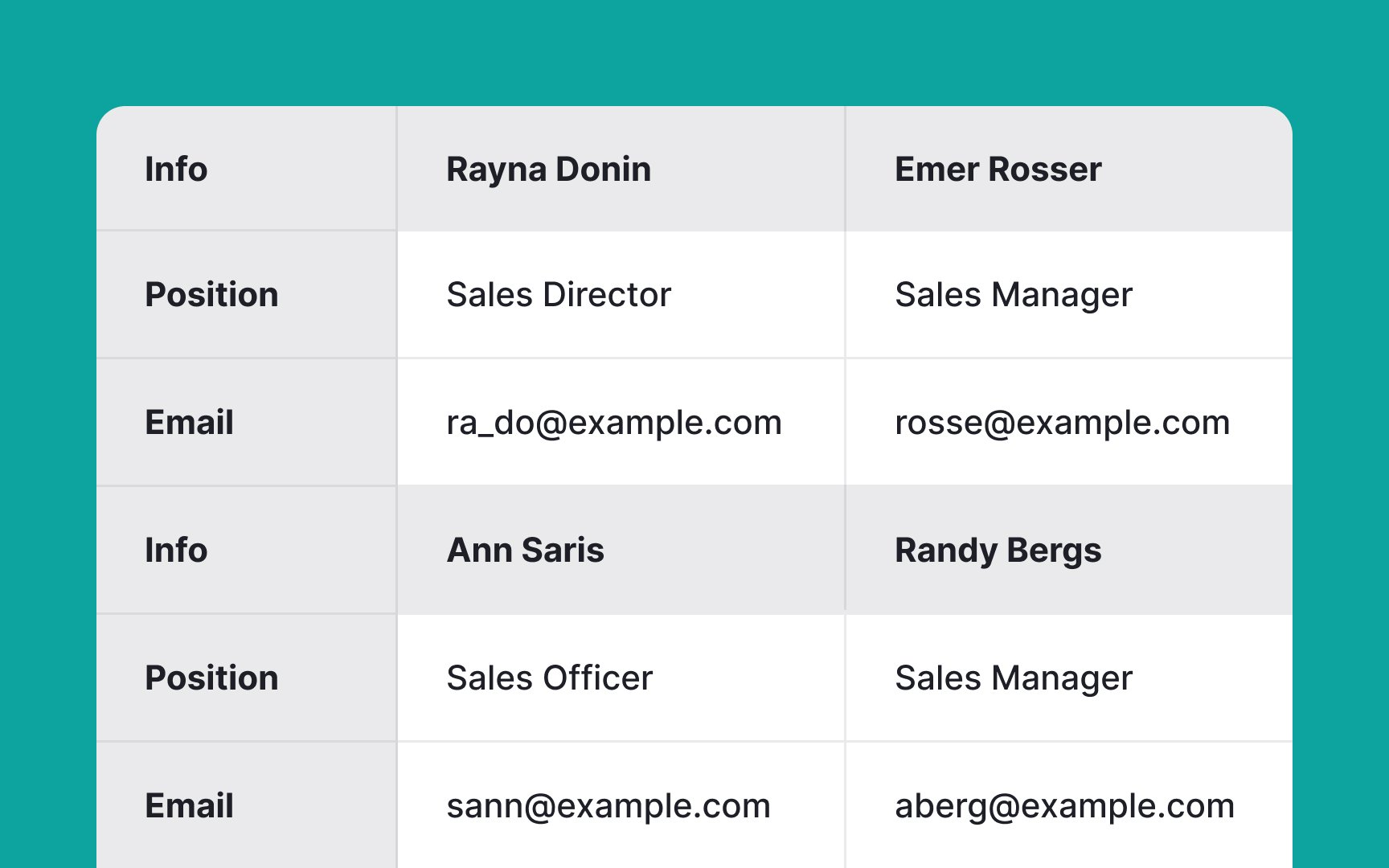
Many screen readers still struggle with complex
Even when screen readers technically support complex tables, non-visual users face significant cognitive load trying to mentally map and retain relationships between scattered data points. Simpler table structures with clearly defined
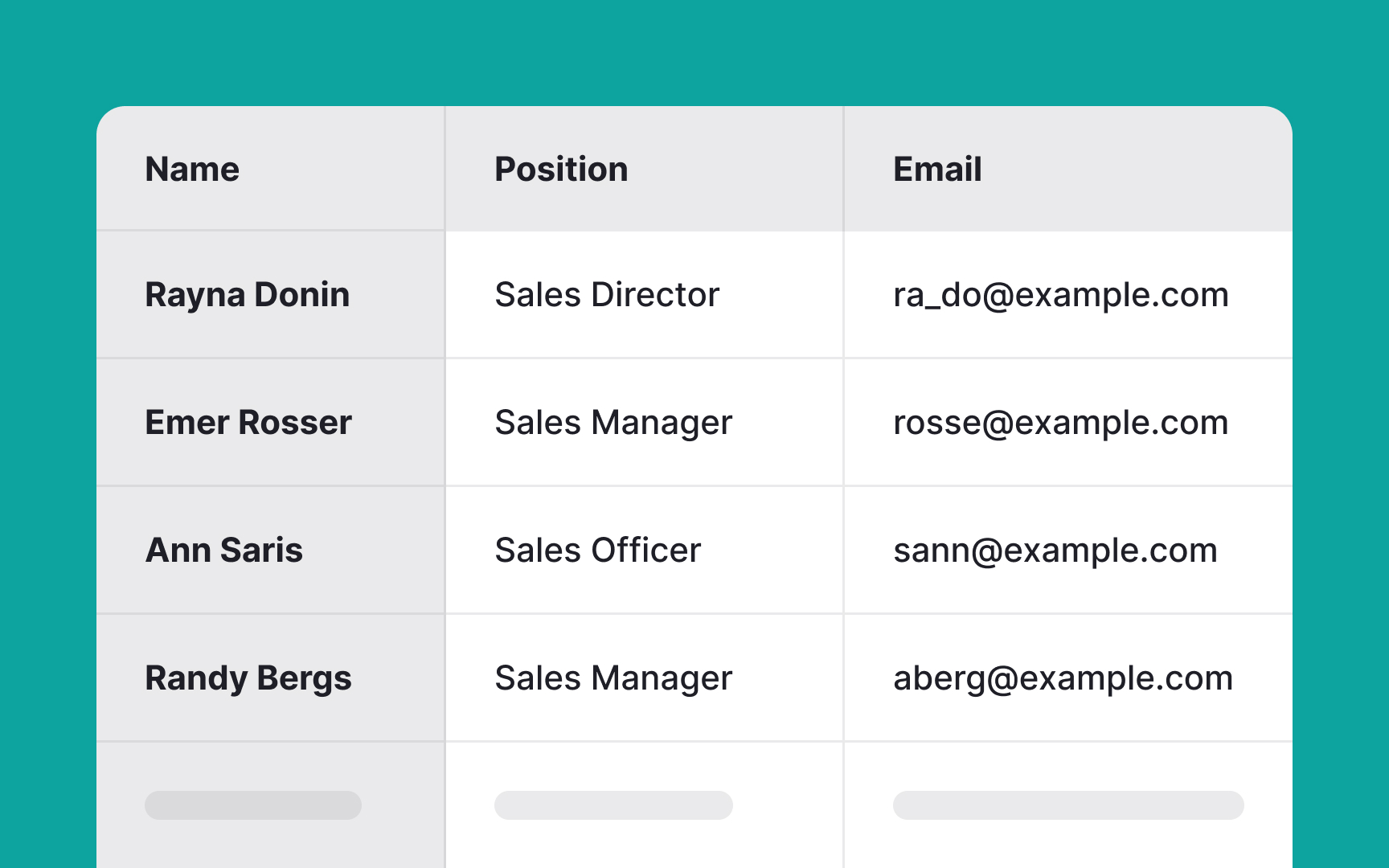
Pro Tip: When complex data relationships can't be avoided, consider breaking information into multiple simple tables with clear relationships rather than creating one complex table with merged cells.
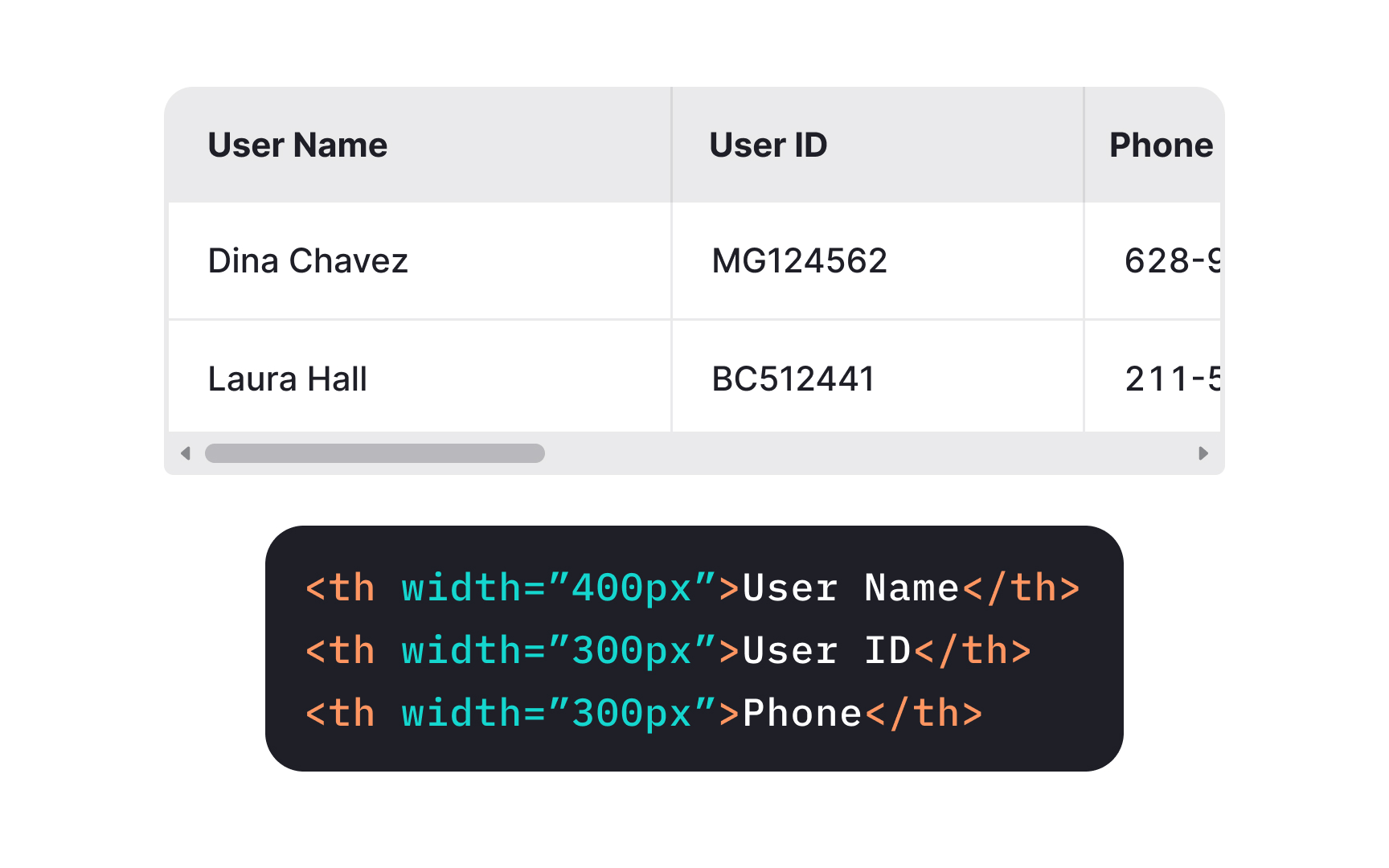
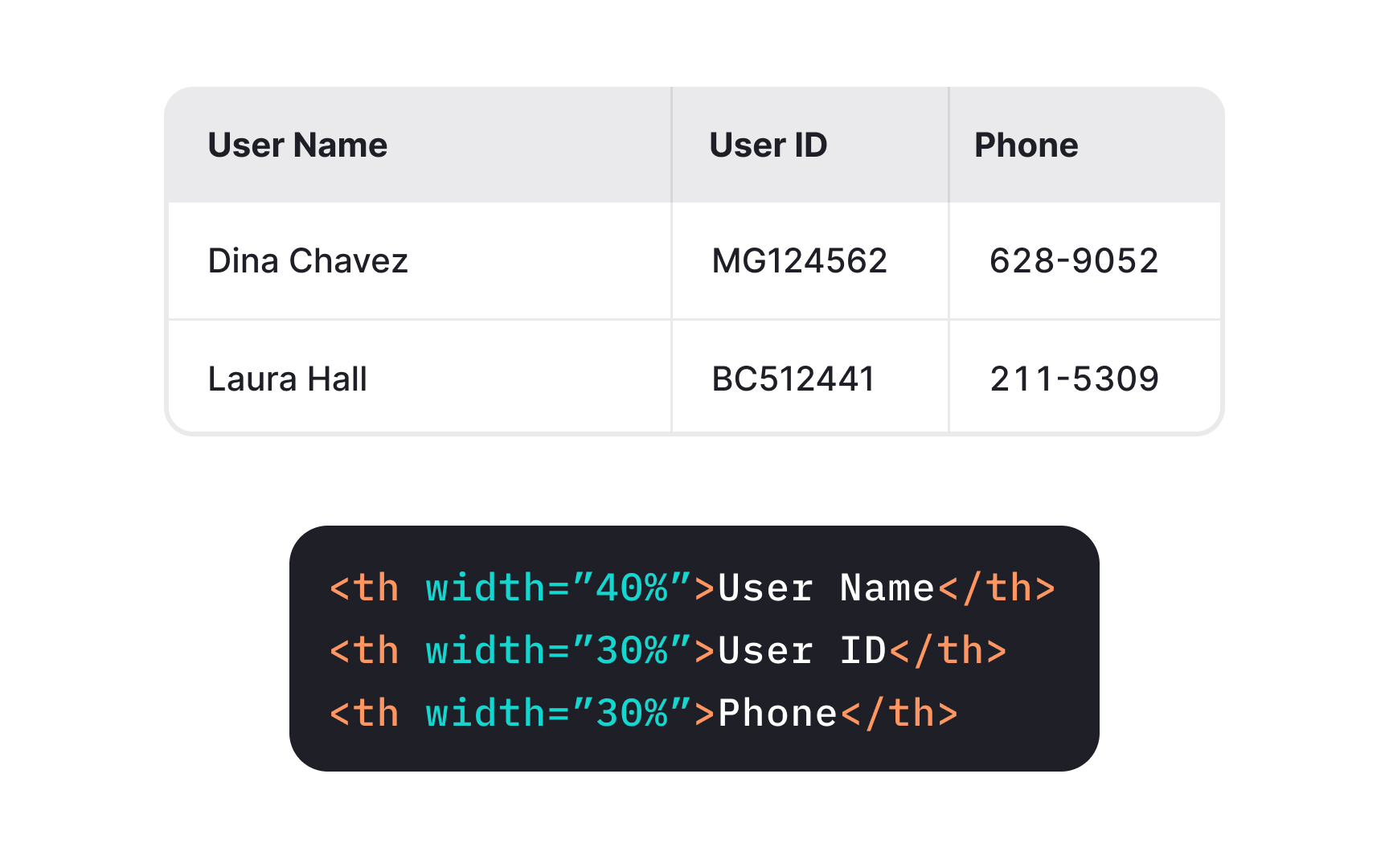
Normally, web browsers automatically determine the
When it comes to cell height, avoid setting it manually so that cells can expand to accommodate their
Lists are great from an
There are 3 ways to organize lists in HTML:
- Use unordered lists with bullet points when the items' order is not relevant
- Use ordered (numbered) lists when the sequence is important
- Use description lists for terms and their definitions: items of such lists are connected programmatically
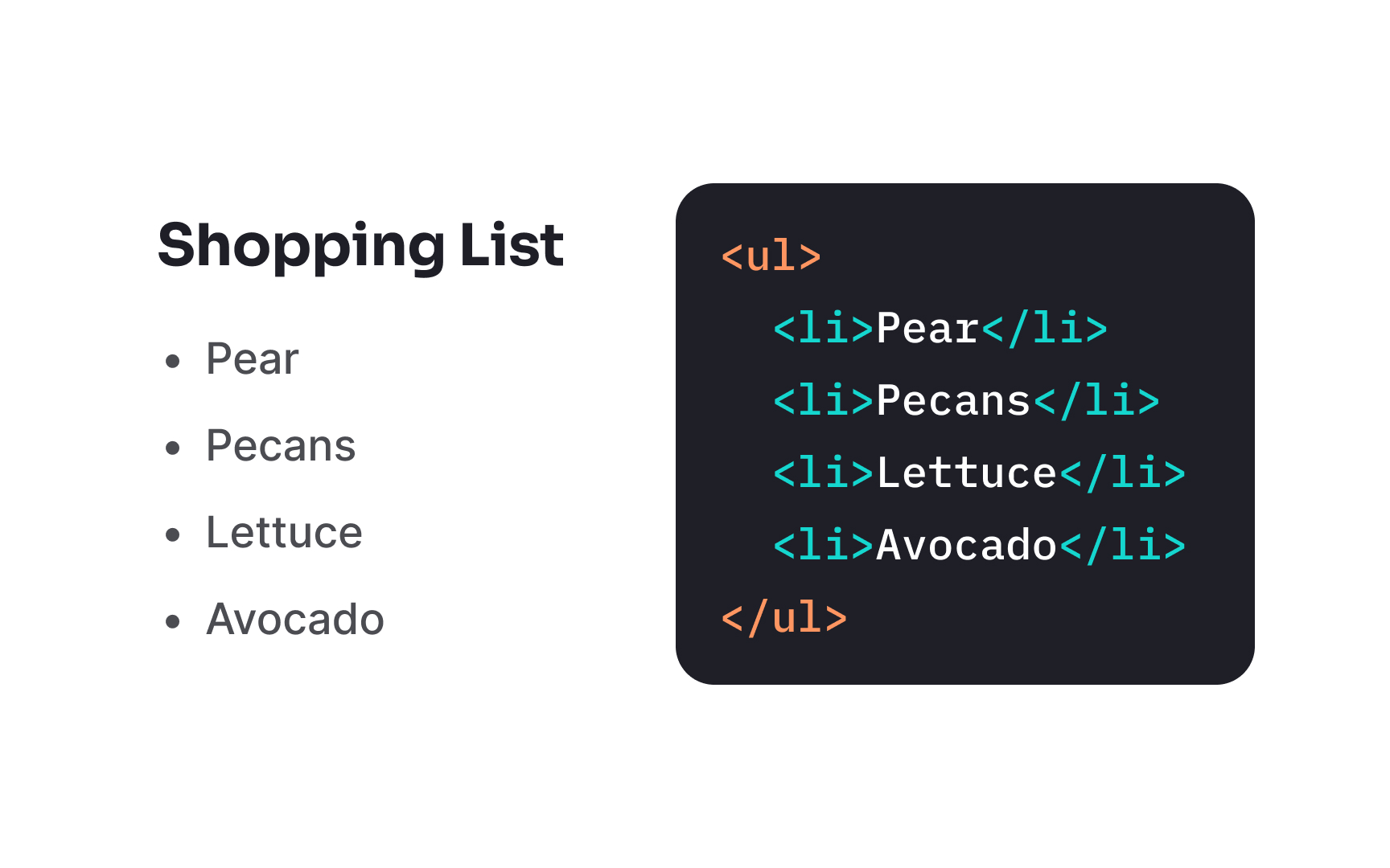
The <ul> element creates unordered lists that display information without numerical sequence. This container element wraps individual list items, each marked with the <li>
Browsers render unordered lists with bullet points by default, though this styling can be modified with
Unordered lists excel at presenting collections where sequence doesn't matter, such as shopping lists or feature sets. They provide clear visual separation between items and create proper semantic structure that assistive technologies can interpret correctly.
Pro Tip: Use unordered lists to improve content scanability, but avoid nesting them more than 3 levels deep, as excessive nesting reduces readability for all users.
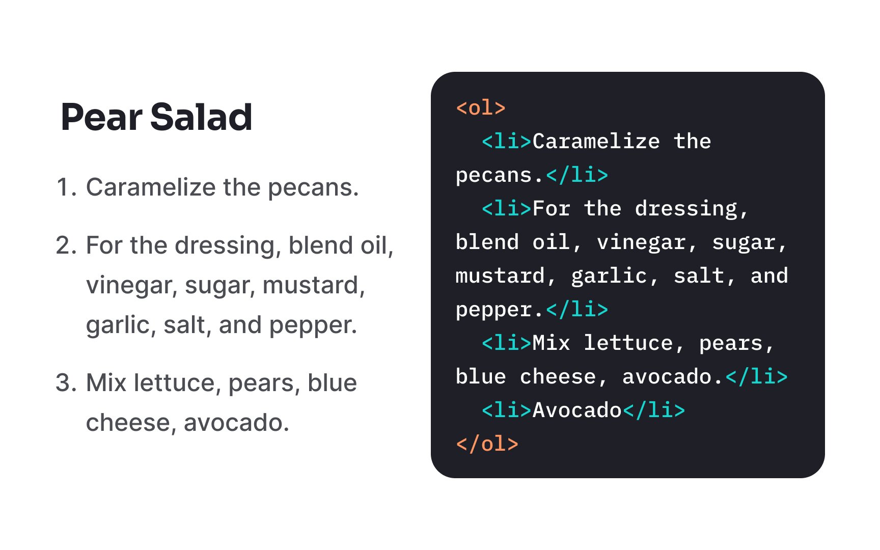
The <ol> element creates ordered lists that display information in a specific sequence. Like unordered lists, this <li> elements that represent each list item.
Browsers automatically number ordered list items sequentially, eliminating the need to manually maintain numbering when adding or removing items. The type attribute allows customization of numbering styles (numbers, letters, or Roman numerals), while the reversed attribute creates countdown sequences.
Ordered lists are ideal for step-by-step instructions, recipes, rankings, or any
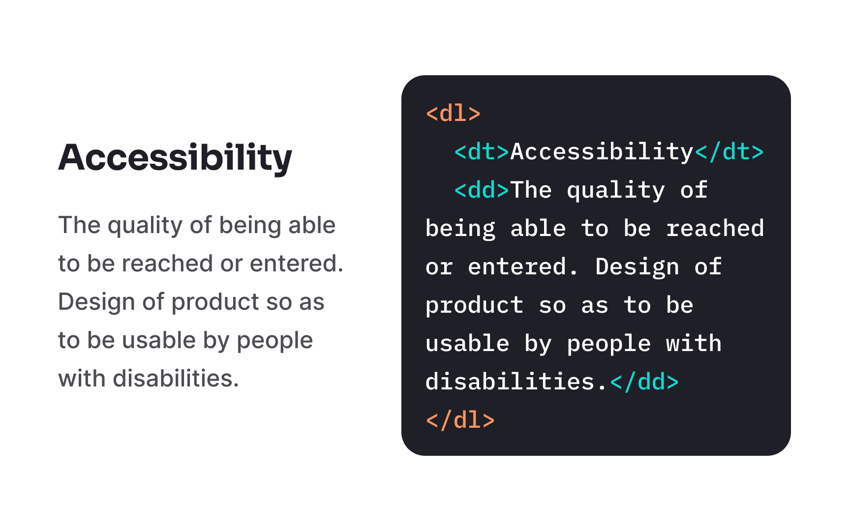
Description lists provide a structured way to present term-definition pairs using specialized <dl> element serves as the
Within description lists, two distinct elements work together to create meaningful relationships. The <dt> (definition term) element marks terms being defined, while the <dd> (definition description) element contains the explanation or definition of each term. Each term can have multiple descriptions if needed.
This semantic structure is particularly valuable for glossaries, dictionaries, FAQs, and metadata presentations. Screen readers announce these relationships specifically, helping users understand the connection between terms and their definitions without relying on visual formatting.
References
Top contributors


Topics
From Course

Images provided by

Share


Similar lessons

Intro to Accessibility

Inclusive Design Basics
