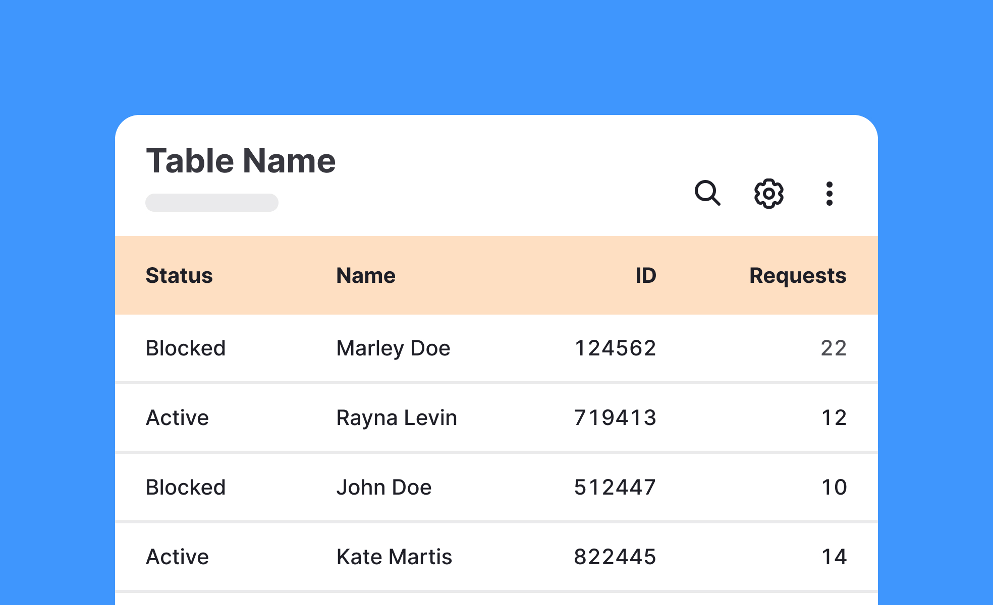
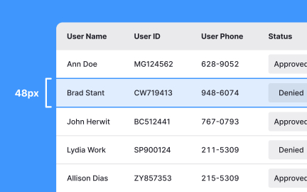
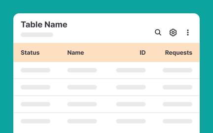
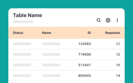
Tables
Tables are structured UI components that organize data into rows and columns, enabling users to compare, scan, and analyze information efficiently.


TL;DR
- Organize data into rows and columns.
- Facilitate comparison and analysis.
- Common in dashboards, reports, and apps.
- Must balance clarity, readability, and accessibility.
Definition
A table is a user interface component that arranges data in rows and columns, making structured information easier to navigate, compare, and interpret.
Detailed Overview
Tables are one of the most practical ways to present structured data. By arranging content into rows and columns, they allow users to quickly compare information and identify patterns. Whether in spreadsheets, dashboards, or reports, tables provide a familiar format for working with data-heavy content.
A frequent question is why tables are used when charts or visuals exist. Charts are excellent for identifying trends or communicating insights at a glance, but tables are better for detail. When users need to see exact numbers, sort specific fields, or cross-reference items, tables provide the granularity that visuals often lack.
Another common query involves usability in digital interfaces. Tables must remain readable across devices. On larger screens, tables can show many columns, but on mobile, they require a responsive design. Designers may collapse less critical columns, use horizontal scrolling, or reformat data to preserve usability.
Teams often ask about functionality. Interactive tables include features such as sorting, filtering, and pagination. These enhance usability when dealing with large datasets. Without such features, tables can overwhelm users, reducing clarity and efficiency.
Accessibility is another critical area. Tables must use semantic markup so screen readers can announce headers and values correctly. Proper contrast, spacing, and clear labeling ensure that all users can interpret table content. Poorly designed tables create barriers, especially for users with vision impairments or cognitive challenges.
Finally, tables are strategic. Businesses use them to highlight comparisons, showcase metrics, and support decision-making. A well-designed table not only communicates data but also guides users toward insights. Thoughtful design transforms tables from static grids into tools for action and understanding.
Learn more about this in the Intro to Tables in IU Lesson, a part of the UI Components II Course.
Tables are best when users need detailed, exact values or want to compare items side by side. Charts are better for showing patterns, trends, or high-level summaries.
Many interfaces combine both: tables for detail and charts for overviews.
Responsive tables collapse or hide non-critical columns, enable horizontal scrolling, or reformat data into card-style layouts. This preserves readability without overwhelming small screens.
Designers must prioritize the most relevant columns for visibility on mobile.
Sorting, filtering, and pagination make large datasets easier to navigate. Sticky headers help users track context as they scroll. Search fields also improve speed and precision.
These features reduce friction and empower users to extract insights efficiently.
Semantic HTML markup ensures screen readers announce data accurately. High-contrast colors, clear text, and consistent alignment enhance readability. Labels and captions provide additional clarity.
Inclusive design ensures tables serve all users equally, regardless of ability.
Tables present information in structured, comparable formats, supporting analysis. Users can see side-by-side details that inform choices, from financial planning to feature evaluations.
Clear tables help teams move from raw data to actionable insights quickly.
Recommended resources
Courses

UX Design Foundations


Core UI Components


Design Terminology

Lessons

Tables & Lists Accessibility

Best Practices for Designing Tables in UIs

When & How to Use Tables in UIs
Exercises
Projects

yofleet - SaaS Pricing Page


Order Management for a restaurant