<?xml version="1.0" encoding="utf-8"?>

TL;DR

  • Temporary content inside fields or layouts.
  • Provides guidance or fills empty states.
  • Common in forms, mockups, and UI design.
  • Must avoid confusion with actual input.

Definition

A placeholder is a piece of temporary text, symbol, or element used in forms, mockups, or design layouts to indicate expected input, occupy space, or represent content that has not yet been added.

Detailed Overview

Placeholders are a familiar element in user interfaces and design workflows. They serve as temporary content that communicates intent, guides input, or fills empty space until real information becomes available. In forms, placeholders often appear as grey text inside input fields. In design, placeholders may be rectangles, dummy images, or sample text blocks used to structure layouts before final content is ready.

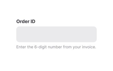
A frequent question is how placeholders aid usability. In forms, they hint at the type of input expected, such as “Enter your email” or “MM/DD/YYYY.” This guidance reduces uncertainty and helps users understand format or content requirements. In design layouts, placeholders create visual balance, showing how real content will eventually fit. This makes wireframes and prototypes easier to interpret and test.

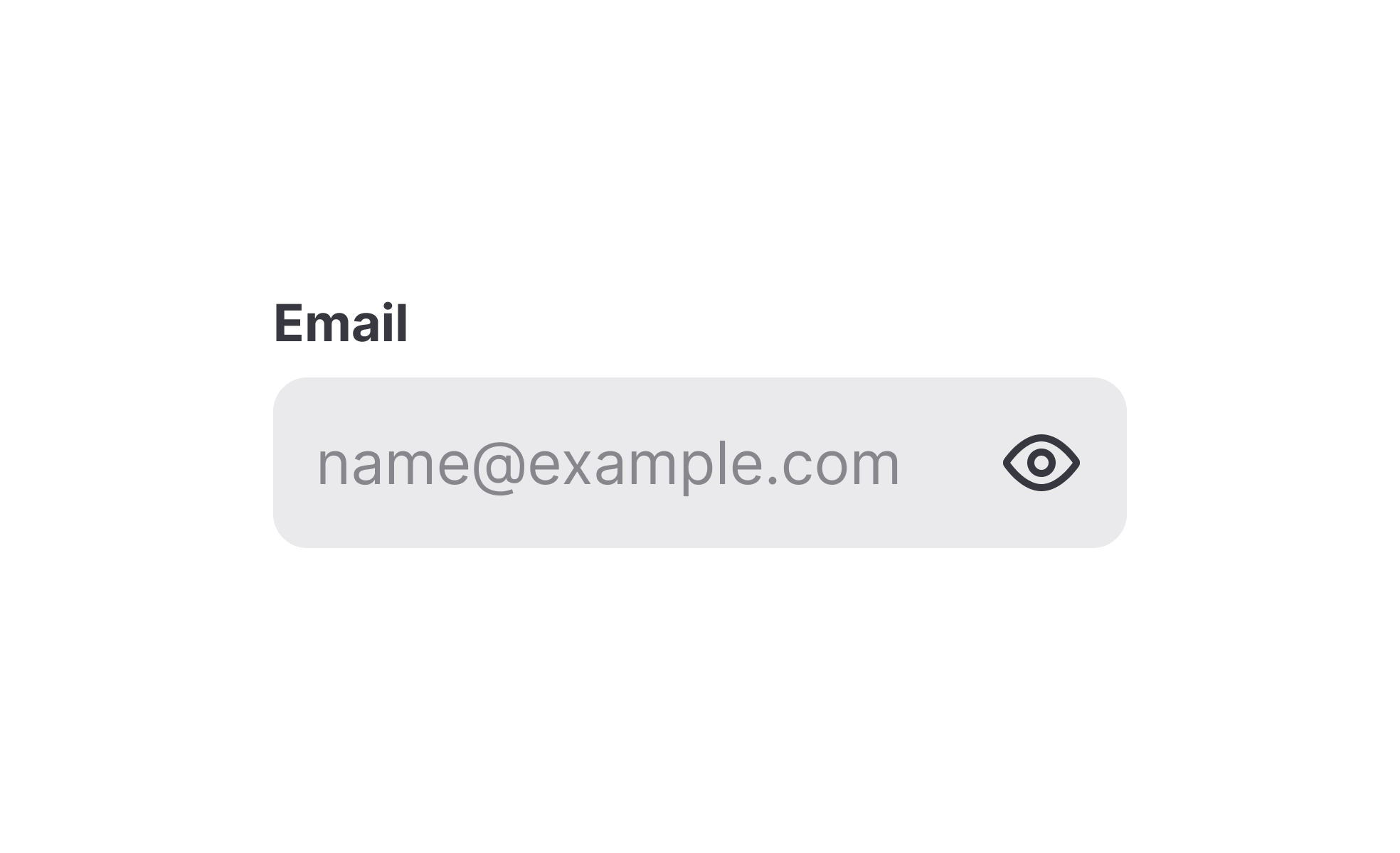
Another common query concerns best practices for placeholders in forms. While they provide hints, they should not replace labels. If placeholders disappear once a user types, people may forget the required format or input type. For example, if the placeholder “DD/MM/YYYY” vanishes, the user might struggle to recall the correct sequence. Designers are encouraged to pair placeholders with persistent labels for clarity.

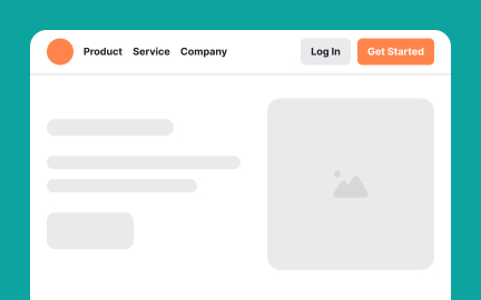
Teams also ask about placeholders in design and development workflows. Designers often use sample text, like “Lorem Ipsum,” or image placeholders to demonstrate how final content will appear. Developers may use dummy data in interfaces under construction. These placeholders ensure that the structure is tested even before final content is integrated.

Accessibility is an important consideration. Placeholders with low contrast can be difficult to read, especially for users with visual impairments. They should never be the sole way of conveying critical information, as assistive technologies may not reliably interpret them. Proper use of labels, descriptive tooltips, and ARIA attributes ensures inclusivity.

Learn more about this in the Placeholders Exercise, taken from the Anatomy of UI Components Lesson, a part of the UI Components I Course.

Recommended resources

Courses

UX Design Foundations Course
Popular
Course

UX Design Foundations

Gene Kamenez
Gene Kamenez
Learn the essentials of UX design to build a strong foundation in core principles. Gain practical skills to support product development and create better user experiences.
Design Terminology Course
Course

Design Terminology

Alesya Dzenga
Alesya Dzenga
Learn UX terminology and key UX/UI terms that boost collaboration between designers, developers, and stakeholders for smoother, clearer communication.
UI Components I Course
Course

UI Components I

Colin Michael Pace
Colin Michael Pace
Learn to create user-friendly interfaces using core UI components, building a solid foundation for designing intuitive and efficient digital products.
Color Psychology Course
Course

Color Psychology

Cameron Chapman
Cameron Chapman
Learn how color influences perception, emotion, and behavior. Discover how to apply color psychology to design more impactful and engaging experiences.
Common Design Patterns Course
Course

Common Design Patterns

Gene Kamenez
Gene Kamenez
Learn design patterns most valued in product development to create intuitive, visually compelling experiences that seamlessly blend form and function.
Accessibility Foundations Course
Course

Accessibility Foundations

Ljubisa Kukulj
Ljubisa Kukulj
Learn the fundamentals of digital accessibility and how to create inclusive experiences for all users. Explore key principles, tools, and best practices.
Wireframing Course
Course

Wireframing

Colin Michael Pace
Colin Michael Pace
Learn to create effective wireframes that seamlessly integrate into your design workflows, improving communication and driving better design outcomes.
UI Components II Course
Course

UI Components II

Colin Michael Pace
Colin Michael Pace
Learn advanced techniques to design dynamic, scalable interfaces using optimized UI components and streamlined navigation for better user experiences.
UX Writing Course
Course

UX Writing

Alesya Dzenga
Alesya Dzenga
Learn to write microcopy that communicates clearly and concisely to improve user experience, build trust, and boost conversions across digital products.
Design Composition Course
Course

Design Composition

Gene Kamenez
Gene Kamenez
Learn the fundamental principles of visual layout, balance, and structure to create compelling and effective design compositions that engage and intrigue users.
Mobile Design Course
Course

Mobile Design

Denis Jeliazkov
Denis Jeliazkov
Learn mobile UI/UX patterns, workflows, and platform-specific strategies to create exceptional, user-friendly mobile experiences across different devices.
Typography Course
Course

Typography

Cameron Chapman
Cameron Chapman
Learn typography fundamentals, from typeface and font selection to layout and spatial arrangement, to create captivating designs that communicate powerfully.
UX Design Patterns with Checklist Design Course
Course

UX Design Patterns with Checklist Design

George Hatzis
George Hatzis
Learn common UX design patterns and how to apply them with practical checklists, ensuring the creation of intuitive, user-friendly, and exceptional interfaces.
HTML Foundations Course
Course

HTML Foundations

Yan Sokalau
Yan Sokalau
Learn the fundamentals of HTML, from basic formatting and structure to advanced elements and best practices, to create accessible and responsive web pages.
Enhancing UX Workflow with AI Course
Course

Enhancing UX Workflow with AI

Colin Michael Pace
Colin Michael Pace
Learn how to integrate AI into UX design to create smarter, more personalized user experiences. Explore tools, trends, and best practices in AI-driven design.
CSS Foundations Course
Course

CSS Foundations

Yan Sokalau
Yan Sokalau
Learn the basics of CSS, including the box model, element style, and content positioning, to improve communication, design handoff, and web decision-making.
Introduction to Figma Course
Course

Introduction to Figma

Gene Kamenez
Gene Kamenez
Learn essential Figma tools like layers, styling, typography, and images. Master the basics to create clean, user-friendly designs
3D Design Foundations Course
Course

3D Design Foundations

Learn essential 3D design principles, from spatial thinking and dimensional relationships to form, lighting, and texture, for a solid foundation in the field.
Information Architecture Course
Course

Information Architecture

Colin Michael Pace
Colin Michael Pace
Learn the basics of organizing, structuring, and labeling content to design clear, user-friendly information systems that enhance usability and navigation.
Apple Human Interface Guidelines Course
Course

Apple Human Interface Guidelines

Denis Jeliazkov
Denis Jeliazkov
Learn Apple’s Human Interface Guidelines to design modern, high-performing apps, focusing on UI principles and best practices for creating effective interfaces.
Introduction to Design Audits Course
Course

Introduction to Design Audits

Romina Kavcic
Romina Kavcic
Learn the art of systematic design evaluation to improve consistency, effectiveness, and create more user-centered products that meet user expectations.
Improve your UX & Product skills with interactive courses that actually work

FAQs

What is the main purpose of placeholders in forms?

Placeholders provide hints about expected input, such as format or type. They reduce uncertainty by showing examples directly in the field. For example, “MM/DD/YYYY” signals a date format, helping users input correctly.

They support usability but should always be paired with visible labels for long-term clarity.


Why should placeholders not replace labels?

When placeholders act as labels, they vanish once the user starts typing. This forces users to remember instructions, increasing the chance of error. For example, someone may forget whether the date format required day-first or month-first.

Persistent labels ensure that instructions remain visible, reducing confusion and errors.


How are placeholders used in design mockups?

In design workflows, placeholders fill layouts with dummy text, shapes, or images. This helps demonstrate how a final product will look and ensures the design accounts for real content sizes and proportions.

These placeholders make prototypes more realistic and easier to test before final assets are ready.


What accessibility concerns exist with placeholders?

Placeholders often use lighter text, which reduces contrast and makes them hard to read. Some screen readers may not reliably announce placeholders. Relying on them alone can exclude users with visual or cognitive impairments.

To maintain accessibility, placeholders should be supplemental rather than primary instructions.


How can placeholders improve user experience beyond forms?

Well-crafted placeholders can guide exploration and set context. For instance, a search bar with “Search by topic, tool, or keyword” communicates possibilities clearly. Similarly, placeholders in empty states can encourage action or explain next steps.

When purposeful, placeholders transform from filler into meaningful guidance that improves engagement.