<?xml version="1.0" encoding="utf-8"?>

Allowing us to purchase everything from movie tickets to flight tickets, booking pages have become a recurring part of our lives. However, users often hesitate to use and share payment details on booking pages plagued by visual clutter, intricate navigation, and slow page loading speeds.

The main elements for optimizing any booking page revolve around ensuring clarity, functionality, and transparency. By learning the basic design principles, sticking to usability heuristics, and exploring users' pains and needs, you'll be able to design booking pages that meet users' expectations.

Exercise #1

Use clear placeholders

Use clear placeholders Bad Practice
Use clear placeholders Best Practice

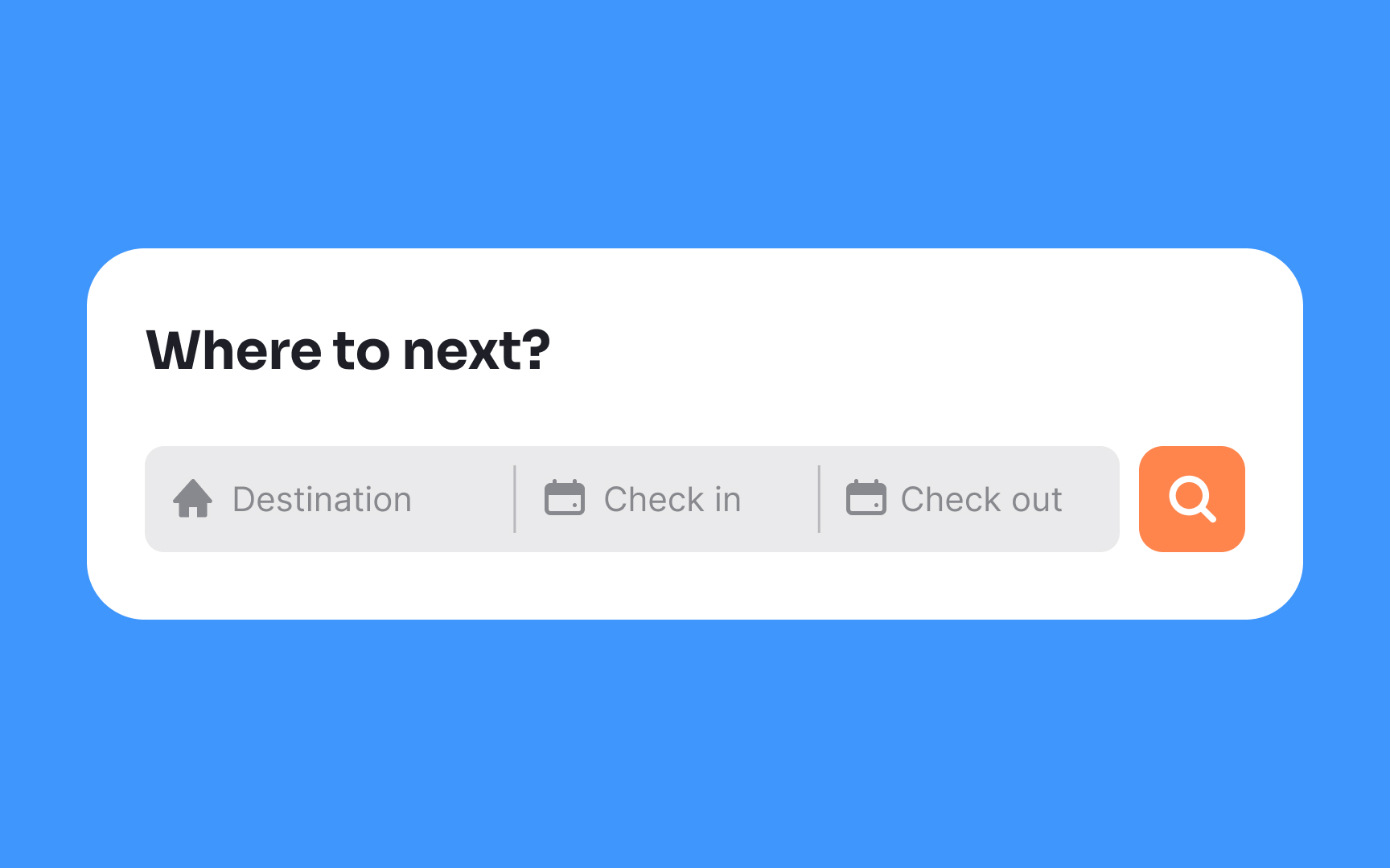
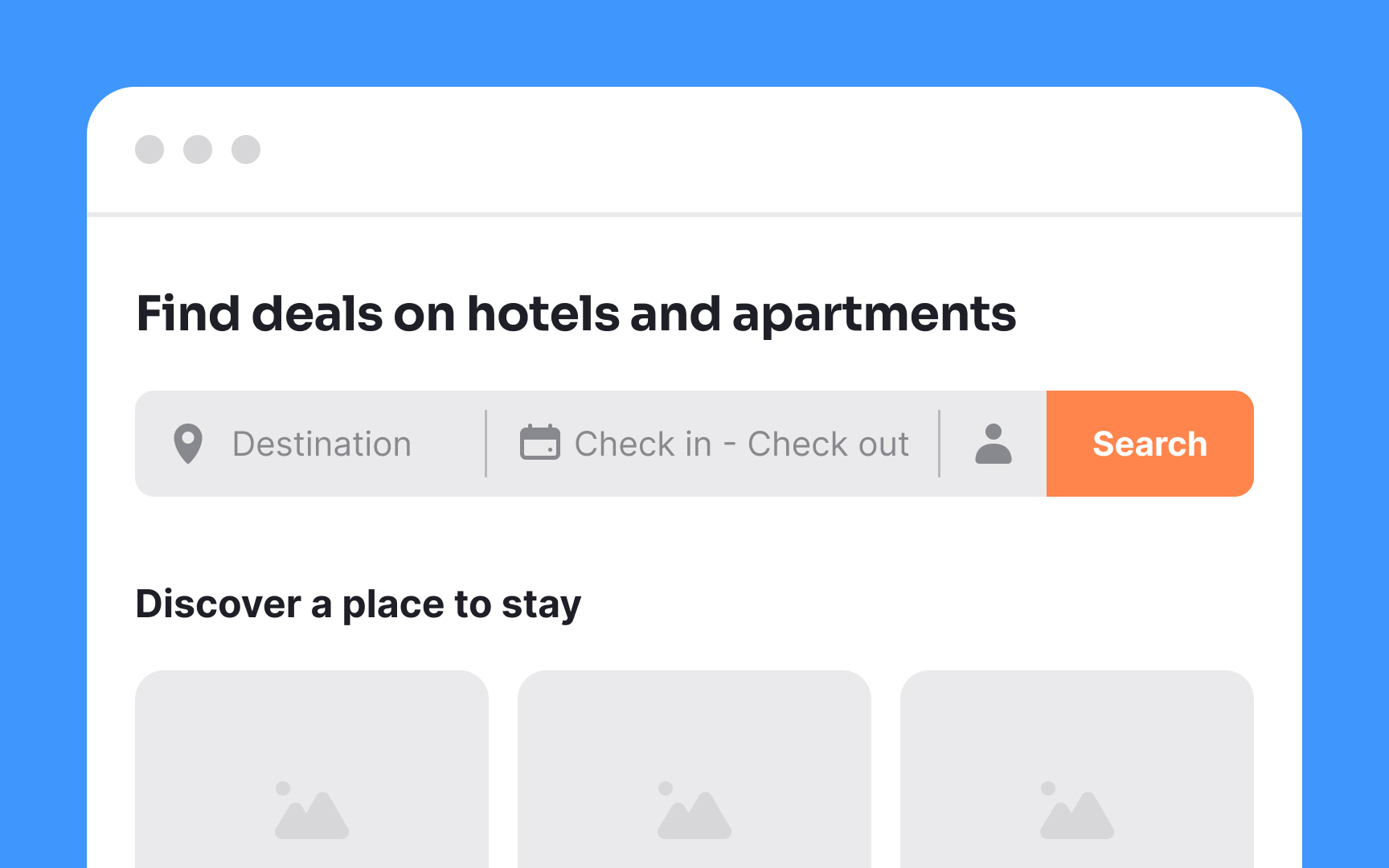
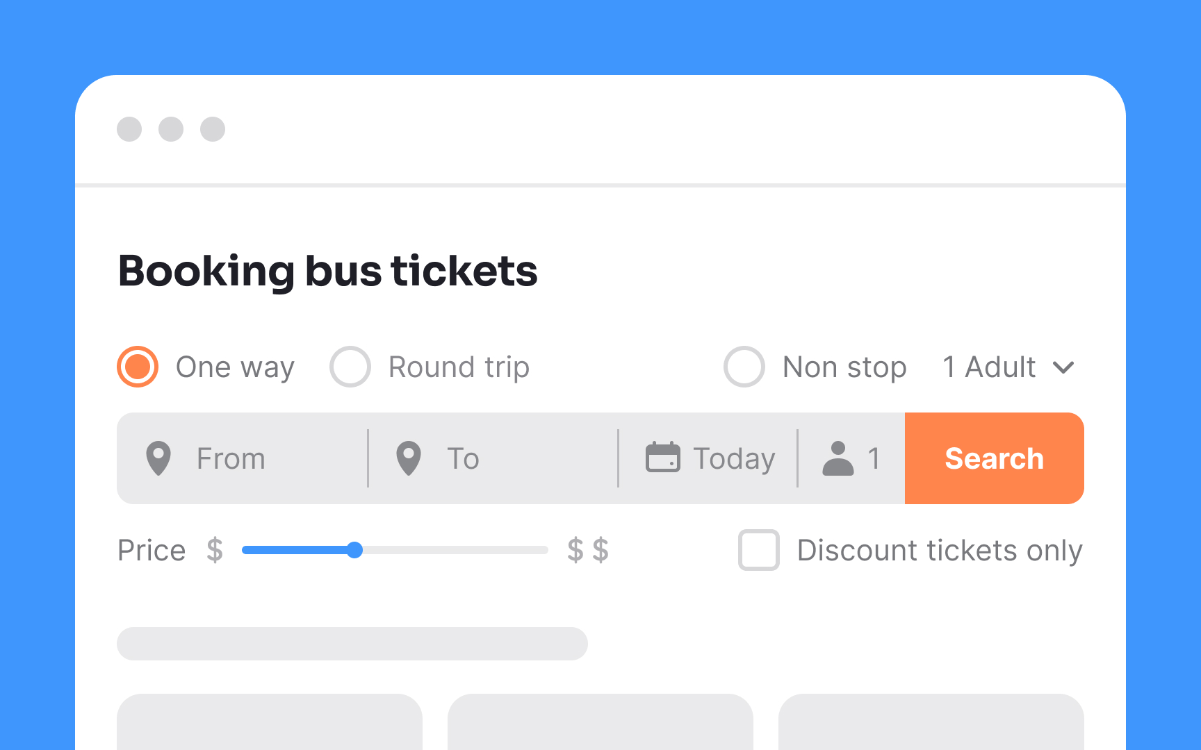
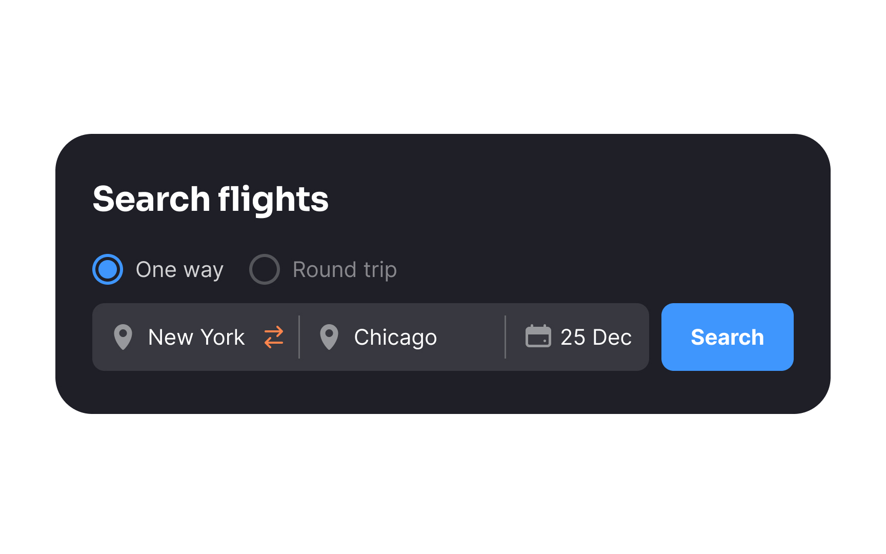
Avoid using generic placeholders in the search interface when creating a booking app, especially for reserving flight tickets. Instead, tailor the language to match the needs of your audience precisely. For instance, prompt users to specify details such as the airport, city, country, and other relevant information. Keep placeholders short — 2-3 words preferably. This results in a more intuitive and user-friendly booking process.

Exercise #2

Make the CTA prominent

Make the CTA prominent Bad Practice
Make the CTA prominent Best Practice

The search bar is the core element of websites for booking flights, appointments, or services. Thus, the CTA button should be as visible as possible so users can jump into the process immediately. Use the primary brand color on the CTA button and maintain a good color contrast to encourage users to take action.

Exercise #3

Make the search bar noticeable

Make the search bar noticeable Bad Practice
Make the search bar noticeable Best Practice

After entering a booking site, users typically begin their journey with a search for tickets, rooms, or apartments. Conventionally, the search bar is at the top of the page. Placing it elsewhere or hiding it behind an icon can add cognitive load and disrupt the user flow. To streamline the experience, the search bar should be prominent, minimizing confusion and facilitating seamless navigation.

Additionally, pay attention to the sizing of each element in the search component. Text should be readable, inputs spacious, and button click areas large enough for all devices and resolutions. Accessible touch targets for interactive elements, like buttons, benefit everyone, including those with motor disabilities, low vision, or larger fingers. Aim for touch targets of at least 48x48dp, spaced by 8dp or more, to ensure usability and balanced information density.[1]

Exercise #4

Keep the search process simple

Keep the search process simple Bad Practice
Keep the search process simple Best Practice

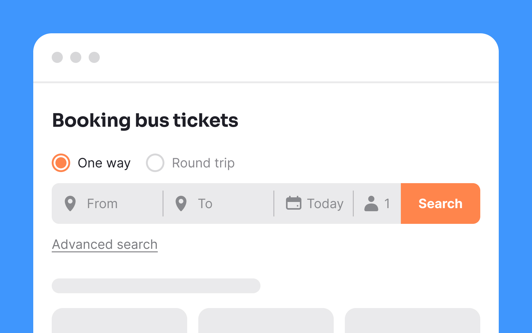
"Keep it simple" should be every designer's motto. Good booking sites entice users to start their search by presenting just the essential elements. This design strategy is known as "progressive disclosure," where the page initially showcases the most basic and commonly used features or options. More advanced and complex options are revealed only when users request them.

Progressive disclosure not only maintains simplicity but also ensures that novice users are not overwhelmed. Furthermore, employing a minimalist search bar not only conserves screen space but also improves the overall scannability of the interface.

Exercise #5

Show hover states when selecting the date range

Show hover states when selecting the date range Bad Practice
Show hover states when selecting the date range Best Practice

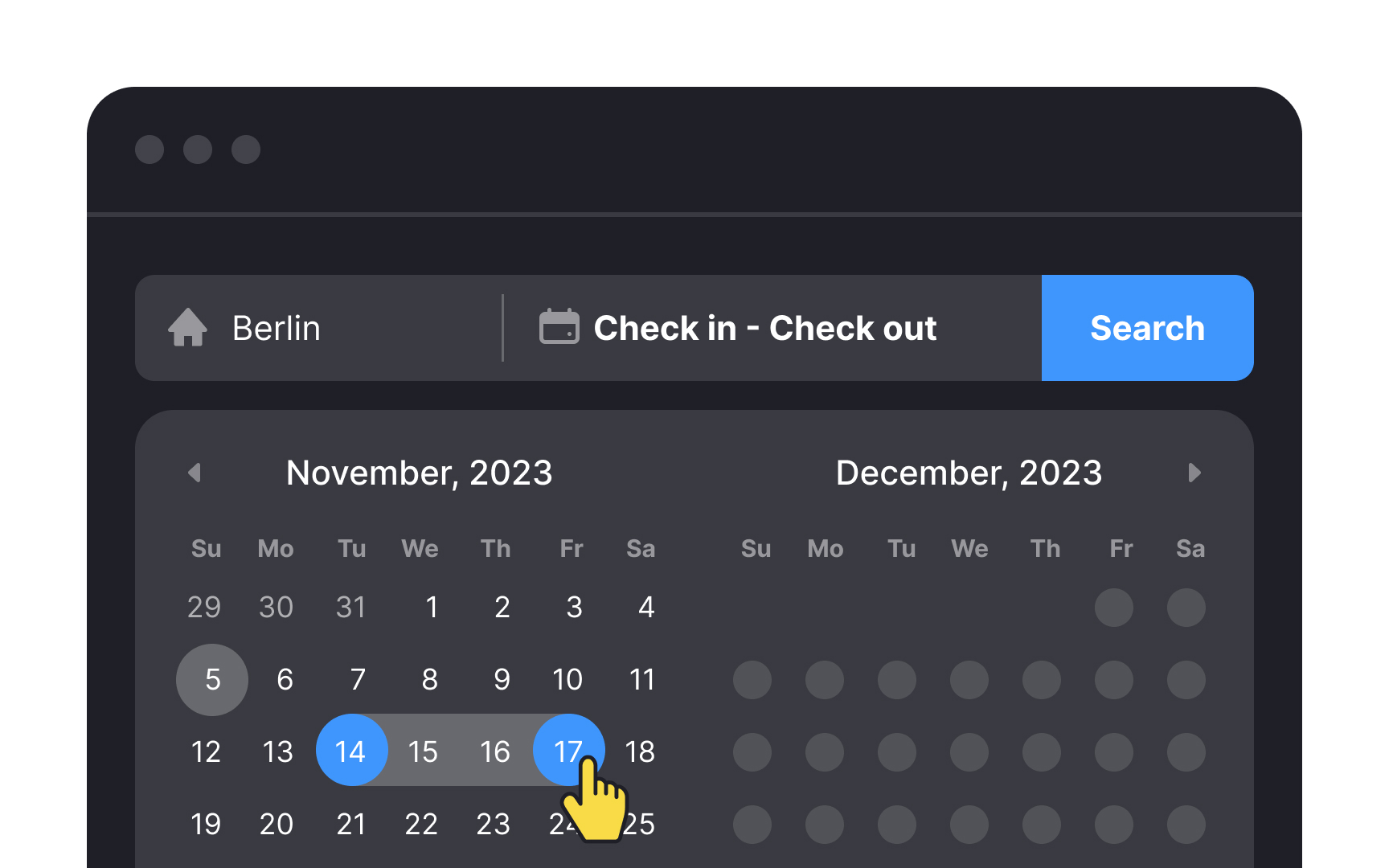
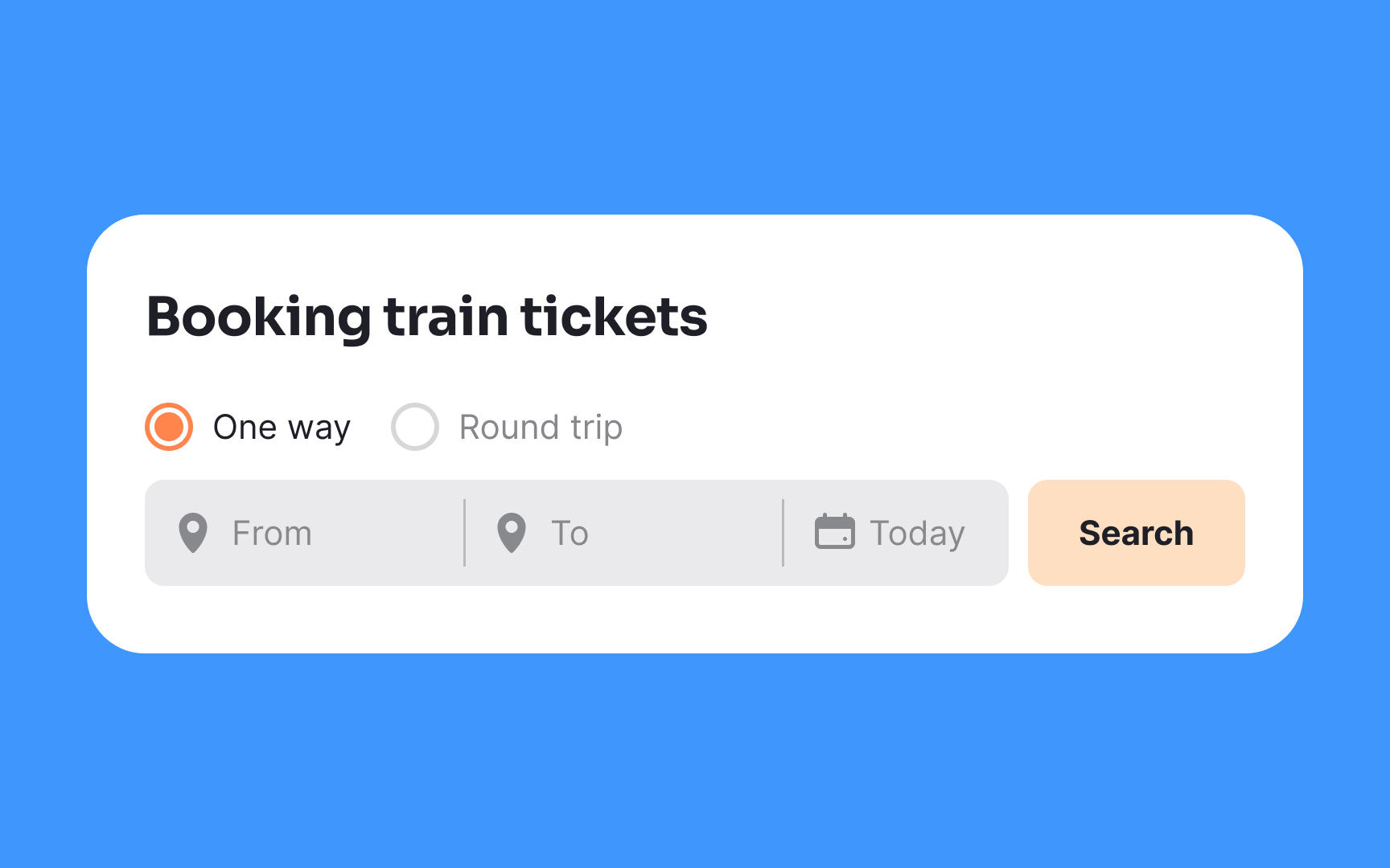
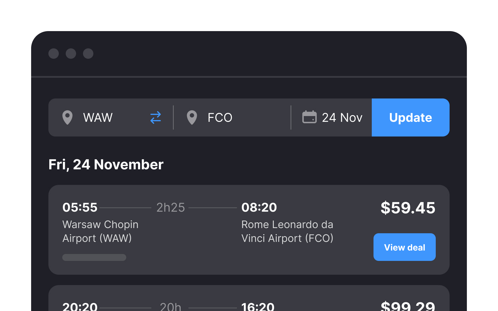
When offering a date picker, ensure that the selected dates are prominently highlighted. Include hover states to indicate the range when users are selecting multiple dates. Use autofill for the date inputs as soon as the date range is selected by users to reduce the chance of errors.

Also, it's vital to make today's date easily noticeable.[2] Users shouldn't have to spend time searching for it on their phone or laptop calendar. A clear and obvious display of the current date streamlines the booking process, enhancing user efficiency and minimizing the risk of date-related errors.

Exercise #6

Maintain natural input hierarchy

Maintain natural input hierarchy Bad Practice
Maintain natural input hierarchy Best Practice

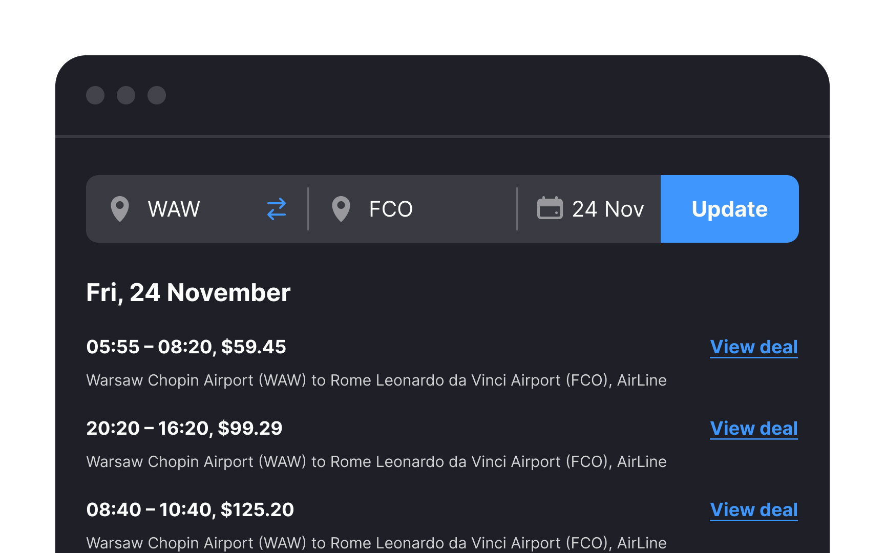
It's beneficial to keep the departure and destination inputs together in the search bar for a couple of reasons. First and foremost, it aligns with the natural order and hierarchy in the booking journey. Users typically follow a logical sequence when planning their travel, making it more intuitive to input departure and destination details together.

Secondly, maintaining this order establishes consistency, which is crucial for gaining user trust. When users encounter a familiar and expected layout, it enhances their confidence in the booking process. This consistency streamlines their experience, requiring less time and effort to figure out how to achieve their primary goal — whether it's booking a flight, purchasing bus tickets, or reserving accommodation.

Exercise #7

Make the search query easy to access

Make the search query easy to access Bad Practice
Make the search query easy to access Best Practice

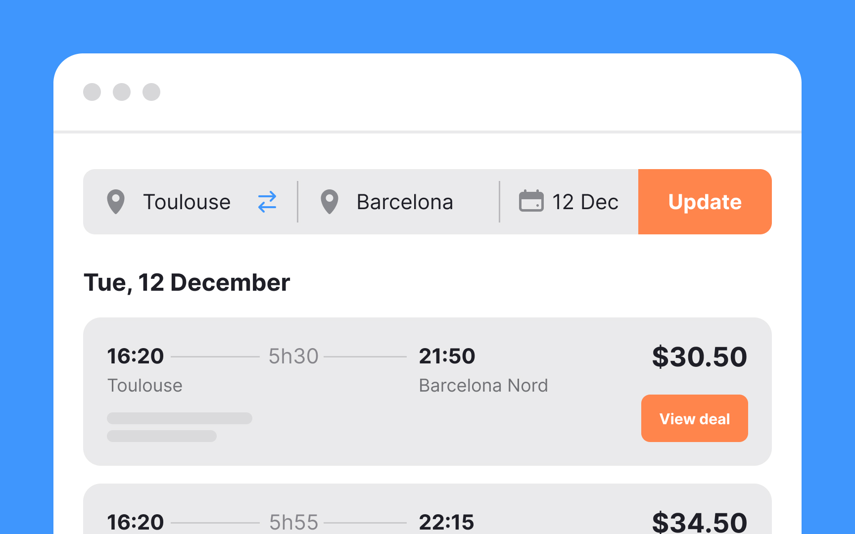
When users are booking tickets, they often find themselves tweaking dates, times, and cities in search of the most cost-effective and comfortable options. To enhance their experience, retain the initial search query on the results page.[3] This ensures that users can iterate on their search without the hassle of navigating back and forth between pages, offering them a more user-friendly and flexible experience.

Exercise #8

Allow changing directions

Allow changing directions Bad Practice
Allow changing directions Best Practice

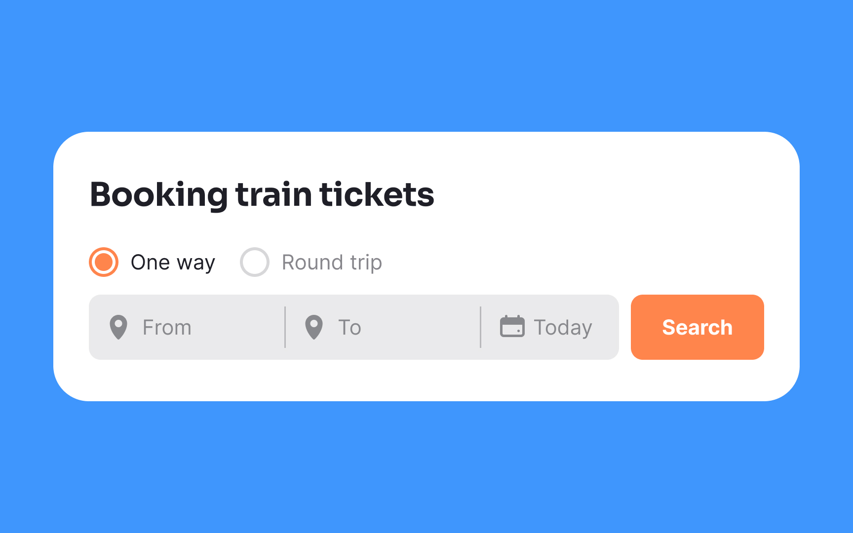
It may seem like a small detail, but allowing users to switch departure and destination cities easily makes for an excellent user experience. Instead of wasting time and typing the city name again, users can easily make changes on the fly.

Exercise #9

Allow bookmarking search results

Allow bookmarking search results Bad Practice
Allow bookmarking search results Best Practice

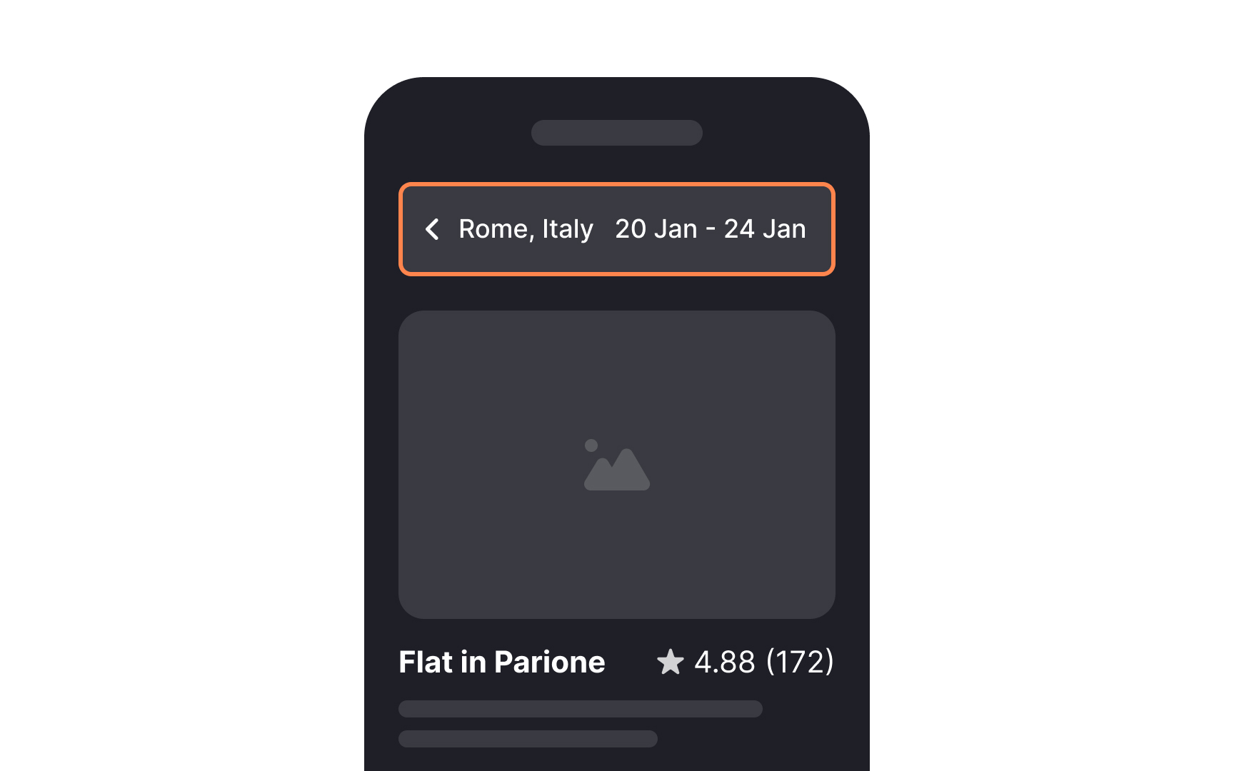
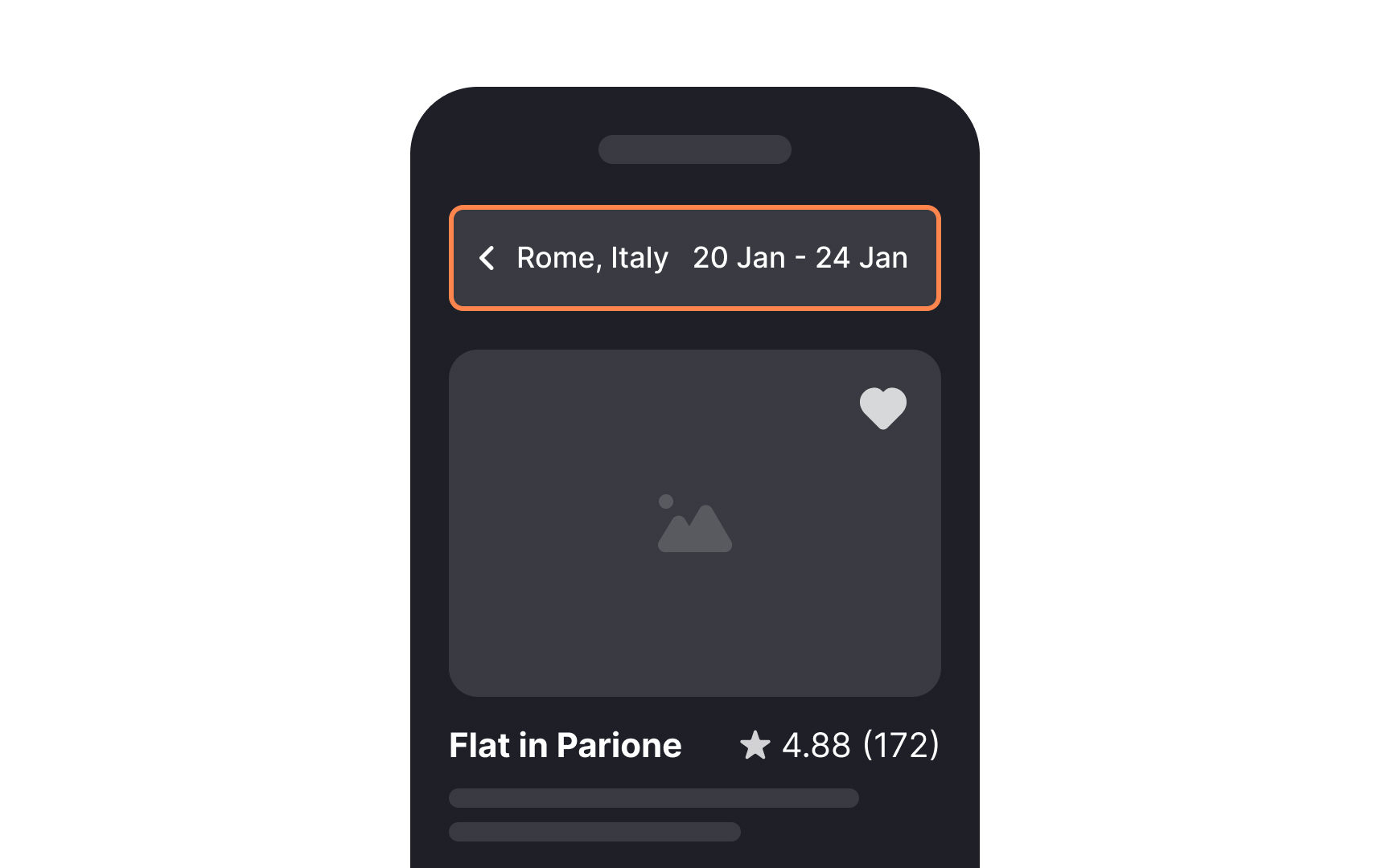
The allure of planning a trip often strikes when you're least expecting it, like when you're at the office or waiting in line. To accommodate such spontaneous inspirations, allow users to search for and save the best options for later consideration.

Integrating a bookmark or heart icon serves as a visual cue for users to bookmark their preferred choices. To enhance usability, consider adding a concise hover tip that explains the purpose of the icon button. This not only makes the bookmarking action more intuitive but also streamlines the process for users, allowing them to effortlessly save options and revisit them at a more convenient time.

Exercise #10

Utilize visual assets to aid users in scanning search results

Utilize visual assets to aid users in scanning search results Bad Practice
Utilize visual assets to aid users in scanning search results Best Practice

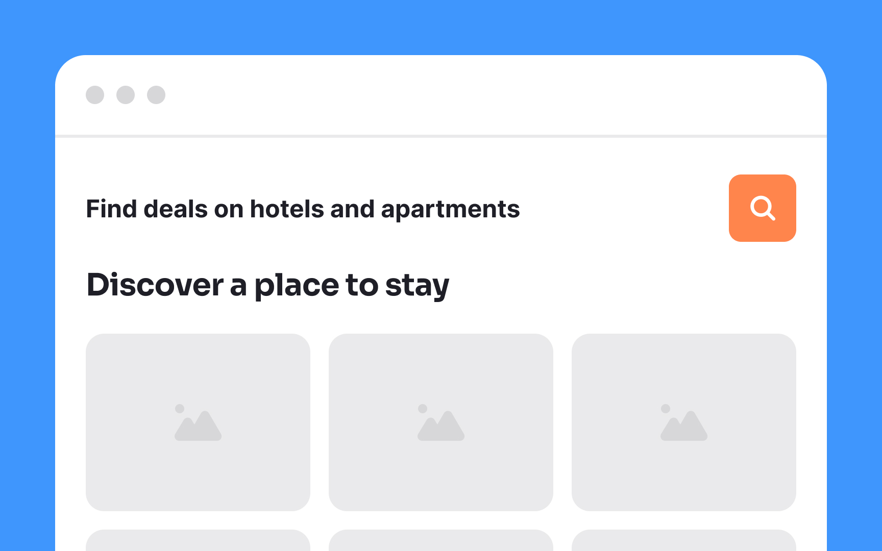
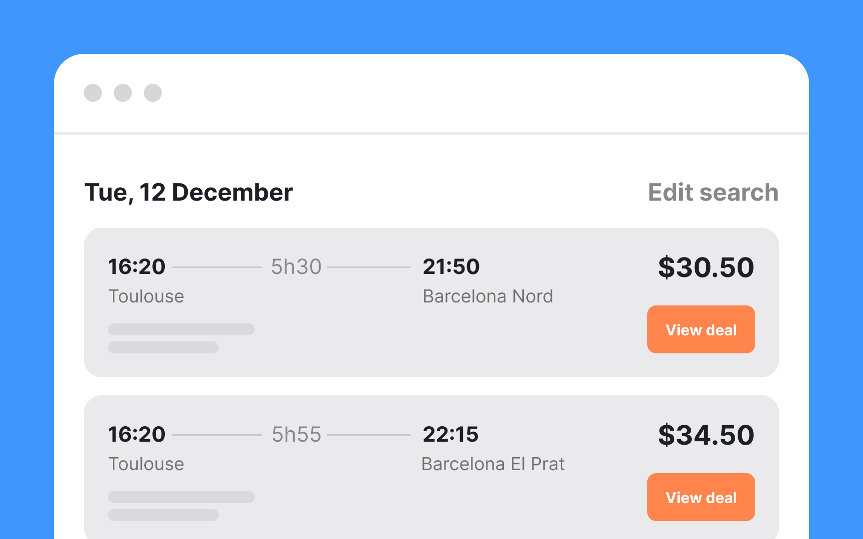
A poorly designed results page is a lot like an avalanche — it sweeps us off our feet but quickly buries us in options. Users don't want to look at a million options, so make sure the display results are designed with browsing in mind.

Consider these tips to make the search results page user-friendly:

  • Use containers or visual dividers to separate results from each other
  • Provide prominent CTAs to encourage users to take the desirable action
  • Rely on headings and subheadings to help users scan the search results page more efficiently
  • Don't neglect spacing between elements to maintain readability
Complete this lesson and move one step closer to your course certificate