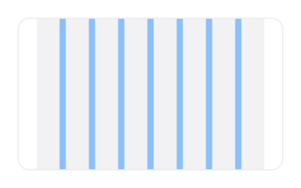
Dividers
Dividers are visual elements used in digital interfaces and documents to separate content areas, improve readability, and create clear organizational structure.


Dividers are simple yet powerful design elements that help structure information within digital interfaces and printed content. By creating clear visual breaks between sections, dividers allow users to process content more easily and follow the flow of information without confusion. They come in different forms, from thin horizontal lines to full-width separators, and are often used in navigation menus, content feeds, or dashboards.
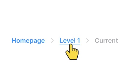
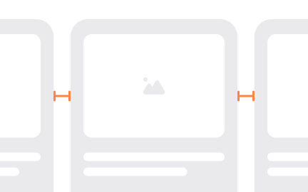
In UX and UI design, dividers reduce cognitive load by visually grouping related information. For example, in a settings page, dividers might separate account preferences from notification controls. In a data table, vertical dividers can help distinguish one column from another, improving scannability. Their strength lies in subtlety; they guide the eye without demanding attention.
Product managers also recognize the role of dividers when collaborating with design teams. Well-structured screens reduce user frustration, and simple elements like dividers can dramatically affect how quickly someone completes a task. In a productivity app, for instance, dividers between projects and tasks help users locate specific information more quickly.
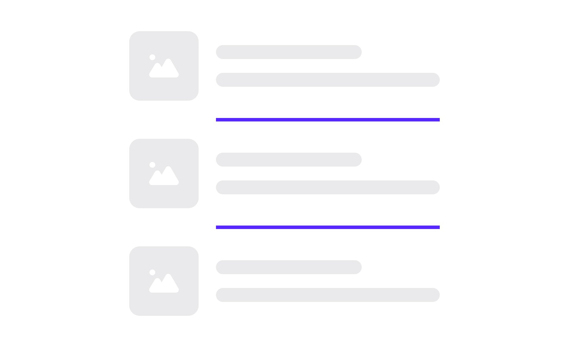
Dividers can also convey hierarchy and rhythm. A bold divider might separate major sections of a dashboard, while lighter dividers break down content within those sections. Designers use spacing, thickness, and color contrast to communicate these distinctions. The consistency of these patterns across a product contributes to an intuitive experience.
Real-world examples show their importance. In messaging apps, dividers often separate conversations by date, making it easy for users to see when interactions took place. In e-commerce sites, dividers distinguish product details from customer reviews, reducing confusion about where one section ends and another begins. Even though they are minimal, their impact on usability is significant.
While dividers are useful, overuse can create visual clutter. Best practice is to combine dividers with whitespace, typography, and alignment to achieve clarity without overwhelming users. By balancing their placement, teams ensure content feels organized without feeling boxed in.
Learn more about this in the Intro to UI Dividers Lesson, a part of the UI Components II Course.
Key Takeaways
- Dividers organize content by creating clear separation.
- They reduce cognitive load and improve scannability.
- Variations in weight, spacing, and color convey hierarchy.
- Used in navigation, tables, feeds, and dashboards.
- Overuse can cause clutter, so balance is critical.
Whitespace relies on spacing alone to separate elements, while dividers use explicit visual markers. Dividers provide clarity when content density is high, ensuring users understand section boundaries. Whitespace works well for minimal interfaces but may not be sufficient when large amounts of data are presented.
In many cases, the best experiences combine both approaches. Whitespace gives breathing room, while dividers provide structural reinforcement. Together they create a balance between simplicity and clarity.
For accessibility, dividers improve content organization for users with cognitive challenges, helping them navigate information more easily. They also support screen reader users when implemented with proper semantic markup, such as <hr> in HTML.
However, designers must ensure dividers have enough contrast for users with visual impairments. Subtle colors may look clean but can fail accessibility checks if not carefully tested.
Minimalist design often reduces visual elements, but dividers still play a role when information density is high. For example, banking apps or analytics dashboards often need clear sectioning, even in minimalist layouts.
Rather than eliminating dividers entirely, designers adapt them. Soft shadows, subtle lines, or typographic hierarchy can function as dividers while maintaining a minimalist look. This ensures clarity without compromising visual style.
Recommended resources
Courses

UX Design Foundations


UI Components I


Design Terminology


Projects

Flame - Mobile Web - Signup/Login


Teach it - School management system - MVP


NovaFlick