Call-to-Action (CTA)
A call-to-action (CTA) is a prompt in digital design or marketing that guides users toward a specific action, improving engagement and conversion outcomes.


A call-to-action, often shortened to CTA, is a critical element in both UX/UI design and product management. It serves as the bridge between user intent and product goals, guiding people toward actions such as signing up, purchasing, downloading, or learning more. CTAs are designed to be clear, direct, and visually distinct so that users know exactly what step to take next.
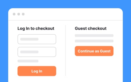
In user experience design, CTAs play a vital role in shaping interaction flows. Whether it’s a button on a website or an in-app prompt, placement and design directly affect usability. For example, a checkout process with poorly placed CTAs can lead to user frustration and abandonment, while well-placed, intuitive CTAs create smoother paths and higher conversion rates.
From a product management perspective, CTAs represent measurable touchpoints for user behavior. They connect product goals to outcomes by tracking clicks, conversions, and drop-offs. For example, a product manager analyzing sign-up funnels will study CTA performance closely to identify whether users are motivated by the wording, placement, or design of the button. CTAs thus become a central part of experiments and optimization efforts.
Real-world cases show the impact of small changes in CTAs. In one well-known example, a major retailer increased annual revenue by millions simply by changing the text on their checkout button from “Continue” to “Proceed to Checkout.” Such cases emphasize how seemingly minor adjustments can have major implications for user journeys and business results.
Designers often experiment with visual treatments such as button shape, color, or microcopy to improve performance. For instance, a company might test “Start Free Trial” versus “Get Started Today” to see which version encourages more sign-ups.
In addition, CTAs exist beyond digital interfaces. They appear in email campaigns, advertisements, landing pages, and even offline marketing. In every case, they act as directional signals for user behavior. Effective CTAs maintain a balance between being persuasive and respectful, motivating users without overwhelming or confusing them.
Learn more about this in the CTA Exercise within the Design in Marketing Lesson, a part of the Design Terminology Course.
Key Takeaways
- CTAs guide users toward desired actions like sign-ups or purchases.
- Design and placement directly influence usability and conversions.
- Product managers track CTA performance as key behavioral data.
- Accessibility in CTAs ensures inclusivity for all users.
- A/B testing helps refine wording and design for better engagement.
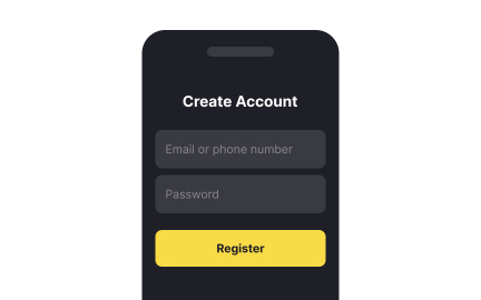
An effective CTA is clear, concise, and action-oriented. It uses strong verbs and communicates a tangible benefit, like “Get Started Free” or “Download the Guide.” Visual distinction also plays a role, as the CTA must stand out from surrounding content without disrupting the flow of the page.
Beyond wording and design, context is key. CTAs must appear at the right moment in the user journey, when motivation is high and friction is low. When matched with intent, CTAs feel natural and lead to higher success rates.
The most common approach is A/B testing, where different versions of CTAs are shown to user segments to compare performance. Teams might test button colors, copy, placement, or even size. Over time, small improvements accumulate, significantly improving engagement and conversions.
Analytics tools also help teams understand performance by tracking clicks and completion rates. Continuous testing ensures that CTAs evolve with user preferences and product goals.
No, CTAs are present across digital and offline experiences. In digital design, they appear as buttons, banners, or prompts. In email campaigns, they guide readers to sign up or purchase. Even traditional ads, such as posters or flyers, often include a CTA like “Visit Our Store Today.”
In every case, the principle is the same: guide people toward a specific action that aligns with business or product objectives. This universality makes CTAs fundamental to communication and experience design.
Recommended resources
Courses

UX Design Foundations


Core UI Components


Design Terminology

Lessons

UI Buttons & When to Use Them

Types of UI Buttons

Best Practices for Designing UI Buttons
Exercises
Projects

Crypto App Onboarding


RetroPlum - Skeuomorphic Style Button Kit


404 Error Page for Fintech Platform Bankr💸
