Best Practices for Designing UI Buttons
Learn the best practices for designing effective UI buttons
When designing any kind of digital product that asks users to take any action, buttons are an invaluable part of the designer's toolkit. Whether using buttons as calls-to-action or navigational elements, they need to follow best practices in order to be as effective as possible.
Buttons have a more commanding presence in an interface than simple text links could ever dream of having, grabbing users’ attention far more readily. From their size and shape to how they’re positioned on the page, buttons play an integral part in good UI design.

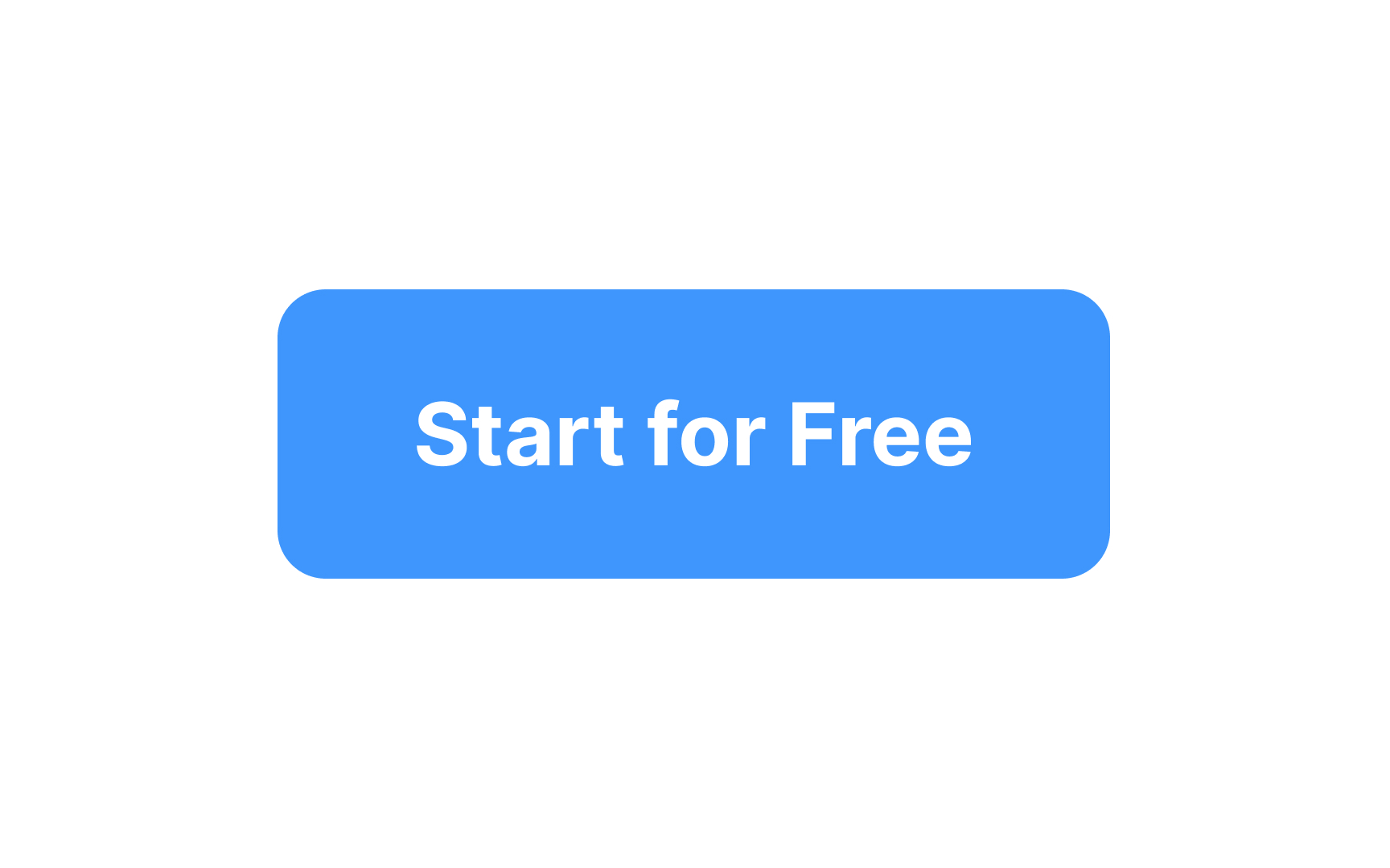
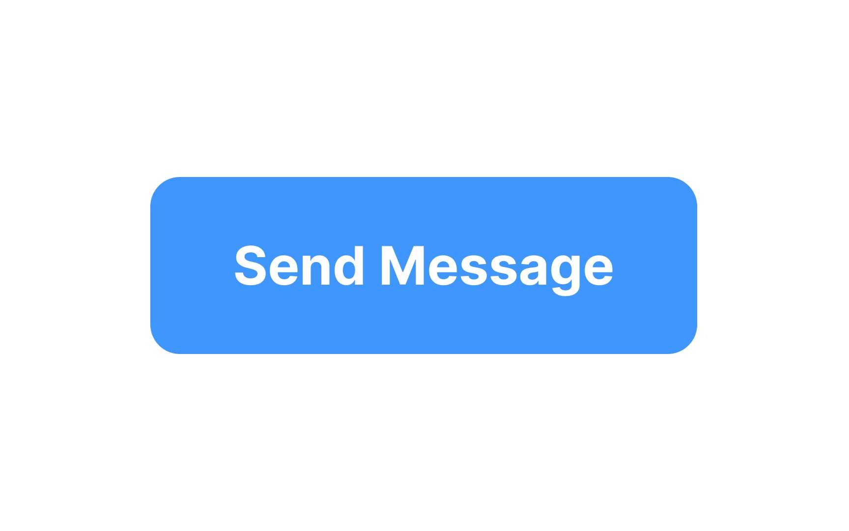
Carefully consider the padding you use around a
A good rule of thumb is to make the padding on the width twice as much as the padding on the height of the button. At minimum, an uppercase “W” should fit between the label and the edge of the button.[1]
On the web, a button's width usually adjusts according to its label.
Pro Tip: For buttons, we recommend a minimum horizontal padding of 16px.
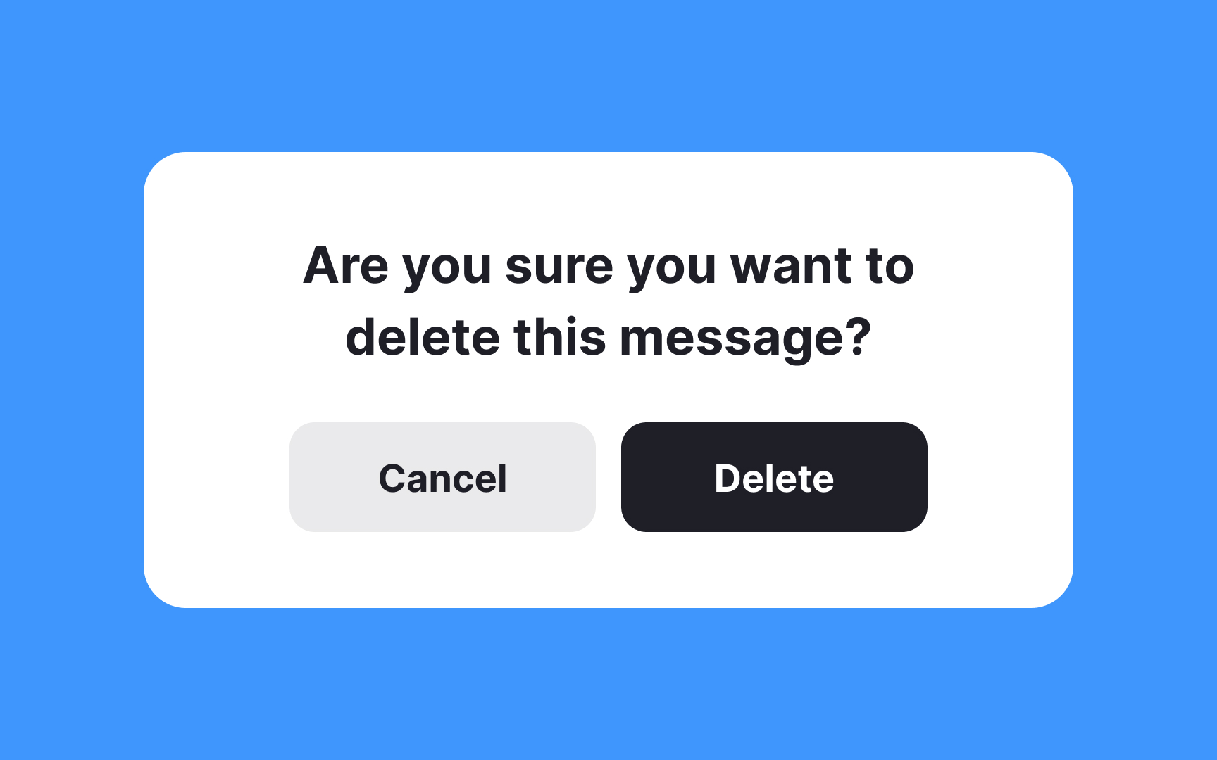
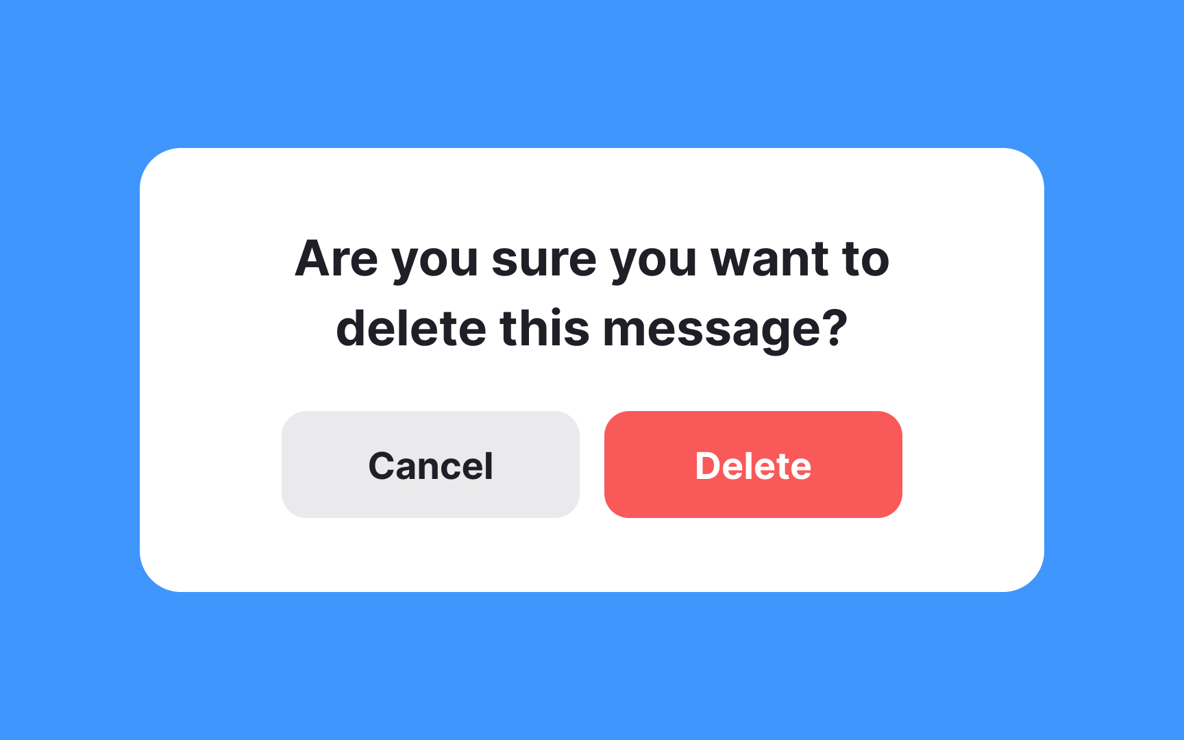
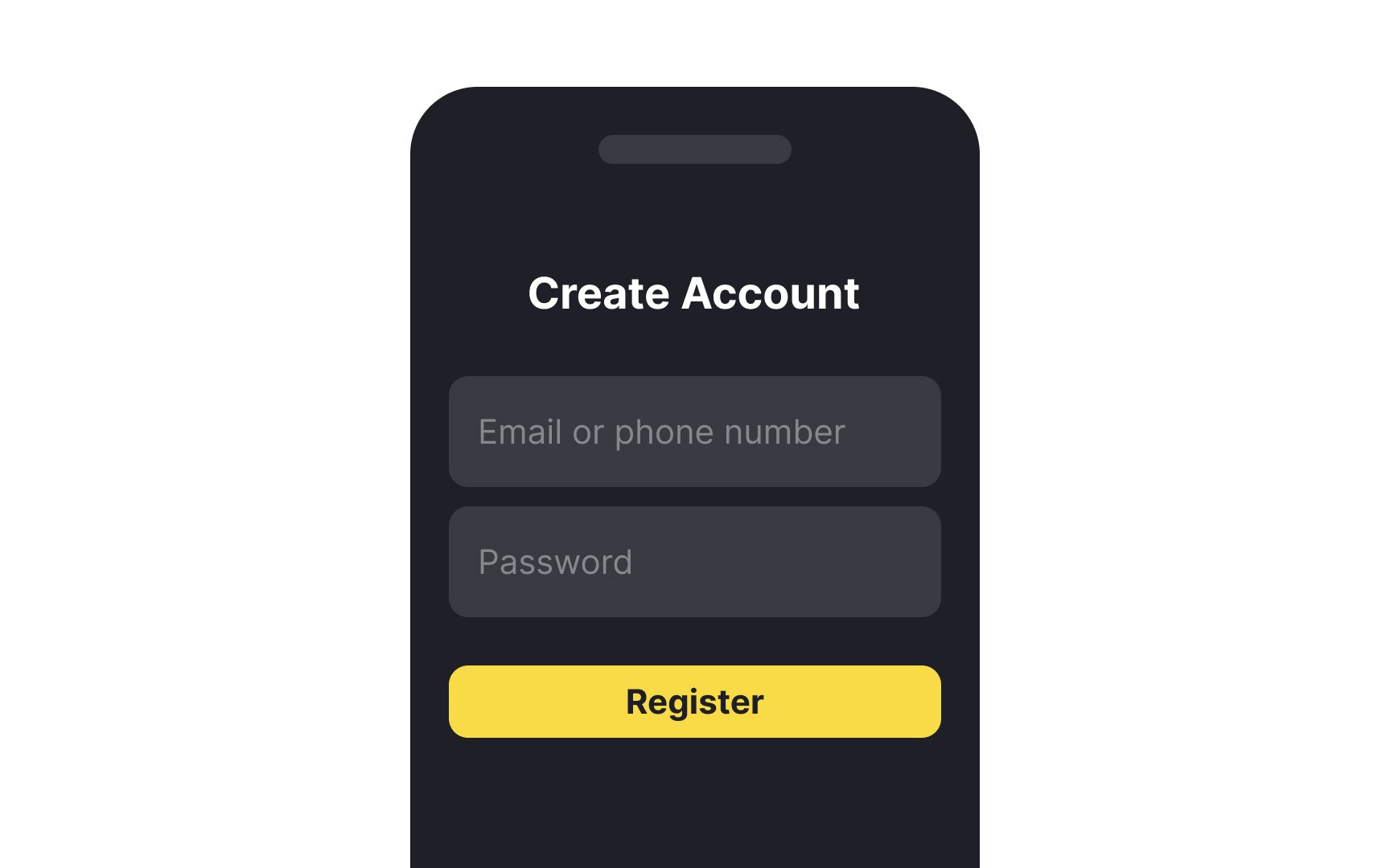
Color is a powerful tool in design that instantly communicates meaning. Utilizing it as a visual signifier can guide users' attention to key elements like
By aligning color cues with user expectations, you create a more intuitive interface that helps users navigate more effortlessly. Just remember, the colors should complement the overall design and meet accessibility standards for optimal user experience.
Consistency is key. Stick to one style for
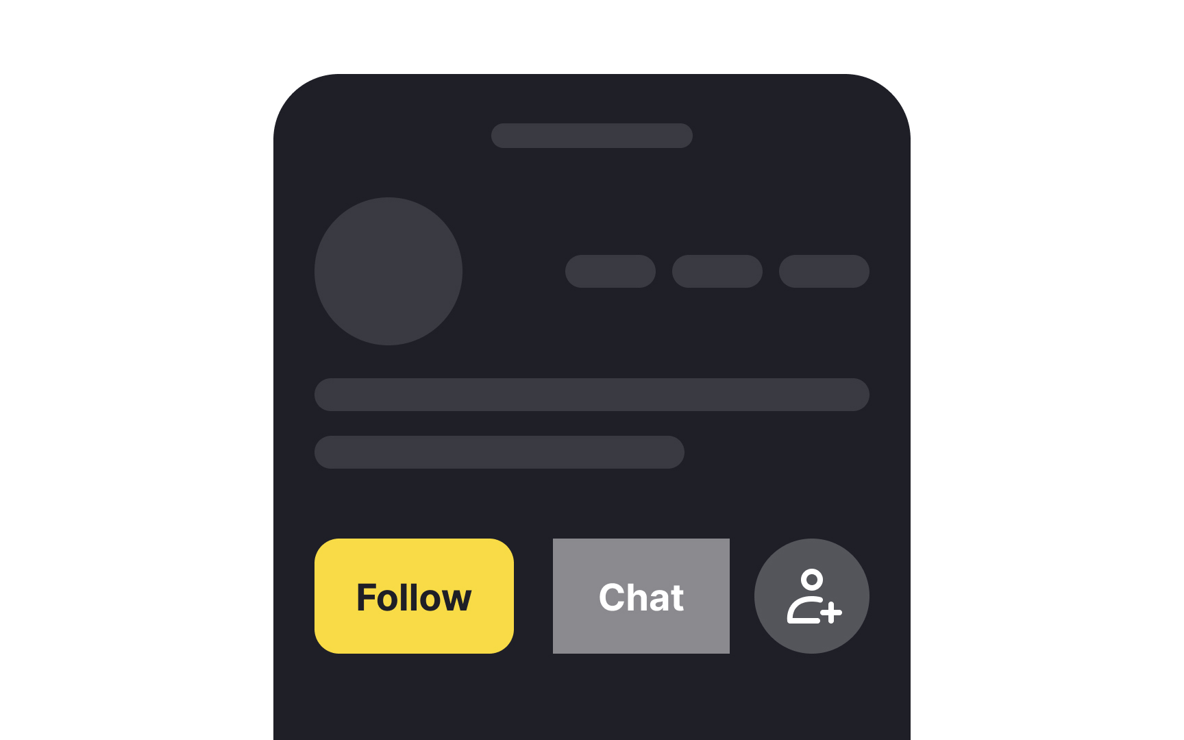
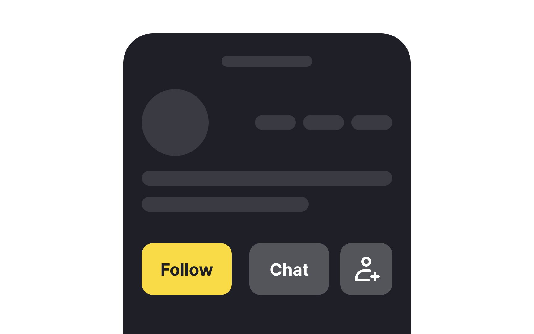
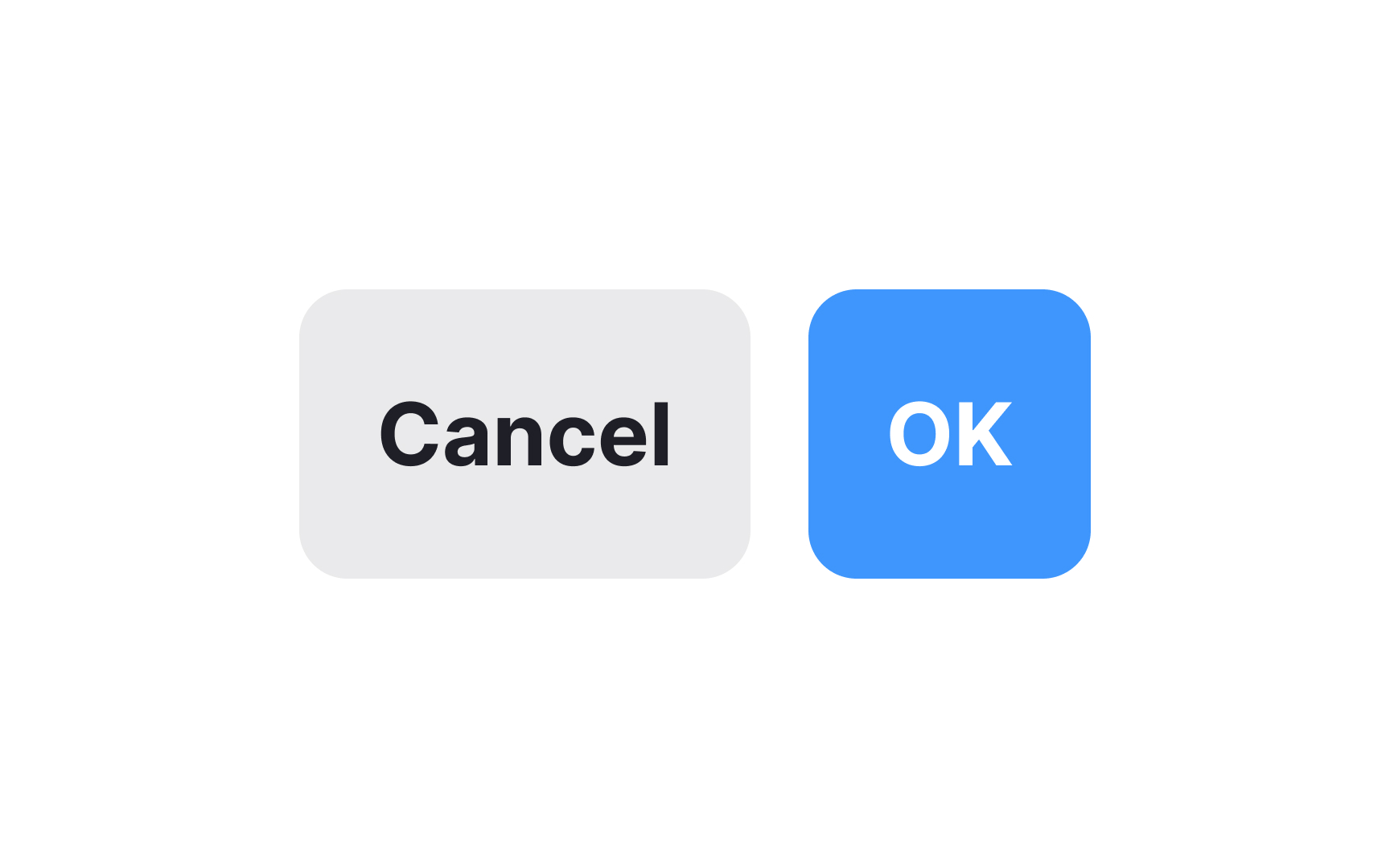
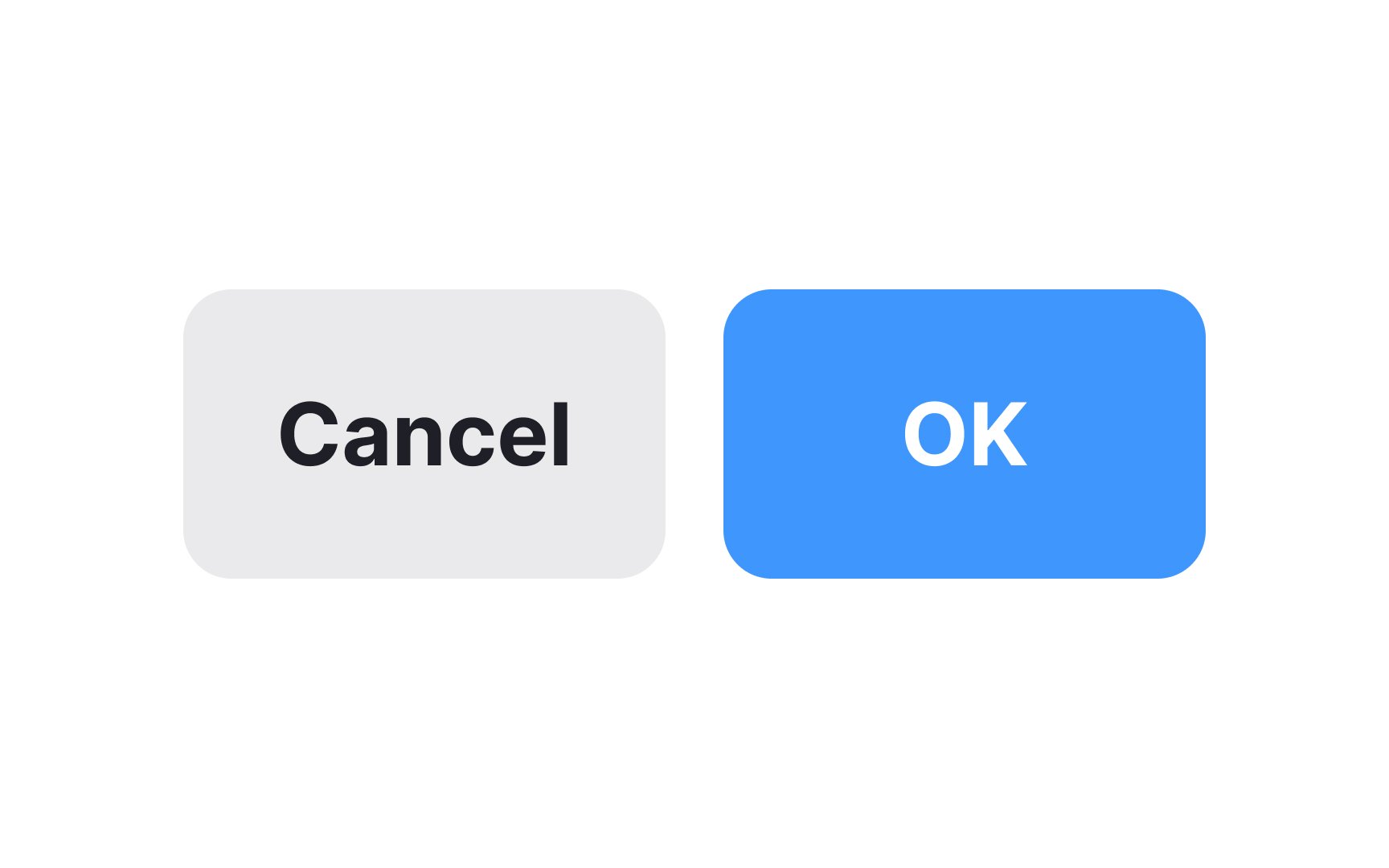
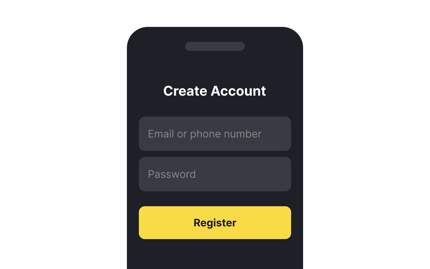
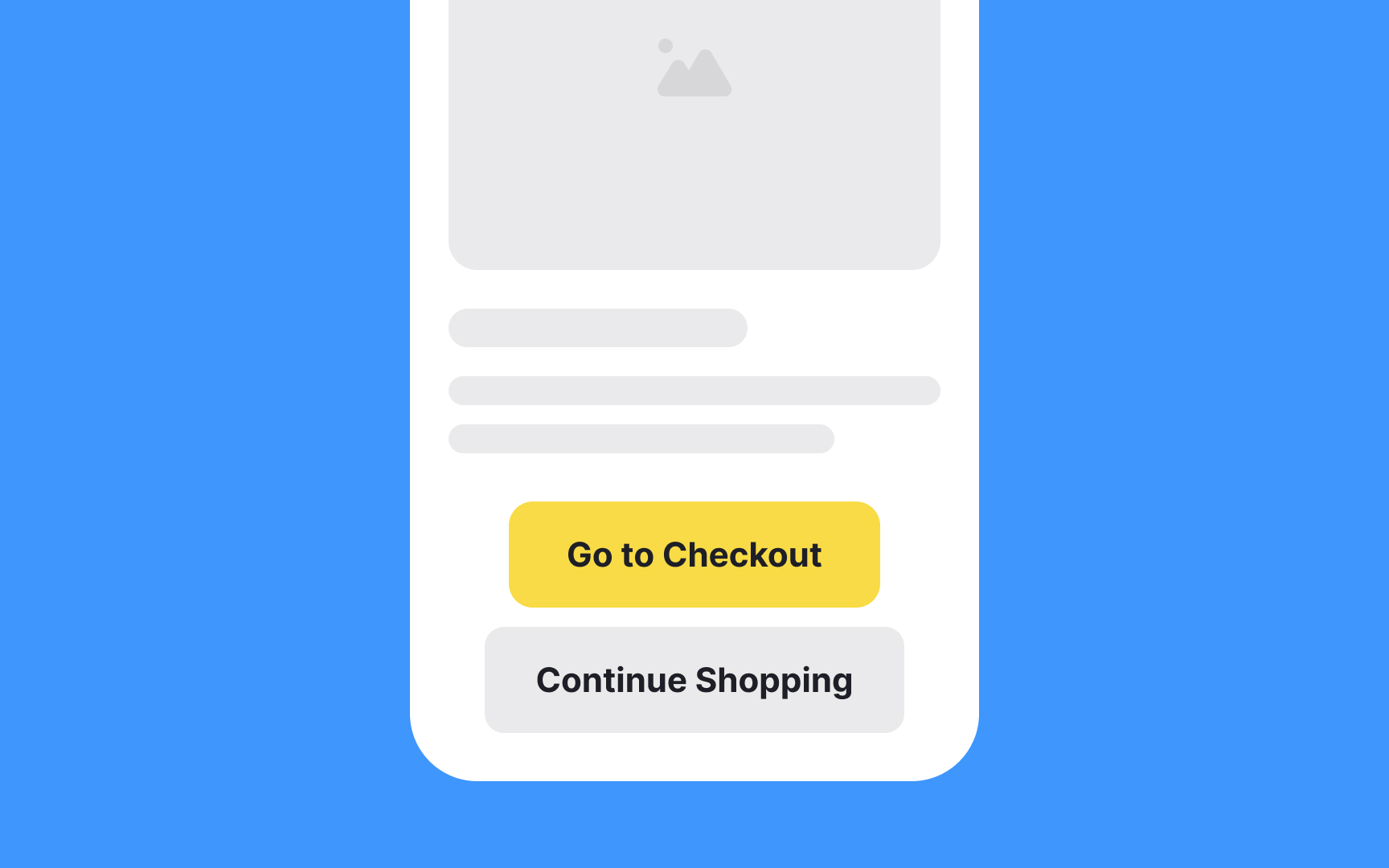
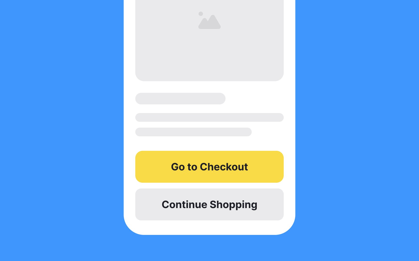
Button hierarchy is crucial in defining the user flow in an interface. Always differentiate between primary, secondary, and even tertiary
The primary button, often used for actions like "Submit" or "Next," should be the most visually prominent. Secondary and tertiary buttons, like "Cancel" or "Back," should be less eye-catching but still easily identifiable.
Utilize varying shades, sizes, or subtle effects like shadows to distinguish these buttons. A well-executed button hierarchy not only eases cognitive load but also makes user interaction more intuitive and efficient. Failing to establish a clear hierarchy could lead to user confusion or
While it's fun to let your creativity flow, it's essential to exercise caution when it comes to button design. The key is balance. You want your
3 golden rules to keep in mind:
- Make sure it looks like a button: Users should instantly recognize it as something they can interact with.
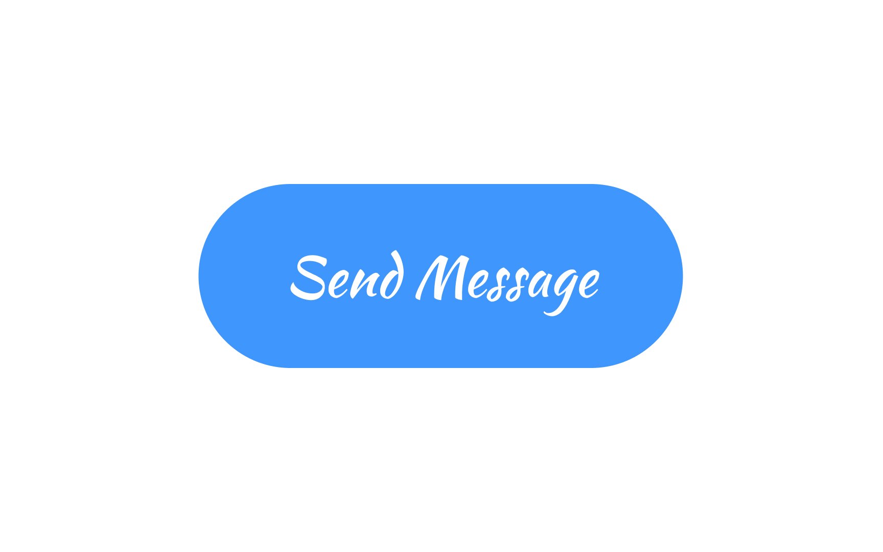
- Keep it readable: No matter how stylish your font or how unique your
color scheme is, users must be able to quickly read thelabel . - Stick to conventions: Creative colors, shapes, and fonts are okay in moderation, but going too far off the beaten path can lead to user confusion.
Feel free to push boundaries, but always prioritize
Pro Tip: Try A/B testing new button designs against more tried and true styles to gather feedback.


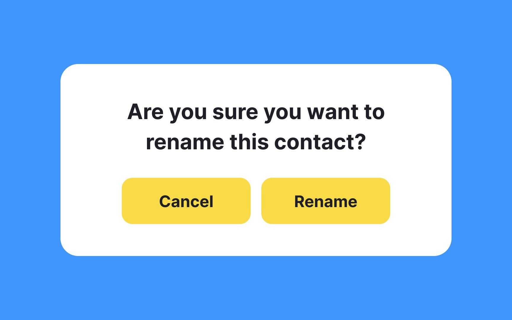
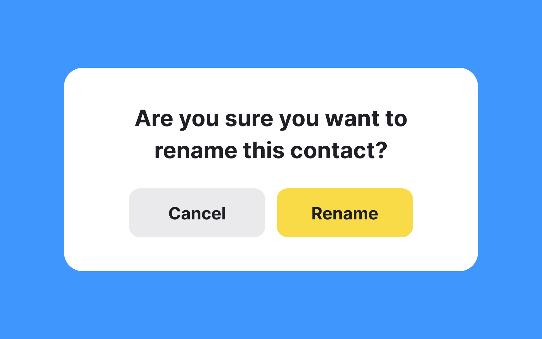
Ensuring your
Here are some tips:
- Aim for a contrast ratio of at least 4.5:1 for normal text and 3:1 for large text.
- Use tools to check your contrast ratio; don't just trust your eyes.
- If your button is on a complex background like an image, consider adding a semi-opaque background to boost contrast.
Remember, high contrast isn't just about readability; it's about making your design inclusive for all users.


Soft
If you decide to make all
Size is one of the most important aspects of button design. It is closely tied to conversion rates, the number of
According to MIT Touch Lab studies, the minimum touch target size is 16-20mm (~45-57px) which equals the average adult person's fingertip size. Notably, the impact area of an average adult's thumb is even larger — 25x25mm (72px).[2]
On desktop interfaces, you’ll want to provide enough top and bottom


While it's common to let
References
- Design better buttons | Medium
- Touch Targets on Touchscreens | Nielsen Norman Group
Top contributors

Topics
From Course

Share


Similar lessons

Common UI Component Definitions I

Image Terminology
