UI Cards
UI cards are container components that group related content, or visuals into a single unit, making information scannable and interactions more organized.


TL;DR
- Visual containers group related content.
- Used for organization and clarity in layouts.
- Common in dashboards, feeds, and catalogs.
- Improve scannability and interaction patterns.
Definition
A UI card is a modular design element that organizes related content, such as text, images, and actions, into a structured, easily scannable block.
Detailed Overview
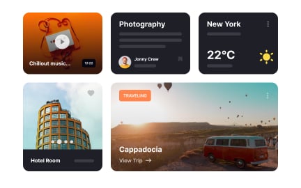
UI cards have become one of the most recognizable patterns in modern interface design. Inspired by physical cards, they create modular containers that group related content together. Each card can hold a mix of elements, titles, descriptions, images, and buttons, making them versatile for a wide range of applications.
A frequent question is why cards are so effective. Cards break down large amounts of information into manageable units. In feeds, dashboards, or catalogs, cards provide structure, helping users process content quickly. They also support responsive layouts, since cards can adapt easily to different screen sizes by stacking or rearranging.
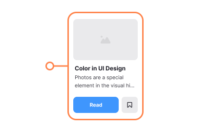
Another common query is about interaction. Cards are not just visual containers; they often function as clickable units. For example, a product card in an online store might include an image, price, and button, all within a single touch target. This integrated approach reduces friction and keeps interaction intuitive.
Designers often ask about hierarchy within cards. Since cards usually hold multiple types of content, establishing a clear hierarchy is essential. Titles should be easily noticeable, visuals should support context, and calls-to-action must stand out. Without proper hierarchy, cards risk feeling cluttered and overwhelming.
Accessibility is also a critical consideration. Cards must have clear focus states, adequate contrast, and meaningful labels for assistive technologies. Interactive cards should communicate their function, so users know whether to click the card itself, the contained buttons, or both. Proper structure prevents confusion and ensures inclusivity.
Finally, UI cards align well with modular design systems. They are reusable, flexible, and easy to style consistently. By building cards as core components, teams can scale design across products while maintaining a unified look and feel. This balance of clarity, interactivity, and scalability explains their widespread adoption.
Learn more about this in the Intro to UI Cards Lesson, a part of the UI Components I Course.
Cards break content into digestible units, improving scannability and reducing information overload. They also adapt well to responsive layouts, stacking neatly on smaller screens.
This modularity makes them highly versatile across industries.
Cards often serve as clickable units, allowing users to access details, perform actions, or navigate to other screens. They may contain buttons or be fully clickable themselves.
This flexibility keeps interactions intuitive and efficient.
Hierarchy ensures users notice the most important elements first, such as titles, visuals, or buttons. Without hierarchy, cards can feel cluttered and hard to parse.
Clear structure improves usability and supports decision-making.
Cards must be labeled clearly for screen readers, use sufficient contrast, and provide visible focus states for keyboard navigation. These practices make cards usable for all audiences.
Inclusive card design improves trust and overall user satisfaction.
Cards are modular and reusable, making them ideal components in design systems. They can be styled consistently and adapted for multiple contexts without breaking patterns.
This scalability improves efficiency across teams and products.
Recommended resources
Courses

UX Design Foundations


UI Components I


Design Terminology

Lessons

Intro to UI Cards

Best Practices for Designing UI Cards

Interface Inventory as the Foundation of Design Systems
Exercises
Projects

HireHarbour Allies: UX/UI Case Study for Inclusive Landing Page


Scholar – Pricing Page for SaaS Education Platform


Parmonic - AI Video Automation Platform