Use card layout for content browsing
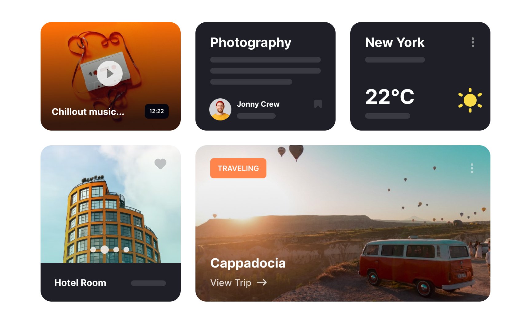
Cards are an excellent solution for grouping together heterogeneous items. Each card can contain different types and amounts of information and, thus, occupies an additional amount of vertical space. Cards may or may not include rich media (the thumbnail image), title, secondary text, hashtags, call-to-action buttons, etc., but they are all associated with one concept.
Card layouts are better for interfaces where users browse information instead of searching. This is because:
- Cards lack a strong hierarchy. All cards are equal and carry the same ranking. When users search, they assume the items on the top of the list are the most relevant.
- Cards are less scannable than lists. Due to their flexible height, the position of elements isn't fixed, which makes them less predictable for human eyes. When people search for a specific item, they need consistency for a more efficient and fast search.
- Cards take more space and thus, require more scrolling. When users search, frequent scrolling demands more mental effort as users need to strain their short-term memory instead of just looking at the page and seeing more items in a single view.[1]
