Scholar – Pricing Page for SaaS Education Platform

I decided to design a pricing page for a platform called Scholar for educators to interact with their students and streamline their work. I would describe it as sophisticated, structured, and minimal. I took this approach to convey a sense of professionalism and simplicity needed for all the various tasks teachers need to do.
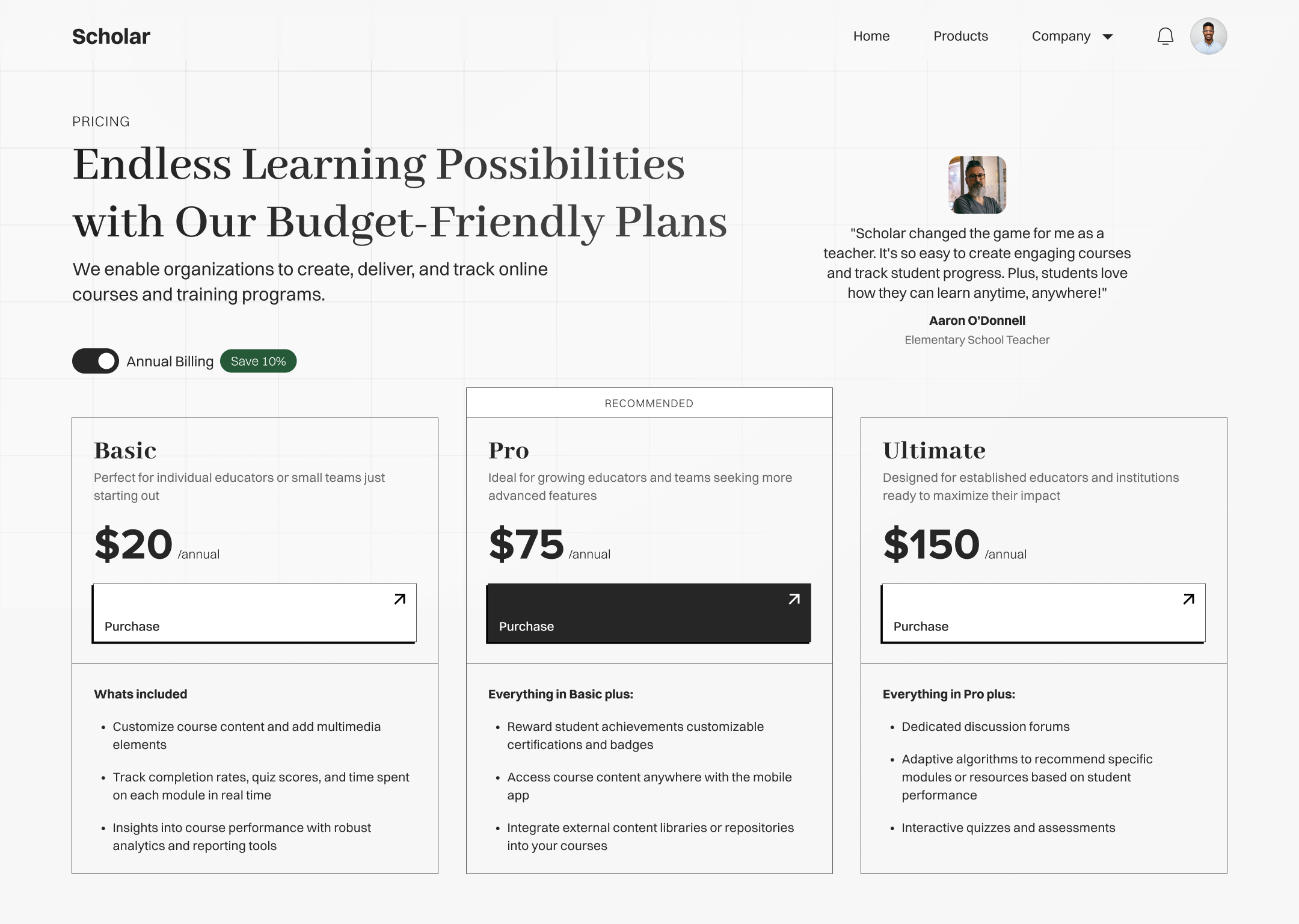
- Clear path to customize billing cycles
- Large simple CTAs that encourage clicking
- Color used sparingly, spacing, and typographic hierarchy make scanning easy
- Social proof with testimonial
- Recommended plan based on account details
- Keep list of features short by summarizing how a plan adds on to another
Thanks for viewing!

Reviews
11 reviews

Positive Aspects:
- Background: The choice of a grid pattern background complements the content presentation, enhancing the overall visual appeal.
- Inviting CTA: Usage of large, simple CTA effectively encourages user interaction.
- Clear Billing Plans: The page clearly guides users through the plans available.
- Social Proof: Incorporating testimonials adds credibility and trustworthiness to the offering.
Areas for Improvement:
- Social Proof Presentation: This appears to have a slight imbalance in the presentation of the content/card. A few more iterations could help to achieve better alignment and visual harmony.
Great work!

Nice job at keeping this page simple and clear.
Where I can see an improvement is with the 'what's included'. UX research shows us that users don't read text strings (or at least find it difficult to absorb the information), and specifically when comparisons are involved for similar products it's really nice to show the user in a clear table format which features and included and which are not, per plan so it's easier to compare and know what they get for their money. This also means you can choose the features to highlight, from those that you know are most important to users (and hence generate sales faster for the plan that has those indispensable features).

The design is well presented, the content is evenly allocated, the white items are balanced, and the details are very suitable. I have the best compliments for you.
Note: The testimonial is in an inappropriate position.
Share: With my experience, you should place it below the price list. This helps your content to be more focused and helps customers have a higher rate of clicking the buy button. Only when the content above is not convincing, is the testimonial a good thing to retain customers.

Nice work! I like it

The project delivers well on the brief. Minimalism, clear typographic hierarchy, and restrained use of color. The progressive feature lists ("Everything in Basic plus") are a smart choice that reduces cognitive load and makes scanning easier. The billing toggle with a "Save 10%" badge is a solid conversion pattern, and highlighting Pro with a filled CTA effectively directs attention to the recommended plan.
I agree with Vivek's observation. The testimonial in the top-right corner feels detached from the rest of the layout. Placed below the pricing section, it would better support the purchase decision. The recommended plan card could benefit from stronger visual differentiation beyond the label and button. Perhaps a subtle background. Small detail: "Whats included" is missing an apostrophe.
The foundations are strong, with good spatial awareness and proportions. A few tweaks to social proof placement and visual details will bring everything together. Solid direction - keep pushing it forward! 💪😊
Your design looks clean, structured and easy scannable as expected from SaaS platforms in general.
One point: I am curious how target users perceive the sparse color scheme in your design.
Overall, a good work.

Beautiful design Tre.
The aesthetics are clean, the fonts work well, and I like the minimal feel it has.
I don't think the testimonial is in a bad spot. People get to see proof right away, but that is in the desktop version, in a mobile version I would indeed like to see it below the pricing table.
Now, as others said; There is no "Pricing" tag on the navigation tab. The copy for plan comparisons could be sightly improved beyond the grammar errors.
A table with the topics laid out and check marks on the plans that have it would work better than the current text strings in my opinion.

You definitely managed to create a sophisticated and minimal look and feel. Very well designed, good job here.
I agree with the previous reviews about the comparison of plans and positioning of social proof elements and want to leave you my thoughts on the design.
1 - You have placed „Home“ as a navigation link in the menu, but I am missing the „Pricing“ here. This seems unusual because users will click on the logo to navigate to the homepage. Since pricing is a crucial part of the decision-making for subscribing to a product, it would be beneficial to the IA to have it in the menu, rather than „Home“.
2 - The minimal design concept for the product looks a little bit too „Mid-Fi“ in my opinion. At least the recommended plan should have a drop of colour to make it stand out from the other options. Maybe a coloured background for the „RECOMMENDED“ headline or highlighting the card frame would work to make it look more engaging.

A clean, professional layout with a well-structured pricing section. The minimalistic design approach makes the information easy to digest.

a little cluttering for my choice but the overall design is good. Keep designing!
You might also like

Lumen — Accessible Signup Form


SONZ - Entertainment platform


Camp & Travel Explorer - App Design


Solar system Dashboard Utility

Uxcel Halloween Icon Pack


Color System

Visual Design Courses

UX Design Foundations


Introduction to Figma

Design Terminology
