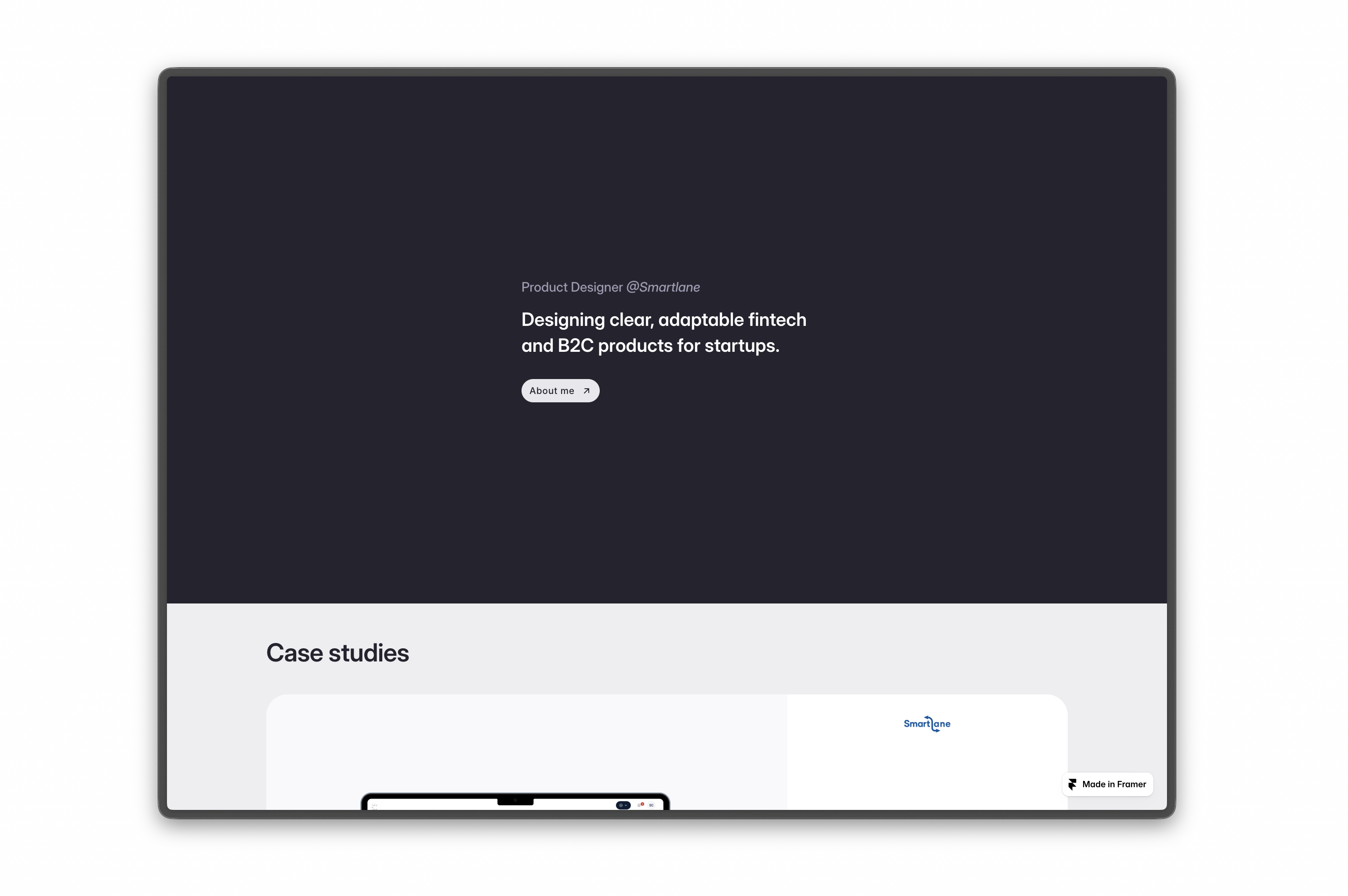
Portfolio website
For this update, the objective of the portfolio is to achieve a cleaner and more structured layout while remaining fully aligned with the brand guidelines. This direction reflects my preferred aesthetic, with a strong emphasis on clarity, balance, and well defined, minimalist spacing.
I would greatly appreciate your feedback on areas where further refinement and iteration may be beneficial. I look forward to your insights and guidance.
Reviews
5 reviews
Hey Ameer, this is a well-presented portfolio. It feels clean, cohesive, and professionally structured.
- In the hero section, I’d suggest making “View Work” the primary CTA and keeping “About Me” as a secondary one. Since the main purpose of a portfolio is to showcase your projects, the primary action should guide users directly to your work.
- In the project descriptions, there’s a small inconsistency in capitalization. For example, one case study description starts with a capital letter while others begin in lowercase. Aligning these will improve polish and attention to detail.
- The hover shadow behavior needs refinement. The Create Smart Lane case study does not have a hover shadow, while the others do. Additionally, the shadows across the cards can be slightly more subtle. On the last case study right above the “Explore Mini Case Study” section, the hover shadow creates a visible line or edge effect that could be blended more smoothly.
- The About section is well written, but it feels slightly word-heavy. You could break it into shorter paragraphs and potentially add a photo or subtle visual element to make it more engaging and easier to scan.
With a few small refinements in consistency, hierarchy, and hover behavior, this portfolio would feel even more polished and intentional. Prioritizing the right CTAs can make it more impactful as well!
Hi Ameer!
This feels sleek. The site has that modern Framer smoothness clean transitions, confident layout, and a nice sense of rhythm while scrolling ✨
The structure feels intentional. It doesn’t feel cluttered, and the spacing gives the content room to breathe. The visual hierarchy guides my eyes naturally, which makes the whole experience feel polished and professional 👌
Maybe add one bold, standout section that really surprises the user something that makes people go “ohhh nice” and remember the site later. But overall, it feels solid, modern, and thoughtfully crafted. Nice work!
Professional portfolio with solid fundamentals. Minimalist aesthetic works well for fintech. Here's my feedback:
Strengths:
- Clean hierarchy and spacing guide users naturally
- Diverse case studies (payments, bookkeeping, ridesharing, design systems) show versatility
- Testimonials are compelling—Usama's speed/quality feedback is powerful social proof
- Framer execution is smooth and polished
- Typography and whitespace create breathing room
Areas to Strengthen:
- Hero Needs Impact — Calm and understated doesn't grab attention. What's your unique value? Why hire you? Add a visual element, micro-interaction, or a bolder headline that makes people pause.
- Case Study Depth — Show why and how, not just what. Add: problem statement, your approach, key decisions, impact metrics ("Reduced friction by 40%"). This proves impact, not just aesthetics.
- Visual Design Section — Feels disconnected. Either integrate into case studies or show applied design (systems, components), not standalone elements.
- About Me — Your tagline is clear, but there is no personal narrative. Why fintech? What drives you? Personal story builds connection and differentiates you.
- CTA — No clear next step. Add prominent CTA: "Let's work together" or "View resume." Make action easy.
Key Questions:
- Target audience? Startups? Agencies? Tailor messaging.
- Competitive advantage? Speed? Fintech expertise? Lead with it.
- Clickable case studies? Full case study pages prove your process.
Overall: You have the chops and work to back it up. Professional and readable. To stand out: add narrative depth, emotional connection, and value positioning. Direction is solid; deepen the story.
Next: Add case study depth and strengthen the hero. You're close to something compelling.
Hej Ameer,
I really like how simple and light your website feels. The focus is clearly on the content, and it naturally guides the user through the page. Having different types of case studies is also a big plus, it makes your work feel more versatile and well rounded.
One small challenge I’d throw your way is the hero section. Right now it’s very calm and understated, which might be intentional, but it also means it doesn’t really grab attention at first glance.
For the sake of contrast and first impression, it could be interesting to explore a version with a bit more impact and personality, just to see how that changes the overall feel.
The portfolio makes a solid first impression. Minimalist aesthetics, plenty of whitespace, clean typography. All of this aligns well with a fintech specialization where clarity is key.
I agree with Insan's feedback. The structure is intentional, and the visual hierarchy guides the eye naturally. The case studies showcase diversity: fintech (Create), local B2C solutions (Digital Khata, Roadside Assistance), and even an Airbnb design system audit. This demonstrates a range of competencies.
The testimonials are strong. Usama highlights speed and attention to detail, which builds trust. The Visual Design section could be that "ohhh nice" element Insan mentions. Right now it feels somewhat disconnected from the rest of the narrative.
Overall, you have a solid foundation. The portfolio is professional and readable, now it's worth adding depth to the storytelling in your case studies. The direction is right. Keep developing it! 💪👍
You might also like

NORTHSIDE - Coworking space Customer Journey Map

Wealthsimple 404 Page

HealthFlow: Designing a Simple and Insightful Wellness Dashboard

Accessibile Login & Signup Form for Notion

Improving Dating App Onboarding: A/B Test Design

FORM Checkout Flow - Mobile
Popular Courses

UX Design Foundations

Design Terminology


