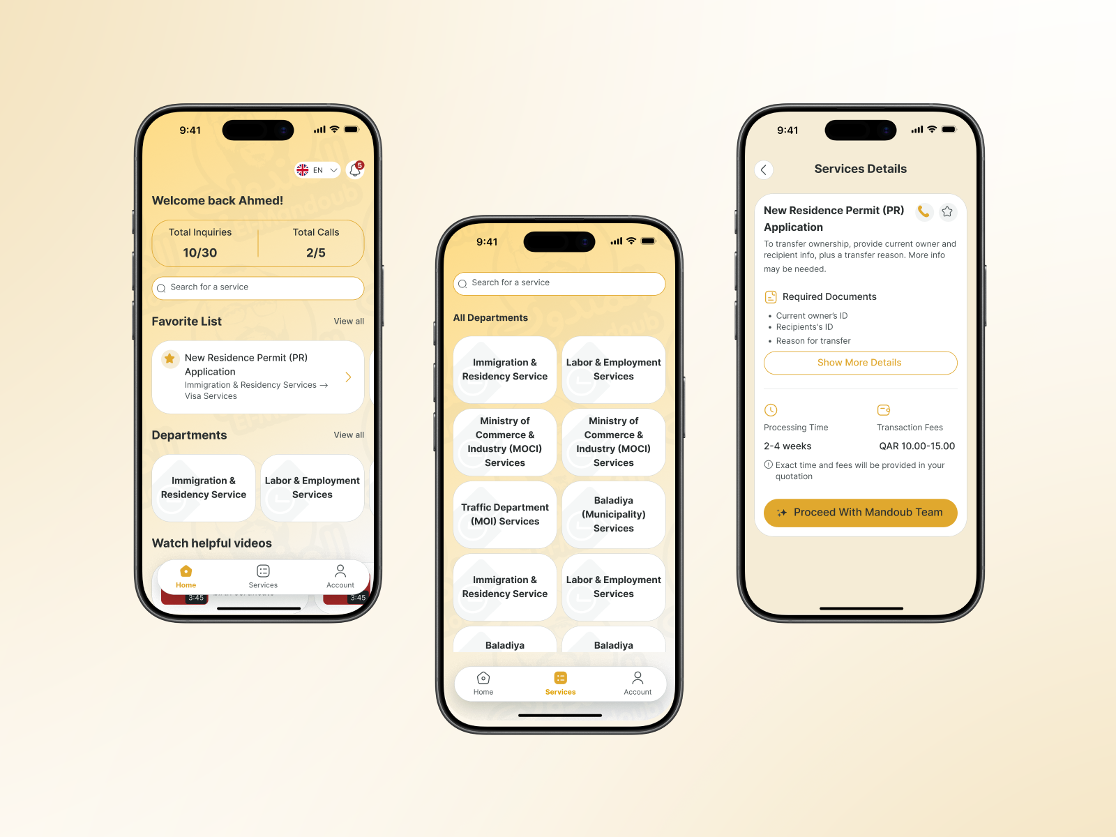
El Mandoub-GovTech App

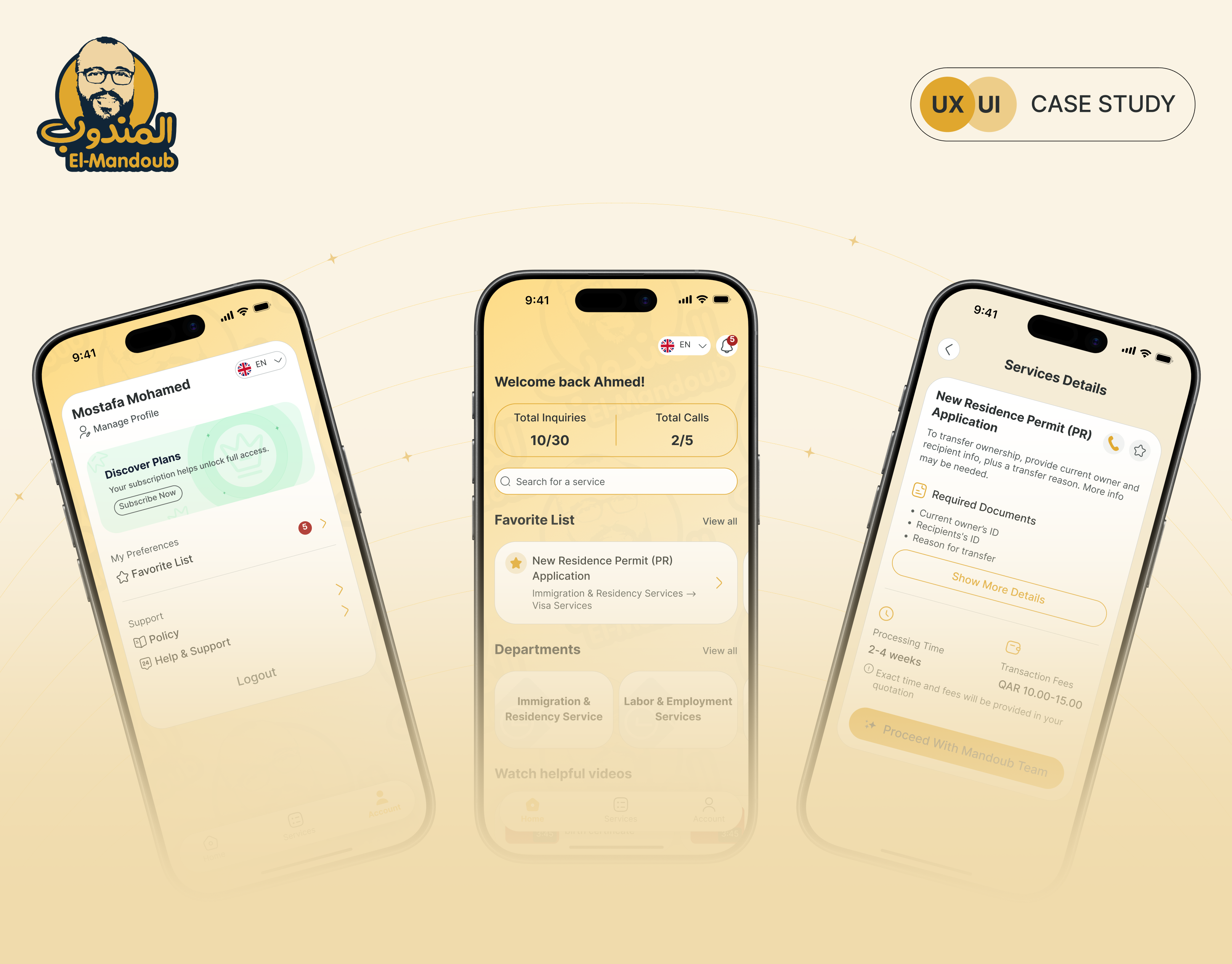
Mandoob is a Qatar-based, subscription-driven GovTech app that simplifies government procedures for individuals and businesses.The platform allows users to inquire about official services, view required steps and documents, and request the execution of procedures through a managed internal team.
Reviews
5 reviews

This is a strong and well-structured case study. You clearly demonstrate end-to-end thinking with IA, user flows, competitive analysis, and a comprehensive set of screens. The visual identity is cohesive and the presentation feels polished and professional. 👏
To elevate it further:
1. Strengthen the connection between insights and UI decisions.
After presenting pain points or competitive findings, explicitly show how each insight influenced a specific feature or screen. This will make your thinking feel more strategic rather than descriptive.
2. Sharpen the problem statement.
The current statement is clear but broad. Making it slightly more specific about the primary user or scenario would add clarity and depth to the case study narrative.
Overall, this is a solid, portfolio-ready case study with strong structure and visual execution. Refining the storytelling and decision mapping would take it to the next level. 🚀

🏛️✨ Okay, this one’s interesting govtech apps are usually… not the prettiest 😅 But yours actually feels structured and modern, which is already a big win.
I like how the layout seems clear and not overloaded. Government-related apps can get messy fast with too much info, but this looks organized and easier to navigate. That clarity builds trust, which is super important here 📲👌
If I’d level it up, maybe add more reassurance elements like status indicators, confirmations, or helpful microcopy so users feel guided the whole way 💬🔍 But overall, solid direction and very practical UX thinking. Nice job!

Strong case study! Research-driven approach, clear IA, and humanized design. Here's my feedback:
Strengths:
- Research identified real pain points (information clarity, trust, and manual follow-ups)
- Strategic IA transforms fragmented data into a clear structure (Home → Departments → Services)
- Humanizing design: warm palette, mascot, and personalization make government approachable
- Comprehensive user flows (onboarding, auth, password recovery)
Areas to Strengthen:
1. Trust Signals — GovTech users need reassurance. Add: security indicators, processing timelines, confirmation emails, status tracking, support access. Critical for subscription model.
2. Edge Cases — Show: service unavailability, rejected documents, payment failures, empty states. These build confidence.
3. Accessibility — Support Arabic/English (good!), but test: color contrast, screen readers, form validation, WCAG compliance.
4. Differentiation — What's Mandoub's defensible advantage beyond "clearer UI"? How do you compete?
5. Metrics — How will you measure success? Define KPIs: task completion, time-to-service, user confidence, retention.
Key Questions:
- Validated IA with real government users? Does "Departments" match their mental models?
- How does the subscription model impact retention? Does the design address churn risks?
- How to handle complex multi-step procedures beyond single services?
Overall: Solid mid-level work. Research and IA are strong. To reach senior level: add trust-building depth, error handling, and strategic thinking about business outcomes.
Next: validate with users and build the "confidence layer" that makes GovTech actually trustworthy.

Visual consistency is solid. The golden brand color, clean Inter typeface, and cream background create a warm and trustworthy feel that fits the GovTech context perfectly.
The 3-step onboarding is well thought out and communicates the product's value from the very first interaction. The registration split into stages (Step 1/2/3 of 3) is good UX practice for reducing cognitive load. You can see the designer was thinking product-first. The Transaction Details screen with its progress bar (Service → Quotation → Payment → Transaction) is one of the strongest moments in the project. The user knows exactly where they are in the process, which directly addresses the "Visibility of system status" heuristic.
But, the user flow in the case study is stripped down to the bare minimum and doesn't show alternative paths. Error states and empty list states are also missing.
The project has real potential and there's clearly solid product thinking behind it. Polishing the flow and filling in the missing states will make this case study genuinely compelling. Keep the momentum going! 💪❤️

Hej Ahmed,
You’ve done a really nice job writing up your case study, and the topic itself is genuinely interesting. A lot of public sector systems suffer from messy information architecture because they’re shaped by many stakeholders, changing rules, and long standing processes, so it’s great to see you tackling something like this.
I’m curious about how you imagine the product working in the real world. Is the app meant to sit on top of existing government processes and simply present them in a clearer, more structured way, or do you see it as something that would be more deeply integrated into those systems?
When it comes to the problem you’re solving, I’d love to see a bit more detail around a full service flow. What does one concrete service look like from start to finish today, and how does your solution simplify that journey compared to the regular experience?
One more thing that caught my eye is the three app reviews on the home screen. What benefit do they have for the user? I’m interested in why you chose to highlight them and what kind of value you expect them to add in that first impression.
You might also like

HealthFlow: Designing a Simple and Insightful Wellness Dashboard


Improving Dating App Onboarding: A/B Test Design

FORM Checkout Flow - Mobile


A/B Test for Hinge's Onboarding Flow


Accessibility Asse


The Fitness Growth Engine

Popular Courses

UX Design Foundations


User Psychology


Introduction to Figma