MalishaEdu - Website Design

MalishaEdu is an international education consultancy platform helping students study in China through end-to-end guidance, from program selection to visa and post arrival support.
Project context
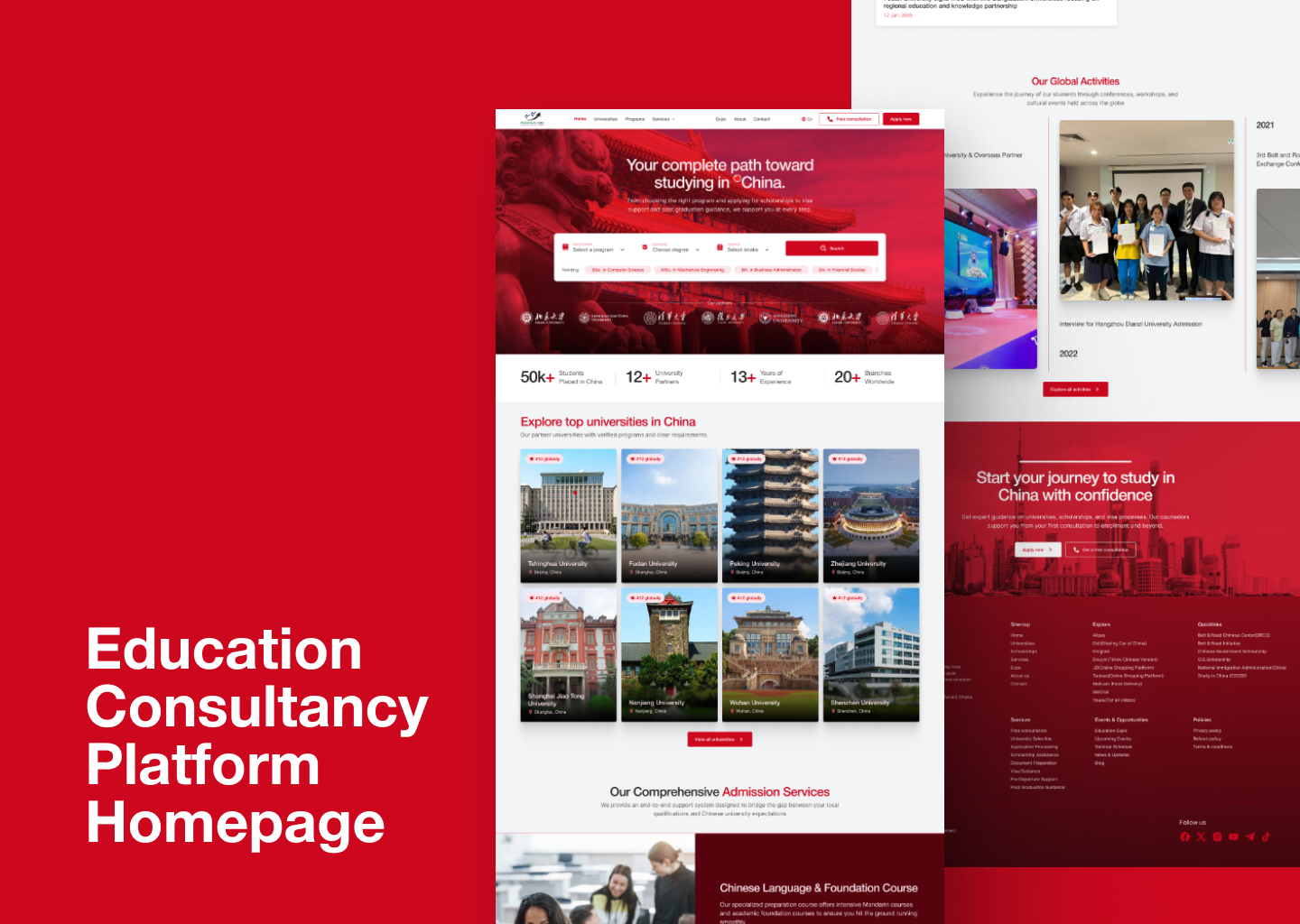
The homepage redesign aimed to clearly communicate value, build trust with first time visitors, and encourage students to explore programs or book consultations with confidence.
The design reduces uncertainty by presenting information progressively. Students can explore first, gain reassurance through trust signals, and take action when ready.
Design choices
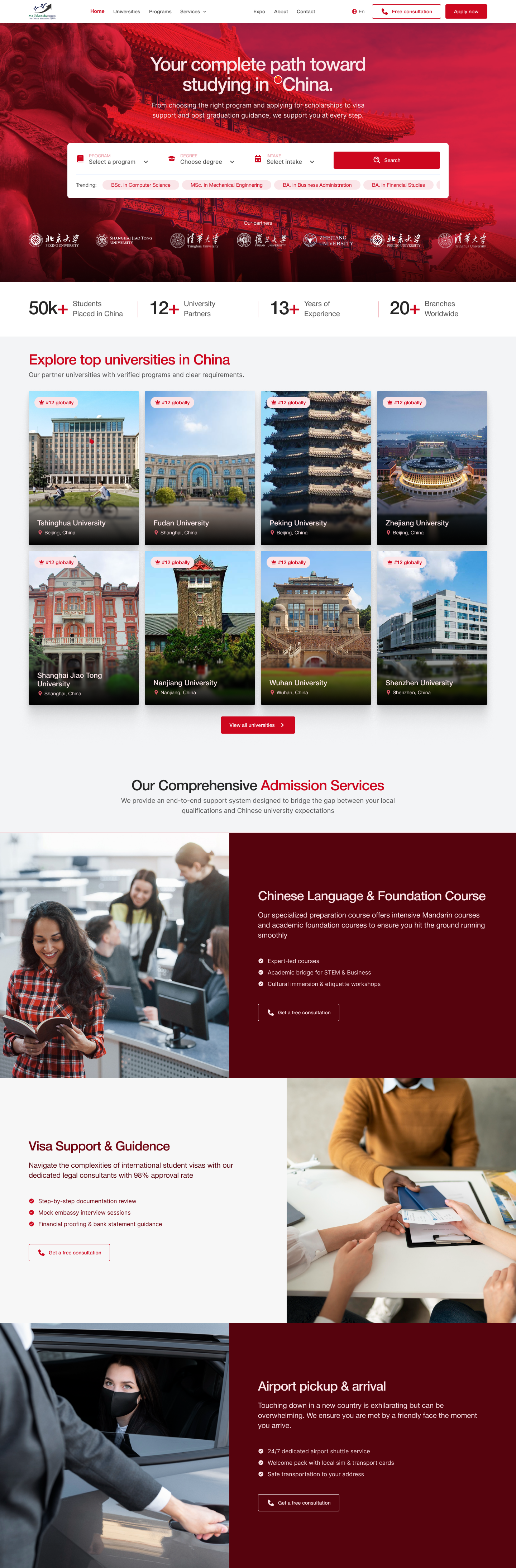
- Search led hero for quick discovery
- Early trust signals and social proof
- Content structured around the student decision journey
- Clear CTAs without pressure
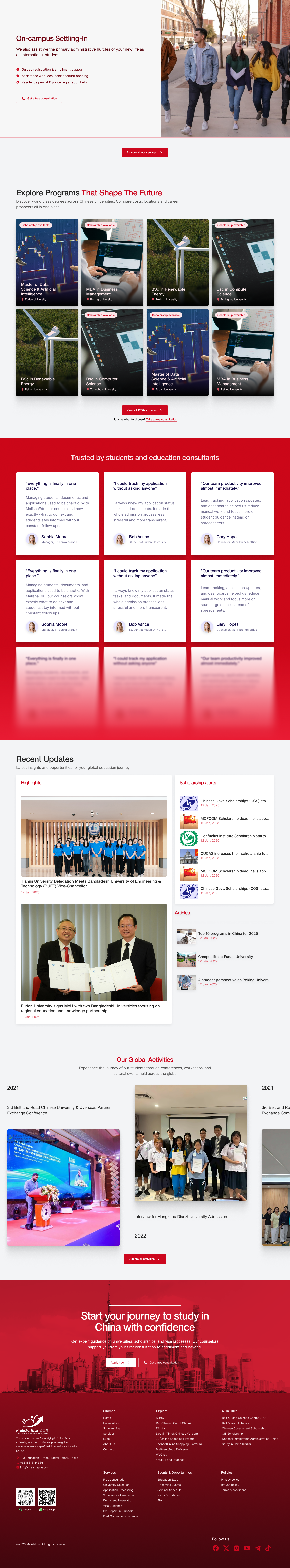
Reviews
6 reviews

Outstanding project! A little bit suggestion for user to easily search top university in china section by adding search bar. I believe it could help.
Waiting for your next great project.

The project has solid foundations. The visual hierarchy is clear, and the red-white palette nicely references the Chinese cultural context. The hero section with the program search is a good idea for quick user engagement, and the stats section with university logos builds trust in line with the brief. 💪
I notice placeholders though. All universities have the identical "#12 globally" badge, and the testimonials repeat the same person and content. The programs grid also shows duplicates. Obviously this needs to be filled in before finalizing.
Small typo: "Guidence" instead of "Guidance" in the visa section.
The alternating layout of service sections works well and maintains a good scrolling rhythm. The footer is complete and well organized.
Overall the project is heading in the right direction. The structure is well thought out, and the flow from hero through services to CTA makes conversion sense. Once you populate it with real data and make minor fixes, this will be a solid homepage that addresses the business goals from the brief nicely. Keep it up! ❤️👍

Amazing job on this! You set out to build trust, and this project achieves that brilliantly. Including logos, testimonials, and placement stats really helps users feel reassured and confident in the brand.
I also love the “Explore programs that shape the future” section. It builds trust in a different way by educating users and positioning MalishaEdu as forward-thinking and aligned with emerging trends.
Such a strong outcome, keep up the great work! 👏
Roy, your redesign of MalishaEdu homepage is impressive and solid referring to your design goals.
Comparing the "old design" website, your new design has created a fundamental breakthrough in terms of building trust (social proof, references, contact, recent news), conveying cultural atmosphere (red and white color theme, authentic photos of universities, ), providing useful information progressively to guide target students apply for programs. Additionally, the hero search design is unique enabling site visitors to get data fast, the layout is clear, user flow runs smoothly, CTAs locations are prominent. Well-considered design.
One minor issue: the button and microcopy consistency, e.g. some instance label as "get a free consultation" while other instance labeled as "free consultation". Another example, in some context the primary button label "Apply now" followed by an arrow while in other context there is no arrow after the label. I understand this version might not yet be the final one, though.
Above all, your redesign is awesome. Looking forward to seeing the updated site with your stunning redesign.

Excellent work, Roy! Your redesign shows strong strategic thinking. Here's my feedback:
Strengths:
- Strategic IA: Content structured around student decision journey (explore → reassure → act)
- Cultural sensitivity: Red-white palette and authentic photos create a connection
- Trust-building: Social proof, stats, and testimonials placed strategically to build confidence progressively
- Hero search: Unique and functional; shows you understand the immediate user need
- Conversion logic: Flow from hero → services → CTAs makes business sense
Critical Issues:
- Placeholder Data — Identical "#12 globally" badges, duplicate testimonials, repeated programs undermine credibility. Real data is non-negotiable before finalizing.
- Microcopy Inconsistency — "Get a free consultation" vs. "Free consultation"; "Apply now" with/without arrow. Create a microcopy guide and audit every instance.
- Typo — "Guidence" instead of "Guidance" in visa section. Proofread thoroughly.
- Button Consistency — Ensure styles, sizes, and placement are consistent across the page. Inconsistency creates friction.
- Accessibility — You tagged WCAG, but did you test? Check color contrast, keyboard navigation, and screen reader compatibility.
Key Questions:
- Performance vs. old design? Show conversion metrics or user testing
- Mobile responsiveness? Show adaptation to smaller screens
- Post-consultation flow? Does design set expectations for next steps?
Overall: Strong strategic thinking and solid execution. The foundation is excellent. Now polish: real data, consistent microcopy, accessibility validation.
Next: Populate with real data, fix consistency, and validate accessibility. You're very close.

The UI looks really great overall. One small suggestion is to add a bit of spacing between “50k” and the “+” so it feels more balanced and easier to read. You could also slightly adjust the vertical alignment to center it better, as it currently feels about 1–2px too low.
For the reviews section, it would be better to use images of different people instead of repeating the same person, to make it feel more natural and trustworthy.
You might also like

Bridge: UI/UX Rebrand of a Blockchain SCM Product


Pulse Music App - Light/Dark Mode


Monetization Strategy


Designing A Better Co-Working Experience Through CJM


Design a Settings Page for Mobile


Zoom Sign in Screen

Popular Courses

UX Design Foundations


Introduction to Figma

Design Terminology
