UX Microcopy
UX microcopy is the small, concise text used in interfaces, such as buttons, and error messages, that guides users, reduces friction, and improves clarity.


TL;DR
- Short text in interfaces like buttons and labels.
- Provides clarity, guidance, and reassurance.
- Shapes tone, and reduces friction.
- Key to smooth and trustworthy interactions.
Definition
UX microcopy is the short, functional text embedded in interfaces, including button labels, tooltips, error messages, and instructions, that supports usability and user confidence.
Detailed Overview
UX microcopy is often overlooked, yet it plays a powerful role in shaping the user experience. Unlike marketing copy, microcopy is highly functional. It appears in small bursts across interfaces, on buttons, in form fields, or in error messages, guiding users through tasks. These tiny bits of text reduce uncertainty and make digital interactions feel smooth and human.
A frequent question is why microcopy matters so much if it’s just a few words. The answer lies in timing and placement. Microcopy often appears at critical moments, like confirming a purchase, entering sensitive information, or facing an error. Well-crafted microcopy reassures users, explains what is happening, and prevents frustration. Poorly written microcopy, by contrast, creates confusion and erodes trust.
Another common query involves tone. Microcopy reflects the brand’s personality while also prioritizing clarity. For example, a playful app might use friendly button labels, while a financial service should keep microcopy straightforward and professional. Regardless of tone, clarity comes first; users must know exactly what will happen when they act.
Error messages are a central focus in microcopy. Instead of vague “Something went wrong,” effective microcopy explains the problem and offers a solution, like “Password must be at least 8 characters.” This practical detail transforms moments of frustration into opportunities to support the user.
Accessibility is also crucial. Microcopy must be concise and understandable to a wide audience, including non-native speakers and users with cognitive challenges. Avoiding jargon and providing clear, actionable language ensures inclusivity. Paired with strong visual design, accessible microcopy strengthens trust across diverse user groups.
Finally, microcopy helps establish confidence. By setting expectations, offering guidance, and reinforcing user actions, it reduces uncertainty at every step. Whether in onboarding flows, checkout forms, or confirmation messages, thoughtful microcopy makes interactions feel natural and reliable.
Learn more about this in the Accessibility in UX Microcopy Lesson, a part of the UX Writing Course.
Marketing copy persuades or attracts, while microcopy informs and guides. It focuses on helping users complete tasks smoothly.
This functional difference makes microcopy critical for usability.
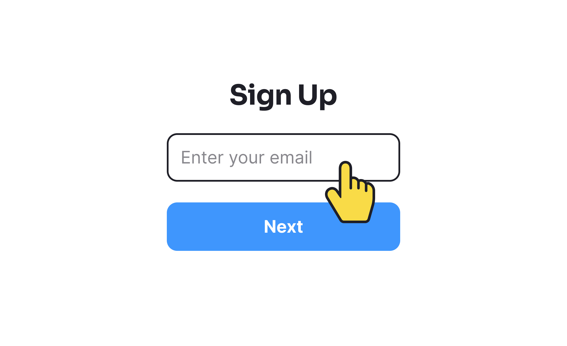
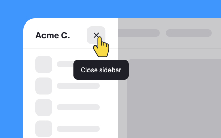
It shows up in buttons, form labels, tooltips, onboarding steps, and error messages. These short texts support users at key moments.
Every placement is tied to task completion and clarity.
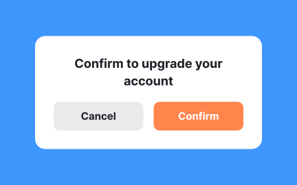
Tone reflects brand personality and influences user trust. A lighthearted tone may work in social apps, while professional tone fits finance or healthcare.
Consistency in tone helps users feel comfortable and confident.
By providing specific explanations and solutions, microcopy reduces frustration. For example, “Card expired, please update details” is more helpful than “Payment failed.”
Clear error text transforms obstacles into solvable steps.
It should use plain language, avoid jargon, and remain concise. Accessible microcopy ensures comprehension across diverse users, including non-native speakers.
This strengthens inclusivity and prevents users from feeling excluded.
Recommended resources
Courses

UX Writing


Common UX/UI Design Patterns & Flows


Advanced UI Components

Lessons

Intro to UX Copy

What is UX Writing?

How to Ask for User Permissions Unobtrusively
Briefs

Write UX Copy for Push Notifications

Design a 404 Error Page

Tutorials

10 Microcopy Tips to Make Every Word Count


How to Make the Most Out of ChatGPT for UX Writing: Part 1

15 Examples of Enhancing a UX Designer's Workflow with ChatGPT
Projects

FinTrust - 404 Error Page


Scholar – Pricing Page for SaaS Education Platform

Blaze – Smart Fitness Tracking in Light & Dark Mode 🚀