Accessibility in UX Microcopy
Get a grasp of the general guidelines to make your UX copy accessible to all
Good microcopy contributes to a good user experience, and making it accessible benefits everyone, especially users with visual and cognitive impairments. These users need clear, concise text that’s easy to locate and understand, reducing cognitive load and enhancing interaction.
To ensure accessibility, focus on crafting microcopy that’s straightforward and strategically placed. Work closely with your design team to integrate accessibility considerations into each design stage, from concept to launch. This collaboration ensures that microcopy not only enhances usability but also meets the needs of all users.
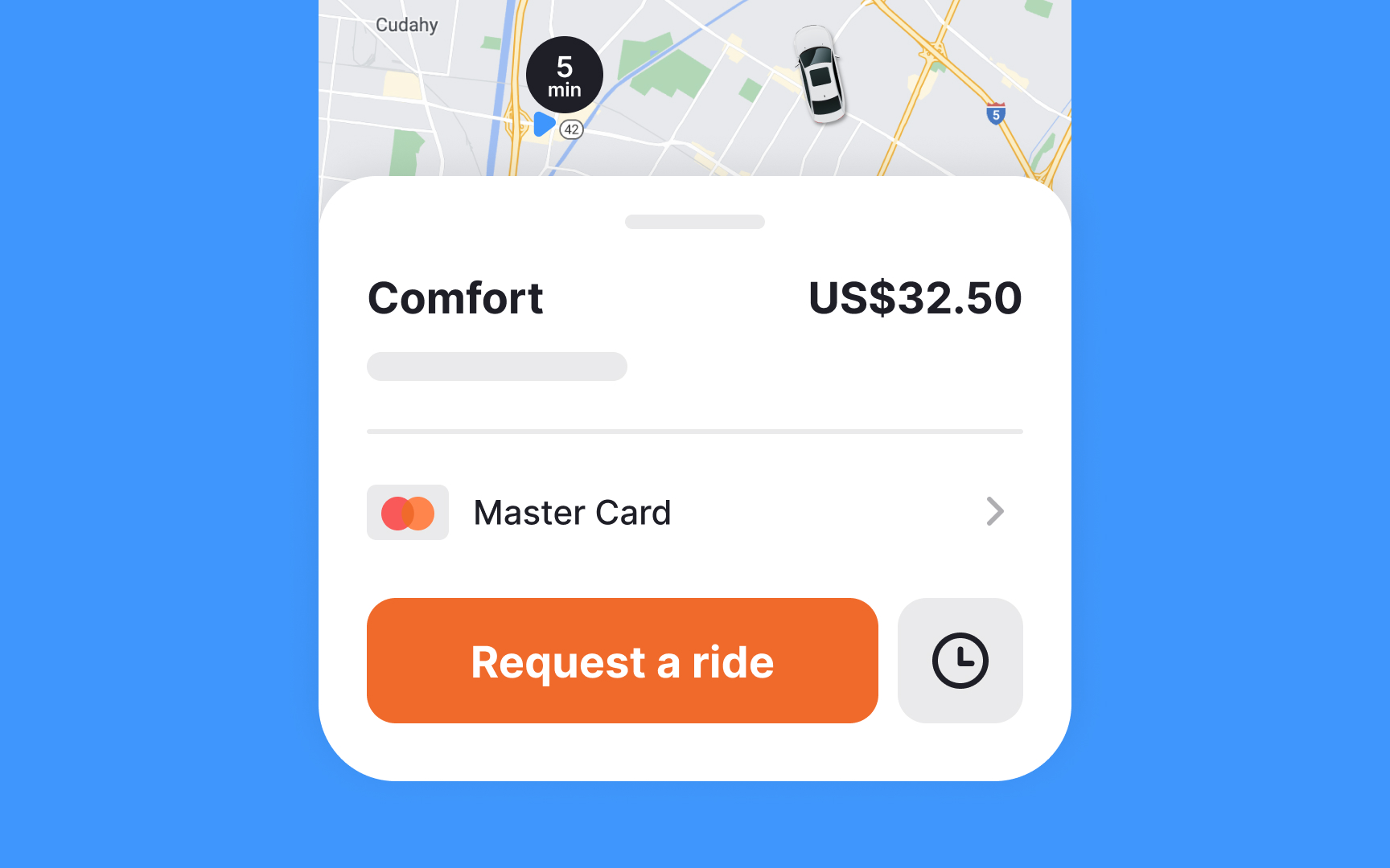
The placement of
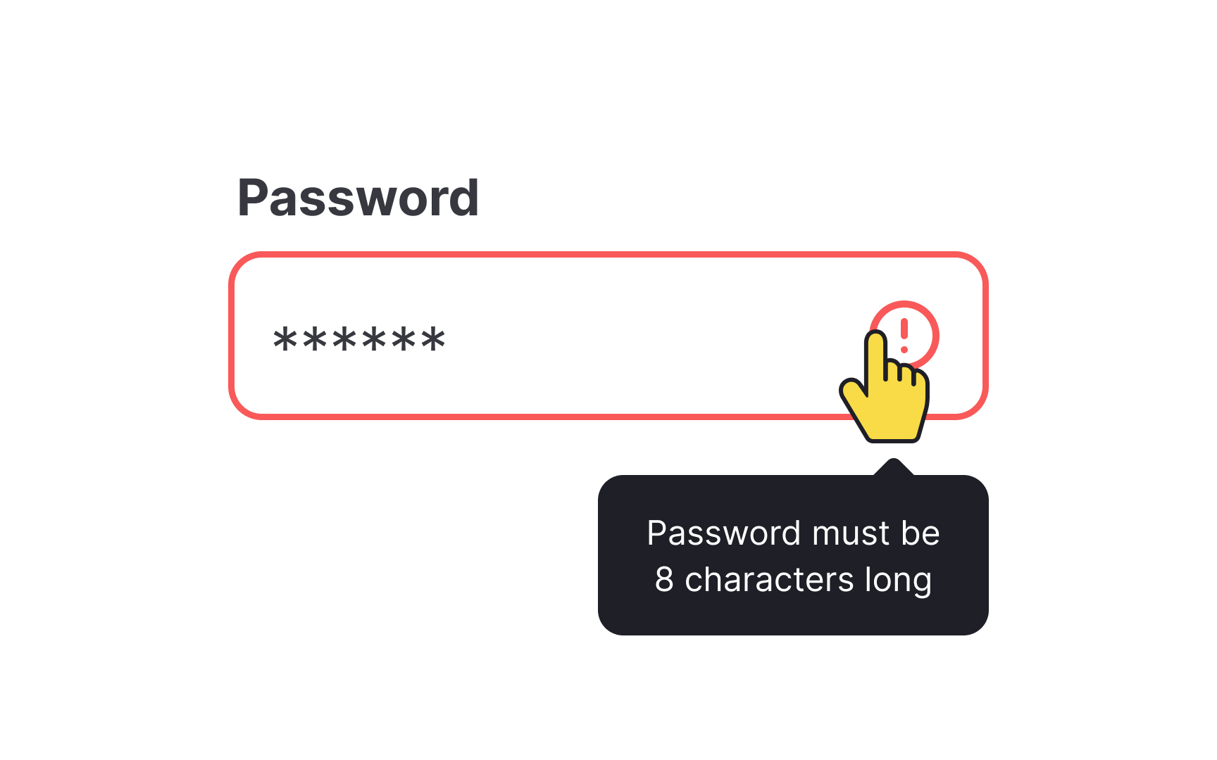
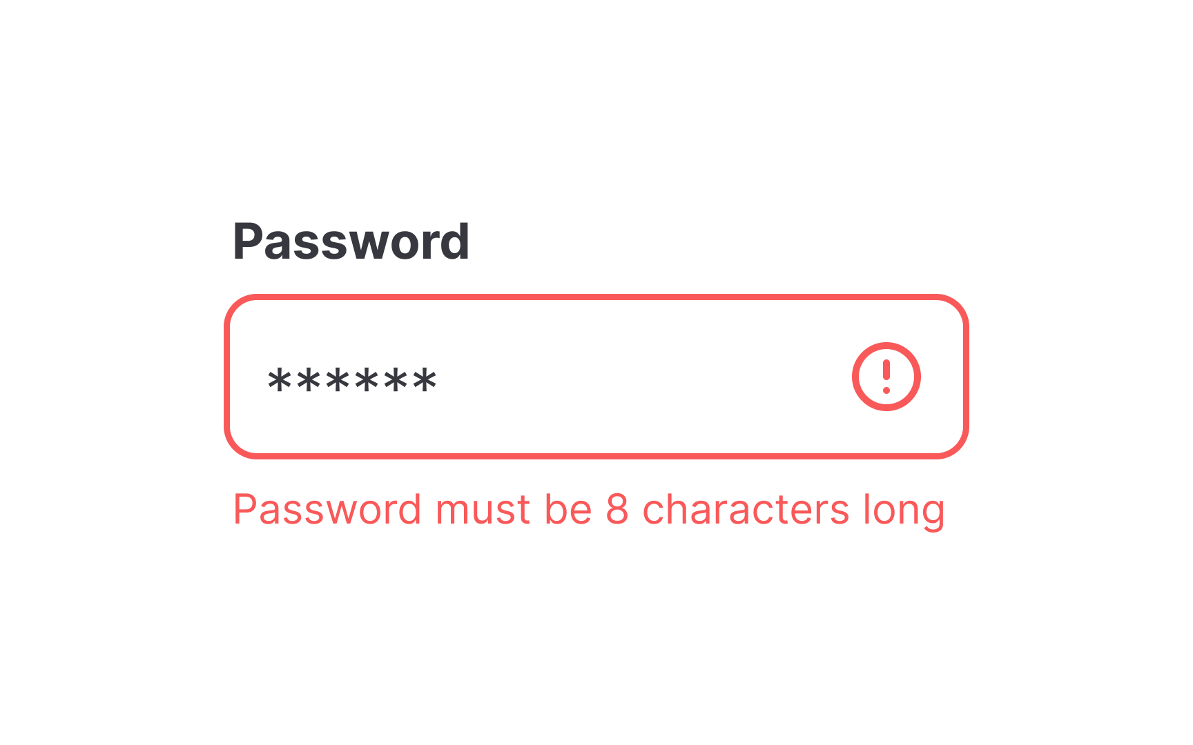
The same goes for confirmation buttons. If important text (like checkboxes for agreeing to terms) appears under the confirmation button, users using screen readers are unlikely to ever read that text.
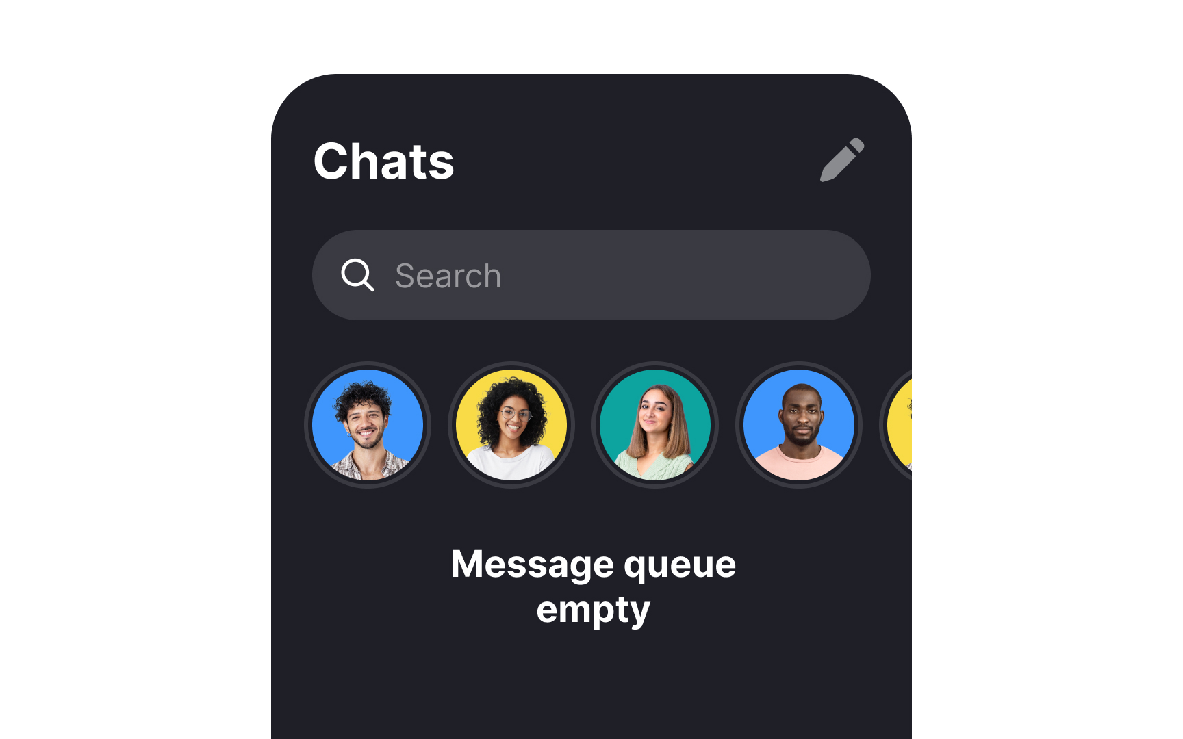
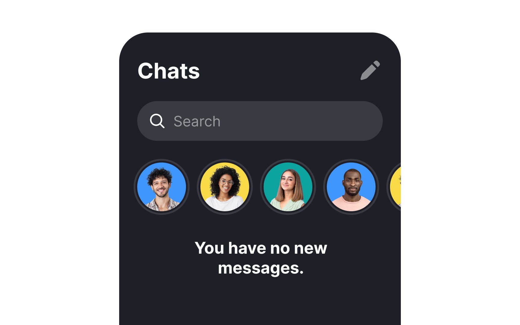
Empty states are often overlooked but can be especially inaccessible for some users. For those using screen readers, adding clear text that explains an empty state’s purpose significantly improves
Plain language should extend beyond empty states to all key

Use language that aligns with your users’ vocabulary. For instance, in a ride-sharing app, use "rides" instead of less familiar terms like "commutes" or "drives." This helps users immediately connect with the app’s functions.[1]
Consider how your users naturally refer to your product's features. While unique

Conventional wisdom says that you should use alt text for every image in your design. However, that’s not necessarily true. If you include images that are purely decorative and don’t have any bearing on the actual content of the page, it’s okay to skip alt text for those images. Why? Because screen readers can already overwhelm users with too much information on a page that’s content-heavy. Adding more information that’s not really relevant to the content of the page just adds to the overwhelm.
So when should you use alt text for images? You can use it for:
- Images that contain important information
- Images that reinforce a message on the page
- Diagrams, data visualizations, and infographics
- Icons, especially when they’re not accompanied by a label
Alt text should always be clear and descriptive. This is not the time to try to be clever or humorous.


When someone is using a screen reader, a link that simply says "Continue" or "More" can be confusing. Using a more descriptive link, such as "Read more about [topic]" gives those using screen readers instant information about what they’re clicking on.
Being more descriptive, in general, across your
When
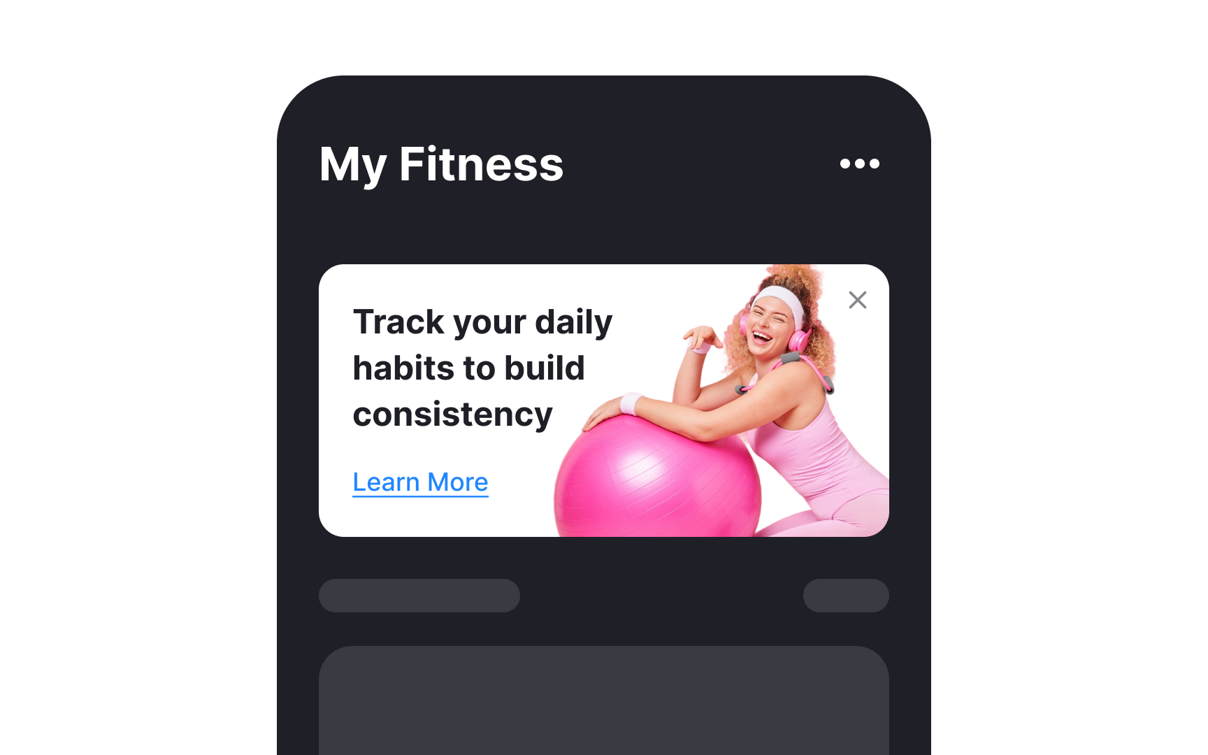
For
"Card with the text: 'Track your daily habits to build consistency,' featuring an illustration of a person lifting weights."
Placing
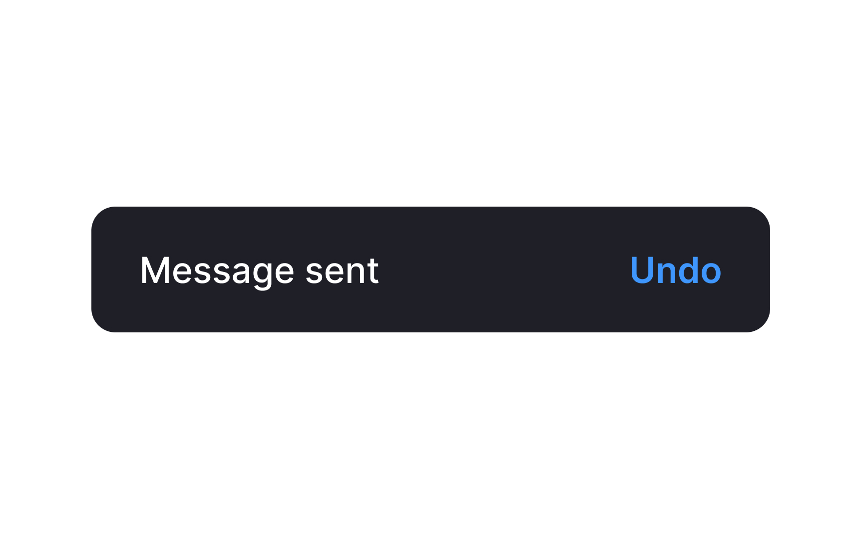
When a user completes an action (like sending a message), provide an accessible acknowledgment to confirm the action happened. This feedback informs users about background system actions and may offer options, like undoing the action.[2]
What does "accessible" mean here?
- Duration: Ensure the acknowledgment stays visible long enough for all users, including those with screen readers, slower reading speeds, or visual impairments. Ideally, keep it on screen until the user navigates away.
- Clarity: The message should clearly state what action was taken. Acknowledgments can appear as snackbars, alerts, or dialogs, with appropriate urgency and options to undo and dismiss.
Keep in mind that acknowledgments differ from confirmations, which require user
References
- Material Design | Material Design
- Material Design | Material Design
Top contributors


Topics
From Course

Share


Similar lessons

Intro to UX Copy

What is UX Writing?
