MalishaEdu Counselor Workspace

Context
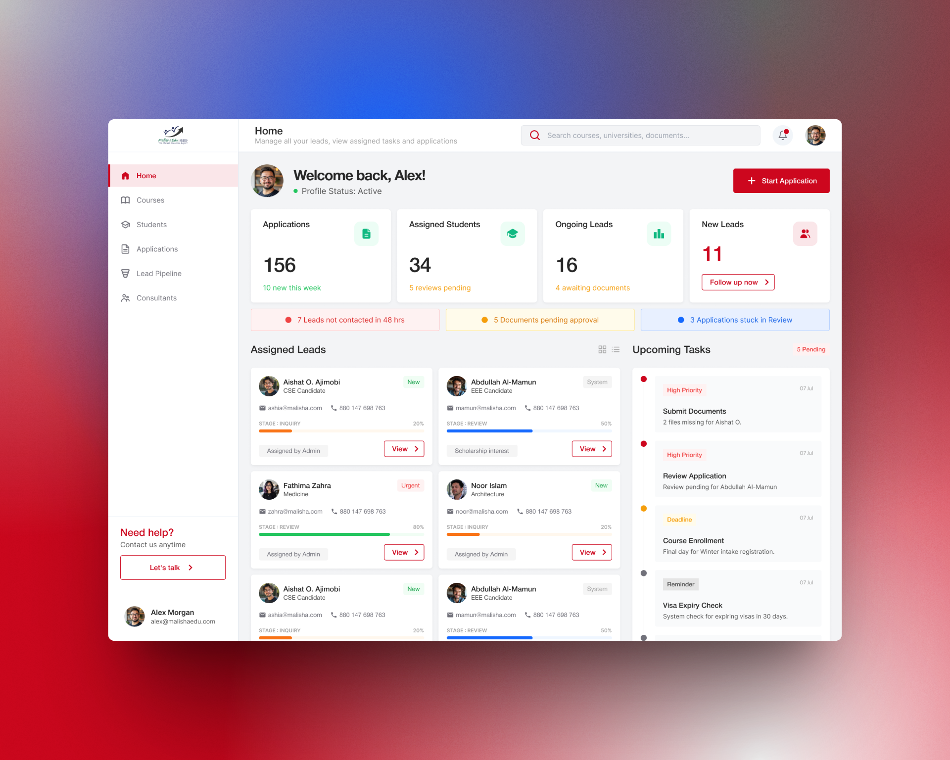
MalishaEdu is a student consultancy management platform used by counselors and branch teams to manage leads, applications, documents, and daily tasks. This dashboard is designed for partners and counselors who need to make fast decisions while handling multiple students at once.
Users
- Branch Managers
- Counselors / Agents
Problems
- Counselors struggle to prioritize work across leads, applications, and documents
- Important follow-ups and approvals often get delayed
- Existing dashboards show numbers but don’t clearly guide next actions
Design Approach
- Focused on action over reporting
- Surfaced critical issues early using a “Needs Attention” section
- Used stage-based progress instead of abstract percentages
- Kept the interface calm and scannable to reduce cognitive load
Key Decisions
- Introduced attention indicators for idle leads, pending documents, and stuck applications
- Made KPIs contextual with meaningful subtext and clear CTAs
- Designed task and lead cards to support quick decision-making, not deep analysis
Outcome
The dashboard helps counselors instantly understand what needs action, prioritize work efficiently, and move students faster through the application pipeline.
Reviews
7 reviews

Hey Roy,
Interesting project. I’d love to see the rest of the screens too, it would really help to understand the full flow.
I also agree with Huda’s comment that the user profile shows up in too many places right now, which makes the layout feel a bit busy.
I would remove the “Welcome back” area and replace it with “Home” plus a short description that is above. That would get rid of one profile instance and give you more breathing room in the header, which currently feels quite crowded.
Between the two remaining profile placements, it’s worth thinking about which one users would naturally look for first.
At first glance there are also quite a lot of colors competing for attention, so it takes a moment to understand what each one means. I know this ties into brand identity, but if red is both your primary brand color and the color for high priority items, the meaning of that color can get a bit mixed.
Overall though, the information architecture feels solid and things are laid out in a logical way.

Hi Roy,
Awesome job on this project. It’s clear a lot of thought has gone into it. The combination of a top bar and side bar makes the dashboard easy to navigate, and I really like the placement of the “Start application” button.
A few thoughts:
- I’d recommend limiting your main colour palette to around three to four colours and applying the 60–30–10 rule to create more visual balance. This article explains it really well: https://uxdesign.cc/how-the-60-30-10-rule-saved-the-day-934e1ee3fdd8
- The amount of information currently shown feels a little overwhelming. Since this is a dashboard, it could help to prioritise what users need to see at this stage. For example, with assigned leads, does the user need to see who the lead was assigned by right away, or could that sit within the view page?
Overall, a really great project that's been nicely thought out. Thanks for sharing!

Very Interesting project Roy. I would recommend you to explore regarding the color palette to for your project. This is actually good when user has many actions to explore but user need to focus on what is the most importance action need to be done. Waiting for your next great project!

Hi Roy 🖐️
The dashboard does a solid job at what it was designed for. The "Needs Attention" section with color-coded alerts actually directs focus to specific actions rather than just displaying numbers. This aligns perfectly with the brief's "action over reporting" approach. KPIs have meaningful subtext ("10 new this week"), which provides helpful context. 💪
I agree with Petar's comment about the user profile. It appears in three places (top right corner, "Welcome back," bottom left). That's unnecessary redundancy taking up space. You could easily drop the welcome section. 🤔
The color issue he raised is also valid. Red as both a brand color and a "high priority" indicator can get confusing. Worth considering separating these functions. 🤔
Lead cards are readable, and progress bars for stages work better than abstract percentages. I'm just missing hover/focus states on buttons. I assume that's still in progress. 😊👍
Solid foundation! The information architecture is logical, and the approach to task prioritization makes sense. A few iterations on the color system and simplifying the header, and this will be a really polished product. Keep it up! 💪❤️

Excellent work, Roy! Your "action over reporting" philosophy is spot-on for B2B dashboards. Here's my feedback:
Strengths:
- Problem-driven design: You solved real pain points (prioritization, delayed follow-ups)
- "Needs Attention" surfaces critical issues first—this is how dashboards should work
- Contextual KPIs: Subtext ("10 new this week") transforms numbers into insights
- Stage-based progress: Much clearer than abstract percentages
- Calm, logical interface with good visual hierarchy
Areas to Refine:
- Color System — Red as both brand color and "high priority" creates confusion. Separate them: use red only for critical alerts; choose a different brand accent (gold, teal). Improves clarity and consistency.
- Profile Redundancy — Appears 3 times (top right, "Welcome back," bottom left). Remove "Welcome back" entirely. Users know who they are. Use that space for value.
- Interactive States — Missing hover/focus/disabled states. Critical for B2B tools. Include in next iteration.
- Full User Flow — Show more screens: lead details, document management, approvals, errors. A single dashboard doesn't prove an end-to-end system.
- Accessibility — Test WCAG AA compliance: color contrast, keyboard navigation.
Key Questions:
- Bulk actions? Can counselors batch-process multiple leads?
- Scalability? What happens with 50+ leads?
- Notifications outside the dashboard? How do they integrate?
Overall: Strong B2B thinking. Your prioritization approach is exactly what enterprise dashboards need. Solid foundation; refine color system, eliminate redundancy, show full flow.
Next: Resolve color/profile issues and expand workflows. You're very close to something polished.

There are a few comments regarding the UI design:
- The profile photo should be limited to one or two images only, as using three feels excessive and less effective.
- The notification indicator can be placed at the top and aligned to the left for better visibility.
- In the Upcoming Tasks section, the colored dot should be applied only to the due date to keep the layout cleaner. The spacing between the section title and the card also feels too wide and could be tightened.
Overall, it would be good to pay closer attention to alignment and spacing to improve visual clarity and consistency.

Great work!
You might also like

Smartwatch Design for Messenger App


Bridge: UI/UX Rebrand of a Blockchain SCM Product


Pulse Music App - Light/Dark Mode


Monetization Strategy


Designing A Better Co-Working Experience Through CJM


Design a Settings Page for Mobile
Popular Courses

UX Design Foundations


Introduction to Figma

Design Terminology
