EntertainHub App (Dark / Light Mode)
Design Approach
I began by designing the main screens in light mode to establish:
- layout hierarchy
- spacing
- content structure
After that, I translated the same screens into dark mode, ensuring visual consistency and smooth theme switching between modes.
Key focus areas:
- Clear content hierarchy
- Comfortable contrast for long-term viewing
- Strong emphasis on featured content and CTAs
- Familiar UI patterns common to streaming platforms
Theme Switching
The light/dark mode switch is placed in the top app bar, making it:
- Easy to discover
- Accessible from the main screen
- Consistent with common mobile UI patterns
This allows users to quickly adapt the interface to their environment and personal preferences.
Theme Switcher Update
As part of the redesign, the appearance of the theme switcher was updated.
The component received a more modern and high-contrast visual style with clearly defined On / Off states, improving readability and aligning it with the overall design system.
Additionally, tooltips were introduced to enhance usability and discoverability.
The tooltips clarify the action of the switch (“Switch to Dark Mode” / “Switch to Light Mode”), reducing cognitive load and making the interaction more intuitive for users.
The image above demonstrates the updated component and its different states.
Dark Mode Color Strategy
The dark mode palette was carefully crafted to meet WCAG accessibility requirements:
- Backgrounds: Deep neutral dark tones instead of pure black to reduce eye fatigue
- Primary text: High-contrast light gray / white for optimal readability
- Secondary text: Muted gray tones to preserve hierarchy
- Accent color: Red remains the brand’s primary action color (Play, Watch Now), ensuring visibility and emotional emphasis
This approach maintains strong contrast ratios while avoiding overly harsh visuals.
Dark Mode Color Strategy
Instead of using pure black (#000000), I selected deep neutral tones to improve visual comfort and maintain hierarchy across interface elements.
Pure black can create excessive contrast, especially when paired with bright text and saturated accents. This often results in visual vibration, faster eye fatigue, and reduced readability over extended viewing sessions — particularly in media-focused environments.
Deep neutral backgrounds allow:
• Better separation between content layers
• Softer contrast transitions
• More controlled accent visibility
• Improved long-session viewing comfort
This decision aligns with common usability findings in digital media interfaces, where users report higher comfort levels with dark gray-based systems rather than absolute black.
Additionally, darker neutrals provide more flexibility when applying elevation, shadows, and component layering — ensuring hierarchy remains visible in both light and dark themes.
Expanding the System: Edge Cases & Real-World States
To make the experience production-ready, I expanded the scope beyond primary screens and included critical system states that reflect real user scenarios.
Streaming products operate in dynamic environments — slow networks, offline states, empty collections, and content creation moments are part of everyday use. Designing only the “happy path” leaves gaps in usability and perception of quality.
In this iteration, I added:
• Loading states (skeleton screens)
• Offline state (no internet connection)
• Empty playlist state
• Playlist creation success state
Each state was designed to maintain brand consistency, preserve hierarchy, and reduce cognitive friction while guiding users toward the next meaningful action.
This extension strengthens usability, accessibility, and system completeness.
Accessibility Considerations
- Text and UI elements meet WCAG contrast guidelines (AA/AAA where applicable).
- All interactive elements follow a minimum 44×44px touch target guideline to ensure comfortable mobile interaction.
- Clear focus states are defined for interactive components (buttons, navigation items, toggles) to support accessibility and keyboard navigation scenarios.
- Active and selected states are visually reinforced through color, iconography, and weight — not color alone.
- Consistent spacing and tap areas reduce the risk of accidental interactions.
- The accessibility system was designed to remain consistent across both light and dark modes.
Tools used
From brief
Topics
Share
Reviews
8 reviews
Excellent work, Anastasia! Light mode first, then dark mode is exactly right. Your accessibility-first mindset is impressive. Here's my feedback:
Strengths:
- Methodical approach: Light mode establishes hierarchy, spacing, structure
- Accessibility: WCAG contrast ratios documented; deep neutrals reduce eye fatigue
- Color strategy: Red accent maintains visibility. Hierarchy preserved through muted text
- Clear documentation: You explain your thinking
- Streaming UI patterns: Familiar and intuitive
- Strong presentation: 33 claps, 4.7 average rating
Critical Gaps (Flagged by Mentors):
- Theme Toggle Discoverability — Top-right toggle is subtle, no label/tooltip. Add a label or consider a more visible placement.
- Inconsistent Patterns — "Award Winning" section has two different presentations (badge vs text). Unify these.
- Missing Player Controls — Lacks basic controls (10s skip, subtitles). These are table stakes for streaming. Show these states.
- Incomplete Accessibility Testing — Show contrast ratios, but what about focus states and touch targets (44px minimum)? Document these.
- Limited Scope — Only main screens shown. What about loading, errors, and empty states? Full flows strengthen case studies.
Key Questions:
- Theme switching performance impact?
- Brand consistency across modes?
- User testing results? Light or dark preference?
Overall: Strong fundamentals and accessibility awareness. Refine: improve toggle visibility, unify patterns, add player controls, and expand scope.
Next: Fix toggle, unify patterns, add controls, document accessibility testing. You're at 80% of an excellent case study.
Hi Anastasia again 👋
Nice project. You can see thoughtful approach to hierarchy and consistency between modes. Good call starting with light mode as a base, it really does make it easier to control spacing and structure.
I found a few things to consider:
- the theme toggle in the top right corner is subtle, but might be hard to discover for new users (there's no label or tooltip) but its detail.
- in the "Award Winning" section you have two different presentation patterns (badge "5 Oscars" vs "Best Picture") worth unifying.
- the player screen is very minimalist, which is fine, but I'm missing basic controls like 10s skip or subtitles.
Regarding WCAG nice that you're showing contrast ratios, but have you also tested focus states and touch targets? With 44px minimum for mobile, it's worth including in the documentation.
Overall solid work with good understanding of streaming UI patterns. Minor inconsistencies are easy to fix, and the foundation is strong. 💪 With this approach to accessibility and color documentation you're on the right track! ❤️👏
You’ve done a strong job structuring and articulating your project presentation. I particularly appreciate the way you’ve thoughtfully integrated accessibility considerations and clearly communicated your design approach. The narrative reflects intentional decision-making and demonstrates a solid understanding of inclusive UX principles.
Overall, this is a clean and well-executed theme adaptation project. From a UI perspective, the hierarchy is strong, CTAs are clearly emphasized, and the transition from light to dark mode feels consistent rather than visually reinterpreted. The red accent maintains brand continuity across both themes, which is a good strategic decision.
From a UX standpoint, placing the theme toggle in the top app bar is intuitive and discoverable. The layout remains familiar to common streaming patterns, which reduces cognitive load. The WCAG contrast documentation and touch target considerations show thoughtful accessibility awareness.
To elevate it further:
- Show more behavioral depth - for example, how theme preference persists (system default vs. manual override) and what happens on first launch.
- Demonstrate interaction states more clearly (pressed, loading, disabled, focus states) instead of just static screens.
- Consider briefly explaining why specific dark tones were chosen over pure black beyond “reducing eye strain”, tying this to user research or usability testing would strengthen the case study.
Overall, strong visual consistency and a solid accessibility foundation with more interaction storytelling, this would feel even more complete as a UX case study.
Hey Anastasia,
You did a really nice job writing up your project presentation. I especially like that you included accessibility in your explanation and took the time to clearly describe your approach. It gives a lot of context to your design decisions and makes the work feel thoughtful and well grounded.
Incredible work, Anastasia. I loved the way you presented the project and transformed the components. The dark mode is very well structured, with clear, recognizable, and accessible colors. Congratulations!
Hello, Anastasia!
Nice work on this case study! Your design approach is clear and well-organized. I really like how you documented the dark mode implementation - the color choices follow WCAG guidelines properly, and using deep neutral tones instead of pure black shows good understanding.
The theme switching placement makes sense, and your accessibility considerations are solid. You clearly thought about hierarchy and user flow.
For next time, try to include some insights from user testing or research. It would make your case even stronger to show how you validated these decisions.
Overall, this demonstrates good UX and thoughtful decision-making.
Hi Anastasia. Well done. Great job for your work. You crafted all into the good presentation. Waiting for your next great job.
You might also like
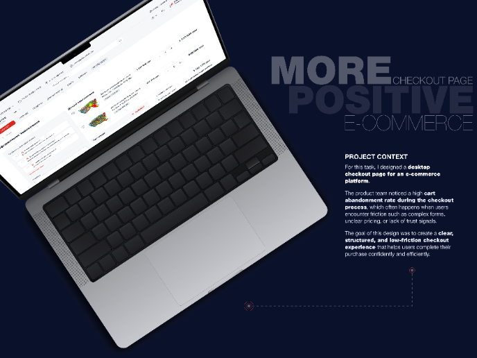
🖥 Desktop Checkout Flow Design
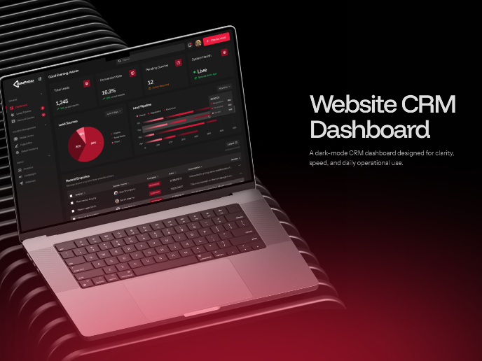
Website CRM Dashboard
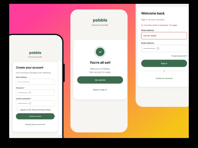
Pebble Accessible SAAS Signup Flow
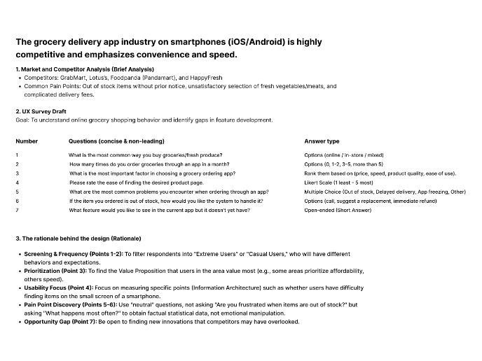
Create a UX Research Survey
Nestra from homepage to checkout process
QuickScan Onboarding
Visual Design Courses

UX Design Foundations

Introduction to Figma

