Sign-Up Page Activity - Miro

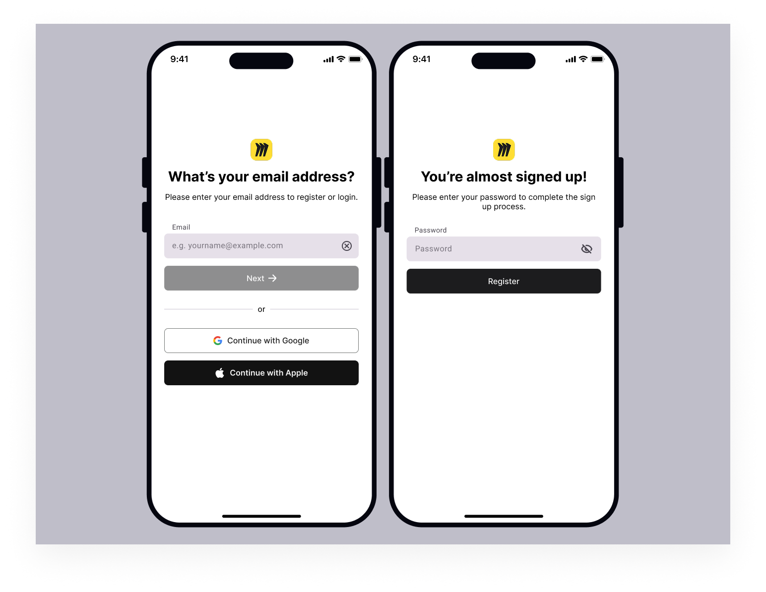
I designed this mobile login and sign-up flow following WCAG 2.1 AA accessibility principles, focusing on clarity, usability, and reduced cognitive load. The form uses clear labels, simple instructions, and high-contrast buttons to ensure content is easy to perceive, while large touch targets and a single-column layout support smooth mobile interaction. I chose an email-first, step-by-step flow to prevent errors and avoid overwhelming users by only showing essential information at each stage. Plain language, consistent layouts, and features like password visibility toggles and third-party sign-in options help make the experience more understandable, inclusive, and user-friendly.
Tools used
From brief

Topics
Share
Reviews
5 reviews

This is a good and clean design. To improve the ux you can add already have an account button. Good overall. Waiting for your next project

You’ve created a clean and focused mobile flow with clear labels and a thoughtful step-by-step progression. The single-column layout, plain language, and password visibility toggle support usability and reduced cognitive load. The hierarchy is strong, and the experience feels simple and intentional!
To strengthen this further, I’d encourage you to demonstrate accessibility more explicitly. While you mention WCAG 2.1 AA, the screens don’t yet show key elements such as visible focus states, accessible error messaging, or confirmation of contrast ratios. For example, how would an invalid email be communicated, and would the error message be programmatically linked to the input? Also consider how keyboard navigation and screen reader users would move through this flow. Adding those details would make your accessibility claims more concrete and testable.
Overall, this is a solid intermediate submission with strong usability thinking and a clean visual structure. With clearer proof of WCAG compliance and attention to edge and error states, it could move much closer to advanced-level accessibility design.

Excellent work, Jessy! Your accessibility-first approach is exactly right. Here's my feedback:
Strengths:
- Accessibility-first mindset: WCAG 2.1 AA from the start, not afterthought
- Smart flow: Email-first, step-by-step, prevents errors and reduces cognitive load
- Clear paths: Login/signup split is obvious and predictable
- Third-party sign-in: Google and Apple options reduce friction
- Password visibility toggle: Respects user control
- Plain language: Instructions are simple and direct
Critical Issues (Flagged by Mentors):
- Clear Button (X) Logic — Appears enabled even when the field is empty. Confusing. Show only when there's content to clear. This micro-interaction signals attention to UX.
- Missing Back Navigation — No way to return from the password screen to change email. Critical UX gap. Users need to correct mistakes. Add back button or "Change email" link.
- Label Font Size — Too small for users with visual impairments. Match label font size to placeholder text for better readability.
- Password Validation — Show feedback as the user types, not after submission. Prevents frustration and errors.
- Already Have Account Link — Add a link to the login for users who realize they have an account. A common conversion killer is missing.
Accessibility Validation:
- Screen reader tested? Show results
- Keyboard navigation verified? Tab order correct?
- Color contrast ratios confirmed? (WCAG AA requires 4.5:1 for text)
- Mobile tested on actual devices?
Overall: Strong accessibility thinking and clean execution. Solid foundation. Refine micro-interactions and validate accessibility claims with testing.
Next: Fix clear button logic, add back navigation, show validation as-you-type, and document accessibility testing. Very close to polished.

Hey Jessy,
Congrats on your project. I’m curious though, did you build on top of the existing Miro flow, or did you just use Miro as a theme and redesign the whole form from scratch?
I really like how you split the form into two clear paths. It’s obvious whether someone is logging in or signing up, and starting both flows with the email field makes the experience feel simple and predictable.
One small thing I’m not fully convinced by is the “X” inside the input. It feels a bit too active when the field is empty. Personally, I’d only show it once the user has actually typed something, otherwise it can feel a little distracting.
When it comes to the password on the sign-up flow, are there any validations in place? If so, it would be great to show them as the user types, instead of after they submit. That usually saves people an extra step and a bit of frustration.
I also agree with Nnamdi’s point about navigation. On the sign-up screen there doesn’t seem to be a back arrow. How is the user supposed to get back to the previous screen if they change their mind?
Overall, it’s a nice, clean concept.

Hi Jessy,
This is such great work! Well done.
I think this design would have a very strong accessibility score
A few thoughts though..
It's possible that the font size of the input labels may be quite small and difficult to read for certain users with visual impairments. Perhaps, making the input label's font size to be the same as the placeholder's font size could do the trick.
Also, the 'x' icon used on the email input field looks enabled even when the user has not typed anything in the field. This gives the impression that the user can remove the entire input field rather than clear the content in the input. If it's a necessary feature, then I think there should be a distinction between when there's no input to clear (disabled) and when there is an input (enabled).
On the UX: Consider adding a back button on the password page or a way for the user to go back to the previous page if they, perhaps, want to change the email they entered.
In all, I think this design is simple, solid and accessible.
Keep up the great work.
You might also like

Smartwatch Design for Messenger App


Bridge: UI/UX Rebrand of a Blockchain SCM Product


Pulse Music App - Light/Dark Mode


Monetization Strategy


Designing A Better Co-Working Experience Through CJM


Design a Settings Page for Mobile
Visual Design Courses

UX Design Foundations


Introduction to Figma

Design Terminology
